In the fast-paced world of branding, keeping up with the latest trends is a must. And when it comes to giving your company a facelift, there’s no better way to do it than with a design/” title=”Law Firm Logo Design”>logo revamp. But fear not, fellow rebranding warriors, for we’ve got the inside scoop on the art of logo revamp. So sit back, relax, and prepare to embark on a journey of transformation and triumph as we unveil the key strategies for successful rebranding. Let’s get ready to shake things up in style!![]()
Understanding the Importance of Logo Revamp
So, your logo looks like it was designed in the 90s by someone who just discovered Clipart. It’s okay – we’ve all been there. But it might be time to upgrade that bad boy and give it a fresh new look. Here’s why:
- Your logo is the face of your brand – and right now it’s giving off more of a ‘90s sitcom dad’ vibe than a sleek, modern business.
- A revamped logo will show your customers that you’re not stuck in the past, but are forward-thinking and ready to take on the future – or at least the next decade.
- Imagine all the cool new marketing materials you can create with a fresh logo! Maybe you’ll finally have that branded fanny pack you’ve always dreamed of.
Plus, a logo revamp is a great opportunity to inject some fresh energy and creativity into your brand. Who knows, maybe your new logo will launch you into superstardom – or at least get you a few extra likes on Instagram. So go ahead, embrace the change, and give your logo the glow-up it deserves!
Analyzing Current Brand Identity
So, let’s dive into the deep, dark depths of our current brand identity and see what we can unearth. In the realm of logos, colors, and messaging, there’s plenty to dissect and decode. Strap on your detective hat, grab a magnifying glass, and let’s get sleuthing!
First up, let’s take a look at our logo. Is it sleek and modern, or does it look like it’s straight out of a ’90s time capsule? Does it scream “cutting edge” or whisper “old fashioned”? *cue dramatic music* Let’s examine the color palette next. Are we rocking a vibrant rainbow of hues, or are we sticklers for black and white minimalism? Are we more retro neon or classic pastels? Oh, the mysteries of branding!
Now, onto the messaging. Are we serving up snappy one-liners that make audiences chuckle, or are we boring them to tears with corporate jargon? Are we speaking their language or leaving them scratching their heads in confusion? Let’s dissect our social media presence, website design, and marketing materials to see if our brand identity is cohesive, consistent, and captivating. *dons Sherlock Holmes hat*
Through this analysis, we’ll uncover the hidden gems and dusty cobwebs of our brand identity. We’ll identify areas for improvement, celebrate our wins, and strategize how to elevate our brand to new heights. So, grab your notepads, sharpen your pencils, and let’s embark on this epic branding adventure together!

Researching Market Trends and Competitors
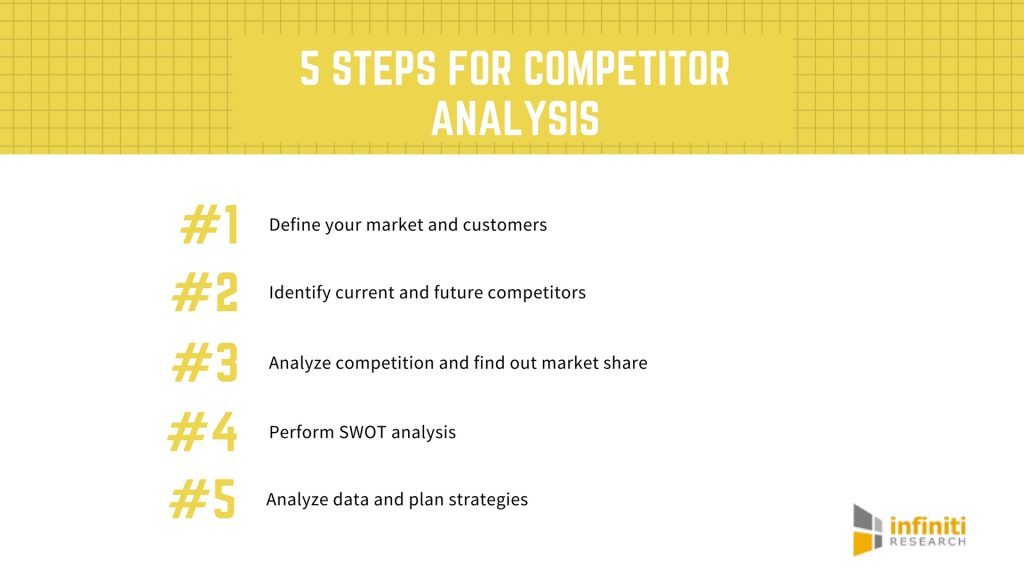
First things first, when it comes to , you need to roll up your sleeves and dive deep into the data. It’s not for the faint of heart, but hey, who said dominating the marketplace was easy?
Now, when it comes to keeping an eye on your competitors, think of it like a game of spy vs. spy. You’ll want to be sneaky, strategic, and maybe even a little bit devious. But hey, all’s fair in love and business, right?
Use tools like Google Alerts and Social Mention to keep tabs on what your competitors are up to. And don’t forget to check out their social media pages for some good ol’ fashioned stalking. Just don’t get caught…
Remember, in the world of business, knowledge is power. So, brush up on your detective skills and start digging for that juicy insider info that will skyrocket your company to the top of the food chain.

Collaborating with Design Experts
When , it’s important to remember that they may speak a different language - one filled with terms like kerning, RGB, and Pantone. Don’t worry if you feel a bit lost at first, just nod sagely and pretend like you totally know what they’re talking about. That’s what I do, and it seems to work!
Another key thing to keep in mind is that design experts have a keen eye for detail. They’ll notice if your logo is slightly off-center or if your font choice is a tad outdated. So be prepared for some gentle (or not so gentle) critiques along the way. Just remember, they’re only trying to help you achieve design greatness.
can be a fun and rewarding experience. You’ll get to see your vision come to life in ways you never thought possible. Plus, you’ll likely learn a thing or two about design along the way. So embrace the process, stay open to feedback, and remember that at the end of the day, you’re in good hands with your design expert pals.
And if all else fails, just bring a box of donuts to your next meeting. Design experts love donuts almost as much as they love good typography. It’s a surefire way to win them over and ensure a smooth collaboration process. Trust me, I speak from experience!

Implementing a Consistent Visual Branding Strategy
So, you want to make sure your brand looks as snazzy as possible? Well, look no further! is key to making sure your company looks on point at all times.
First things first, you gotta pick a color scheme and stick to it like glue. Whether it’s a vibrant rainbow extravaganza or a sleek, minimalist monochrome look, make sure your colors are consistent across all platforms.
Next up, logos are your best friend. Slap that bad boy on everything from business cards to billboards to social media profiles. Make sure it’s front and center, so people know exactly what you’re all about.
And don’t forget about fonts! Choose a couple of fonts that represent your company’s personality and stick to them like your life depends on it. Consistency is key, people!
Rolling Out the Rebranded Logo to Stakeholders
Attention all stakeholders! The moment you’ve been waiting for is finally here – our rebranded logo is ready to make its grand entrance! Get ready to be wowed, amazed, and possibly even a little starstruck by our slick new design that screams “We’re here to slay the competition!”
So, what can you expect from our fabulous new logo? Well, picture this: a sleek, modern font that oozes sophistication, a dynamic color scheme that pops like a firework in the night sky, and a symbol that represents our commitment to innovation, progress, and all things awesome.
But wait, there’s more! In addition to our snazzy new logo, we’ve also got a whole bunch of exciting changes in store that are guaranteed to knock your socks off. From revamped marketing materials to a fresh new website, we’re pulling out all the stops to ensure that our brand is as shiny and sparkly as a disco ball on New Year’s Eve.
So, get ready to be dazzled, dazzled, and maybe even a little dazzled by our rebranded logo and everything that comes with it. Because at the end of the day, we’re not just rolling out a new look - we’re rolling out a whole new attitude that’s going to take us to the tippity-top of the business world. Buckle up, stakeholders, because it’s going to be a wild ride!
Measuring Success and Making Adjustments
So you’ve set your goals, implemented your strategies, and now it’s time to measure success and make adjustments. But how do you know if you’re on the right track? Fear not, for we have some tips to help guide you through this process:
- First and foremost, celebrate even the smallest victories. Did you successfully update your LinkedIn profile picture? Treat yourself to a cookie.
- Don’t get caught up in comparing yourself to others. Remember, success is subjective. Just because Cindy from accounting got a promotion doesn’t mean your accomplishment of reaching inbox zero should be overlooked.
- Utilize data to your advantage. Take a look at your analytics to see which strategies are working and which ones are falling flat. Maybe that TikTok dance you posted was a hit, but your blog post about the benefits of broccoli wasn’t as well-received.
Remember, success is like a good cup of coffee – it takes time to brew. If things aren’t going according to plan, don’t be afraid to make adjustments. Maybe it’s time to pivot your focus from Twitter to Instagram, or perhaps it’s time to retire your signature catchphrase “YOLO” and embrace a more professional tone.
FAQs
Why should a company consider revamping their logo?
Because nothing says “we mean business” like ditching your old logo and investing in a shiny new one. Plus, it’s a great excuse to throw a party and treat your employees to some fancy catered lunch.
What are some key strategies for a successful logo revamp?
First and foremost, you’ve got to really nail down what message you want your logo to convey. Are you sleek and modern? Quirky and fun? Once you’ve got that figured out, work with a talented designer to bring your vision to life. And don’t forget to test it out on all different mediums – from websites to billboards to even those tiny little business cards.
How can a company ensure their logo revamp resonates with customers?
Simple. Ask your customers! Set up focus groups, send out surveys, and maybe even offer some free swag in exchange for feedback. You want to make sure your logo isn’t just a hit with your marketing team – you want it to be a hit with the people who are actually going to be looking at it.
What are the potential risks of rebranding a logo?
Well, for starters, you might upset the die-hard fans of your old logo. I mean, we’re talking about people who have that logo tattooed on their biceps, so be prepared for some serious backlash. You also run the risk of confusing customers if your new logo is a total 180 from your old one. So, tread carefully and maybe have a PR strategy in place, just in case.
How often should a company consider rebranding their logo?
Listen, you don’t want to be like that person who changes their hairstyle every week. It’s a bad look. Generally, experts recommend rebranding every 5-10 years. But hey, if you’re feeling antsy and your current logo just isn’t doing it for you anymore, go for it! Life’s too short to stick with a logo you hate.
Time to Rebrand Like a Boss!
Congratulations, dear reader, you have now mastered the art of logo revamp! Armed with these key strategies, you are ready to tackle any rebranding challenge that comes your way. Remember, the key to successful rebranding is creativity, boldness, and a touch of humor. So go forth, unleash your inner design guru, and watch your brand soar to new heights!


