In the ever-evolving world of branding, one thing is certain: change is inevitable. But why settle for a plain ol’ makeover when you can give your logo a full-on facelift with the power of adaptive reuse? So grab your markers and bring out the big guns, because we’re about to dive headfirst into the wild world of revitalizing brands through logo redesign. Get ready to witness the magic of transformation as we turn outdated logos into brand spanking new masterpieces – all while keeping our tongues firmly planted in our cheeks. Let the redesign revolution begin!
Evolution of Brand Identity
When it comes to brand identity, change is inevitable. Brands evolve over time like a Pokemon evolving into a more powerful form. Here are some ways brand identity has transformed over the years:
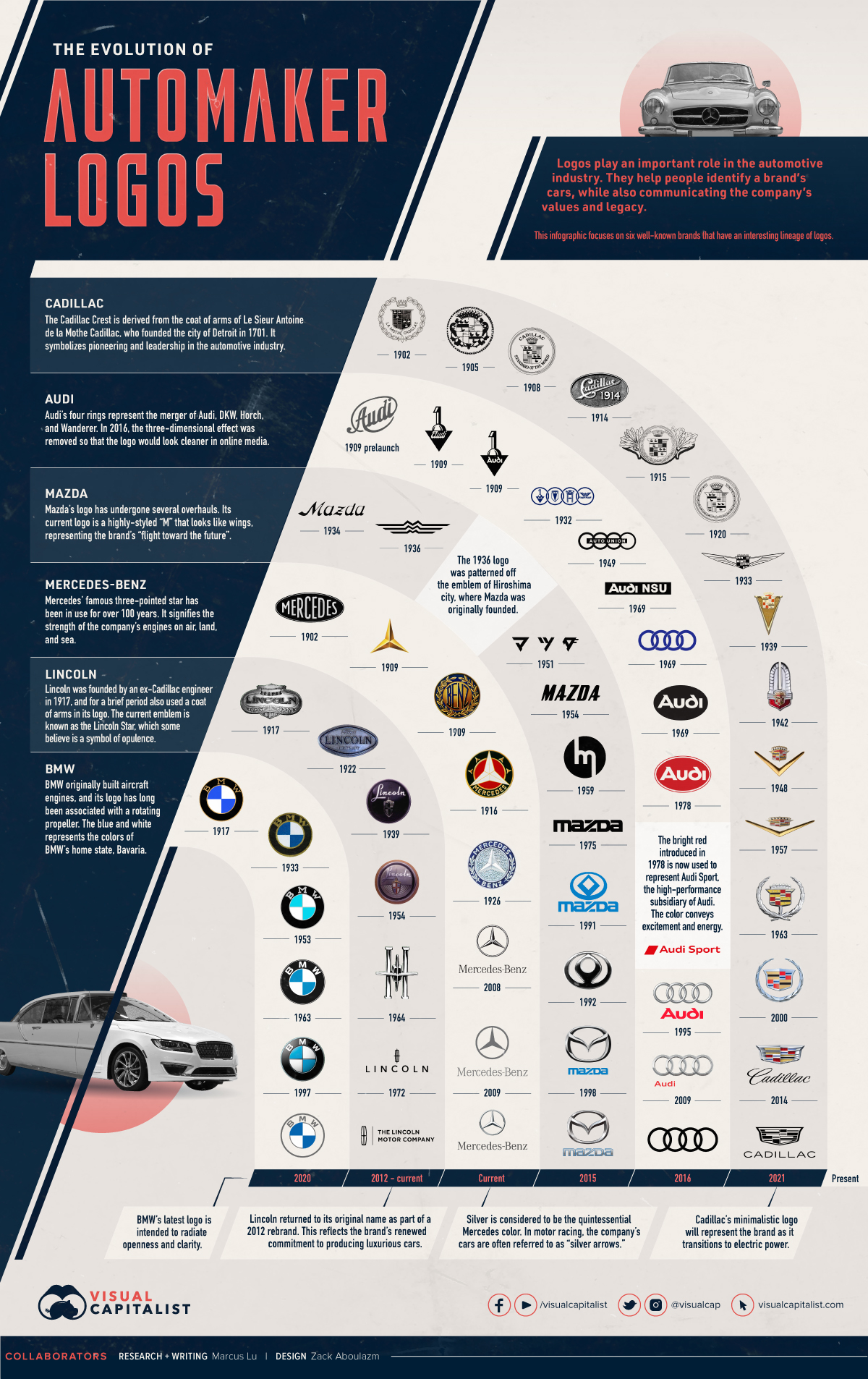
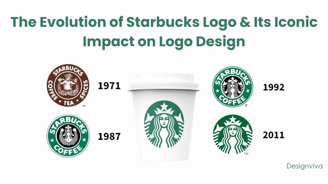
1. Logo Makeovers: Just like getting a new haircut, brands often give their logos a makeover to refresh their look. From Coca-Cola to Starbucks, logos have gone through their own glow-ups throughout history.
2. Brand Mascots: Remember the days when Tony the Tiger and the Pillsbury Doughboy were the ultimate brand mascots? Nowadays, brands are reimagining their mascots to stay relevant in the digital age. The Geico gecko and the Twitter bird are just a few examples of this evolution.
3. Social Media Influence: With the rise of social media, brands have had to adapt their identity to fit the online world. From crafting witty tweets to engaging Instagram stories, brands have had to embrace the digital age to stay connected with consumers.

The Importance of Logo Redesign
In the ever-evolving world of branding, logo redesign is key to staying relevant. Think of it as giving your logo a facelift - who doesn’t love a good makeover?
But why exactly is logo redesign so important, you ask? Well, let me break it down for you:
- Reflecting current trends: Your logo should be as up-to-date as your wardrobe, darling. Keeping it fresh and trendy will show that you’re not stuck in the past - unless your brand is all about nostalgia, in which case, carry on.
- Standing out from the competition: With every business vying for attention, having a logo that pops is crucial. You don’t want to be mistaken for your competitors – unless they’re winning awards left and right.
So don’t be afraid to shake things up and give your logo a new lease on life. Who knows, it might just be the makeover your brand needs to make a lasting impression. Just remember: there’s no going back once you’ve chopped off those bangs (or pixels).
 Branding“>
Adaptive Reuse in Branding
When it comes to branding, sometimes you have to think outside the box… or in this case, outside the building! Adaptive reuse is all the rage these days, and it’s not just for old warehouses and factories – it can also be a game-changer for your brand. Here are a few ways you can incorporate adaptive reuse into your branding strategy:
Instead of starting from scratch with a brand new logo, why not give your old one a facelift? A fresh coat of paint, a new font, and some strategic tweaks can breathe new life into your brand – without breaking the bank. Plus, it’s a great way to show customers that you’re not afraid to adapt and evolve.
Think about repurposing old marketing materials in new and creative ways. That old billboard might not be getting much attention on the side of the highway, but what if you turned it into a giant mural in a bustling urban area? Or how about using those outdated brochures as quirky packaging for your products? The possibilities are endless!
Don’t be afraid to mix and match elements from different eras and styles in your branding. Who says you can’t pair retro typography with a sleek, modern color palette? By embracing the eclectic and unexpected, you’ll stand out from the competition and create a brand that’s as unique as you are.

Examples of Successful Logo Revitalization
Remember when Pepsi had that awkward logo that looked like a weird smiley face? Well, their recent logo revitalization has turned things around completely! The sleek new design now gives off a vibe of sophistication and class – definitely an A+ for their rebranding efforts.
- The Gap also made a bold move with their logo redesign, going from basic to trendy in a blink of an eye. Who knew a simple font change could make such a big difference? Kudos to them for keeping up with the times!
- On the flip side, the Instagram logo change caused quite a stir among users. But love it or hate it, you can’t deny that their revitalization got people talking. Isn’t that what it’s all about in the end?
And let’s not forget about Mastercard – they decided to drop the words from their logo entirely, leaving only their iconic circles. It’s like they’re saying, “We’re so cool, we don’t even need words to prove it!” Bold move, but it totally paid off.

Strategies for Updating a Brand Identity
So, you’ve decided it’s time to give your brand identity a facelift. Maybe your logo is looking a little outdated, or perhaps your color scheme screams “old school”. Never fear, we’ve got some creative strategies to help you update your brand without losing your essence.
First things first, do some research. Take a look at what your competitors are doing and see what’s working for them. Then, think about your target audience. What do they respond to? Do they prefer sleek and modern designs, or are they more drawn to a vintage vibe? Keep these factors in mind as you start brainstorming ideas for your brand refresh.
Next, consider tweaking your logo. You don’t have to go for a complete overhaul – sometimes a subtle change is all you need. Maybe update the font or play around with the colors. Remember, your logo is the face of your brand, so make sure it reflects who you are and what you stand for.
Finally, don’t forget about your brand voice. Maybe it’s time to freshen up your tagline or come up with a new brand message. Think about what sets you apart from your competitors and how you can communicate that to your audience in a fun and engaging way. And remember, updating your brand identity is a process, so take your time and enjoy the journey!
Benefits of Adaptive Reuse for Brands
When it comes to adaptive reuse, brands can enjoy a plethora of benefits that go beyond just saving money on renovations. One major advantage is the ability to connect with consumers on a deeper level by showcasing their commitment to sustainability. By repurposing existing structures instead of building new ones, brands can reduce their carbon footprint and appeal to eco-conscious customers.
Additionally, adaptive reuse allows brands to tap into the nostalgia factor. By breathing new life into historic buildings or repurposing familiar spaces, brands can evoke a sense of nostalgia in consumers, creating a powerful emotional connection that can drive brand loyalty. Who doesn’t love a good throwback?
Moreover, adaptive reuse allows brands to stand out in a sea of cookie-cutter establishments. By utilizing unique and unexpected spaces for their operations, brands can create a one-of-a-kind experience that sets them apart from the competition. Whether it’s a boutique hotel in a former brewery or a trendy restaurant in an old library, these unconventional spaces can help brands make a lasting impression on consumers.
So, don’t be afraid to think outside the box (or building) when it comes to adaptive reuse. Not only will your brand benefit from cost savings and sustainability initiatives, but you’ll also create a memorable and meaningful experience for your customers. Plus, who doesn’t love a good story behind their favorite brand?
Future Trends in Logo Redesign
Logo redesign is an exciting industry that is constantly evolving. As we look forward to the future, there are several trends that we can expect to see in logo redesign:
- Minimalism: More and more companies are opting for minimalist designs that are clean, simple, and impactful. In the future, we can expect to see logos that use fewer elements and colors to convey a strong message.
- Adaptive Logos: With the rise of digital media, logos that can adapt to different platforms and screen sizes are becoming increasingly important. The future of logo redesign will likely focus on creating designs that are versatile and can be easily resized without losing their impact.
- Interactive Logos: In an age where consumer engagement is key, interactive logos are on the rise. We can expect to see more logos that incorporate elements of animation, sound, or even gamification to create a more engaging user experience.
Additionally, in the future, we may see a shift towards more personalized and customizable logos. As companies strive to connect with their target audience on a deeper level, logos that can be tailored to individual preferences or demographics could become more common.
FAQs
Can a logo redesign actually revitalize a brand?
Absolutely! Just like a good year-end closet cleanout can breathe new life into your wardrobe, a logo redesign can give your brand a fresh look and keep it relevant in the ever-evolving world of design.
How do you know if your brand is in need of a makeover?
If your logo looks like it’s stuck in the ’80s, it might be time for a change. Trends come and go, and brands need to keep up with the times to stay on top. Plus, if your logo doesn’t accurately reflect who you are as a brand, it’s definitely time for a redesign.
What are some benefits of adaptive reuse in logo redesign?
Adaptive reuse allows you to take elements of your existing logo and give them a fresh twist. It’s like repurposing that old piece of furniture in your house – it’s familiar, but with a modern update. This approach can help maintain brand recognition while also breathing new life into your visual identity.
How can a logo redesign attract new customers?
A shiny, new logo can catch the eye of potential customers who might have otherwise overlooked your brand. It’s like putting a fresh coat of paint on your front door - suddenly, everyone wants to come in and see what’s inside.
Are there any risks involved in a logo redesign?
Of course! Changing your logo too drastically can confuse existing customers and alienate your loyal fan base. It’s all about finding the right balance between old and new, so that your brand stays recognizable while still feeling fresh and exciting.
Don’t Let Your Logo Go Stale!
Say goodbye to boring logos and hello to revitalized brands with the power of adaptive reuse! Remember, a good logo is like a fine wine - it only gets better with age (and a little redesign magic). So, don’t be afraid to shake things up and give your brand a fresh new look. After all, a little change never hurt anyone – except maybe your old, outdated logo. Cheers to new beginnings and a reinvigorated brand presence!


