Logo redesigns can be a designer’s worst nightmare, like trying to draw a perfect circle freehand or explaining to your grandma how to use emojis. But fear not, intrepid designers, for in this article we will explore the treacherous waters of logo redesign and how to navigate the choppy seas of design challenges. So buckle up, grab your mouse (or pencil for you traditionalists), and let’s embark on a journey to mastering the art of logo redesign.
Creating a Strong Conceptual Foundation
So you want to create a strong conceptual foundation, huh? Well, you’ve come to the right place! Let’s dive deep into the world of ideas and theories and build a rock-solid foundation that will make your project stand out.
First things first, toss out those flimsy concepts like last season’s fashion trend. We want concepts that are strong and sturdy, like a brick house in a tornado. Think big, think bold, think outside the box (but not so far outside that you end up lost in the wilderness).
Here are some tips to get you started:
- Define your core idea: What is the heart and soul of your project? What sets it apart from everything else out there? Once you have a clear vision, everything else will fall into place.
- Research, research, research: Knowledge is power, my friend. Dive deep into the subject matter of your project and explore every nook and cranny. The more you know, the stronger your foundation will be.
- Get feedback: Don’t be a lone wolf in the world of concepts. Share your ideas with others and get their input. Fresh perspectives can help you see things in a new light and strengthen your foundation.
Remember, a strong conceptual foundation is the key to success. So roll up your sleeves, put on your thinking cap, and get ready to build something truly remarkable!
Analyzing Current Logo Strengths and Weaknesses
Current Logo Strengths:
- The color scheme is eye-catching and bright, perfect for grabbing attention in a crowded market.
- The font choice is modern and stylish, giving the logo a professional and polished look.
- The simple design makes it versatile and easy to reproduce across various platforms and marketing materials.
Current Logo Weaknesses:
- The logo is a bit generic and doesn’t really stand out or differentiate the brand from its competitors.
- There’s a lack of symbolism or meaning behind the design, leaving consumers puzzled about what the brand represents.
- The logo feels outdated and not in line with current design trends, risking the brand looking behind the times.
Overall, while the current logo has some strengths, it could benefit from a refresh to address its weaknesses and better align with the brand’s values and personality. By incorporating more meaningful elements and updating the design to be more current and unique, the logo can become a powerful tool for brand recognition and differentiation in the market.
Understanding Brand Identity and Audience Perception
So, you think you’ve got your brand identity all figured out, huh? Well, think again! Your audience’s perception of your brand could be completely different from what you have in mind. Let’s dive into the murky waters of brand identity and audience perception, shall we?
First things first, **brand identity** is not just about your fancy logo or snazzy website. It’s about the essence of your brand – what you stand for, your values, your personality. It’s like your brand’s personality – is it fun and quirky, or serious and no-nonsense? Your audience will pick up on these cues and form their perception of your brand accordingly.
Now, onto **audience perception**. Your audience is like a bunch of detectives, constantly sleuthing around to uncover the truth about your brand. They’re not just looking at your marketing materials – they’re observing how you interact with customers, what others are saying about you, and even how you respond to criticism. In short, they’re Sherlock Holmes in disguise, so watch out!
So, what happens when your brand identity and audience perception clash? It’s like a bad blind date – awkward, uncomfortable, and downright cringeworthy. Your audience might start to mistrust you, or worse, they might start spreading rumors about you. So, make sure your brand identity aligns with how you want your audience to perceive you, or you might end up in a branding nightmare!
Navigating the Revision Process with Stakeholders
So, you’ve finally reached the revision stage of your project and now it’s time to navigate the treacherous waters of stakeholder feedback. Buckle up, because this is where things can get a little dicey. But fear not, brave adventurer, for I have some tips to help you navigate this challenging process with grace and finesse.
First and foremost, remember that stakeholders are like mythical creatures – they each have their own unique powers and perspectives. Some may have the strength of a dragon, fiercely defending their ideas to the death. Others may have the cunning of a fox, always looking for ways to manipulate the process in their favor. And let’s not forget the unicorn stakeholders, who bring a touch of magic and whimsy to every revision meeting.
When engaging with stakeholders, it’s important to be mindful of their individual quirks and tendencies. Listen carefully to their feedback, no matter how absurd it may seem. Remember, stakeholders are often more invested in the project than you are (after all, it’s their precious baby), so treat their opinions with the respect they deserve. Be open to compromise, but also stand your ground when necessary. Just like negotiating with a genie, you may have to make some tricky wishes to get what you want.
Ultimately, the key to successfully is to maintain a sense of humor and perspective. Embrace the chaos and unpredictability of stakeholder feedback – it’s all part of the fun (or torture) of working in a collaborative environment. And remember, at the end of the day, everyone just wants to create something amazing together. So grab your compass, hoist the sails, and set sail on the wild seas of stakeholder revisions. Adventure awaits!
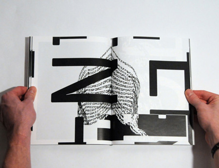
Experimenting with Typography, Color, and Graphics
Who knew that playing with text, colors, and images could be so much fun? Well, we did! And let us tell you, we’ve been having a blast experimenting with all the different ways we can jazz up our designs.
In terms of typography, we’ve been going wild with **fonts** and **styles**. From classic serifs to funky scripts, the possibilities are endless. And don’t even get us started on **text effects** – drop shadows, outlines, and gradients, oh my! Who knew text could be so exciting?
As for color, we’ve been channeling our inner Picasso and going crazy with **palettes**. Bright neons, pastel pinks, and moody blues – we’ve tried them all. And the best part? Mixing and matching to create eye-catching combinations that really make our designs pop.
And let’s not forget about graphics. We’ve been scouring the internet for the best **illustrations** and **icons** to use in our designs. Whether it’s a cute cartoon character or a sleek geometric shape, adding graphics really takes our designs to the next level. Plus, it’s just plain fun to play around with all the different options available.
Implementing Feedback and Iterating Designs
So you’ve received feedback on your design, and now it’s time to put that feedback to good use! Here are some tips for :
First, take a look at the feedback you’ve received and make a list of the key points. This will help you identify the areas that need improvement and guide your design iterations. Remember, feedback is a gift!
Next, roll up your sleeves and start making changes to your design. Don’t be afraid to experiment and try out new ideas. Who knows, maybe that crazy suggestion from your colleague will turn out to be a stroke of genius!
Once you’ve made some changes, it’s important to test your design again. Get feedback from others and see how they react to the new iterations. Remember, design is a collaborative process, and sometimes the best ideas come from unexpected sources.
Finalizing the Redesigned Logo for Maximum Impact
After countless hours of brainstorming, debating, and doodling on napkins, we have finally come up with a logo that truly encapsulates our brand. With our new logo, we are ready to make a splash in the market and leave our competitors in the dust.
We’ve made sure to consider every little detail to ensure that our logo makes a lasting impression. From the color scheme to the font choice, every aspect has been meticulously crafted to convey our message in the most visually appealing way possible.
So, what makes our new logo so impactful, you ask? Well, let me break it down for you:
- Vibrant Colors: Our logo pops off the page with bold and eye-catching colors that demand attention.
- Sleek Design: The clean lines and modern design of our logo give off an air of sophistication and professionalism.
- Memorable Symbol: Our logo incorporates a unique symbol that will stick in people’s minds long after they’ve seen it.
FAQs
How do I know if my logo needs a redesign?
Well, if your logo looks like it’s stuck in the 90s, it’s probably time for a makeover. If it’s illegible, gives people a headache, or makes them cringe, it’s definitely overdue for a redesign!
What are some common design challenges when redesigning a logo?
Oh, where do I start? You’ve got to balance honoring the old with embracing the new, making sure it’s versatile enough for all your branding needs, and ensuring it’s not a total eyesore. Just a walk in the park, right?
How can I overcome these design challenges?
Take a deep breath, grab your design tools, and get creative! Research your audience, stay true to your brand essence, and don’t be afraid to think outside the box. And remember, Rome wasn’t built in a day – neither is a killer logo!
What are some tips for creating a timeless logo design?
Keep it simple, stupid! Avoid trendy fonts and colors, focus on scalability, and make sure it looks just as good in black and white as it does in full color. And always remember – less is more!
Ready to redesign like a boss?
Now that you’ve armed yourself with the knowledge and skills to conquer the world of logo redesign, go forth and create beautiful, captivating logos that will leave your clients in awe. Remember, Rome wasn’t built in a day, and neither will your design empire. But with perseverance, creativity, and a touch of humor, you’ll be mastering the art of logo redesign in no time. Happy designing!


