Attention all aspiring logo designers! Have you been tirelessly slaving away at your computer, trying to create the perfect logo but ending up with something that looks like it was made by a toddler on a sugar high? Fear not, dear friends, for we have the key to unlocking the secrets of logo design mastery. In this article, we will explore the essential principles that will take your logo game from amateur hour to design superstar. So grab your pens, dust off your creativity, and get ready to unleash your inner logo genius!
Understand the Fundamentals of Graphic Design
So, you want to dive into the world of graphic design, huh? Well, strap in, because it’s going to be a wild ride! Before you start creating masterpieces, you need to . It’s like learning to ride a bike before attempting a backflip off a ramp – trust me, you’ll thank me later.
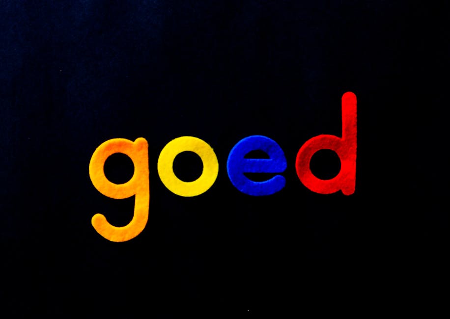
First things first, let’s talk about the power of color. Colors can evoke emotions, convey messages, and set the tone for your design. It’s like choosing the right outfit for a first date – you want to make a good impression, right? Remember the color wheel? That thing from kindergarten art class? Well, it’s your new best friend. Get cozy with it and make sure to use complementary colors like peanut butter and jelly – they just go together like, well, peanut butter and jelly.
Next up, we’ve got the importance of typography. No, it’s not a fancy way of saying “text.” Typography is all about font choice, spacing, and alignment. It’s like choosing the right words for a love letter – you want it to be impactful and sincere. Play around with different fonts, but beware of Comic Sans – it’s like showing up to a black-tie event in a Hawaiian shirt. Keep it classy, folks.
And last but not least, we can’t forget about the magical world of composition. It’s all about arranging elements in your design to create a harmonious and visually appealing layout. Think of it as arranging toppings on a pizza – too much cheese in one spot and not enough pepperoni can throw off the whole balance. Experiment with different layouts and remember the rule of thirds – it’s like the secret sauce that takes your design from good to great.

Research the Brand Identity and Values
So you’re on a quest to uncover the hidden secrets behind the brand identity and values of the company you’re researching? Well, buckle up because this is going to be a wild ride! Dive into the depths of the internet, scouring every nook and cranny for information about what makes this brand tick.
Start by stalking their social media profiles like a ninja in the night. Get to know their tone of voice, their vibe, their aesthetic. Are they funny and relatable, or serious and professional? Do they use emojis liberally, or are they more reserved in their communication style? Make notes, create a mood board, and channel your inner detective to crack the code of their brand persona.
Next, look into their values like you’re Sherlock Holmes solving a case. What do they stand for? Do they care about sustainability, social justice, or just making a killer product? **Make a list of their core values and see how they align with your own beliefs.** Remember, you want to work with a brand that shares your values, not one that makes you question your moral compass.
And finally, don’t be afraid to reach out and ask questions. Send them an email, slide into their DMs, or even pick up the phone and give them a call. **Show them you’re interested in what they have to say and watch as the floodgates of brand knowledge open before your very eyes.** Who knows, you might even uncover some juicy insider info that will make you the envy of all your research buddies.

Simplicity is Key in Logo Design
When it comes to logo design, simplicity reigns supreme. Think about it – the most iconic logos in the world are easily recognizable and unforgettable because of their simplicity. The Nike swoosh, the Apple apple, the McDonald’s golden arches - all simple, yet effective in conveying their brand message.
So why should you follow the trend of simplicity in your logo design? Well, for starters, a simple logo is more versatile. It can be easily scaled up or down without losing its impact, making it perfect for all types of branding materials. Plus, simple logos are easier for customers to remember, which is essential for brand recognition.
One of the perks of keeping your logo design simple is that it stands the test of time. Trends come and go, but a well-designed simple logo is timeless. You won’t have to worry about rebranding every few years to keep up with the latest fads - your logo will remain relevant for years to come.
So, when in doubt, remember that less is more in logo design. Stick to clean lines, bold fonts, and minimal colors to create a logo that speaks volumes without saying a word.
Typography and Color Theory in Logos
When it comes to designing logos, typography and color theory play a crucial role in creating a memorable and impactful design. Just like a bad font pairing can ruin a logo, using clashing colors can also make your brand look like a hot mess. Here are some tips to make your logo stand out for all the right reasons:
– Choose the right font: Fonts are like the Spice Girls of typography – each one brings a different vibe to the party. Make sure to choose a font that reflects your brand’s personality. Whether you want to look sleek and modern like Helvetica or bold and attention-grabbing like Comic Sans (just kidding, please never use Comic Sans), there’s a font for every occasion.
– Embrace the power of contrast: Just like how salt makes caramel taste even better, using contrasting colors in your logo design can make it pop. Use colors that are on opposite sides of the color wheel to create visual interest and make your logo stand out in a sea of bland designs.
– Keep it simple: Remember that old saying, “less is more”? Well, it definitely applies to logo design. A cluttered logo with too many fonts and colors can overwhelm your audience and make your brand look unprofessional. Stick to a simple color palette and no more than two fonts to keep things clean and cohesive.
So, if you want your logo to be the Beyoncé of the branding world, make sure to pay attention to typography and color theory. With the right combination of fonts and colors, your logo will be a showstopper that gets everyone talking (in a good way, of course).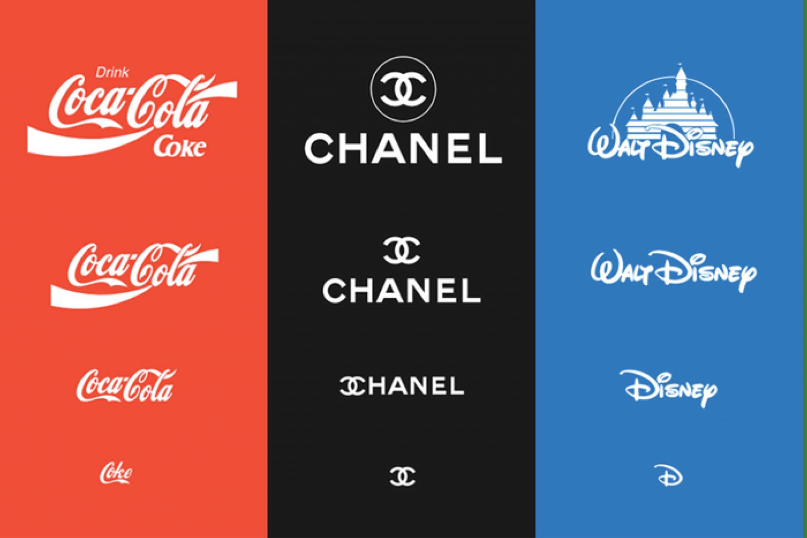
Create Versatile and Scalable Logos
When it comes to creating logos, versatility and scalability are key! You want a logo that can be easily resized without losing its impact or becoming unrecognizable. With the right design, your logo should be able to stand tall on a billboard or squeeze into a tiny social media profile picture without breaking a sweat.
One way to ensure your logo is versatile is to choose a simplistic design. Think timeless and iconic – like a well-tailored black suit or a classic red lipstick. Avoid overly intricate details that may get lost when your logo is scaled down to fit on a business card or promotional item.
Another trick to achieve versatility and scalability is to stick to a limited color palette. A logo that looks good in black and white, as well as in full color, is a logo that can adapt to any situation. Plus, a simple color scheme can make your logo easier to remember and recognize.
Remember, a versatile and scalable logo is like a chameleon – it can blend in or stand out depending on the situation. So, whether your logo is plastered on a giant billboard or tucked away in the corner of a website, make sure it looks good and represents your brand in the best way possible. Who knew logos could be so flexible and multi-talented?
Get Feedback and Refine Your Designs
So you’ve put in the hard work and created a masterpiece of a design. But before you go patting yourself on the back, it’s time to gather some feedback and refine those designs. After all, you might think your creation is the next Mona Lisa, but others might see it more like a finger painting from kindergarten.
Why get feedback, you ask? Well, unless you’re a mind reader, you won’t know what others think of your design unless you ask. Plus, getting feedback can help you see your work from a different perspective and catch any blind spots you might have missed.
Here are a few ways to get feedback:
- Ask your friends, family, and coworkers for their honest opinions
- Join a design critique group or forum
- Run user testing to see how people interact with your design
Once you’ve gathered feedback, it’s time to refine your designs:
- Make adjustments based on the feedback you received
- Sleep on it and come back with fresh eyes
- Iterate, iterate, iterate – Rome wasn’t built in a day, and neither is a perfect design
FAQs
Why is logo design important?
Well, without a logo, how else would people recognize your brand? Imagine trying to find your favorite fast food joint without those golden arches. Chaos.
What are some essential principles to keep in mind when designing a logo?
Keep it simple, memorable, versatile, and timeless. Basically, aim for something that won’t make you cringe in a few years.
How can color choice impact a logo?
Colors can evoke emotions and convey messages. Just think about how red makes you hungry (hello, McDonald’s) or how green can make you think of nature (hello, Starbucks).
Is it necessary to hire a professional designer for a logo?
Well, you could try your hand at it, but unless you’re a design wizard, it might be worth investing in someone who knows what they’re doing. Trust us, your brand will thank you.
What role does research play in logo design?
Research helps you understand your target audience, competitors, and industry trends. Plus, you don’t want to accidentally copy someone else’s logo. Awkward.
Putting the ”Rad” in “Logo Design”
Congratulations, design warrior! You’ve now armed yourself with the essential principles to conquer the world of logo design. So go forth, wield your creativity like a mighty sword, and craft logos that will leave your clients gasping in awe. Remember, with great power comes great design responsibility! Now go forth and create some rad logos!


