Are you tired of being green with envy over other companies’ vibrant logos? Do the blues of your mediocre design skills leave you feeling color blind? Well, fear not, dear reader! In this article, we will dive headfirst into the wild world of color psychology in logo design. So grab a rainbow of colored pencils and prepare to paint your way to logo perfection!
Understanding the Basics of Color Psychology
Have you ever wondered why certain colors make you feel happy, calm, or even hungry? Well, my friend, that’s the power of color psychology! Let’s dive into the basics of this magical world, shall we?
First things first, we need to understand that each color carries its own unique energy and vibe. It’s like they have their own little personalities, just waiting to influence our mood and behavior. Here’s a little cheat sheet to help you make sense of it all:
- Red: The color of passion and energy. It can make you feel powerful and hungry (think fast-food logos).
- Blue: The color of calm and serenity. It can help you relax and think clearly (perfect for those stressful work days).
- Yellow: The color of happiness and optimism. It can lift your spirits and bring a smile to your face (just like a ray of sunshine).
So, the next time you’re feeling down or need a little pick-me-up, just remember that colors have your back. Dress in red for a confidence boost, surround yourself with blue to chill out, or add a pop of yellow to brighten your day. Who knew that something as simple as color could have such a big impact on our lives? It’s like having a rainbow of emotions at our fingertips!
Choosing the Right Color Scheme for Your Brand
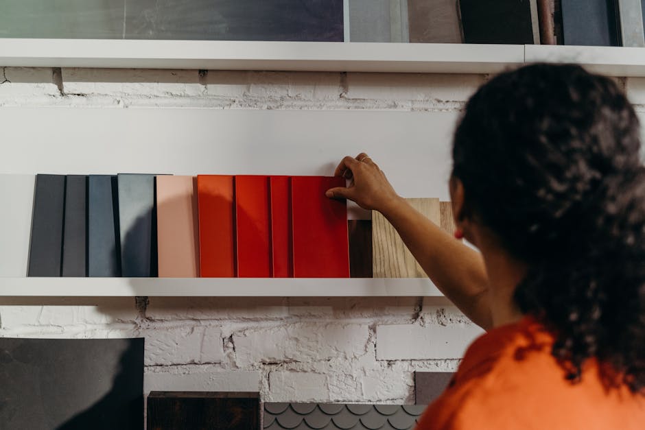
So, you’ve decided to take the plunge and create a brand for yourself. Congratulations! Now comes the fun part – choosing the right color scheme. This may seem like a trivial decision, but trust me, it’s more important than you think. The colors you choose will play a huge role in shaping how your brand is perceived by your audience.
Before you start picking random colors out of a hat, take a moment to think about what you want your brand to convey. Are you aiming for a bold and eye-catching look, or do you want something more subtle and sophisticated? Once you have a clear idea in mind, it’s time to start playing with different color combinations.
Remember, not all colors are created equal. Some colors have certain connotations that you might not want associated with your brand. For example, red can symbolize passion and energy, but it can also come across as aggressive or intense. On the other hand, blue is often associated with trust and reliability, but it can also be seen as cold or distant.
When in doubt, go back to the basics. Black and white are classic choices that never go out of style. They can convey a sense of sophistication and timelessness that will never steer you wrong. Just remember to inject a pop of color here and there to keep things interesting. After all, nobody wants a brand that’s as boring as watching paint dry.
Utilizing Color Psychology to Evoke Emotions
Color psychology is a powerful tool that can be used to manipulate emotions and influence behavior. By understanding the impact that different colors have on our brains, we can create impactful designs that resonate with our target audience.
For example, did you know that red is often associated with passion, energy, and excitement? It’s no wonder that so many fast-food restaurants use this color in their branding – they want you to feel the urge to indulge in their tasty treats!
On the other hand, blue is known for its calming and trustworthy qualities. That’s why many banks and financial institutions use shades of blue in their logos and marketing materials – they want you to feel at ease when trusting them with your hard-earned money.
So the next time you’re designing a website, creating a marketing campaign, or even just choosing a new outfit, consider the power of color psychology and how you can use it to evoke the emotions you want in yourself and others. Remember, the world is your crayon box – use it wisely!
Creating a Consistent Brand Image Through Color
When it comes to creating a consistent brand image, color is key. Imagine a world where every time you saw the color red, you immediately thought of Coca-Cola. That’s the power of branding through color. Here are some tips on how to use color effectively to create a strong and consistent brand image:
- Choose a primary color and stick with it. This will help people associate that color with your brand. Think about McDonald’s golden arches or Tiffany’s signature blue.
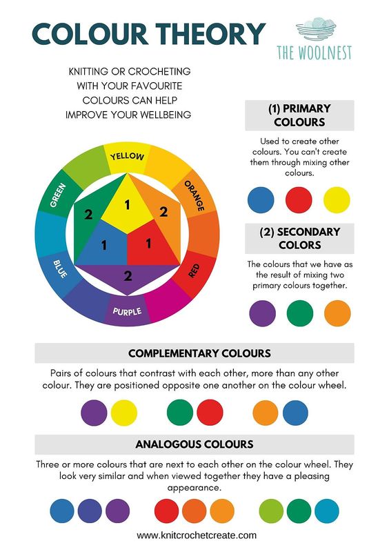
- Use complementary colors to enhance your primary color. Just like peanut butter and jelly, some colors are better together. Make sure your secondary colors work well with your primary color to create a cohesive look.
- Consider the psychology of color. Different colors evoke different emotions and can send subtle messages to your customers. For example, blue is often associated with trust and professionalism, while red can evoke excitement and passion.
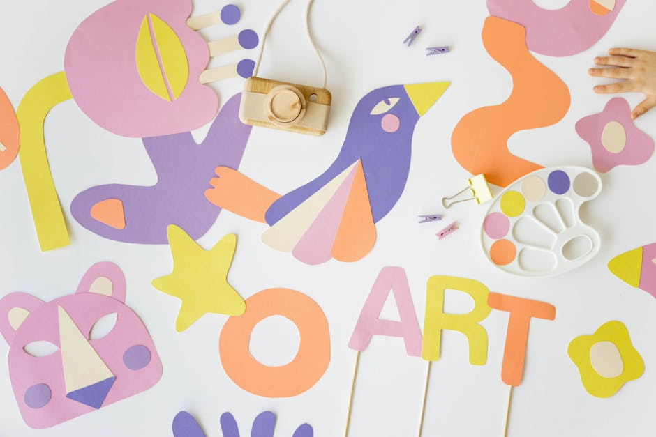
Don’t be afraid to get creative with your color choices. Just like a painter selects the perfect shade for their masterpiece, choose colors that reflect the personality and values of your brand. And remember, consistency is key. Use your brand colors across all of your marketing materials, from your website to your social media posts, to create a strong and memorable brand image.
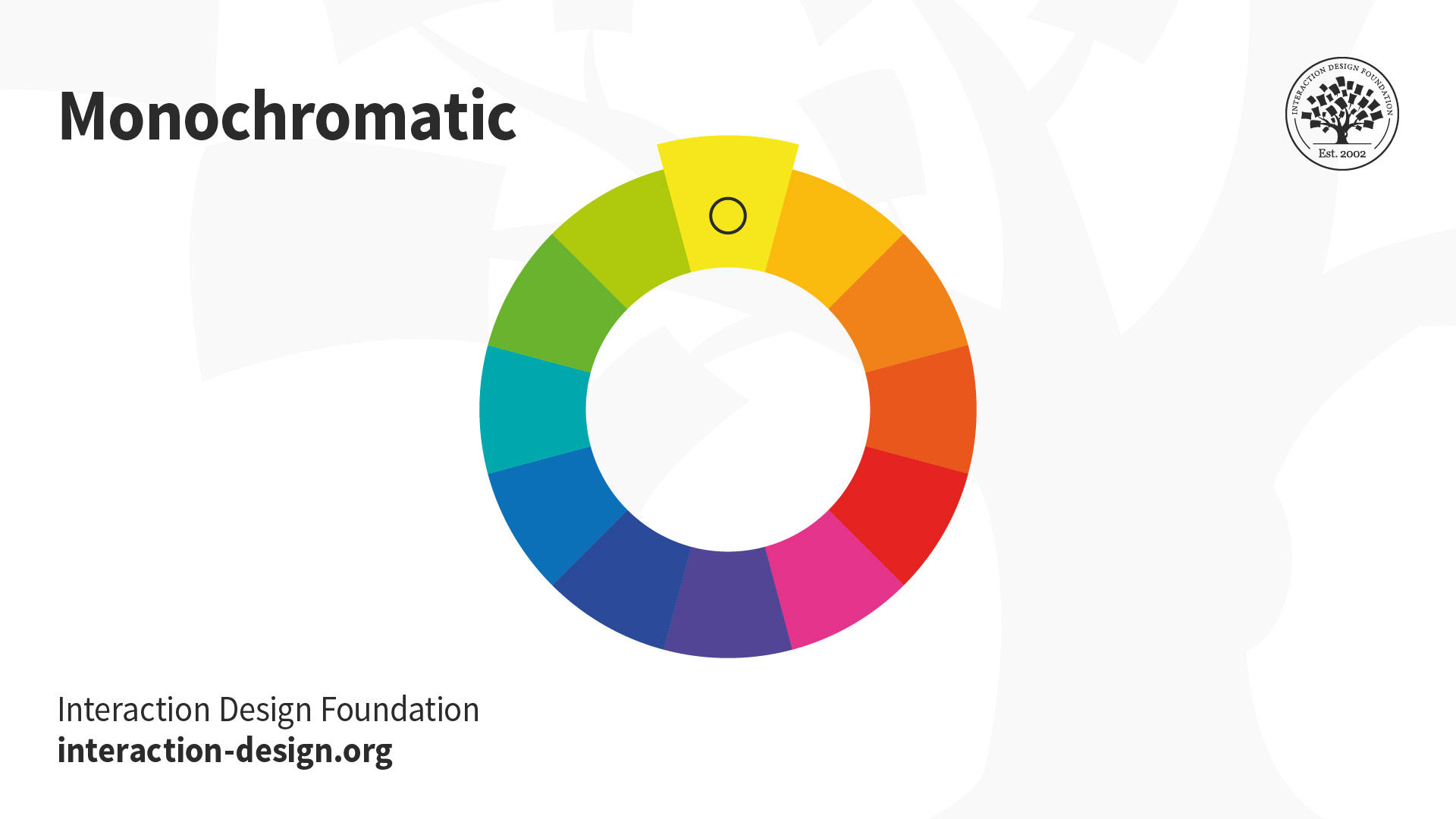
Exploring the Impact of Different Colors on Consumer Behavior
Have you ever wondered how the color of a product can affect your decision to buy it? Well, let’s dive into the colorful world of consumer behavior and explore the impact of different hues on your purchasing habits.
From vibrant reds to calming blues, colors have a way of influencing our moods and behaviors without us even realizing it. Here are a few ways in which different colors can impact consumer behavior:
- Red: This fiery hue is known to create a sense of urgency, making consumers more likely to make impulse purchases.
- Green: Associated with nature and health, green can evoke feelings of calmness and wellness, making it appealing for eco-friendly and organic products.
- Black: Often associated with luxury and sophistication, black can command a higher price point and appeal to a more upscale demographic.
So, the next time you find yourself drawn to a certain product, take a moment to consider the color of its packaging. Who knows, you might just be falling victim to the powerful influence of color psychology!
Enhancing Brand Recognition and Recall with Strategic Color Choices
Colors are powerful tools that can evoke emotion, influence decision-making, and leave a lasting impression on consumers. By strategically choosing the right colors for your brand, you can enhance brand recognition and recall like never before.
One of the most important aspects of color choice is consistency. **Consistent use of colors** across all brand materials, from your logo to your website to your marketing materials, helps establish a strong visual identity that consumers will remember. Think of the iconic red and white of Coca-Cola or the bold yellow and blue of IKEA - these brands have successfully used color to create a strong visual association with their products.
Another key factor to consider when choosing colors for your brand is **understanding color psychology**. Different colors can elicit different emotional responses, so it’s important to choose colors that align with your brand’s values and messaging. For example, blue is often associated with trust and reliability, while red can evoke feelings of excitement and passion. By understanding the psychological impact of color, you can choose hues that resonate with your target audience.
Ultimately, the goal of strategic color choices is to create a brand that is easily recognizable and memorable. By selecting colors that are unique, consistent, and emotionally resonant, you can set your brand apart from the competition and leave a lasting impression on consumers. So next time you’re choosing a color scheme for your brand, remember: it’s not just about what looks good, it’s about creating a visual identity that sticks in people’s minds like a catchy jingle!
FAQs
How can color psychology impact a logo design?
Oh, color psychology is like the secret sauce of logo design! Different colors evoke different emotions and can make a huge impact on how a brand is perceived. So, make sure you choose your colors wisely!
What are some common colors and their associated emotions?
Well, red can make you feel powerful and passionate, while blue can bring a sense of trust and reliability. Green is all about growth and health, while yellow screams happiness and optimism. Purple is for luxury and creativity, and black exudes sophistication and mystery. Choose wisely!
How should one go about selecting colors for a logo design?
First things first, consider the brand’s personality and target audience. Then, think about the emotions you want to evoke and choose colors that align with those feelings. And don’t forget to check how the colors look together – you don’t want your logo to look like a hot mess!
Can using too many colors in a logo design be a bad idea?
Absolutely! Using too many colors can make your logo look like a rainbow threw up on it. Stick to a few colors that complement each other well, and your logo will thank you for it by looking snazzy and professional.
What role does contrast play in color psychology in logo design?
Oh, contrast is like the spice that makes your logo design pop! By using contrasting colors, you can create visual interest and make certain elements stand out. Just make sure you don’t overdo it – you want your logo to be eye-catching, not eye-gouging!
Color Your Way to Success!
Congratulations! You’ve now unlocked the secrets of color psychology in logo design. With these essential tips, you’ll be able to create logos that not only look great but also resonate with your target audience on a deeper level. So go forth and unleash your creativity with colors – the world is your canvas! Remember, when in doubt, just think of a rainbow – because who doesn’t love a rainbow? Stay colorful, my friends!


