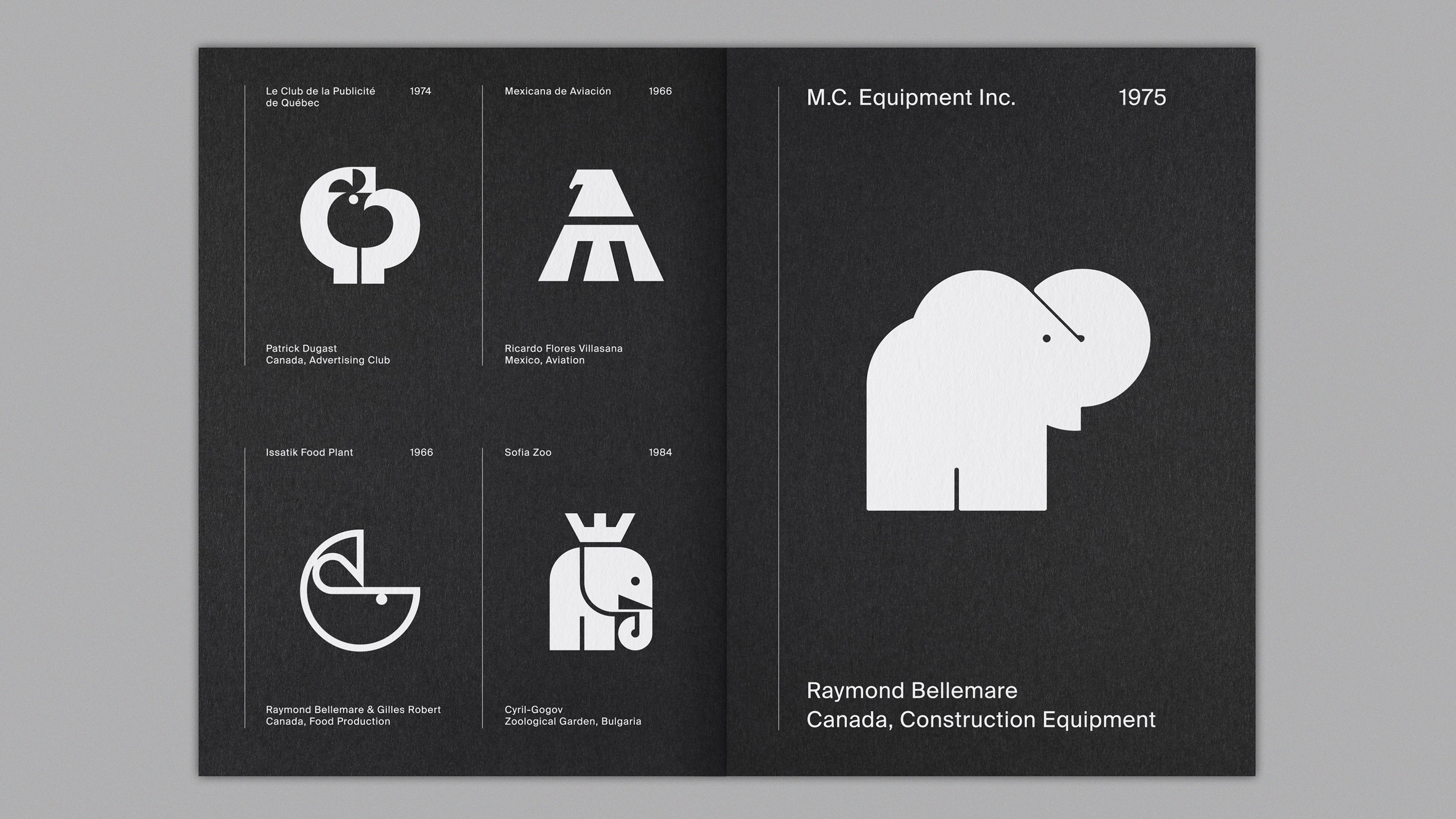
Once upon a time, in a world filled with clip art and comic sans, logo design trends were as predictable as a pigeon pooping on a statue. But oh, how things have changed! From minimalist masterpieces to bold and brazen creations, the evolution of logo design trends has had a seismic impact on the industry. So buckle up, my fellow design enthusiasts, as we take a wild ride through the ever-changing landscape of logos and discover how they’ve transformed from ho-hum to holy cow!
Early Origins of Logo Design
So, you think creating logos is a modern invention? Think again! Logo design has been around for centuries, dating back to ancient times when cavemen used to slap their handprints on cave walls as a form of branding. Talk about primitive marketing tactics, am I right?
Fast forward to ancient Egypt, where hieroglyphics were essentially the OG logos. Pharaohs would slap their royal symbols on everything from pottery to papyrus scrolls. Imagine opening up a canopic jar and seeing a little pharaoh logo staring back at you. Talk about brand loyalty!
Not to be outdone, the ancient Greeks took logo design to a whole new level. They would stamp their personal symbols onto coins, not only for authenticity but also to make a statement. It’s like wearing a toga made by Gucci – you gotta have that Greek logo swag!

traditional-design-elements-in-logos”>Traditional Design Elements in Logos
When it comes to , there are a few tried and true classics that never go out of style. These elements have stood the test of time and continue to be used in modern logo design with great success.
One of the most iconic traditional design elements is the use of serif fonts. These classic typefaces exude an air of sophistication and timelessness that can elevate any logo design. Whether it’s a classy script font or a bold serif typeface, using a serif font in your logo can give it that extra touch of elegance.
Another traditional design element that never fails to impress is the use of heraldic symbols. From lions to eagles to crowns, these symbols have been used in logos for centuries to convey strength, power, and prestige. Incorporating a heraldic symbol into your logo design can instantly give it a regal and majestic feel.
Lastly, let’s not forget about the classic color palettes that have been used in logo design for generations. Black and gold, navy blue and white, red and white – these timeless color combinations never fail to make a statement. When in doubt, sticking to a traditional color palette can help give your logo a sense of familiarity and reliability.
modernization-and-minimalism-in-logo-design”>Modernization and Minimalism in Logo Design
When it comes to logo design, less is definitely more in this day and age. Modernization and minimalism have taken over the design world, influencing everything from websites to branding. And logos are no exception!
So, what exactly does modernization and minimalism look like in logo design? Think sleek lines, simple shapes, and a whole lot of negative space. Forget the cluttered logos of the past – today’s designs are all about getting straight to the point!
Here are a few key principles to keep in mind when it comes to modernizing and minimizing your logo:
- Simplicity is key: Keep your design clean and clutter-free. No need for unnecessary frills or details!
- Go bold: Use bold, modern fonts to make a statement. No more need for fancy cursive or script fonts!
- Embrace negative space: Let your design breathe by incorporating plenty of negative space. This will make your logo stand out and look ultra-modern!

Innovative Technology and Interactive Logos
Imagine a world where logos are more than just static images on a screen. Thanks to innovative technology, interactive logos are now a reality! These logos engage users in a whole new way, incorporating elements of gamification and interactivity that make them stand out from the crowd.
With interactive logos, brands can create a truly memorable user experience that sets them apart from their competition. From animations that respond to user input to hidden Easter eggs that reveal special surprises, the possibilities are endless. Interactive logos allow brands to showcase their creativity and personality in a fun and engaging way.
Not only are interactive logos entertaining, but they also serve a practical purpose. By making logos more interactive, brands can boost user engagement, increase brand recognition, and leave a lasting impression on their audience. By incorporating innovative technology into their logos, brands can create a unique and memorable experience that users won’t soon forget.
So, next time you’re designing a logo, why not think outside the box and add a touch of interactivity? Who knows, maybe your logo will become the next viral sensation, captivating users around the world with its clever and engaging design. With interactive logos, the sky’s the limit!
Influence of Globalization on Logo Trends
With the rise of globalization, the world has become a smaller place, and this has had a significant impact on logo trends. Companies are now catering to a global audience, and this is reflected in their branding strategies.
Here are some ways in which globalization has influenced logo trends:
- Companies are simplifying their logos to make them more easily recognizable across different cultures and languages.
- Logos are becoming more minimalist and versatile, ensuring they can be used on various platforms and mediums.
- Globalization has led to the incorporation of symbols and icons that have universal recognition, making logos more relatable to consumers worldwide.
- Companies are also using vibrant colors and bold fonts to make their logos stand out in a crowded global market.
In conclusion, the cannot be understated. Brands are embracing diversity and inclusivity in their branding efforts, resulting in logos that are not only visually appealing but also culturally relevant to a worldwide audience.
Sustainable and Eco-Friendly Design in Logos
Are you tired of boring, uninspiring logos that do nothing but contribute to the clutter of our already crowded digital world? Well, fear not, because is here to save the day! Say goodbye to generic, cookie-cutter logos and hello to designs that not only look good but also do good for the planet.
With sustainable design practices, logos can be created using eco-friendly materials and techniques that minimize harm to the environment. From using recycled paper for business cards to implementing energy-saving printing processes, there are endless possibilities for creating logos that are not only visually appealing but also environmentally conscious.
So how can you incorporate sustainable and eco-friendly design into your logos? Here are a few tips to get you started:
- Use earth-friendly colors: Opt for shades inspired by nature, such as greens, blues, and browns, to convey a sense of eco-friendliness in your logo.
- Choose sustainable materials: Consider using recycled paper, bamboo, or other eco-friendly materials for your business cards, letterheads, and promotional materials.
- Go digital: Embrace the digital age by creating logos that are optimized for online and mobile platforms, reducing the need for printed materials.
FAQs
What are some current logo design trends that are popular in the industry?
Think minimalist, think simple, think sans-serif fonts. Today’s logo design trends are all about clean lines and bold colors that make a statement without being overwhelming. More and more brands are opting for a more minimalist approach to their logos, with simple geometric shapes and uncomplicated typography.
How do these trends impact the way consumers perceive a brand?
Well, imagine you’re walking down the street and you see a logo that looks like it was designed in the 90s. You might think, “Is this company still in business?” But if you see a sleek, modern logo that looks like it was designed by a top-notch designer, you’re more likely to trust that brand and be drawn to what they have to offer.
Are there any logo design trends that are considered timeless?
They say that “less is more” and that certainly holds true when it comes to logo design. Logos that are simple, versatile, and easy to recognize will always stand the test of time. Take the Nike swoosh, for example – it’s been around for decades and is still as iconic as ever.
How can businesses stay ahead of the curve when it comes to logo design trends?
Keep an eye on what’s hot and what’s not in the design world. Follow design blogs, attend conferences, and be open to taking risks with your branding. Don’t be afraid to shake things up and try something new – you never know, you might just start the next big logo trend.
In conclusion, the evolution of logo design trends has definitely made its mark on the industry!
From minimalistic designs to intricate animations, logo designers have certainly kept us on our toes. So next time you see a logo that catches your eye, remember to appreciate the creativity and innovation that goes into its design. And who knows, maybe one day you’ll be the one setting the next big trend in logo design!Keep designing and stay creative!


