Are you tired of the same old boring logos adorning the packaging of your favorite snacks and beverages? Well, fear not my friends, because we are here to shake things up in the world of food and drink branding! Say goodbye to bland and forgettable designs, and hello to logos that are as delicious as the products they represent. Get ready to feast your eyes on our mouth-watering creations as we delve into the art of creating unforgettable logos for food and drink brands. So grab a snack, sit back, and prepare to be amazed by the deliciously designed world we’re about to unveil!
Visual Taste Bud Stimulus: The Importance of Logo Design in the Food Industry
Have you ever taken a bite of a delicious burger and felt a surge of happiness wash over you? Well, guess what – that feeling was probably brought to you by the power of logo design!
Imagine walking into a restaurant and being greeted by a logo that makes your mouth water. That’s the power of a well-designed logo in the food industry. It’s like a direct line to your taste buds, making you instantly crave whatever it is they’re serving.
But what makes a good food logo, you ask? Let me break it down for you:
- Color: Bright, appetizing colors like red, yellow, and green are key to stimulating your visual taste buds.
- Typography: A fun, whimsical font can make you feel like you’re about to embark on a culinary adventure.
- Iconography: Clever use of food-related images can make your mouth water just by looking at them.

Telling a Culinary Story: Using Logos to Convey Brand Identity
When it comes to telling a culinary story, **brand identity plays a crucial role** in captivating your audience. Using logos is a great way to convey this identity and leave a lasting impression on your customers. Let’s dive into how you can use logos to showcase your brand’s unique personality.
First things first, your **logo should reflect your brand’s values and mission**. Whether you’re a fine dining establishment or a food truck serving up street eats, your logo should speak to the heart of your culinary creations. Think about what sets you apart from the competition and how you can translate that into a visual representation that customers will immediately recognize.
Next, consider the **colors and imagery** you want to incorporate into your logo. Are you all about fresh, organic ingredients? Maybe you opt for earthy greens and vibrant yellows to convey that message. Or perhaps you’re a trendy modern eatery with a minimalist aesthetic – in that case, sleek lines and a monochromatic color scheme could be the way to go.
Lastly, don’t forget about **consistency across all platforms**. Your logo should be visible on everything from your physical storefront to your website and social media accounts. By creating a cohesive branding strategy, you’ll ensure that customers can easily recognize your culinary brand no matter where they encounter it.
Clever & Creative: Elements of Memorable Food and Drink Logos
When it comes to food and drink logos, creativity is key! A memorable logo is like a secret recipe – it needs just the right combination of cleverness and innovation to leave a lasting impression.
One element of a memorable food and drink logo is the clever use of food-related imagery. Whether it’s a slice of pizza cleverly incorporated into the design or a beer bottle cleverly shaped into the company’s initials, these logos make you hungry just by looking at them!
Another element that sets these logos apart is their use of bold colors and unique fonts. A bold color palette can make a logo stand out in a sea of bland designs, while a quirky font can add a touch of personality that will stick in your mind long after you’ve finished your meal or drink.
And let’s not forget about the element of surprise – some of the most memorable food and drink logos are the ones that make you do a double-take. Whether it’s a hidden message in the design or a clever play on words, these logos keep you coming back for more.
Color Psychology in Logo Design: Making Hungry Minds Hungrier
When it comes to logo design, color psychology can make all the difference in capturing the attention of hungry minds and making them even hungrier. Colors have the power to evoke certain emotions and cravings, which can be a powerful tool in the world of marketing. So, what colors should you consider when designing a logo to appeal to the voracious appetites of your audience?
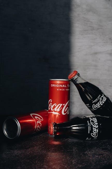
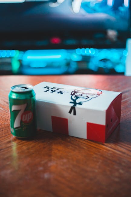
For starters, red is known to increase appetite and stimulate excitement. It’s no wonder that so many fast food chains use this fiery hue in their logos. Think of McDonald’s, KFC, and Wendy’s – all guaranteed to make your tummy rumble at just the sight of their iconic logos.
Orange is another color that is associated with energy and enthusiasm, making it a great choice for food-related logos. Brands like Fanta and Nickelodeon have capitalized on this vibrant shade to appeal to the zestful and hungry minds of their target audience.
And let’s not forget about yellow – the color of sunshine and happiness. This cheerful hue can make your audience associate your brand with warmth and positivity, perfect for enticing their taste buds and leaving them craving more. Just ask brands like Subway and McDonald’s, who have successfully used yellow in their logos to make customers want to sink their teeth into their delicious offerings.

Typography Matters: Choosing the Right Fonts for Food & Drink Brands
When it comes to choosing fonts for your food and drink brand, it’s not just about making your menu items look pretty—it’s about conveying the right message to your customers. After all, you wouldn’t want to use a quirky, hand-written font for a high-end steakhouse, right?
So, how do you choose the right fonts for your brand? Well, first off, consider the type of cuisine you’re serving. Are you a trendy, modern sushi spot? Then sleek, sans-serif fonts might be the way to go. Are you a cozy, family-owned Italian restaurant? Maybe a classic serif font is more your style.
Another factor to keep in mind is readability. You don’t want your customers squinting at your menu trying to figure out if that says “filet mignon” or “friet minion.” Make sure your font choice is clear and easy to read, whether it’s on a menu board, a flyer, or even a food packaging label.
And finally, don’t be afraid to get a little creative! Your font choice can be a fun way to showcase your brand’s personality. Maybe you use a bold, playful font for your dessert offerings, or a elegant script font for your wine list. Whatever you choose, just remember: Typography Matters!
A Recipe for Success: Steps to Creating a Deliciously Designed Logo
So you want to cook up the perfect logo for your business, huh? Well, you’re in luck because I have the secret recipe for success right here! Follow these steps to whip up a deliciously designed logo that will leave your competition drooling.
First things first, gather your ingredients. You’ll need a pinch of creativity, a dash of originality, and a whole lot of passion. Mix them all together in a big bowl and let it marinate for a while. This is the foundation of your logo, so make sure it’s flavorful!
Next, it’s time to get cooking! Use a hot oven (aka your computer) to bake your ideas into a beautiful design. Play around with colors, shapes, and fonts until you find the perfect combination. Don’t be afraid to experiment – sometimes the best recipes come from a little trial and error.
Once you’ve finished cooking up your logo, it’s time to serve it to the world. Show it off on your website, social media, and business cards. Let everyone taste the deliciousness of your hard work and watch as your brand starts to sizzle. And remember, a good logo is like a fine wine – it only gets better with age.
FAQs
Why is having a well-designed logo important for food and drink brands?
Because no one wants to eat something that looks like it was designed by a kindergartener with a crayon.
How does a logo design influence a consumer’s perception of a food or drink brand?
It’s like judging a book by its cover – no one wants to read a book with a boring cover, and no one wants to eat or drink from a brand with a subpar logo.
What are some key elements to consider when designing a logo for a food or drink brand?
Think about colors that make people hungry (hint: red and yellow), fonts that are easy to read even when you’re hangry, and images that scream “eat me!”
How can a logo help a food or drink brand stand out in a crowded market?
It’s like being the shiniest apple in the bunch – if your logo is eye-catching and mouth-watering, consumers won’t be able to resist giving you a taste.
What are some examples of successful food and drink brand logos you admire?
Just think of the golden arches, the swoosh, or the mermaid – those logos are so iconic, you can practically taste the burgers, sneakers, or coffee just by looking at them.
Bon Appétit!
Thanks for joining us on this delicious journey through the world of creating unforgettable logos for food and drink brands. We hope you’ve been inspired to whip up your own tasty designs that will leave a lasting impression on your customers. Remember, the key ingredients to a successful logo are creativity, simplicity, and a dash of pizzazz.
So go forth and cook up some mouth-watering designs that will have everyone clamoring for a taste of your brand. And remember, if all else fails, just add bacon – because everything is better with bacon!
Stay hungry for success and keep those creative juices flowing. Cheers to creating logos that are as scrumptious as they are unforgettable!


