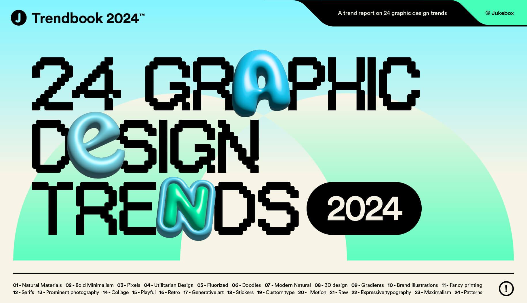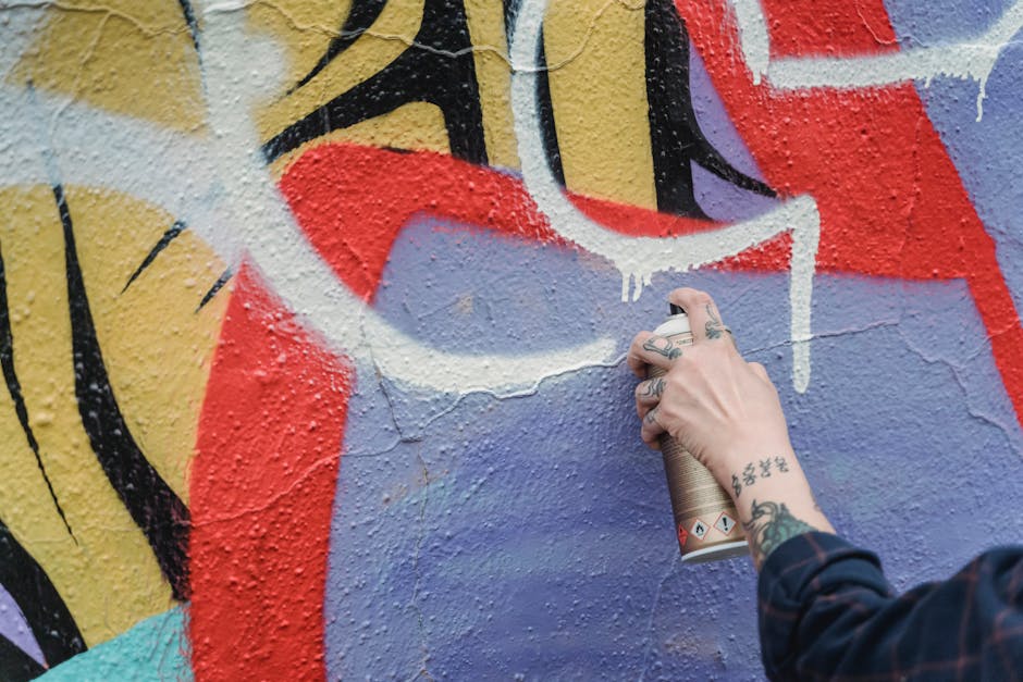
In the wild and wonderful world of logo design, trends come and go faster than you can say “Papyrus font”. But fear not, fellow design aficionados, for we are here to guide you through the cutting-edge landscape of logo design trends. So grab your trusty Wacom pen and buckle up, because we’re about to embark on a rollercoaster ride of innovation, creativity, and maybe even a little bit of Comic Sans (just kidding, that’s never okay). Let’s dive into the ever-evolving world of logo design and embrace the future with wide open arms – and maybe a few quirky shapes along the way. Let’s get ready to logo!
Innovative Color Gradients and Duotones
Are you tired of boring, flat colors in your designs? Say goodbye to monotony and hello to the exciting world of innovative color gradients and duotones! These trendy techniques are guaranteed to make your designs pop and stand out from the crowd.
With color gradients, you can create eye-catching transitions between two or more colors, adding depth and dimension to your designs. The possibilities are endless – from subtle and sophisticated gradients to bold and vibrant ones that scream for attention. Say goodbye to plain, one-dimensional designs and hello to a whole new world of creativity!
And let’s not forget about duotones – the perfect way to add a touch of elegance and sophistication to your designs. By combining two different colors in a harmonious way, you can create a striking visual impact that will leave your audience in awe. Whether you’re going for a classic black and white duotone or experimenting with more unexpected color combinations, the choice is yours!
So why settle for boring colors when you can elevate your designs with innovative color gradients and duotones? Let your creativity run wild and transform your designs from mundane to magnificent in just a few simple steps. Don’t be afraid to experiment and push the boundaries – the results will be well worth it!
Abstract and Geometric Shapes
Who doesn’t love a good ol’ abstract and geometric shape? They’re like the art world’s version of a puzzle - except you don’t have to spend hours trying to fit all the pieces together. Triangles, squares, circles - oh my!.
These shapes may seem simple, but there’s a whole world of creativity waiting to be unleashed. Geometric shapes are like the Legos of the art world - you can mix and match, stack them up, or break them apart to create something entirely new and exciting.
Abstract shapes, on the other hand, are like a blank canvas waiting for your imagination to run wild. From squiggly lines to bold, abstract patterns, the possibilities are endless. Who knew that a few simple shapes could hold so much artistic potential?
So next time you’re feeling stuck creatively, why not give a try? Let your inner Picasso shine! Who knows, you might just create a masterpiece that’s as unique and quirky as you are.

Mixing Different Typography Styles
It’s time to spice up your design game with some font flair! can add a whole new level of interest and creativity to your projects. So, why settle for the same old boring font when you can mix it up and make your text pop like never before?
Imagine a world where serif and sans-serif fonts frolic in perfect harmony, where bold and italic text hold hands and skip merrily across the page. Embrace the chaos and let your inner font fanatic run wild!
With HTML at your fingertips, you can easily experiment with different font styles to create a truly unique and eye-catching design. Play around with sizes, weights, and colors to find the perfect combination that suits your style. Remember, there are no rules when it comes to mixing typography styles - just let your creativity guide you!
So, ditch the basic fonts and embrace the wild world of typography. Mix and match to your heart’s content and watch as your design takes on a whole new life of its own. Who knows, you might just discover the perfect font pairing that will make your project stand out from the rest!
Dynamic and Interactive Logos
Ever wished your logo could dance, sing, or even tell jokes? With , the possibilities are endless! These logos are not your typical static images – they come alive on your website or digital platform, engaging your audience in a whole new way.
Imagine a logo that changes colors based on the time of day, or one that responds to user interactions with fun animations. With dynamic logos, you can keep your brand fresh and exciting, always surprising your customers with something new. Say goodbye to boring, static designs and hello to logos that spark joy and laughter.
Interactive logos take user engagement to a whole new level. Incorporating features like clickable elements, scroll-triggered animations, or even mini-games, these logos invite your audience to interact and play. Who knew a logo could be so much fun? With endless possibilities for creativity and innovation, are the future of branding.
So why settle for a plain old logo when you can have one that dances, sings, and keeps your audience entertained? Embrace the magic of and watch your brand come to life in ways you never thought possible. Stand out from the crowd and let your logo shine with creativity and humor. Say goodbye to boring branding and hello to a world of endless possibilities!
Minimalistic and Simplistic Designs
Are you tired of cluttered and busy designs that make your eyes spin? Look no further, because we have the solution for you - !
With clean lines, simple shapes, and a focus on negative space, these designs are sure to bring a sense of calm and order to your chaotic life. Say goodbye to overwhelming visual noise and hello to a sense of zen.
Embrace the less-is-more philosophy and let your design speak volumes with just a few carefully selected elements. Whether you’re looking to revamp your website, refresh your branding, or simply declutter your space, are the way to go.
Join the ranks of design minimalists and simplify your aesthetic today. Trust us, your eyes (and your sanity) will thank you!
Blending Analog and Digital Elements
Ever wonder what happens when you mix the old school with the new school? Well, in the world of design, can lead to some seriously funky results. Imagine a world where floppy disks are used as coasters and arcade game sounds play in the background of your virtual reality headset. It’s a wild ride, but hey, creativity knows no bounds!
So how exactly do you go about blending these two worlds together? Well, it’s all about finding that perfect balance. You want to keep things fresh and modern, but also pay homage to the classics. Here are a few tips to help you nail that blend:
- Use retro fonts like Comic Sans or Papyrus in your digital designs for that nostalgic touch.
- Pair a traditional pencil sketch with digital coloring techniques for a unique mixed media look.
- Take inspiration from classic art movements like Surrealism and give them a digital twist with Photoshop filters.
Remember, the key to successful blending is to have fun with it! Don’t be afraid to experiment and push the boundaries of what’s possible. Who knows, you might just create the next big design trend that everyone will be raving about!
FAQs
Why should businesses consider embracing cutting-edge logo design trends?
Well, if you want your business to stand out in a sea of competitors like a flamingo in a flock of pigeons, cutting-edge logo design trends are the way to go. Embracing innovation in logo design shows that your business is forward-thinking, on-trend, and downright snazzy.
What are some examples of cutting-edge logo design trends?
Think bold color gradients that make you feel like you’re tripping on unicorn sprinkles. Or kinetic logos that move and groove like a breakdancing robot. And don’t forget about minimalist designs that pack a punch with simplicity. Basically, anything that makes your logo pop like a champagne cork.
How can businesses ensure that their cutting-edge logo design is still timeless?
Ah, the age-old dilemma of wanting to be cool now without looking like a mullet in ten years. To make your cutting-edge logo design timeless, focus on classic design principles like balance, symmetry, and legibility. And maybe sprinkle in a dash of quirkiness to keep things interesting.
What are some pitfalls to avoid when implementing cutting-edge logo design trends?
Avoid the siren song of trendy design fads that will make your logo look as out of place as a clown at a funeral. Stay away from overly complex designs that confuse your audience, and steer clear of copycat logos that scream “I have no original ideas.” Be bold, be daring, but above all, be you.
Stay Ahead of the Curve with These Logo Design Trends!
So there you have it, folks! Embrace innovation, think outside the box, and let your creativity run wild when it comes to logo design. With these cutting-edge trends in your toolbox, your brand will be sure to stand out from the crowd and leave a lasting impression. Remember, boring is out, and bold is in. So go ahead, push the boundaries, and watch your logo shine brighter than ever before!


