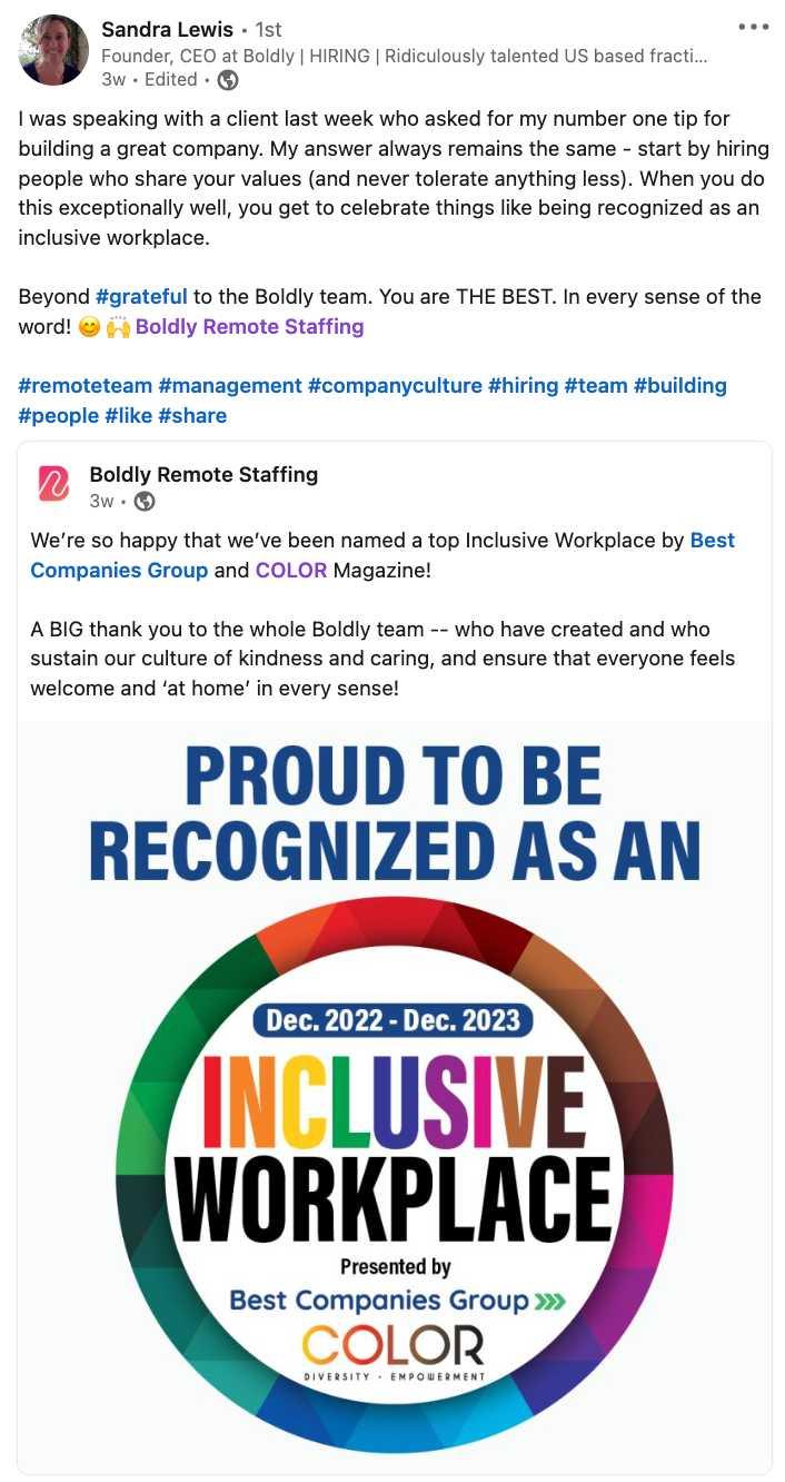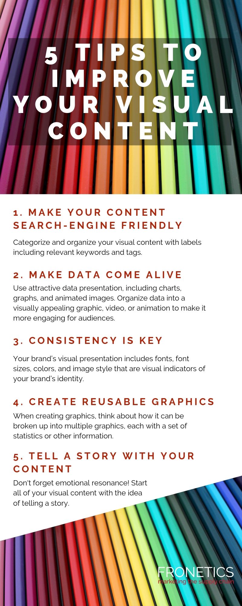
In a world where diversity is celebrated and inclusion is the name of the game, it’s time for brands to step up their logo design game. Gone are the days of one-size-fits-all logos – it’s time to embrace the kaleidoscope of humanity and create logos that truly represent the colorful tapestry of our world. So grab your design toolkit and get ready to learn the best practices for creating diverse and inclusive brands that will make you stand out from the crowd (in a good way, of course). Let’s dive in and paint the town rainbow!
Researching the Target Audience
Now that you’ve identified your target audience, it’s time to dive deep into researching them. Here are some tips to help you better understand who you’re trying to reach:
- Utilize social media platforms – stalk, I mean, observe your target audience’s behavior and interests on platforms like Facebook, Instagram, and Twitter.
- Conduct surveys or polls - gather valuable insights by directly asking your audience questions about their preferences.
- Look at your competitors - see who is engaging with your competitors and learn from their strategies. Just don’t copy them, that’s so unoriginal.
Once you have gathered enough data, it’s time to analyze and interpret it. Look for patterns and trends that can help you tailor your content to better resonate with your target audience. And don’t forget to think outside the box! Maybe your audience loves memes or cat videos – who knows what will strike a chord with them.
Remember, researching your target audience is an ongoing process. Keep monitoring their behavior and preferences to stay one step ahead. Who knows, you might even discover some unexpected insights that could lead to a breakthrough in your marketing strategy. Happy stalking, I mean, researching! Fonts“>
Choosing Inclusive Colors and Fonts
When selecting colors and fonts for your project, it’s important to consider inclusivity. After all, no one wants to feel left out because they can’t read the text or the colors clash with their eyeballs. So, let’s dive into some tips on how to choose the most inclusive colors and fonts for your design.
First off, let’s talk about colors. Consider using a color palette that’s easy on the eyes, like soft pastels or muted tones. Avoid using overly bright or neon colors that can be hard to read for some people. When in doubt, stick to a high-contrast palette to make sure your text is legible against the background. And remember, not all colors are created equal – some may be more difficult for color-blind individuals to distinguish. So, keep that in mind when selecting your color scheme.
Next, let’s chat about fonts. When choosing a font for your project, opt for ones that are easy to read and accessible to everyone. Stick to sans-serif fonts like Arial or Helvetica, which are known for their clarity and legibility. Avoid fancy script fonts or ones with overly decorative elements that can make reading a challenge. And make sure to use a font size that’s comfortable for all readers – nobody wants to squint at tiny text all day!
In conclusion, when it comes to , remember to keep things simple, clear, and accessible to all. Your design will be more welcoming and user-friendly when you take the time to consider the needs of everyone. So, next time you’re deciding on colors and fonts, think about how you can make your project a more inclusive and enjoyable experience for all.
Avoiding Stereotypical Imagery
Now, we all know how tempting it can be to rely on stereotypical imagery to convey a message. But let’s face it, using cliché visuals won’t do your brand any favors. So, let’s explore some fun ways to steer clear of tired old stereotypes!
First and foremost, **think outside the box** when brainstorming ideas for visuals. Instead of going for the obvious choice, try to come up with something unexpected and original. Trust us, your audience will thank you for it!
Another tip to avoid falling into the trap of stereotypical imagery is to **embrace diversity**. Showcasing a range of different backgrounds, cultures, and experiences in your visuals will not only make your brand more relatable, but it will also demonstrate a commitment to inclusivity.
And finally, don’t be afraid to **get weird** with your imagery. Sometimes, the most memorable visuals are the ones that are quirky, unconventional, and a little bit out there. So, have fun with it and don’t be afraid to take risks!
 Diversity in Symbolism”>
Incorporating Diversity in Symbolism
When it comes to , the possibilities are endless! Instead of sticking to the same old cliches, why not spice things up with symbols from different cultures and backgrounds? Here are a few fun and creative ways to add a little diversity to your next project:
- **Incorporate symbols from different religions:** Instead of just sticking to the usual Western symbols, why not include symbols from other religions such as Buddhism, Hinduism, or Islam? Not only will this add some cultural diversity to your work, but it will also give your audience a chance to learn about different belief systems.
- **Use symbols from different countries:** From the Chinese dragon to the Celtic knot, each culture has its own unique symbols that can add depth and meaning to your work. Mix and match symbols from different countries to create a truly unique and diverse piece of art.
- **Celebrate LGBTQ+ symbols:** Don’t forget to include symbols that represent the LGBTQ+ community in your work. Whether it’s the rainbow flag, the transgender symbol, or the pink triangle, these symbols are a powerful way to show support and inclusivity.
By , you not only create a more interesting and engaging piece of work, but you also send a powerful message of inclusivity and acceptance. So next time you’re looking for inspiration, why not think outside the box and add a little diversity to your symbols?

Embracing Cultural Representation in Logo Design
When it comes to logo design, embracing cultural representation can add a whole new level of depth and meaning to a brand’s identity. Incorporating elements from various cultural backgrounds can make a logo stand out and appeal to a wider audience. So why stick with the same old generic designs when you can infuse some cultural flair?
One way to incorporate cultural representation in logo design is to use symbols or motifs that are meaningful in a particular culture. Whether it’s a traditional pattern, a sacred symbol, or a historic landmark, these elements can add a touch of authenticity and uniqueness to a logo.
Another fun way to embrace cultural representation in logo design is to play with colors that are significant in different cultures. For example, red symbolizes luck and prosperity in Chinese culture, while purple is associated with royalty in many Western cultures. By incorporating these colors into a logo, you can not only create a visually appealing design but also convey a deeper message.
So why limit yourself to cookie-cutter designs when you can infuse your logo with cultural richness? can help your brand connect with a broader audience and stand out in a sea of bland designs. So go ahead, get creative, and let your logo reflect the vibrant tapestry of cultures around the world!
Ensuring Accessibility for All Users
To make sure everyone can access our website, we need to consider all kinds of users, even those who navigate the web in unconventional ways. Here are some tips to ensure accessibility for all:
- **Alt text for images**: Don’t leave anyone in the dark, describe your images in detail for those who can’t see them.
- **Keyboard navigation**: Let’s face it, not everyone can work a mouse like a pro. Make sure your website can be easily navigated using only a keyboard.
- **Color contrast**: Some of us might love a good pastel palette, but others need high contrast to see text clearly. Take all users into account when designing your color scheme.
Remember, accessibility isn’t just about following rules, it’s about making sure everyone feels welcome and included. So let’s get creative and think outside the box to ensure a user-friendly experience for all!
FAQs
Why is it important for brands to focus on diversity and inclusion in logo design?
Well, have you ever seen a logo that made you cringe because it was culturally insensitive or exclusive? Yeah, that’s why it’s important. In today’s world, it’s crucial for brands to be mindful of the diverse communities they serve and ensure that their logos reflect that.
What are some best practices for incorporating diversity into logo design?
First and foremost, do your research! Understand the cultural significance of different symbols, colors, and shapes before incorporating them into your logo. Additionally, consider working with diverse designers who can bring unique perspectives to the table.
How can brands ensure inclusivity in their logo design?
One way is to avoid stereotypes or caricatures that may perpetuate harmful biases. Instead, focus on creating a logo that resonates with a wide range of audiences and celebrates diversity in all its forms.
Are there any examples of brands that have successfully created diverse and inclusive logos?
Absolutely! Look at companies like Google, who have incorporated different colors into their logo to symbolize diversity, or Nike, who have featured athletes from various backgrounds in their branding. These brands have shown that diversity and inclusion can be a powerful tool in logo design.
Designing Your Way to Diversity
Congratulations! You’ve now completed your crash course in creating diverse and inclusive brands through logo design. Remember, inclusion isn’t just a trend – it’s the future of successful branding. So go forth, armed with your newfound knowledge, and start designing logos that speak to everyone. Let’s make the world a more colorful, welcoming, and brilliantly diverse place, one logo at a time!


