Welcome to the glamorous world of luxury brand logos, where sophistication is more than just a fancy word—it’s a way of life. Crafting a logo for a luxury brand is like sculpting a masterpiece, with every curve and color chosen with precision and grace. So grab your diamond-encrusted pencil and satin-lined sketchbook, because we’re about to delve into the principles of creating logos that exude elegance and opulence. It’s time to elevate your design game and unleash your inner haute couture designer. Let’s get started, darling!
Elegant Simplicity: Minimalist Designs
When it comes to minimalist designs, less is truly more. Gone are the days of cluttered spaces filled with unnecessary knick-knacks and busy patterns. Embracing elegant simplicity means embracing a lifestyle of clean lines, neutral colors, and a sense of calm.
Imagine walking into a room that is as sleek and organized as a Marie Kondo dream. Each piece of furniture carefully chosen for both form and function. A single piece of art adorning the walls, creating a focal point without overwhelming the space. It’s like living in a real-life Pinterest board.
Minimalist designs are all about quality over quantity. Investing in timeless pieces that will last a lifetime rather than following fleeting trends. Think Scandinavian-inspired furniture, with its clean lines and understated beauty. Or a monochromatic color palette that creates a sense of cohesion and simplicity.
So, next time you’re feeling overwhelmed by clutter and chaos, take a step back and embrace the elegance of minimalism. Simplify your space, calm your mind, and live your best minimalist life. After all, less really is more.
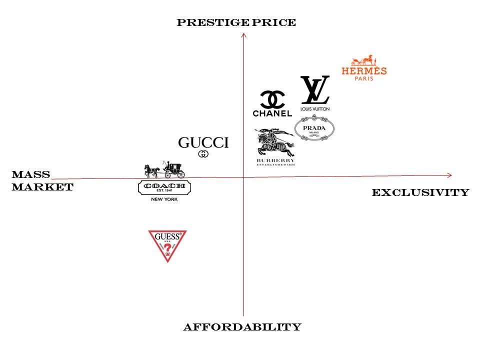
Symbolic Meanings: Communicating Brand Identity
In the world of branding, symbols are more than just pretty pictures – they are the key to communicating the essence of a brand to consumers. From logos to color schemes to typography, every aspect of a brand’s visual identity is carefully crafted to convey a specific message. Let’s delve into the wild world of symbolic meanings and see how brands are using these clever devices to communicate their identity in ways that words simply can’t.
So, what exactly do these symbols mean? Well, buckle up, because we’re about to take a deep dive into the realm of brand imagery. Let’s start with logos – those little nuggets of design genius that are the face of a brand. Whether it’s the swoosh of Nike or the golden arches of a certain fast-food giant, these symbols are more than just pretty pictures - they are the visual shorthand for everything a brand stands for.
Next up, let’s talk about color. No, we’re not just being superficial – color actually plays a huge role in conveying meaning. From the calming blues of a tech giant to the fiery reds of a spicy chicken sandwich, colors can elicit emotional responses and convey a brand’s personality in an instant. And don’t even get us started on typography – the font choice can make or break a brand’s identity. Whether it’s the sleek lines of a sans-serif font or the quirky curves of a script, typography is the unsung hero of brand communication.
In conclusion, symbols are the secret sauce that gives a brand its flavor. So next time you see a logo, take a moment to appreciate the hidden meanings and clever tricks that brands use to communicate their identity. And who knows, maybe you’ll start seeing the world in a whole new light – through the eyes of a brand!
Sophisticated Typography: Choosing the Right Font
So you’ve decided to step up your typography game and choose the right font to elevate your design. Congratulations, you’re about to embark on a journey of sophistication and style!
When selecting a font, remember to consider the overall tone and message of your project. Is it formal and elegant? Playful and whimsical? Make sure the font reflects the personality you want to convey. Remember, Comic Sans may not be the best choice for that resume you’re sending to your dream job.
Experiment with different fonts and styles to see what works best for your design. Don’t be afraid to mix and match different fonts to create a unique and eye-catching look. Just make sure they complement each other and don’t clash like a bad fashion disaster.
And finally, don’t forget about readability! No matter how fancy or stylish a font may be, it won’t do you any good if no one can actually read what it says. So, keep in mind legibility when choosing the right font for your project. Your readers will thank you for it!

refined-color-palettes-creating-a-luxurious-aesthetic”>Refined Color Palettes: Creating a Luxurious Aesthetic
Are you tired of your space looking like a hot mess of colors that clash worse than a two-year-old throwing a tantrum in the candy aisle? It’s time to level up and create a refined color palette that will make your friends jealous and your enemies weep with envy!
When it comes to creating a luxurious aesthetic, less is more. Stick to a few key colors that exude elegance and sophistication. Think of your space as a designer handbag – you wouldn’t want it covered in neon stickers, would you? No, you want it sleek, chic, and oh-so fabulous!
Here are some pro tips to help you nail that refined color palette:
- Choose a neutral base color like cream, beige, or light gray. This will be the foundation of your palette and will help other colors pop.
- Accent your base color with one or two rich, jewel tones like emerald green, sapphire blue, or amethyst purple. These colors add depth and opulence to your space.
- Don’t forget to add metallic accents like gold or silver. These shiny touches bring a touch of glamour and luxury to any room.
So go forth, dear reader, and create a color palette that would make even the Queen of England green with envy. Remember, the key to a luxurious aesthetic is all in the details – so don’t be afraid to experiment, mix and match, and most importantly, have fun!

Balanced Proportions: Ensuring Visual Harmony
When it comes to creating visually appealing designs, balanced proportions are key. Just like baking a cake, you need to have the right ingredients in the right amounts to achieve that perfect harmony.
Imagine your design as a delicious pizza - you don’t want to overload one side with too much pepperoni while leaving the other side with just a sad little olive. You want to make sure each slice has just the right amount of toppings to satisfy every tastebud.
Think of your design elements like a well-dressed salad – you want a mix of colors, textures, and shapes to create a beautiful and appetizing presentation. Just like you wouldn’t want a salad with only lettuce and croutons, you don’t want your design to be unbalanced or lacking in variety.
So, as you embark on your design journey, remember to keep your eye out for those pesky unbalanced proportions. Use symmetry, contrast, and visual weight to create a design that is not only visually pleasing but also satisfying to the soul. Just like a perfectly cooked meal, a well-balanced design will leave your audience wanting more.
Attention to Detail: Fine-tuning Logo Components
When it comes to designing logos, every little detail matters. It’s like putting together a puzzle where each piece needs to fit perfectly to create a masterpiece.
One of the key components to pay attention to is the font choice. Make sure the typography aligns with your brand’s personality and message. Whether you opt for a sleek sans-serif or a playful script, the font should complement the overall design.
Next up, colors play a crucial role in logo design. Consider the psychology behind different hues and how they evoke certain emotions. Don’t just pick any color out of the rainbow; choose shades that resonate with your target audience.
Lastly, don’t forget about scalability. Your logo should look just as great on a billboard as it does on a business card. Test it out in various sizes to ensure that all the elements remain clear and legible.
FAQs
Why is having an elegant logo important for a luxury brand?
Well, darling, first impressions are everything! A luxury brand needs to exude sophistication and class from the get-go, and a stunning logo is the perfect way to set the tone.
What are some key principles to keep in mind when designing a luxury brand logo?
Think timeless, think minimal, think high-end. Your logo should embody the essence of your brand while remaining simple and sophisticated. Remember, less is more!
How can colors and fonts play a role in creating a luxurious logo?
Oh, honey, it’s all about the details! Opt for rich, luxurious colors like gold, black, or deep navy, and choose elegant, serif fonts to convey prestige and sophistication.
What are some common mistakes to avoid when designing a luxury brand logo?
Avoid clutter, tackiness, and over-complication like the plague! Your logo should be sleek, refined, and effortlessly chic. Keep it classy, never trashy!
How can a luxury brand logo help a company stand out in a crowded market?
Darling, in a sea of mediocrity, a luxurious logo is like a shining beacon of sophistication and opulence. It’s the ultimate way to make a statement and leave a lasting impression on your customers.
Farewell to Frills
Well, my elegant comrades, it’s time to bid adieu to our journey through the intricate world of luxury brand logos. Remember, when it comes to crafting elegance, simplicity is the key! So go forth, armed with the principles of sophistication and style, and conquer the design world with your newfound knowledge.
But before you leave, make sure to raise a glass of champagne to toast your newfound expertise. And who knows, maybe one day your own logo will grace the halls of luxury and sophistication. Until then, keep designing with flair and panache, my friends. Adieu!


