Does your brand’s image resemble a Picasso painting gone wrong, with a mishmash of colors and shapes that leave your customers scratching their heads in confusion? Fear not, dear reader, for we are here to rescue you from the depths of design despair! In this article, we will dive into the world of crafting a consistent brand image through logo and website design tips that will have your brand looking sleeker than a freshly waxed mustache. So buckle up, grab your design tools, and get ready to transform your brand from a hot mess to a design masterpiece!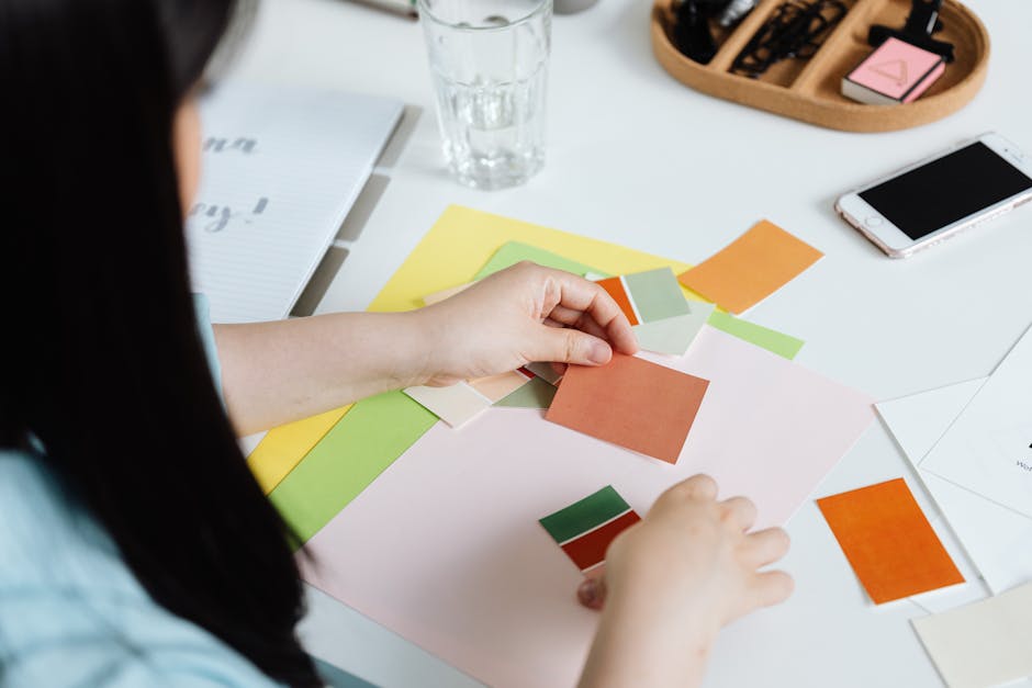
Choosing the Right Color Palette
When it comes to , it’s like picking the perfect outfit for a special occasion. You want to make sure all the colors complement each other and enhance the overall look. Here are some tips to help you nail your color scheme:
First things first, consider the mood and tone you want to convey with your color choices. Are you going for a bold and vibrant look, or something more subtle and calming? Once you have a clear idea of the vibe you’re going for, it will be easier to narrow down your options.
Next, think about the overall theme or style of your project. Are you going for a modern and sleek design, or something more whimsical and playful? Different color palettes can evoke different emotions and aesthetics, so choose wisely!
- Don’t be afraid to play around with different shades and tones within the same color family. Mixing and matching colors can create depth and visual interest in your design.
- Consider using a color wheel to help you find complementary or analogous colors that work well together. Remember, opposites attract!
- When in doubt, go for a classic black and white color scheme. It’s timeless, chic, and always in style.

Creating a Memorable Logo Design
When it comes to , there are a few key things to keep in mind. First and foremost, you want your logo to be unique and eye-catching. You don’t want it to get lost in a sea of bland and forgettable designs! To ensure your logo stands out, consider incorporating bold colors, interesting shapes, and maybe even a touch of whimsy.
Another important factor to consider when designing your logo is scalability. You want your logo to look great whether it’s blown up on a billboard or shrunk down on a business card. Make sure to test your logo in various sizes to ensure it remains clear and legible at all scales.
Don’t forget about versatility! Your logo should be able to adapt to different applications, whether it’s on a website, a t-shirt, or a coffee mug. Consider creating variations of your logo for different purposes to ensure maximum flexibility.
Finally, remember that simplicity is key. A cluttered and overly complex logo can be overwhelming and difficult to remember. Keep your design clean and streamlined to ensure it leaves a lasting impression on your audience.

Utilizing Consistent Typography
Typography is like the unsung hero of design – it quietly does its job, but without it, everything would fall apart faster than a cheap pair of scissors trying to cut wrapping paper. Consistency is key when it comes to typography, so let’s break it down like your ex breaking down the reasons why they’re leaving you.
First things first, pick a font and stick with it like your favorite pair of sweatpants – reliable, comforting, and knows how to make you look good. Make sure your headings and body text are always in the same font – ain’t nobody got time for a mismatched mess. And while we’re at it, let’s talk about size. No one likes playing hide and seek with font sizes, so keep it consistent across the board.
Spacing is like the glue that holds everything together – too little and it’s a jumbled mess, too much and it’s like trying to hug a cactus. Keep your line spacing and letter spacing consistent so your text can breathe like a yoga instructor in a room full of stressed out beginners. Oh, and let’s not forget about alignment – left, right, center, or justified – just pick one and own it like a Kardashian at a selfie convention.
Implementing Brand Guidelines
When it comes to , think of it like following a recipe – you don’t want to end up with a burned soufflé, do you? So, grab your spatula and let’s get cooking!
First things first, familiarize yourself with the brand guidelines and make sure you understand what makes your brand tick. Is it sassy and bold like Sriracha sauce, or classic and refined like a fancy cheese platter? Once you’ve got that sussed out, it’s time to start sprinkling that brand magic everywhere you go.
Next, update all your digital assets to reflect your brand’s personality. From your website to your social media profiles, make sure everything looks and feels cohesive. Remember, you want your brand to be as recognizable as a celebrity in a pair of oversized sunglasses.
And finally, don’t forget the little details – they’re what make your brand stand out from the crowd. Whether it’s choosing the right font for your emails or making sure your business cards are as slick as a skating rink, every little touch will help reinforce your brand’s identity. And there you have it, a brand identity that’s as solid as a well-baked cake, ready to be enjoyed by all. Happy branding!
Optimizing Website User Experience
So you’ve got a website, huh? Fancy! But is your website user experience as smooth as a freshly shaved dolphin sliding through a pool of olive oil? If not, fear not my friend, for I am here to sprinkle some glittery unicorn magic on your website and make it shine like a diamond-encrusted, rainbow-farting unicorn.
First things first, let’s talk about the importance of responsive design. Your website needs to look spiffy on all devices, from grandma’s ancient desktop computer to little Timmy’s brand new iPad. Make sure your website is as flexible as a yoga instructor on a trampoline, so users can navigate with ease no matter what device they’re using.
Next up, let’s talk about speed, baby! Ain’t nobody got time for a slow website. If your site takes longer to load than it takes me to finish a family-sized bag of Doritos (spoiler alert: not long), then you’re in trouble. Use tools like **Google PageSpeed Insights** to optimize those images, minimize your code, and get your website running faster than a cheetah on a caffeine high.
Lastly, don’t forget about navigation. Your website should be easier to navigate than a treasure map with a big red X marking the spot. Use clear and concise menus, breadcrumbs, and calls to action so users can find what they’re looking for faster than you can say “supercalifragilisticexpialidocious.” Remember, a happy user is a user who won’t click away faster than you can say “oops, my bad.” So go forth, my friend, and optimize that website user experience like a boss!
Showcasing Brand Values Through Design
When it comes to , it’s all about making a statement that truly reflects what your brand stands for. Whether it’s through colors, imagery, or typography, every aspect of design should scream “This is who we are!”
One way to convey your brand values through design is by using bold and vibrant colors that not only catch the eye but also evoke the emotions and feelings associated with your brand. Think about how colors like red can represent energy and passion, or how green can symbolize growth and harmony – use these colors strategically to convey your brand’s values.
Another key element of is through unique and eye-catching imagery. Whether it’s through custom illustrations, photography, or graphics, the visual elements of your design should tell a story and resonate with your audience. Use images that align with your brand values and that provoke a reaction, whether it’s humor, nostalgia, or inspiration.
Typography also plays a crucial role in design when it comes to showcasing brand values. Choosing fonts that not only look good but also reflect the tone and personality of your brand can make a huge difference. Whether it’s a sleek and modern sans-serif font for a tech-savvy brand or a playful and whimsical script font for a fun and creative brand, typography can help reinforce your brand values in a visually appealing way.
Staying on Top of Design Trends
Are you tired of your designs looking like they were created in the dark ages? Well fear not, my fellow creators, for I have gathered some top-notch tips for !
First things first, always keep an eye on what the cool kids are doing. Follow design blogs, sign up for newsletters, and stalk your favorite designers on social media. You never know when a trendy new color palette or font could inspire your next masterpiece.
Next, don’t be afraid to experiment with new techniques. Try out different software, play around with different textures and patterns, and don’t be afraid to break the rules. Remember, Picasso didn’t become Picasso by coloring inside the lines!
Lastly, always remember the golden rule of design: less is more. Keep your designs clean, simple, and to the point. No one likes a cluttered mess of a design – unless that’s the trend you’re going for, in which case, go wild!
FAQs
1. How can I ensure my logo and website design stay consistent?
Think of your brand image like a quirky pair of socks – it should always match! Stick to the same color palette, typography, and design elements across all platforms to create a cohesive and memorable brand image.
2. What are some logo design tips for creating a standout logo?
Make sure your logo is like a great pick-up line – simple yet memorable. Avoid cluttered designs and opt for something clean and easily recognizable. Also, play around with different concepts until you find one that truly represents your brand personality!
3. What elements should I consider when designing a website to match my brand image?
Think of your website like a first date – make it visually appealing, easy to navigate, and reflective of your brand identity. Choose colors, fonts, and imagery that align with your logo and overall brand image to create a seamless experience for your visitors.
4. How can I make sure my brand image stands out amongst competitors?
Stand out like a unicorn in a sea of horses by infusing your brand image with personality and originality. Add unique design elements, quirky copy, or engaging visuals to make your brand memorable and irresistible to your target audience.
Don’t Be a Square, Craft a Cool Brand Image!
Thanks for tuning in to our guide on crafting a consistent brand image through logo and website design. Remember, a good logo and website are like a good pair of socks – they should be eye-catching, a perfect fit, and make you feel like a million bucks! So go ahead, let your creativity run wild, and make your brand stand out from the crowd. Happy crafting!


