Have you ever looked at a logo and thought “Wow, that shade of blue really speaks to my soul”? Or maybe you’ve seen a bright red logo and suddenly felt the urge to stop, drop, and purchase whatever they’re selling? Well, my friends, that’s the fascinating world of color psychology at work in logo design. In this article, we’ll dive deep into how colors can influence our perception of brands and ultimately drive our decision-making process. Grab your rainbow of emotions, because we’re about to embark on a colorful journey through the psychology of logos.
The Impact of Color Psychology on Logo Design
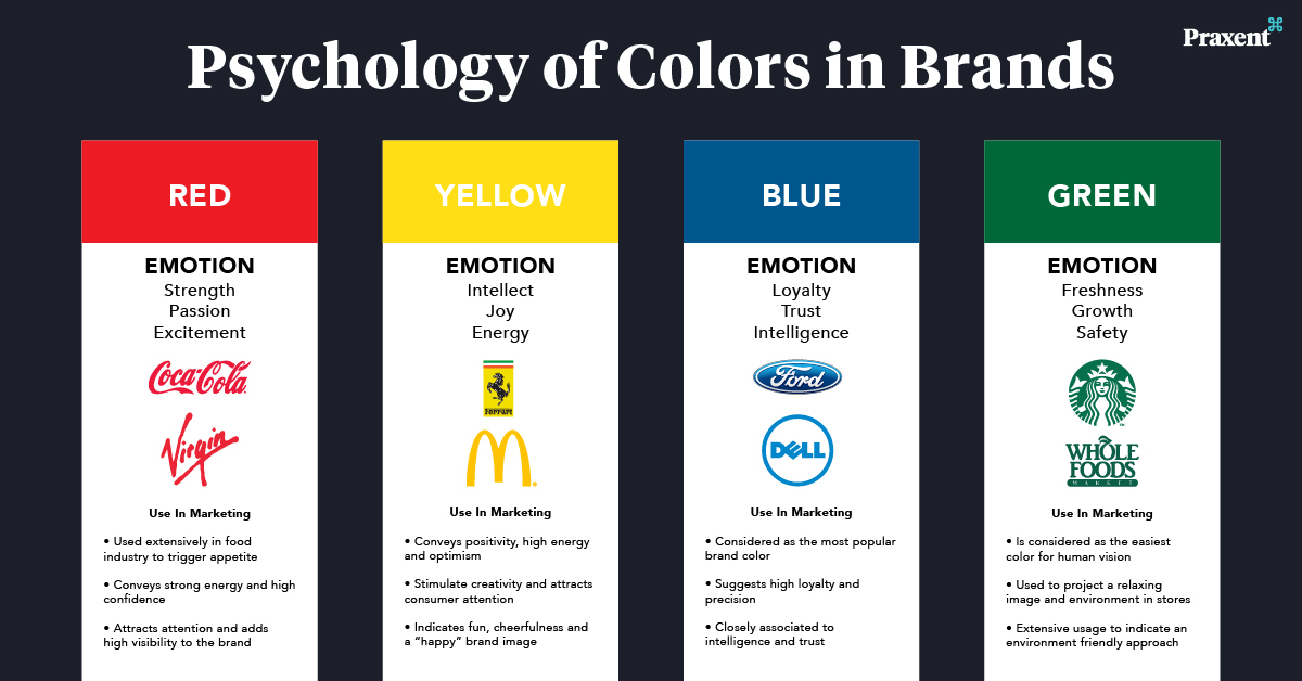
Color psychology plays a crucial role in logo design, affecting how people perceive a brand without them even realizing it. Let’s dive into how different colors can influence emotions and behaviors, shaping the success of a logo:
1. Red: This fiery hue symbolizes passion, energy, and excitement. It’s no wonder that brands like Coca-Cola and Target use red in their logos to evoke a sense of urgency and intensity.
2. Blue: Known for its calming and trustworthy vibes, blue is a popular choice for corporate logos. Think of brands like IBM and Facebook, using blue to convey reliability and stability.
3. Yellow: Cheerful and optimistic, yellow can grab attention and radiate positivity. Brands like Ikea and McDonald’s rely on yellow in their logos to create a sense of happiness and warmth.
4. Green: Associated with growth, health, and nature, green is often used by eco-friendly and organic brands. Companies like Whole Foods and Starbucks embrace green in their logos to showcase sustainability and freshness.

Choosing the Right Colors for Brand Identity
When it comes to choosing the right colors for your brand identity, it’s important to remember that you want to make a statement, not a fashion faux pas. Colors play a crucial role in how your brand is perceived, so let’s make sure you’re not sending the wrong message with your hues!
First things first, think about the emotions you want to evoke with your brand. Are you aiming for trustworthiness and reliability? Go for cool blues and greens. Want to stand out as bold and adventurous? Try vibrant reds and yellows. Just remember, you don’t want to confuse your customers by giving off mixed signals – so keep it cohesive!
Next, consider your target audience. Are you appealing to millennials who love pastels and neutral tones, or are you trying to reach older generations who appreciate classic, timeless colors? It’s all about knowing who you’re trying to attract and choosing colors that will resonate with them.
Finally, don’t be afraid to get a little creative with your color choices. Maybe you want to add a pop of neon pink to your otherwise earthy palette, or perhaps you’re feeling inspired by the colors of a tropical sunset. As long as you stay true to your brand’s identity and message, there’s no harm in thinking outside the box (or outside the color wheel, for that matter!).
Understanding the Psychological Associations of Different Colors
Colors evoke various psychological associations that can influence our mood, behavior, and perceptions. Let’s delve into the fascinating world of color psychology and uncover the hidden meanings behind different hues.
Red is often associated with passion, energy, and excitement. It can evoke feelings of love or anger, depending on the context. If you find yourself inexplicably drawn to red, perhaps you’re a fiery individual who thrives on exhilarating experiences. Just make sure you don’t see red too often!
On the other hand, blue is often linked to calmness, serenity, and trust. If you find yourself gravitating towards shades of blue, you might be a naturally cool and collected individual who exudes a sense of reliability. Embrace your inner ocean and ride the waves of tranquility!
Green is the color of nature, growth, and harmony. If you’re drawn to green, you might have a strong connection to the earth and a deep appreciation for all things organic. Embrace your inner tree hugger and let the greenery inspire you to flourish and thrive!

Using Color to Convey Emotions in Logo Design
When it comes to logo design, color plays a crucial role in conveying emotions. Just like how you choose the perfect outfit to match your mood, selecting the right colors for your logo can speak volumes without saying a word. Here’s how you can use color to evoke specific emotions in your logo:
- Red: Want to grab attention and stir up some excitement? Red is your go-to color. It’s bold, passionate, and perfect for logos that want to make a statement. Just be prepared for your logo to be the life of the party!
- Blue: Feeling calm, cool, and collected? Blue is the color for you. It’s trustworthy, professional, and perfect for brands that want to exude reliability. Your logo will be the friend everyone turns to for advice.
- Yellow: Need a little sunshine in your logo? Yellow is the answer. It’s cheerful, optimistic, and guaranteed to put a smile on people’s faces. Your logo will be the ray of light on a cloudy day.
Remember, the key to using color effectively in logo design is to consider your target audience and the message you want to convey. Don’t be afraid to mix and match colors to create a unique look that captures the essence of your brand. So go ahead, unleash the power of color and watch your logo come to life!

Creating Memorable Logo Designs with Color Psychology
When it comes to creating memorable logo designs, color psychology plays a crucial role. By understanding how different colors evoke emotions and convey messages, designers can craft logos that truly stand out. Here are some tips to help you harness the power of color psychology in your logo designs:
**1. Choose the Right Palette:**
- Consider the emotions you want to evoke with your logo. For example, blue is often associated with trust and reliability, while red is linked to passion and excitement. Pick colors that align with your brand’s values and identity.
- Experiment with different color combinations to see what resonates with your target audience. Remember, the right palette can make or break a logo design.
**2. Play with Contrast:**
- Contrast is key when it comes to creating a visually appealing logo. Use contrasting colors to make certain elements pop and draw the viewer’s eye.
- Consider the background color as well – a logo that looks great on a white background might not be as effective on a dark background. Test your design in different contexts to ensure it remains impactful.
**3. Be Mindful of Cultural Associations:**
- Colors can have different meanings and symbolism in various cultures. Make sure to research the cultural context of the colors you plan to use in your logo design, especially if your brand has a global audience.
- Avoid unintentional faux pas by understanding how certain colors may be perceived in different regions. A little cultural sensitivity can go a long way in creating a logo that resonates with diverse audiences.
Strategies for Effective Color Selection in Logo Design
When it comes to logo design, choosing the right colors can make or break your brand. Here are some hilarious yet effective strategies to help you nail that perfect color scheme:
- **Play the Color Association Game:** Think about the emotions and messages you want your brand to convey. For example, red can symbolize passion, energy, or anger. Blue can represent trust, calmness, or sadness. Choose colors that align with your brand’s personality.
- **Consider Color Psychology:** Did you know that yellow is said to stimulate appetite, which is why many fast-food chains use it in their logos? Use this to your advantage! Make people crave your brand with a strategic color choice.
- **Mix and Match:** Don’t limit yourself to just one or two colors. Experiment with different combinations to see what works best. Maybe try a neon pink with a mint green for a fresh and eye-catching look! Who says logos have to be boring?
Remember, the colors you choose will be the first thing people notice about your brand. So, have some fun with it! Get creative, think outside the box, and most importantly, make sure your logo stands out in a sea of mediocrity!
FAQs
Why is color psychology important in logo design?
Color psychology is crucial in logo design because colors have the power to evoke emotions and associations in viewers. Choosing the right colors can help a logo communicate the desired message effectively.
How can warm colors influence consumer perception?
Warm colors like red, orange, and yellow are known to evoke feelings of energy, positivity, and passion. Incorporating these colors into a logo can create a sense of urgency or excitement, making consumers more inclined to take action.
What impact do cool colors have on brand identity?
Cool colors such as blue, green, and purple are associated with calmness, trustworthiness, and professionalism. Using these colors in a logo can help establish a sense of reliability and stability, which can be appealing to consumers.
Can the same color evoke different emotions in different cultures?
Absolutely! Different cultures may have varying associations with colors due to historical, religious, or societal contexts. It’s important for businesses to consider the cultural connotations of colors when designing logos for a global audience.
How can contrast be used to enhance the efficacy of a logo?
Contrast is a powerful tool in logo design as it helps draw attention to certain elements and create visual interest. By using contrasting colors strategically, designers can make logos more memorable and impactful.
Are there any hard and fast rules when it comes to using color in logo design?
While there are guidelines and best practices for color usage in logo design, there are no strict rules that must be followed. It ultimately depends on the brand’s personality, target audience, and message. Experimentation and creativity are key!
Parting Thoughts on the Power of Color Psychology in Logo Design
As we bid adieu to this colorful journey through the world of logo design and color psychology, remember that the hue is just the beginning! With the right combination of colors, you can evoke emotions, convey messages, and leave a lasting impression on your audience. So, the next time you’re designing a logo, think beyond the rainbow and consider the psychological impact of each color choice. Happy designing, and may your logos shine brighter than a double rainbow!

