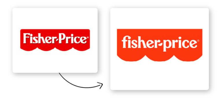
In the ever-changing world of branding, logos are like Pokemon – they gotta evolve to stay relevant. Just like a Charmander turning into a majestic Charizard, logos need a makeover from time to time to keep up with the times. Join us on a whimsical journey through the world of brand evolution as we explore the art of logo redesign and the magic behind giving a brand a fresh new look. So grab your pens, put on your creative hats, and let’s embark on this colorful adventure of logo transformation!
The Importance of Logo Redesign for Brand Evolution
Hey there, fellow design enthusiasts! Let’s talk about . We all know that logos are like the superhero capes of a brand – they symbolize identity, power, and sometimes, a little bit of mystery.
Now, imagine your logo is wearing a cape that is so 90s, it’s practically hanging off the edges like a worn-out shawl. It’s time for a logo redesign! Here are a few reasons why giving your logo a facelift is essential for your brand evolution:
- Stay Relevant: Just like fashion trends, design trends come and go. Keep your logo fresh and modern to stay relevant in the ever-evolving market.
- Adapt to Change: Your brand may have evolved over the years, and your logo should reflect that growth. A redesign can help your logo adapt to the changes in your brand identity.
- Stand Out: A unique and eye-catching logo can set you apart from the competition. Who wants to be a plain Jane in a sea of logos when you can be the Beyoncé?
So, whether your logo needs a minor touch-up or a complete makeover, remember that a logo redesign is not just about aesthetics – it’s about signaling to the world that your brand is ready to conquer new heights. Embrace the power of reinvention and let your logo shine like the superhero it was always meant to be!

Strategic Considerations for Updating a Logo
Getting ready to update your logo? Here are some strategic considerations to keep in mind:
First and foremost, think about the message you want your logo to convey. Is it fun and quirky, or sleek and professional? Make sure your new logo reflects the personality of your brand.
Next, consider the longevity of your new logo. Avoid trendy design elements that may quickly go out of style. Instead, opt for a timeless design that will still look great years from now.
Don’t forget to consider how your new logo will look across different mediums. Whether it’s on a business card or a billboard, make sure your logo is versatile and scalable.
Trends in Logo Design for Modern Brands
In the wild world of modern branding, logo design trends are constantly evolving. From minimalist to maximalist, the options are endless. Let’s take a look at some of the latest trends that are making waves in the design world:
When it comes to colors, **neon hues** are all the rage. Think bright pinks, electric blues, and fluorescent greens. These eye-catching colors are sure to grab attention and make a bold statement. Pair them with a sleek, modern font for a truly cutting-edge look.
**Geometric shapes** are another hot trend in logo design. From triangles to hexagons, these clean, angular shapes add a contemporary feel to any brand. Combine different shapes for a layered, dimensional look that is sure to stand out from the competition.
One of the most popular trends in logo design right now is **negative space**. By using cleverly placed cutouts and empty spaces, designers are able to create logos that are both simple and sophisticated. This minimalist approach is perfect for brands looking to convey a sense of elegance and refinement.

Case Studies of Successful Logo Redesigns
Let’s dive into some juicy that completely transformed a company’s image!
- Company X: Their old logo looked like it was designed in the 90s by a toddler with crayons. But after a sleek redesign featuring modern typography and a vibrant color palette, the company saw a 30% increase in brand recognition.
- Company Y: Their original logo was so bland and forgettable that even their own employees couldn’t pick it out of a lineup. Cue the redesign with a bold graphic element and a clever play on the company name – now it’s a fan favorite on social media!
- Company Z: Known for their subpar products and lackluster marketing, Company Z’s logo redesign was a Hail Mary pass that paid off big time. With a fresh, clean design that reflects their commitment to quality, sales skyrocketed and even their competitors took notice.
So, the next time you’re feeling uninspired by your brand’s logo, just remember these success stories – a well-executed redesign could be just what your company needs to stand out from the competition!

Expert Tips for Implementing a Logo Redesign
So, you’ve decided it’s time for a logo redesign. Congrats! Here are some expert tips to ensure your logo revamp goes off without a hitch:
First and foremost, conduct thorough research. Look at your competitors’ logos, your industry trends, and gather feedback from your target audience. You want your new logo to stand out in a sea of mediocrity, not blend in like a chameleon at a color blind convention.
Next, keep it simple. Your logo shouldn’t look like a Picasso painting after a few too many drinks. Keep the design clean and easily recognizable. Remember, you want people to remember your logo, not scratch their heads in confusion.
Don’t be afraid to get weird with it. Think outside the box and don’t be afraid to take risks. Remember, the best logos are the ones that make people say “Wow, I never would have thought of that!” So go ahead, channel your inner Picasso (minus the drinks) and make your logo redesign a masterpiece!
Maximizing Impact: Launching a Rebranded Logo
So, you’ve finally decided to unveil your brand’s snazzy new logo to the world. Congratulations! Now it’s time to kick it up a notch and make sure you’re maximizing the impact of this rebrand. Here are some ways to do just that:
First things first, make sure you’re getting the most bang for your buck by updating all of your branding materials with the new logo. From business cards to letterheads to promotional materials, slap that bad boy on everything! And don’t forget to update your website and social media profiles – you want your new look to be front and center wherever your customers are looking.
Next, throw a launch party! Break out the champagne and invite all your clients, employees, and even your pet goldfish if they’re up for it. A little celebration never hurt anyone, right? Plus, it’s a great way to generate buzz and get people talking about your rebrand.
Lastly, don’t be afraid to show off your new logo in creative ways. Whether it’s through a clever ad campaign, a funky pop-up event, or even some swag giveaways, make sure you’re making a splash with your rebranded look. Remember, the goal is to get people excited about your brand and leave a lasting impression!
FAQs
Why do companies decide to redesign their logos?
Companies redesign their logos to keep up with changing trends, appeal to a new audience, or to cover up the fact that they accidentally made their old logo look like something inappropriate.
How can companies ensure a successful logo redesign?
Companies can ensure a successful logo redesign by hiring a team of highly skilled designers, conducting thorough market research, and avoiding unnecessary features like Comic Sans or clip art.
What are some examples of successful logo redesigns?
Some examples of successful logo redesigns include Starbucks, Apple, and Google. These companies managed to modernize their logos while maintaining their brand identity.
What are some common mistakes companies make when redesigning their logos?
Common mistakes companies make when redesigning their logos include ignoring feedback from their customers, overcomplicating the design, or accidentally creating a logo that looks like a hotdog instead of a rocket ship.
How can companies ensure that their new logo will stand the test of time?
Companies can ensure that their new logo will stand the test of time by avoiding trendy design elements, choosing timeless colors, and making sure that it doesn’t resemble any questionable objects or animals.
Stay ahead of the curve with your logo redesign
So there you have it, folks! Embrace the art of logo redesign and watch your brand evolve into something truly amazing. Remember, a logo is like a fine wine – it just gets better with age (and a little bit of tweaking). So go forth, be bold, and redesign that logo like the creative genius you are. Your brand will thank you for it! Cheers to logo evolution!


