Have you ever looked at a logo and thought, “Hmm, there’s something aesthetically pleasing about that, but I can’t put my finger on it”? Well, my friends, let me introduce you to the world of the Golden Ratio in logo design. It’s like the secret sauce that brings together beauty and logic in a harmonious blend that makes your eyes dance with delight. So buckle up and get ready to dive into the fascinating world of math meets beauty in the world of logos. It’s the ultimate guide to making your brand shine brighter than a disco ball at Studio 54.
Understanding the Golden Ratio
So you want to delve into the mysterious world of the Golden Ratio, huh? Buckle up, because we’re about to take you on a wild mathematical ride!
First things first, the Golden Ratio, also known as the divine proportion, is a magically mathematical number that makes everything in nature just perfect. It’s like the universe’s way of saying, “Hey, I’m a math genius, deal with it!”
Imagine a line divided into two portions, A and B. The ratio of the whole line to the longer segment is the same as the ratio of the longer segment to the shorter segment. Mind-blowing, right? That’s the Golden Ratio at work, making things all harmonious and aesthetically pleasing.
Some famous examples of the Golden Ratio in action include the Parthenon in Greece, Leonardo da Vinci’s Vitruvian Man, and even your own face (if you happen to be as mathematically perfect as, well, the Golden Ratio).

History of the Golden Ratio in Design
The Golden Ratio, also known as divine proportion or the golden mean, has been used in design for centuries. People have been obsessed with this magical ratio ever since they discovered its aesthetic appeal and mathematical perfection. Let’s take a trip down memory lane to explore the fascinating .
In ancient Egypt, architects and designers utilized the Golden Ratio to construct the magnificent pyramids. They believed that incorporating this divine proportion into the dimensions of the pyramids would bring them closer to the gods. Imagine the pharaohs discussing floor plans and saying, “Let’s make sure the base is in a Golden Ratio with the height, so Ra will be pleased.”
During the Renaissance, legendary artists like Leonardo da Vinci and Michelangelo used the Golden Ratio in their masterpieces to achieve visual harmony and balance. If you look closely at the Mona Lisa’s composition or the proportions of the human body in the statue of David, you’ll notice the subtle presence of the Golden Ratio. It’s like a secret code hidden in plain sight, waiting to be decoded by design enthusiasts.
Fast forward to the modern era, and you’ll see the Golden Ratio continuing to influence contemporary design trends. From architecture to graphic design to web design, this magical ratio still holds its charm and captivates the creative minds of designers worldwide. Designers today use the Golden Ratio to create visually appealing layouts, pleasing shapes, and harmonious compositions. Who knew that a mathematical formula could have such a lasting impact on the world of design? The Golden Ratio truly is the unsung hero of aesthetic perfection.
Application of the Golden Ratio in Logos
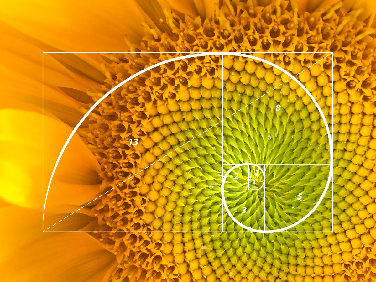
Ever wonder why some logos just seem to catch your eye more than others? It might be because they secretly follow the mystical laws of the Golden Ratio! This divine proportion, represented by the number 1.618, can be found in nature, art, and yes, even in logos. Let’s dive into how this magical ratio is applied to create visually appealing logos that are bound to make you do a double-take.
Using the Golden Ratio in logos isn’t just a matter of slapping a spiral on a design and calling it a day. Designers actually carefully calculate and apply this ratio to create a sense of balance and harmony in the logo. From the spacing of elements to the proportions of shapes, every detail is meticulously crafted to align with the Golden Ratio. It’s like a mathematical secret code hidden in plain sight!
- Curves and lines in logos often follow the Golden Ratio, creating a pleasing sense of flow and movement.
- Shapes and text are often positioned according to the Golden Ratio grid to create a visually appealing composition.
- Color schemes may even be chosen based on the Golden Ratio to create a harmonious balance in the logo.
So, next time you see a logo that just seems to *click* with you, take a closer look. You might just uncover the hidden power of the Golden Ratio at work, silently beckoning your eyes to dance along its divine proportions. Who knew that a little math could make logos so enchanting?
Benefits of Using the Golden Ratio in Logo Design
The Golden Ratio is like a magical potion for logo design, offering a plethora of benefits that can take your brand to the next level. Imagine your logo as a shining beacon of harmony, balance, and aesthetic perfection! Here are just a few reasons why incorporating the Golden Ratio into your logo design can work wonders:
- Visual Harmony: By using the Golden Ratio, you can achieve a sense of visual balance and harmony in your logo design. It creates a pleasing and symmetrical composition that draws the eye in and captivates the viewer.
- Timeless Appeal: The Golden Ratio has been used in art and design for centuries, making it a timeless and classic choice for your logo. Embracing this ratio in your design ensures that your logo will never go out of style.
- Memorable Impact: Logos created using the Golden Ratio tend to be more memorable and impactful. The harmonious proportions and balanced composition of these logos make them stand out and leave a lasting impression on your audience.
Examples of Successful Logos Using the Golden Ratio
Have you ever wondered why some logos just seem to catch your eye and stick in your mind? Well, it might just be because they were designed using the Golden Ratio – the magical mathematical formula that makes everything look prettier. Here are a few examples of logos that nailed it:
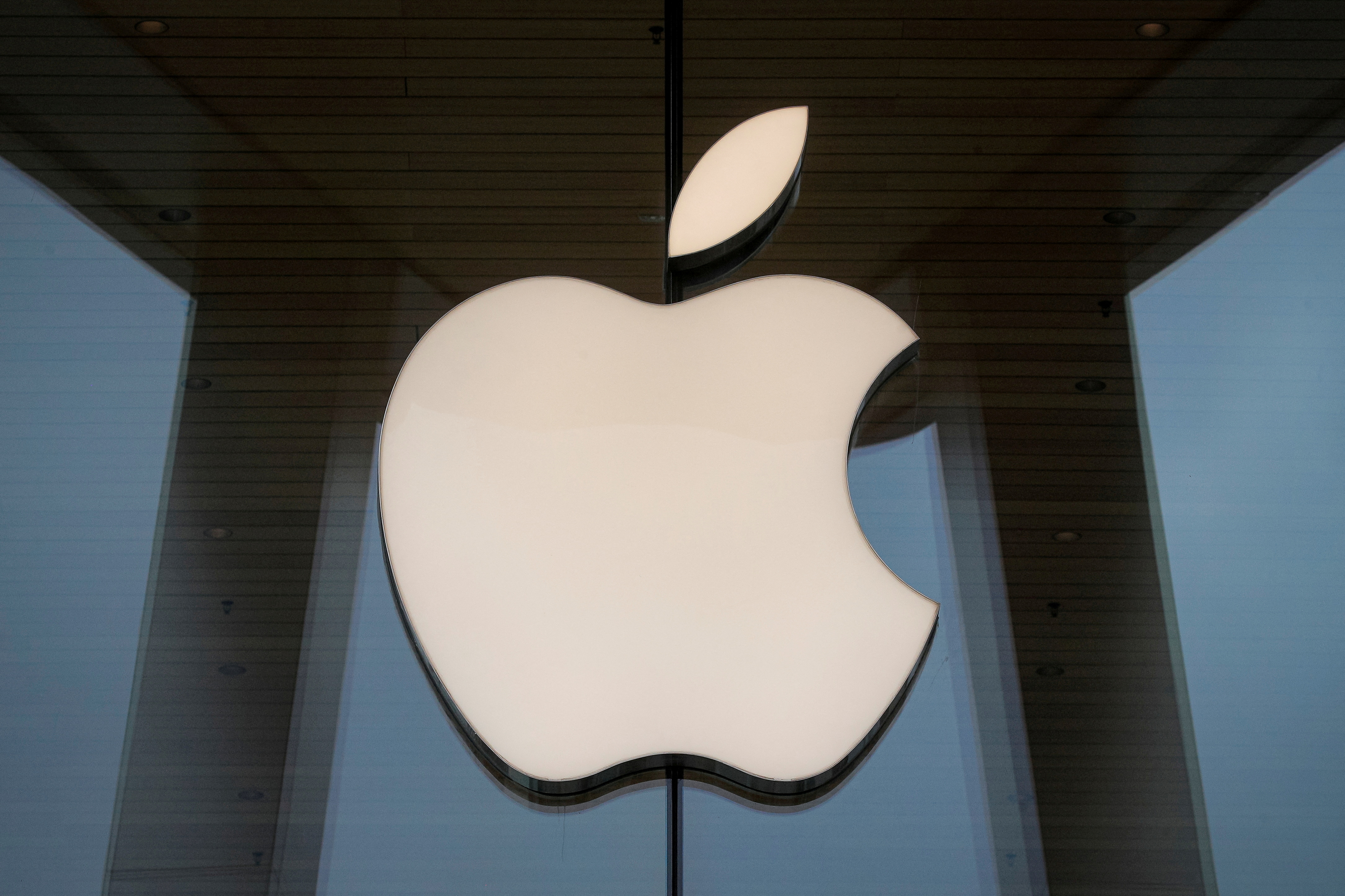
- Apple: The iconic apple logo is a perfect example of the Golden Ratio at work. The apple shape itself fits perfectly within a golden rectangle, creating a sense of harmony and balance.
- Twitter: The little blue birdie in the Twitter logo is not only cute, but also meticulously designed using the Golden Ratio. No wonder we can’t seem to stop tweeting!
- Adobe: The sleek and sophisticated Adobe logo is not just a random swoosh – it’s a carefully crafted design that follows the principles of the Golden Ratio. It’s no wonder their software is so darn irresistible!
So next time you’re designing a logo, why not give the Golden Ratio a try? Who knows, you might just end up with a masterpiece that leaves everyone in awe. It’s like magic, but with numbers!
Tips for Incorporating the Golden Ratio in Your Logo Design
So, you’ve decided to try your hand at incorporating the Golden Ratio into your logo design. Congratulations! You’re about to enter the mystical realm of divine proportions and aesthetic perfection. But before you dive in headfirst, here are some tips to help guide you along the way:
- Don’t be afraid to experiment: The Golden Ratio is all about balance and harmony, so feel free to play around with different compositions and layouts until you find the perfect fit.
- Embrace asymmetry: While the Golden Ratio is often associated with symmetry, don’t be afraid to break the rules and incorporate some asymmetrical elements into your design. After all, rules were made to be broken, right?
- Keep it simple: Remember, the Golden Ratio is all about simplicity and elegance. Avoid cluttering your design with unnecessary elements and focus on creating a clean, streamlined look that will stand the test of time.
And finally, don’t forget to trust your instincts. The Golden Ratio is a powerful tool, but at the end of the day, your gut feeling is just as important. So go forth, brave designer, and may the divine proportions be ever in your favor!
FAQs
Why is the Golden Ratio important in logo design?
The Golden Ratio is like the secret sauce that makes logos so appealing and memorable. It’s all about that perfect balance between beauty and logic, giving your logo that extra oomph!
How can I incorporate the Golden Ratio into my logo design?
Ah, the age-old question! Fear not, my friend. You can easily use tools like grids and Fibonacci spirals to help you find that sweet spot. Just remember, practice makes perfect!
Can the Golden Ratio work for any type of logo?
Absolutely! Whether you’re designing a minimalist masterpiece or a bold and colorful creation, the Golden Ratio is your best friend. It’s like the fairy godmother of logo design - it works its magic on everything!
Does using the Golden Ratio guarantee a successful logo?
Well, my dear reader, nothing in life is certain. But using the Golden Ratio in your logo design definitely gives you a head start. It’s like having a map to success – you still have to navigate the journey, but at least you know where you’re going!
In conclusion: Let your logos shine with the golden ratio!
Thank you for taking the time to explore the magical world of harmonizing beauty and logic in logos with the golden ratio. Remember, next time you’re designing a logo, don’t forget to sprinkle in some of that golden goodness for a touch of mathematical elegance. Who knew that beauty and logic could get along so well? Now go forth and create some truly golden logos! Stay golden, my friends!


