A logo is like the plastic surgery of the branding world – a touch here, a tweak there, and suddenly you’ve got a whole new look. But unlike a botched boob job, the evolution of logos is more than just cosmetic. It’s a carefully crafted reinvention that can make or break a brand faster than you can say “Botox“. So grab your magnifying glass and your judgmental goggles, because we’re diving into the world of logo redesigns and watching these icons transform faster than a Kardashian on a reality show.
The Importance of Logo Design in Brand Identity
When it comes to brand identity, your logo is the face of your business. It’s like the superhero cape you wear to stand out in a crowded marketplace. A well-designed logo doesn’t just look pretty – it communicates who you are and what you stand for in a single glance. It’s your calling card, your first impression, your…well, you get the idea.
Imagine if Batman decided to ditch the Bat Signal in favor of a stick figure drawing. Or if McDonald’s replaced the golden arches with a picture of a sad clown. It just wouldn’t have the same impact, right? Your logo is your visual representation of your brand, so don’t settle for anything less than super (hero).
Just think about some of the most iconic logos out there - Nike’s swoosh, Apple’s…well, apple, or Coca-Cola’s swirly script. They’re not just images – they’re symbols that embody the entire essence of their respective brands. So, when it comes to logo design, don’t be afraid to channel your inner superhero and create a logo that truly packs a punch.

Analyzing Trends in Logo Redesign
Today, we’re diving deep into the world of logo redesigns – buckle up, folks! Let’s take a closer look at the recent trends in this high-stakes game of rebranding.
First off, we’ve noticed a recurring theme of companies simplifying their logos. **Less is more**, they say. Gone are the days of intricate, detailed designs – now it’s all about sleek, minimalist vibes. Think about it: would you rather have a visually cluttered logo, or one that’s clean and to the point? Exactly.
Another trend we’ve seen is the evolution of color schemes. Companies are straying away from traditional colors and opting for bold, unexpected choices. **Think outside the box**, they say. Who knew a neon pink logo could be so eye-catching? Don’t be afraid to experiment!
Lastly, the rise of **responsive design** is changing the game. Logos are no longer limited to a single static image – they need to adapt to different platforms and screen sizes. It’s a challenge, for sure, but the companies that nail it are the ones that stand out in a crowded market.

Challenges Faced When Redesigning a Logo
So you’ve decided to take on the daunting task of redesigning a logo, huh? Well, get ready to face some challenges that will make you question your sanity. Here are some of the struggles you might encounter along the way:
- **Client Indecision:** Ah, the classic “I’ll know it when I see it” response. Good luck trying to read their minds and decipher what they actually want.
- **Creative Block:** Staring at a blank canvas can be both inspiring and terrifying. Don’t be surprised if you find yourself doodling stick figures instead of designing a logo.
- **Feedback Overload:** Everyone thinks they’re a design expert once you show them your work. Get ready for conflicting opinions and endless revisions.
But fear not, brave designer! With a little patience, perseverance, and maybe a few cups of coffee, you’ll conquer these challenges and emerge victorious with a logo that wows everyone. Just remember to keep calm and design on!

Successful Examples of Logo Reinvention
Remember that time when Pepsi revamped its logo and tried to hop on the minimalist bandwagon? Yeah, that was a total flop. But fear not, there have been that have actually hit the mark. Let’s take a look at a few of these logo glow-ups that have us all saying “YAAAS!”
First up, we have the iconic fast-food chain, McDonald’s. They ditched the old, outdated clown mascot and went for a sleeker, more modern look. The golden arches got a makeover and now they’re looking fresher than ever. Who knew those arches could be so chic?
Next, we have the sportswear giant, Nike. Just when you thought their swoosh logo couldn’t get any cooler, they turned up the heat. They added some gradient colors and a 3D effect, and voila! The swoosh went from basic to boujee real quick. You go, Nike!
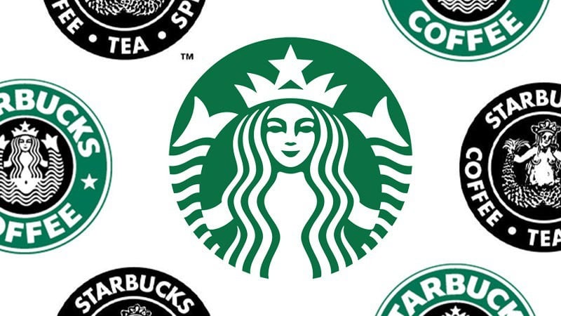
And let’s not forget about Starbucks. They took their mermaid logo and turned her into a total queen. They simplified the design, added some pops of color, and now she’s looking fierce and fabulous. Bow down to the coffee queen!
 Evolution“>
The Psychology Behind Logo Evolution
Logos may seem like just a simple image, but there is actually a lot of psychology behind their design and evolution. Companies don’t just randomly decide to change their logos, there is a method to the madness.
One reason why logos evolve is to keep up with the times. Just like fashion trends, logo designs can become outdated and need a refresh. Companies want to stay relevant and appeal to a modern audience, so they update their logos accordingly.
Another reason for logo evolution is to reflect changes within the company itself. Perhaps the company has undergone a rebranding or shifted its focus, and the logo needs to reflect these changes. It’s important for a logo to accurately represent what the company stands for.
Overall, logo evolution is a fascinating glimpse into the ever-changing world of branding and marketing. It’s amazing to see how a simple image can have such a profound impact on consumer perception. So next time you see a logo redesign, take a moment to appreciate the psychology behind it!
Strategies for a Successful Logo Redesign
So, you’ve decided it’s time to give your logo a makeover. But before you dive headfirst into the redesign process, here are some strategies to consider:
- Research, research, research: Before you start sketching out new logo ideas, take the time to research your target audience, competitors, and current design trends. You want your new logo to stand out, not blend in!
- Keep it simple: Remember, your logo needs to be easily recognizable and scalable across different mediums. Avoid cluttering your design with unnecessary elements – less is more!
- Get feedback: Don’t be afraid to show your new logo designs to friends, family, or even strangers on the street. Getting outside perspectives can help you identify any potential issues before you unveil your new logo to the world.
And remember, a successful logo redesign isn’t just about a flashy new design – it’s about creating a visual identity that truly captures the essence of your brand. So, take your time, have fun with the process, and before you know it, you’ll have a logo that’s worth showing off!
Future Directions in Logo Design
As we look towards the future of logo design, it’s clear that the industry is constantly evolving and pushing boundaries. Here are some exciting trends and possibilities we can expect to see in the world of logo design:
- Interactive Logos: With advancements in technology, we may see logos that are interactive and respond to user interactions. Imagine a logo that changes colors or shapes based on how you interact with it!
- Dynamic Logos: Logos that adapt and change in real-time based on external factors or events. This could create an entirely new level of personalization and engagement for brands.
- Augmented Reality Logos: With the rise of AR technology, logos could come to life in the physical world through our smartphones or AR glasses. Imagine seeing your favorite brand’s logo floating in the air in front of you!
With these exciting possibilities on the horizon, the future of logo design is sure to be filled with innovation and creativity. As designers, it’s important to stay ahead of the curve and embrace these new technologies to create logos that truly stand out in a crowded marketplace. The future is bright, and the possibilities are endless!
FAQs
Why do companies decide to redesign their logos?
Well, think about it – who doesn’t want a facelift every now and then? Just like humans, logos can get tired of looking at the same thing day in and day out. Companies redesign their logos to stay relevant, appeal to a new audience, or simply because they got bored of the old design. Plus, it gives them an excuse to have a fancy unveiling ceremony and get some press coverage.
What are some common elements that companies consider when redesigning their logos?
Companies take a lot of factors into consideration when giving their logos a makeover. They might want to modernize the design, make it more versatile, or even just simplify it for easier recognition. Some companies also consider cultural connotations, color psychology, and how the logo will look across different platforms - because let’s face it, a logo that looks great on a billboard might not look so hot on a tiny app icon.
How do customers typically respond to logo redesigns?
Customer responses to logo redesigns can be a bit unpredictable. Some people embrace the change with open arms, eager to see what fresh new look the company has come up with. Others might throw a little tantrum, saying things like, “But that’s not the logo I grew up with!” Either way, it’s a great way to drum up some buzz and get people talking about the brand - even if they’re just complaining about it on social media.
What are some examples of successful logo redesigns for brand reinvention?
There have been plenty of logo redesigns that have successfully helped brands reinvent themselves. Take Starbucks, for example – they went from a weird brown mermaid thing to a sleek green siren that’s recognized worldwide. And let’s not forget about Apple’s transformation from a rainbow-hued apple to the iconic black bitten apple we know today. Sometimes a little nip and tuck can make all the difference!
So long, old logos! Hello, new icons!
Thanks for embarking on this journey through the evolution of logos with us. From outdated designs to sleek, modern makeovers, we’ve seen brands reinvent themselves in the most fabulous ways. Just remember, when it comes to redesigning your logo, don’t be afraid to think outside the box. Who knows, maybe one day your brand will have a logo makeover that will have everyone talking!


