In a world where emojis speak louder than words and Instagram filters are considered a valid form of self-expression, traditional logo design is beginning to feel as outdated as dial-up internet. But fear not, fellow design enthusiasts, because we’re here to guide you through the wild and wacky world of modern logo design. So grab your MacBook, adjust your seatbelt, and get ready to ride the digital wave with us as we explore the ever-evolving landscape of logos in the 21st century.
The Evolution of Logo Design in the Digital Age
When it comes to logo design, gone are the days of simple text-based logos. Thanks to the digital age, logos have evolved into dynamic, visually stunning works of art that capture the essence of a brand in a single image.
With the rise of social media and digital marketing, logos have become more important than ever in helping a brand stand out in a sea of competition. Designers are constantly pushing the boundaries of creativity to create logos that are not only memorable but also versatile enough to be used across various platforms.
From flat designs to 3D animations, the possibilities for logo design in the digital age are truly endless. Brands are now experimenting with interactive logos that respond to user interactions, as well as logos that change color based on the time of day.
In a world where attention spans are shorter than ever, a well-designed logo can make all the difference in capturing a consumer’s attention. In the digital age, logo design is no longer just about creating a symbol for a brand – it’s about creating an experience that resonates with consumers on a deeper level.

Minimalism and Simplicity: The Key to Effective Logo Design
When it comes to logo design, less is more! Minimalism and simplicity are the key ingredients that can make a logo truly effective and memorable. Just like a well-cooked meal is not the one with the most ingredients, a great logo does not need to be cluttered with unnecessary elements.
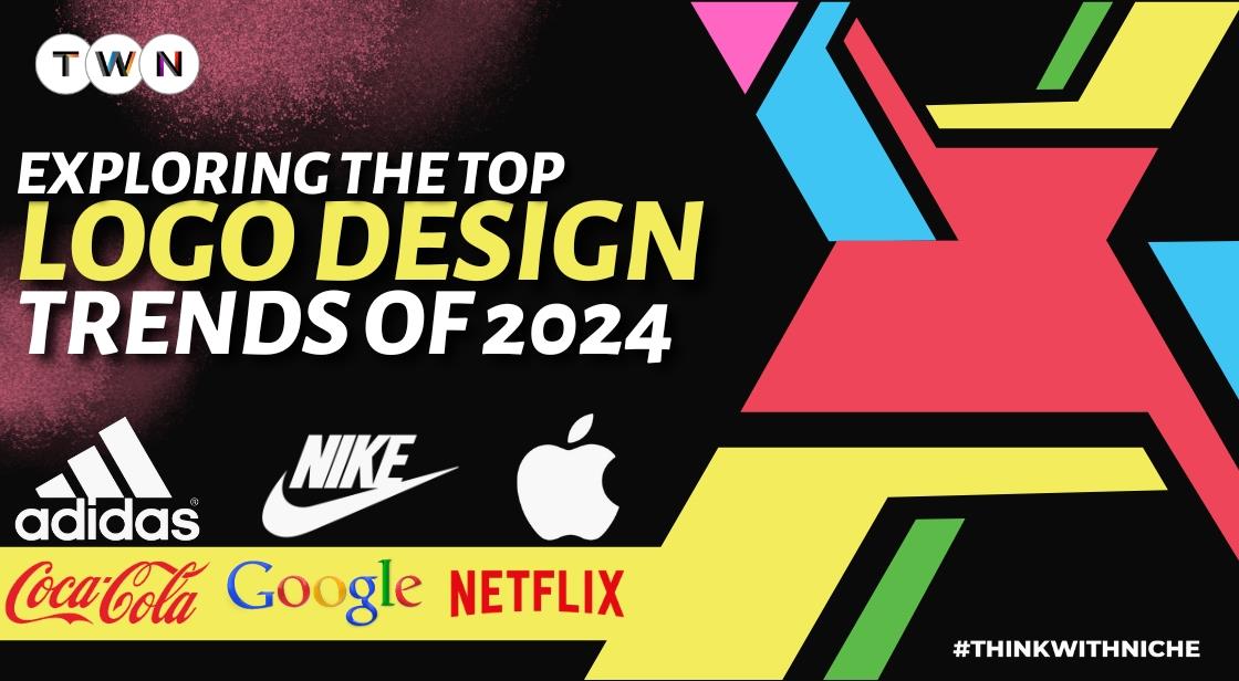
By keeping your logo design simple, you allow for a stronger impact and easier recognition. Think about some of the most iconic logos in the world – Apple, Nike, McDonald’s - all of them are simple yet instantly recognizable. Minimalism helps in creating a lasting impression on your audience.
A minimalist logo also means that it will be versatile across different mediums and sizes. Whether it’s on a business card or a billboard, a simple design will always stand out and be easily identifiable. Plus, let’s be honest, who has time to decipher a complicated logo in today’s fast-paced world?
So, the next time you’re brainstorming ideas for a logo, remember to keep it simple and to the point. Embrace the beauty of minimalism and watch your logo design speak volumes with just a few strokes. After all, in the world of design, sometimes less is truly more!

Responsive and Scalable: Designing Logos for Multi-Platform Use
Designing logos for multi-platform use can be a daunting task, but fear not – with the right approach, it can be a breeze. Here are some tips to help you create logos that are both responsive and scalable:
Responsive design is key when it comes to creating logos that will look great on any device. Make sure your logo adapts well to different screen sizes, from a tiny mobile phone to a massive desktop monitor. Embrace the power of media queries to ensure your logo looks fantastic no matter what the screen size.
Scalability is another important factor to consider when designing a logo for multiple platforms. A good logo should look just as crisp and clear when it’s tiny as it does when it’s blown up to billboard size. Utilize vector graphics to ensure that your logo can be scaled up or down without losing any quality.
When designing for multiple platforms, keep in mind that different devices have different color capabilities. Make sure your logo looks good in both full color and grayscale. Consider creating a simplified version of your logo for use on devices with limited color capabilities.
Remember, the key to designing logos for multi-platform use is flexibility. A good logo should look great no matter where it’s displayed – from a tiny social media profile picture to a giant billboard on the side of a building. So go forth, design with confidence, and create logos that shine on every platform!
Incorporating Animation and Dynamic Elements in Modern Logo Design
Are you tired of boring, static logo designs that look like they were created in the Stone Age? Well, fear not! is the way to go. Imagine your logo coming to life right before your eyes, winking at your customers and stealing the show. Sounds exciting, doesn’t it?
With the advancements in technology, adding animation to your logo has never been easier. From subtle movements like a blinking eye or a waving hand to more complex animations that showcase your brand’s personality, the possibilities are endless. Give your logo that extra oomph it deserves and watch as it captivates your audience like never before.
But wait, there’s more! Dynamic elements in logo design can take your brand to a whole new level. Incorporating interactive elements like hover effects or scrolling animations will make your logo stand out from the crowd. Your logo will no longer be just a static image, but a dynamic piece of art that engages and excites your customers.
So, what are you waiting for? Embrace the power of animation and dynamic elements in modern logo design and watch your brand come to life in ways you never thought possible. Your logo will thank you, and so will your customers. Let your creativity run wild and see where it takes you.
Customization and Personalization: Tailoring Logos to Target Audiences
Are you tired of seeing generic logos that don’t quite hit the mark? Say no more! Our team of expert designers specializes in customizing and personalizing logos to specifically target your unique audience. We don’t believe in a one-size-fits-all approach – each logo is carefully tailored to suit the needs and preferences of your target demographic.
With our custom logo design service, you can finally say goodbye to cookie-cutter designs that fail to make an impact. We work closely with you to understand your brand identity, values, and target audience, ensuring that every element of your logo resonates with the people you’re trying to reach. Whether you’re appealing to millennials, moms, sports enthusiasts, or foodies, we’ve got you covered.
Our designers are masters of their craft, utilizing the latest tools and techniques to create logos that are not only visually stunning but also highly effective in attracting and engaging your target audience. From bold and vibrant color schemes to sleek and modern typography, we pay attention to every detail to ensure that your logo stands out from the crowd and leaves a lasting impression.
- Customized color palettes tailored to evoke specific emotions and responses
- Unique typography choices that reflect the personality and values of your brand
- Iconography and imagery that resonate with your target audience’s interests and preferences
Innovative Use of Color, Typography, and Negative Space in Digital Logo Design
When it comes to digital logo design, creativity is key. One way to make your logo stand out is to utilize innovative color choices. Instead of sticking to the traditional blue and red, why not experiment with bold and unexpected hues like neon pink or electric green? Let your logo pop with colors that demand attention!
Another important element in logo design is typography. Don’t be afraid to mix and match different fonts to create a unique look. Play around with sizing and spacing to draw the eye to the most important parts of your logo. Remember, the words in your logo are just as important as the graphics!
One often overlooked aspect of logo design is negative space. Instead of cramming your logo with every design element possible, embrace the power of empty space. Use negative space to create subtle shapes or hidden messages within your logo. Let your logo breathe and speak volumes with its simplicity.
By combining vibrant colors, creative typography, and clever use of negative space, you can create a digital logo that not only catches the eye but also leaves a lasting impression. Don’t be afraid to push the boundaries and think outside the box when it comes to designing your logo. After all, a logo is not just a symbol – it’s a reflection of your brand’s identity and personality!
FAQs
Why is it important for logo design to adapt to digital trends?
Well, you wouldn’t wear parachute pants in 2022, would you? Just like fashion, design trends change over time. If your logo looks like it’s stuck in the MySpace era, potential customers might wonder if your business is still using dial-up internet.
What are some key digital trends impacting logo design?
Think bold colors, sleek gradients, and minimalist designs that make your grandma’s collection of porcelain figurines look cluttered. Oh, and don’t forget about responsive design – your logo should look just as snazzy on a tiny smartwatch screen as it does on a massive billboard.
How can businesses ensure their logo is relevant in the digital age?
Time to dust off that crystal ball and predict the future, right? JK – research, research, research! Stay up-to-date on the latest design trends, know your target audience, and be open to shaking things up if your logo is starting to look as outdated as a fax machine.
What are some examples of companies that have successfully adapted their logos to digital trends?
Ever heard of a little company called Starbucks? They’ve gone from a generic brown mermaid to an ultra-sleek green and white emblem that’s more recognizable than your 10th-grade crush. And let’s not forget about Apple – they’ve come a long way from their rainbow apple days to the iconic monochrome masterpiece they have now.


