Introducing the unsung hero of logo design: the Golden Ratio. You may not have heard of it, but trust us, this mathematical marvel is the secret sauce behind some of the most iconic logos in the world. So grab your protractor and get ready to dive into the world of symmetry, harmony, and a whole lot of nerdy fun. Let’s talk about why the Golden Ratio is the Beyoncé of logo design – flawless, mesmerizing, and absolutely essential.
Origin of the Golden Ratio in Design
Believe it or not, the Golden Ratio in design has a long and mysterious origin. Legend has it that it was discovered by a group of ancient Greek mathematicians who were trying to solve the age-old question of what makes things aesthetically pleasing. After many failed attempts and a lot of head scratching, they stumbled upon this magical ratio that seemed to make everything just right.
Some say that the Golden Ratio was a gift from the gods, while others think it was just a happy accident. Regardless of how it came to be, designers have been using it for centuries to create harmonious and visually pleasing compositions.
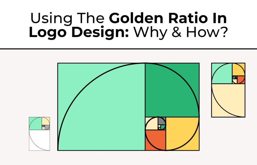
So, what exactly is this Golden Ratio? Well, it’s a mathematical ratio that is equal to approximately 1.61803398875. When applied to design, it creates a sense of balance and proportion that is visually appealing to the human eye. It’s like the secret ingredient that makes everything look just right.
Next time you’re admiring a beautiful piece of artwork or a well-designed building, take a closer look and see if you can spot the Golden Ratio hiding in plain sight. Who knows, maybe you’ll unlock the mysteries of the universe with a simple math equation!

Historical Use of the Golden Ratio in Art and Architecture
Many artists and architects throughout history have utilized the Golden Ratio to create aesthetically pleasing and harmonious works of art and architecture. This divine proportion, also known as Phi or Φ, has been used in various ways to achieve balance and beauty in both two-dimensional and three-dimensional compositions.
From the Parthenon in ancient Greece to the Mona Lisa by Leonardo da Vinci, the Golden Ratio has been a key element in some of the world’s most iconic masterpieces. Artists and architects have incorporated this ratio into their designs to create visually appealing compositions that resonate with viewers on a subconscious level.
Whether it’s the spiral shape of a seashell or the proportions of the human body, the Golden Ratio can be found everywhere in nature, making it a powerful tool for artists and architects seeking to emulate the natural beauty of the world around them.
By understanding and incorporating the Golden Ratio into their work, artists and architects can create compositions that are not only visually stunning but also spiritually uplifting. So next time you admire a work of art or architecture, take a moment to appreciate the mathematical precision and divine beauty of the Golden Ratio at play!

Key Principles of the Golden Ratio in Logo Design
When it comes to creating a truly iconic logo, the Golden Ratio is your best friend. This magical mathematical formula has been used for centuries to create perfectly balanced designs that are pleasing to the eye. Here are some key principles to keep in mind when incorporating the Golden Ratio into your logo:
- Balance is key: The Golden Ratio is all about achieving harmonious balance in your design. Make sure that all elements of your logo are proportioned in a way that is visually appealing and natural.
- Keep it simple: While the Golden Ratio can help you create intricate and complex designs, sometimes less is more. Don’t overcomplicate your logo – simplicity is often the key to making a lasting impression.
- Embrace symmetry: Symmetrical designs are often the most pleasing to the eye, and the Golden Ratio can help you achieve that perfect balance. Aim to create a logo that is symmetrical and well-proportioned.
By following these , you can create a visually stunning and perfectly balanced logo that will stand the test of time. So go ahead, let your creativity flow and watch as your logo becomes a work of art!

Examples of Famous Logos Utilizing the Golden Ratio
Prepare to have your mind blown by these famous logos that have utilized the Golden Ratio in their design. From fast food giants to tech titans, the Golden Ratio is everywhere!
Just take a look at the Apple logo – that sleek, half-bitten apple is more than just a symbol of technology, it’s a prime example of the Golden Ratio in action. Who knew math could be so tasty?
And how about the Pepsi logo? That red, white and blue swirl is not just a refreshing beverage, it’s also a mathematical masterpiece. The Golden Ratio strikes again!
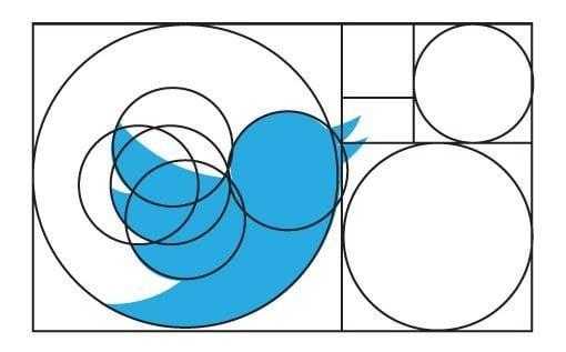
Let’s not forget about the Twitter logo – that little bird may only have 140 characters, but it’s got infinite beauty thanks to the Golden Ratio. Tweet that, Fibonacci!

Impact of the Golden Ratio on Brand Perception
Have you ever wondered how the Golden Ratio affects the way we perceive brands? Well, buckle up because we’re about to take you on a wild ride through the world of design and branding!
First and foremost, the Golden Ratio is like the secret sauce that gives brands that extra oomph! When a brand incorporates the Golden Ratio into its logo, packaging, or website design, it automatically elevates its aesthetic appeal. It’s like sprinkling a little bit of magic dust on your brand and making it stand out from the competition!
Furthermore, consumers subconsciously associate brands that use the Golden Ratio with qualities such as symmetry, harmony, and balance. This creates a sense of trust and credibility in the brand, making consumers more likely to choose it over others. It’s like the Golden Ratio whispers in the consumer’s ear, “This brand is legit, trust me!”
So, the next time you’re working on a brand design, remember to sprinkle a little Golden Ratio magic to make your brand shine like a diamond in a sea of pebbles. Trust us, your brand perception will thank you!
Implementing the Golden Ratio in Contemporary Logo Design Trends
When it comes to contemporary logo design trends, incorporating the golden ratio is like adding a sprinkle of magic to your branding. This age-old mathematical proportion has been used by artists and designers for centuries, and for good reason – it just looks darn good.
So, how can you implement the golden ratio in your logo design? Well, it’s as easy as pie – or should I say, as easy as phi (get it? Phi is the symbol for the golden ratio. No? Tough crowd).
- Start with a perfect square: Draw a square and use it as the basis for your logo design. The sides of the square will act as your guide for creating the perfect proportions.
- Divide the square: Divide the square into sections using the golden ratio. This will help you place elements in your logo in a harmonious and visually appealing way.
- Create harmony: Use the golden ratio to size and position elements within your logo. By following this ancient proportion, you’ll achieve a sense of balance and symmetry that will make your design stand out.
Remember, the golden ratio is not just a design trend – it’s a timeless principle that has been proven to create visually pleasing compositions. So, why not give it a try and watch your logo design shine brighter than a pot of gold at the end of a rainbow?
FAQs
Why is the golden ratio important in logo design?
Well, do you ever wonder why some logos just look so darn pleasing to the eye? It’s because they’ve got that magical golden ratio sprinkled all over them! The golden ratio is like the secret sauce that makes logos go from meh to marvelous.
How does the golden ratio impact the visual appeal of a logo?
Listen, the golden ratio is like the Beyoncé of design principles – it just makes everything better. When you use the golden ratio in logo design, it creates a harmonious balance and symmetry that just screams sophistication and elegance. It’s like giving your logo a virtual facelift!
Can you give examples of famous logos that use the golden ratio?
Oh honey, let me take you on a tour of the red carpet of logo design! We’re talking about iconic logos like Apple, Twitter, and even good ol’ Starbucks. These big shot companies know that slapping some golden ratio on their logos is the key to success.
How can I incorporate the golden ratio into my own logo design?
Alright, buckle up, buttercup! You can start by sketching out your logo design using the golden ratio grid as your trusty sidekick. Make sure those dimensions and proportions are in tip-top shape, and voila! You’ve got yourself a logo that’s ready to slay the design game.
Does the golden ratio guarantee a successful logo design?
Now hold your horses, cowboy! While the golden ratio is like having a golden ticket in the design world, it doesn’t guarantee you a one-way ticket to logo stardom. Remember, design is a mix of art and science, so don’t forget to sprinkle in some creativity and originality to make your logo truly shine. It’s like adding a cherry on top of your already fabulous golden ratio cake!
In conclusion, Logo-nificent!
And there you have it folks, the golden ratio in logo design is like the secret sauce that makes a burger taste better. It’s the magic spell that makes logos pop and stand out in a crowded marketplace. So next time you see a swoosh or an apple with a bite taken out of it, you’ll know that there’s a little touch of golden ratio brilliance behind it. Keep designing and keep creating, because when it comes to logo design, the golden ratio is the real MVP.


