Ever found yourself in the precarious situation of designing a logo that inadvertently offends an entire culture? Trust me, it’s not a badge of honor you want displayed on your design portfolio. In a world where cultural sensitivity is key, creating globally conscious logos should be at the top of every designer’s to-do list. So buckle up, grab your non-offensive color palette, and let’s dive into the world of cultural sensitivity in design.
Understanding Cultural Symbolism in Logo Design
When it comes to logo design, understanding cultural symbolism is key to creating a successful and impactful design. Incorporating elements of different cultures can help your logo resonate with a wider audience and convey a deeper meaning. Here are some tips to help you master the art of cultural symbolism in logo design:
– Research, research, research: Before diving into designing your logo, take the time to research the cultural symbolism of different regions and communities. This will help you avoid inadvertently using symbols that may be offensive or misunderstood by your target audience.
– Embrace diversity: Don’t be afraid to mix and match cultural symbols in your design. By embracing diversity, you can create a logo that is both visually appealing and rich in meaning. Just make sure to do so with respect and sensitivity.
– Think outside the box: Instead of sticking to the obvious symbols associated with a particular culture, challenge yourself to think creatively. Consider how you can reinterpret traditional symbols in a modern and unique way that will resonate with your audience.
Incorporating cultural symbolism in logo design can add depth and richness to your branding. By taking the time to understand and respect different cultures, you can create a logo that not only looks great but also conveys a powerful message. So go ahead, get inspired by the world around you and let your creativity shine!
Researching Global Iconography for Inspiration
Looking to add some spice to your design work? Why not take a journey through the fascinating world of global iconography! From the vibrant patterns of African textiles to the intricate designs of Asian architecture, there is inspiration to be found everywhere.
Take a virtual trip to the streets of Paris and soak in the elegance of the French art nouveau movement. Or dive into the colorful chaos of India, where every symbol tells a story and every color holds a meaning.
Don’t forget to explore the mystical symbols of Native American cultures, where animals and nature intertwine to create powerful imagery. And for a taste of the ancient world, look no further than the majestic Egyptian hieroglyphs that have captivated imaginations for centuries.
So grab your virtual passport and embark on a global iconography adventure – who knows what treasures you’ll discover along the way!

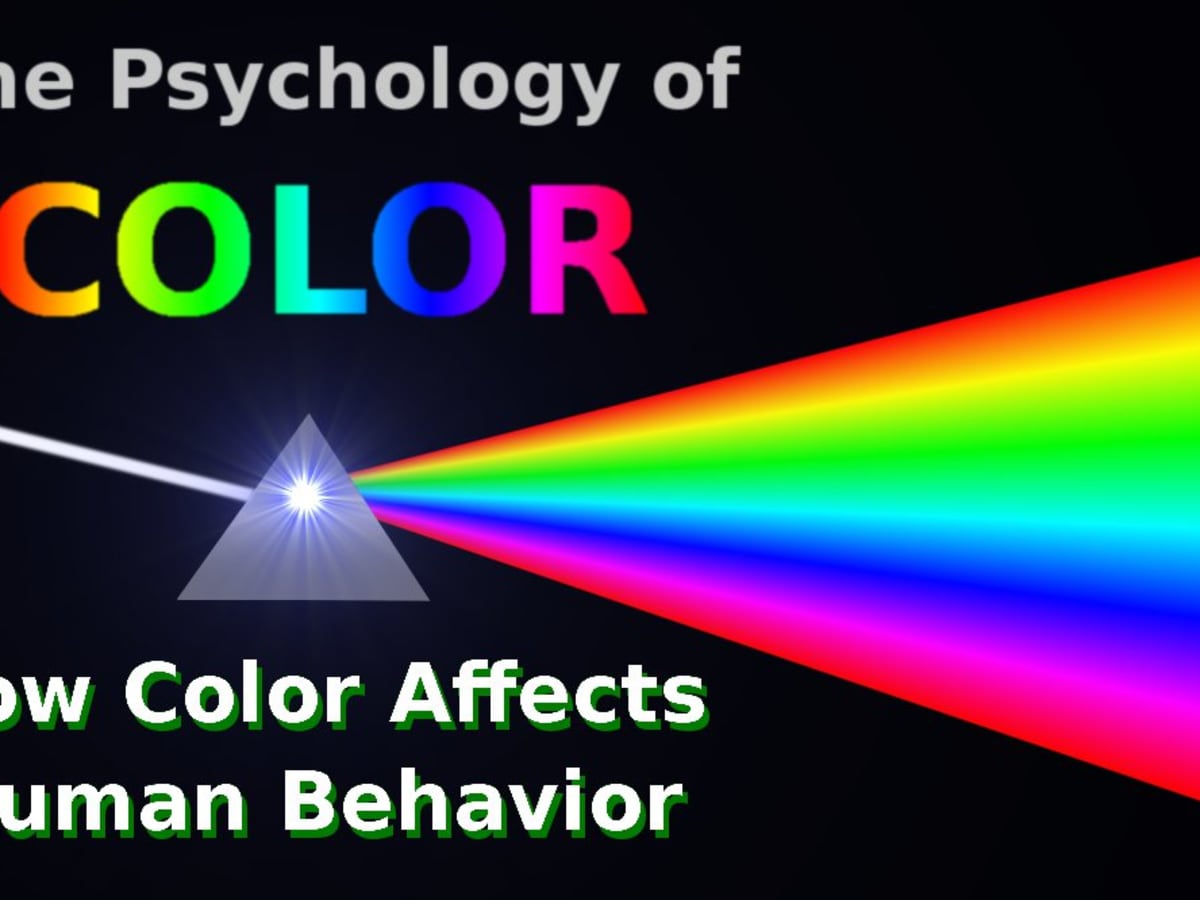
Applying Color Psychology for Cross-Cultural Appeal
When it comes to creating a product with cross-cultural appeal, understanding color psychology is key. Different cultures associate colors with different meanings and emotions, so it’s important to choose colors wisely. Here are some tips on how to apply color psychology effectively:
- Research cultural meanings: Before selecting colors for your product, research what different colors symbolize in different cultures. For example, while white represents purity and innocence in Western cultures, it symbolizes death and mourning in some Asian cultures.
- Use universal colors: Some colors have universal meanings that are understood across cultures. Blue, for example, is often associated with trust and reliability, making it a safe choice for products that need to appeal to a wide audience.
- Avoid cultural taboos: Be aware of any cultural taboos associated with certain colors. In some cultures, certain colors are considered bad luck or inappropriate for certain occasions. Make sure to steer clear of these colors to avoid offending potential customers.
By applying color psychology thoughtfully and strategically, you can create a product that resonates with audiences from diverse cultural backgrounds. Remember, colors speak louder than words, so choose wisely!

Avoiding Cultural Appropriation in Logo Creation
So you want to create a logo that truly represents your brand, but you also want to avoid cultural appropriation? Fear not, my friend! Here are some tips to help you walk that fine line:
First and foremost, do your research! Make sure you understand the cultural significance of any symbols or imagery you plan to use in your logo. If you can’t confidently explain the history behind it, you probably shouldn’t be using it.
When in doubt, leave it out! If you’re unsure whether something might be considered culturally appropriative, it’s best to err on the side of caution and choose a different design element.
Remember that cultural appropriation isn’t just about avoiding offensive stereotypes. It’s also about respecting the cultural heritage of others and acknowledging that some symbols are sacred and shouldn’t be used for commercial gain.

Embracing Diversity in Visual Communication
When it comes to visual communication, diversity isn’t just a buzzword – it’s a way of life. From the colors we choose to the images we use, embracing diversity is key to creating engaging and impactful designs.
One way to embrace diversity in visual communication is by incorporating a wide range of cultural references. Whether it’s using symbols from different religions or highlighting traditional art forms from around the world, including diverse elements in your designs can help your message resonate with a larger audience.
Another way to celebrate diversity in visual communication is by showcasing a variety of faces and bodies in your imagery. Say goodbye to the days of using stock photos of the same generic models – instead, opt for images that reflect the true beauty and diversity of humanity. Boldly showcase people of all shapes, sizes, colors, and abilities to create visuals that truly speak to everyone.
Finally, don’t be afraid to think outside the box when it comes to colors and design elements. Embrace the rich tapestry of hues and styles available to you, and use them to create visuals that are as unique and diverse as the world around us. Remember, embracing diversity isn’t just about checking boxes – it’s about using creativity and imagination to create visuals that truly reflect the world we live in.
Championing Inclusivity through Thoughtful Design Choices
When it comes to creating inclusive design choices, there are a few key things to keep in mind. First and foremost, consider the diverse range of individuals who will be interacting with your design. Whether it’s people with disabilities, different cultural backgrounds, or varying levels of expertise, thoughtful design choices can make all the difference.
One way to champion inclusivity is by incorporating features that cater to different needs. From adjustable font sizes and color contrasts to voice commands and screen reader compatibility, there are endless possibilities to make your design accessible to all. Remember, a one-size-fits-all approach rarely works when it comes to inclusivity!
Don’t forget about the power of representation in design. Including diverse imagery and perspectives can help create a more welcoming and relatable experience for everyone. Whether it’s showcasing people from different backgrounds or featuring a variety of voices in your content, representation matters.
So, next time you’re making design choices, think about the impact they can have on inclusivity. With a little creativity and consideration, you can create a space that welcomes everyone with open arms. After all, inclusivity is not just a buzzword – it’s a mindset that can transform the way we interact with the world around us.
FAQs
What are some common pitfalls to avoid when designing a globally conscious logo?
Avoid using culturally insensitive symbols or colors, such as the use of religious symbols or sacred imagery of other cultures without proper understanding and respect. Also, steer clear of using language or fonts that may be offensive or misinterpreted in different cultures.
How can designers ensure their logos are culturally sensitive?
Research, research, research! Understanding the cultural significance of symbols, colors, and imagery is key. It’s also important to consult with individuals from the target culture to get feedback and ensure that the design is respectful and appropriate.
Can incorporating elements from multiple cultures in a logo be culturally sensitive?
Absolutely! Just make sure that the elements are used thoughtfully and respectfully, and that they are not appropriated or misrepresented. It can be a great way to celebrate diversity and promote inclusivity in your design.
How important is it for a logo to reflect cultural sensitivity in today’s global marketplace?
It’s crucial! In a world that is increasingly interconnected, being culturally sensitive in your design can make or break your brand. Consumers are more aware than ever and are quick to call out cultural insensitivity, so it’s best to get it right from the start.
Putting the “Globe” in Globally Conscious Logos
As you embark on your journey to create culturally sensitive logos, remember: the world is full of diverse perspectives and traditions, so don’t be afraid to think outside the box (or logo template, for that matter). Keep in mind that cultural sensitivity isn’t just about avoiding offensive symbols or imagery—it’s about celebrating the rich tapestry of global design and showcasing your brand’s commitment to inclusivity. So go forth, brave designer, and may your logos be as culturally conscious as they are visually stunning. And remember: when in doubt, just ask yourself, “WWBD?” (What Would Beyoncé Do?)


