With the current trend of businesses shifting towards clever logo design (rather than obvious visual representation of their brand), the logo design industry has seen some changes. This new and impressive method of design helps companies separate themselves from the competition, and presents them in a modern and progressive light. Not only are these logos visually appealing, they have an additional dash of intelligence that helps make them distinctive. That said, witty logos are not easy to create, and often require assistance from skilled design professionals.
Visual Double-Entendres
Visual double-entendres are important elements of many clever logotypes. They can inform the public about your company’s identity or business without using copious amounts of text. As the popular adage goes, “a picture is worth a thousand words,” this tactic can help make a logo quite memorable.
The logo for Mister Cutts (a barber shop in Wichita Falls, Texas), is a great example of clever graphic design. The centerpiece of this logo is a stylized set of scissors, which reminds potential clients that the retail outlet focuses on haircuts. The scissor blades double as a neatly trimmed mustache, and the finger rings serve as eyes. Even though you may need to a moment to process the details throughout the logo design, it is quite easy to spot the face within the logo. This image of a well-groomed man tells observers that Mister Cutts is a solid option for the male demographic.
Writing Your Message with Word Art
Words are cornerstone to any clever logo design. However, when using text in witty logos, they are often deployed with uncommon approaches. Clever logo designers do not tend to worry as much about whether serif or sans-serif fonts convey the right corporate image. They are more focused on strategies and phrases that can subtly hint at details about the name of a company or its services.
Consider the logo of the worldwide parcel carrier, FedEx Express, for clever text inspiration. At first glance, you may only see a bold purple and orange heading that spells out the company name. However, if you observe the negative area within this text, you will see a perfect, white arrow between the orange letters E and X. Not only does this suggest that FedEx will reliably transport your parcels from A to B, but also implies that the company is continuously moving forward.
Thoughtful Ambigrams
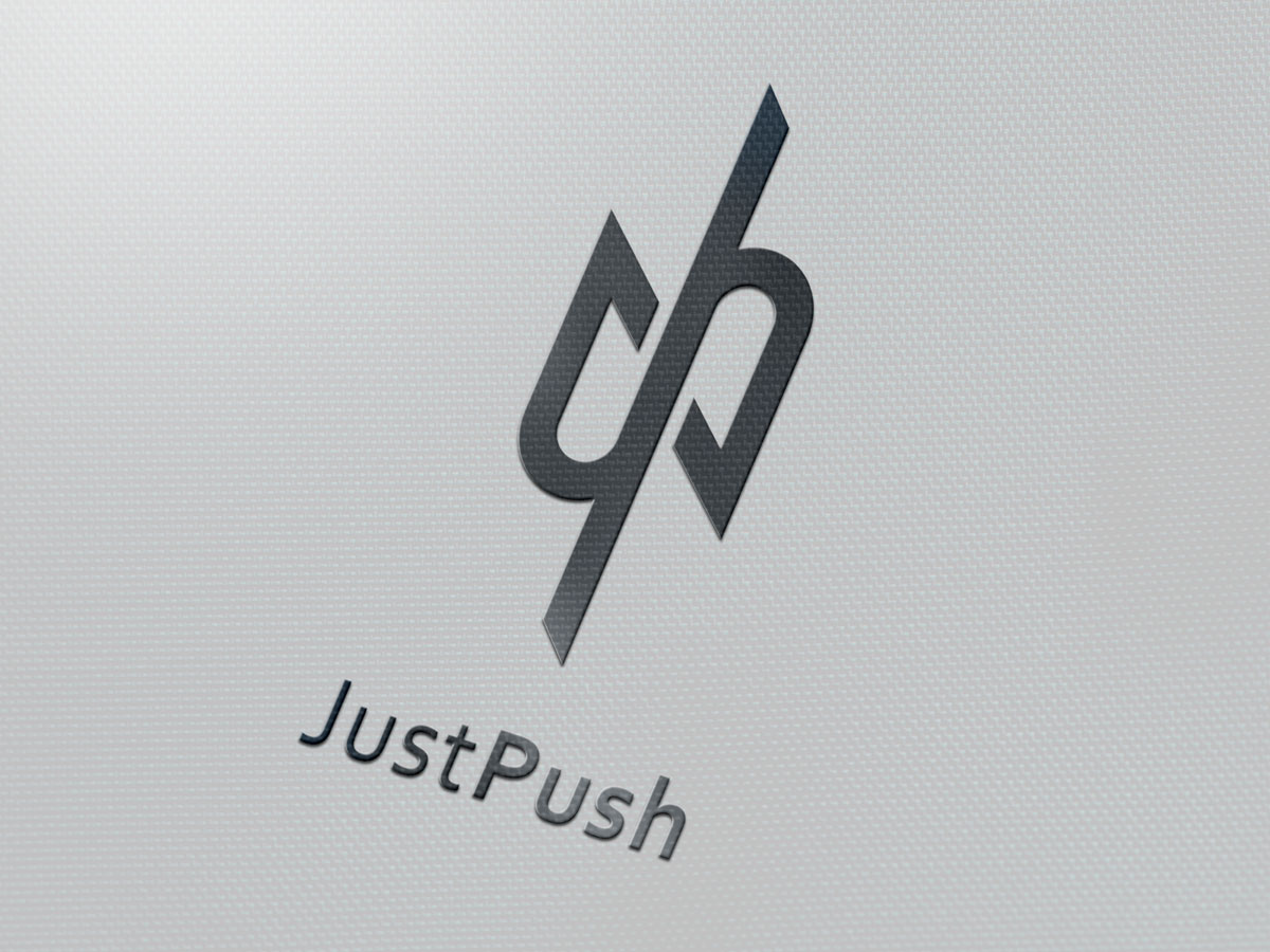
Ambigrams also employ typography. However, these clever design tools are unique and different from general fonts. Ambigrams are words or phrases that can be read in more than one way. Designing successful and intelligent ambigrams is tricky (and they are a lot more difficult to create), but taking a look at some examples may help make this concept easier to understand.
Creating a clever logo design is truly an art, and should not be attempted by amateurs. Logo Coast will carefully select a skillful team of professional designers to help you design a witty logo that will best represent your business. Our team will closely involve you throughout the entire process, and will develop a range of concepts for your consideration.


