Are logos just pretty pictures or do they hold secret messages that only the chosen few can decipher? Dive into the mysterious world of logo design and uncover the hidden power of symbolism that lurks behind every sleekly designed emblem. Get ready to unlock the secrets of the symbols and reveal the true meaning behind your favorite brand logos. It’s time to unravel the enigmatic language of logos and see beyond the surface level design – are you ready to decode the messages hidden in plain sight
The Importance of Symbolism in Logo Design
Logos are more than just pretty pictures – they are powerful symbols that convey a message about a company’s values, vision, and personality. Let’s dive into the world of logo design and explore why symbolism is so important:
In logo design, symbols are like secret agents – they communicate complex ideas in a single image. Whether it’s a swoosh representing speed and movement or a bitten apple symbolizing innovation and creativity, symbols have the power to speak volumes without saying a word.
Using symbolism in logo design is like speaking a universal language – it transcends cultural barriers and resonates with people on a deep, subconscious level. A well-crafted symbol can evoke emotions, trigger memories, and create instant connections with consumers.
So, the next time you see a logo, take a closer look at the symbols hidden within it. You might be surprised by what you discover – a world of meaning, metaphor, and magic waiting to be uncovered!

The Psychology Behind Symbols in Branding
Symbols in branding serve as powerful tools to evoke emotions and create strong connections with consumers. They play a crucial role in shaping how a brand is perceived and remembered. Here’s a deeper dive into the fascinating psychology behind symbols in branding:
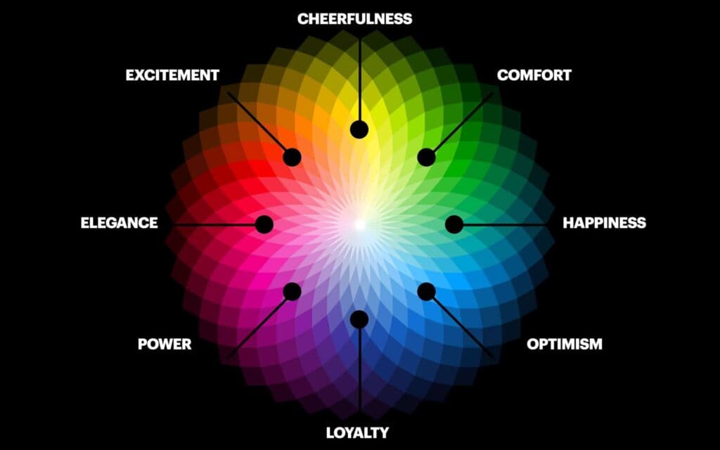
- **Color Psychology:** The colors used in a brand’s symbol can have a significant impact on how consumers perceive the brand. For example, red is often associated with excitement and passion, while blue conveys trust and reliability. So, if your brand’s symbol is a vibrant red, you’re basically telling consumers to get ready for an adrenaline-filled rollercoaster ride!
- **Shape Matters:** The shape of a symbol can also influence consumer perception. Rounded shapes like circles and ovals tend to evoke feelings of comfort and inclusivity, while angular shapes like triangles and squares can convey strength and stability. So, if your brand’s symbol is a perfect square, you’re basically telling consumers that you’re as solid as a rock!
Symbols in branding have the power to tap into our subconscious minds and trigger emotional responses that can influence purchasing decisions. By understanding the psychology behind symbols, brands can create logos that resonate with their target audience on a deeper level. So next time you see a brand’s symbol, take a moment to think about the hidden meanings and messages that it might be conveying. Who knew that a simple swoosh or golden arches could have such a profound impact on our psyche
How Symbolic Logo Elements Influence Consumer Perception
Ever noticed how the golden arches of McDonald’s instantly make you crave a Big Mac? Or how the bitten apple of Apple products makes you feel like you’re part of an exclusive club? That’s the power of symbolic logo elements in influencing consumer perception.
From the swoosh of Nike to the red and white swirl of Coca-Cola, these elements are carefully designed to convey a message without saying a word. They evoke emotions, memories, and associations that make us form opinions about a brand before we even try their products.
Think about it – if you see a logo with a smiling face or a heart shape, you automatically feel more positive about the brand, right? That’s because these symbols tap into our subconscious desires and values, creating a connection that goes beyond what meets the eye.
So next time you see a logo with a hidden meaning or a clever twist, remember that it’s not just a random symbol – it’s a carefully crafted tool that shapes how you feel about a brand. And who knows, maybe that cute little panda or colorful swirl will be the reason you choose one product over another. Marketing magic at its finest!

Examples of Successful Logo Designs Utilizing Symbolism
Some of the most iconic logos in the world are successful because they utilize symbolism in clever and creative ways. Let’s take a look at some examples that perfectly demonstrate how symbolism can make a logo stand out:
- Apple: The bitten apple in the Apple logo is a symbol of knowledge, a nod to the story of Adam and Eve in the Garden of Eden. It’s a clever way to represent the company’s commitment to innovation and cutting-edge technology.
- Nike: The swoosh symbol in the Nike logo represents movement and speed, perfectly capturing the brand’s focus on athleticism and performance. It’s a simple yet powerful symbol that has become instantly recognizable worldwide.
- McDonald’s: The golden arches in the McDonald’s logo evoke the image of a smiling face, creating a sense of warmth and comfort. The symbol has become synonymous with fast food and has helped make the brand one of the most well-known in the world.
These examples show how symbolism can help convey a brand’s message and values in a memorable and engaging way. So next time you’re designing a logo, think about how you can incorporate clever symbolism to make it truly stand out!

Utilizing Color Symbolism to Enhance Brand Messaging
When it comes to making a lasting impression, color symbolism can make all the difference in brand messaging. By strategically choosing colors that evoke certain emotions or associations, you can create a powerful and memorable brand identity.
So, what colors should you consider using to enhance your brand messaging? Here are a few suggestions:
- Red: This passionate hue is perfect for conveying energy, excitement, and power. It can help your brand stand out and make a bold statement.
- Blue: Known for its calming and trustworthy qualities, blue is a great choice for brands that want to exude professionalism and reliability.
- Yellow: Cheerful and optimistic, yellow is a fantastic option for brands looking to convey positivity and warmth.
Remember, the key to utilizing color symbolism effectively is to stay true to your brand’s personality and message. So, don’t be afraid to experiment and get creative with your color choices!
Incorporating Cultural Symbolism to Connect with Target Audiences
So, you want to connect with your target audience on a cultural level? Look no further than incorporating cultural symbolism into your marketing strategy! By understanding the significance of certain symbols to different cultures, you can create a deeper connection with your audience and set your brand apart.
Here are some tips to help you infuse cultural symbolism into your marketing efforts:
- Research, research, research: Before you start plastering symbols all over your campaigns, make sure you actually understand what they mean. Nothing says “out of touch” like using a symbol incorrectly.
- Be authentic: Don’t just use a cultural symbol because it’s trendy. Make sure it actually relates to your brand and message.
- Think outside the box: Instead of going for the obvious symbols, consider using more subtle nods to culture that can be just as impactful.
By incorporating cultural symbolism into your marketing strategy, you’ll not only tap into the emotions of your target audience, but you’ll also show that you’re a brand that truly understands and respects different cultures. So go ahead, get creative with your symbolism and watch your audience connection grow!
FAQs
Why do logos need symbolism?
Well, think of symbolism as the secret sauce that makes a logo unforgettable. Just like how adding bacon makes everything better, adding symbolism to a logo gives it depth and meaning that resonates with your audience.
How can symbolism impact a brand’s identity?
Symbolism can make or break a brand’s identity faster than you can say ”I need a new logo.” It helps convey your brand’s values, message, and personality in a memorable way. So, choose your symbols wisely, my friend.
Are there any common symbols used in logo design?
Oh, you bet your bottom dollar there are! From the classic power of a lion to the trustworthy embrace of a handshake, certain symbols have stood the test of time in logo design. But don’t be afraid to get creative and think outside the box, like a box of chocolates with a hidden message inside.
How can businesses effectively use symbolism in their logos?
Businesses can effectively use symbolism in their logos by understanding their target audience and incorporating symbols that resonate with them. It’s like speaking their language, but with pictures instead of words. So, do your research, get creative, and watch your logo come to life.
Unleash Your Symbolism Superpowers!
Now that you’ve uncovered the secret power of symbolism in logo design, don your cape and soar into the world of branding with confidence! Remember, with great symbolism comes great responsibility. Use your newfound skills wisely and watch your logos become iconic symbols of awesomeness. So go forth, young symbolizer, and conquer the design world one logo at a time!


