Color in logo design is more than just picking your favorite shade of pink because it matches your shoes (although that is a solid fashion choice). In fact, the psychology behind color selection can make or break a logo’s effectiveness. So grab your color wheel and buckle up, because we’re about to unlock the power of color in logo design like never before! Let’s paint a vivid picture of how hues can leave a lasting impression on your audience’s subconscious mind.
Importance of Color in Logo Design
Choosing the right colors for a logo is crucial in logo design! Colors can convey different meanings and emotions, so it’s important to make sure your logo is sending the right message. Here are some reasons why color is so important:
- Colors can evoke certain emotions in people. For example, red can symbolize passion and excitement, while blue can represent trust and professionalism.
- Color can help your logo stand out from the competition. Imagine a world where every logo was in grayscale – how boring would that be?
- Colors can also help with brand recognition. Think of some of the most iconic logos out there - chances are, you can picture them in your head in full color!
So don’t underestimate the power of color in logo design! Whether you’re going for a bold and vibrant look or a more subtle and sophisticated vibe, the colors you choose can make all the difference in how your logo is perceived. Remember, it’s not just about looking pretty – it’s about effectively communicating your brand’s identity!
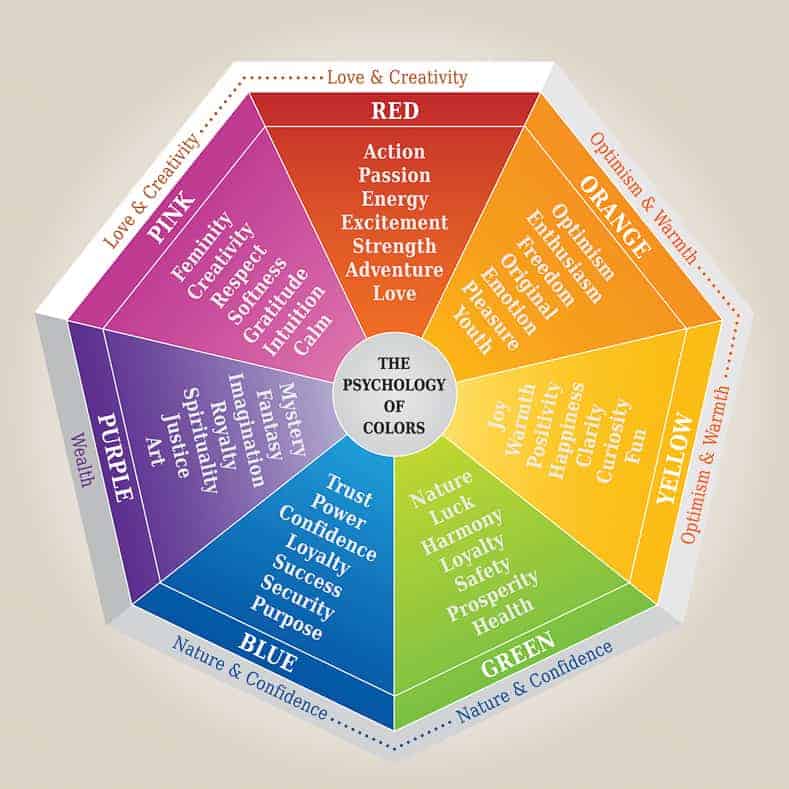
Understanding Color Psychology
Color psychology is a fascinating field that explores the impact that different hues can have on our emotions and behaviors. Understanding how colors can influence our mood can be a powerful tool in everything from marketing to interior design.
Did you know that certain colors can make us feel hungry? That’s right—restaurants often use warm tones like red and orange to stimulate our appetite. On the other hand, cool colors like blue are known for their calming effects, making them perfect for bedroom decor.
When it comes to selecting the perfect color for your project, consider the following tips:
– **Think about your audience:** Different colors have different meanings across cultures, so make sure you’re using hues that resonate with your target demographic.
- **Consider the context:** The same color can have different effects depending on the situation. For example, green might represent growth and renewal in a nature-inspired brand, but could signal illness in a medical setting.
In conclusion, color psychology is a powerful tool that can be harnessed to evoke specific emotions and behaviors in your audience. By understanding the impact of different colors, you can create designs that are not only visually pleasing, but also psychologically compelling.
Creating Emotional Connections through Color
Have you ever thought about how color can impact our emotions? It’s pretty wild to think that something as simple as a shade of blue or a pop of yellow can make us feel all the feels. Let’s dive into the world of colors and how they can create emotional connections like no other.
When it comes to evoking emotions through color, think about the vibrant red of a juicy apple or the calming blue of a clear sky. These colors have the power to stir up all kinds of feelings within us. Whether it’s excitement, tranquility, or happiness, color plays a key role in setting the mood.
Imagine walking into a room painted in a soft, soothing green. You instantly feel a sense of peace and harmony wash over you. Green is known for its calming properties, making it the perfect color choice for creating a tranquil atmosphere. Pair it with some leafy plants and you’ve got yourself a little slice of zen heaven.
On the flip side, a room drenched in bold, fiery red can spark feelings of passion and energy. It’s no wonder red is often associated with love and lust – it’s like wearing your heart on your walls! Whether you’re going for a cozy, intimate vibe or a fiery burst of energy, red is the way to go. Let’s paint the town red, shall we
Choosing the Right Color Palette for Your Brand
When it comes to branding, choosing the right color palette is crucial. You want colors that not only reflect the essence of your brand, but also appeal to your target audience. Here are some tips to help you find the perfect colors:
First thing’s first, think about the emotions you want your brand to evoke. Do you want to seem friendly and approachable? Go for warm colors like orange or pink. Looking to exude sophistication and luxury? Purple might be the way to go.
Consider your target demographic. What colors are they most drawn to? For millennials, blue is a popular choice. If you’re targeting a more mature audience, perhaps green would be a better fit.
Don’t forget to think about the practicality of your color choices. Will they work well across all platforms? Will they look good in print as well as online? Make sure your colors are versatile and can be used in a variety of situations.
Harnessing the Impact of Color in Logo Design
When it comes to logo design, color plays a crucial role in capturing your audience’s attention and conveying your brand message. Whether you’re aiming for a bold and vibrant look or a more subtle and sophisticated feel, the colors you choose can make or break your logo design. Here are a few tips on how to harness the impact of color in logo design:
First off, consider the psychology behind different colors and how they can influence people’s perceptions. For example, blue is often associated with trust and reliability, making it a popular choice for corporate logos. On the other hand, red can evoke a sense of urgency and excitement, making it ideal for brands in the food or retail industries.
Another important factor to keep in mind is color contrast. Pairing complementary colors together can create a visually striking logo that stands out from the competition. Experiment with different color combinations to see what works best for your brand – you might be surprised by the results!
Don’t be afraid to think outside the box when it comes to color choices for your logo. Sometimes, unconventional color schemes can make your brand more memorable and help you stand out in a crowded marketplace. Embrace your creativity and don’t be afraid to take risks – your logo design will thank you for it!
FAQs
Why is color important in logo design?
Well, color is like the spice of logo design – it adds flavor and brings your brand to life! Think of it as the Beyoncé of design elements.
How does color impact a person’s perception of a brand?
Color is like a Jedi mind trick – it can influence emotions, memories, and even purchasing decisions. Use it wisely, young Jedi.
What colors should I use for my logo to convey trustworthiness?
Go for the classic blues – they’re like the Clark Kent of colors, cool, calm, and totally trustworthy.
Can different colors evoke different emotional responses?
Absolutely! Reds are like the firecracker of colors – they bring out passion and excitement, while greens are more Zen and calming, like a spa day for your eyeballs.
Should I consider cultural differences when choosing colors for my logo?
Definitely! What works in one country might not work in another. Take the French, for example - they love their blues, whites, and reds, but throw in a little yellow and it’s a whole different story. Vive la différence!
Color Your Logo World!
Now that you’ve learned about the psychological power of color in logo design, you’re ready to unleash your creativity and make your brand stand out from the rest! Remember, the colors you choose can communicate emotions, evoke memories, and even influence purchasing decisions. So go ahead, paint your logo canvas with the vibrant hues of success and watch your brand shine brightly in the competitive jungle of the business world. Happy logo designing!


