Have you ever stopped to think about the power that color holds in the world of logo design? It’s like that one friend who always knows how to make an entrance – bold, vibrant, and impossible to ignore. So, if you’re ready to unleash the influence of color in your logo designs, grab your sunglasses and dive headfirst into the rainbow of possibilities. Let’s paint the town (and your brand) red, yellow, blue, or whatever color tickles your fancy!
Designing an Eye-Catching Logo with Color Psychology
Imagine creating a logo that not only catches the eye but also speaks to the viewer on a subconscious level. With the right color choices, you can convey emotions, create associations, and ultimately make your brand unforgettable. Let’s dive into the world of color psychology and how it can help you design an eye-catching logo that stands out from the rest.
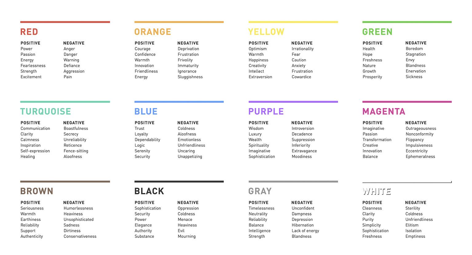
First things first, you need to understand the basics of color psychology. Different colors evoke different emotions and associations, so choosing the right palette is crucial. Here are a few key tips to keep in mind:
- Red: Bold and passionate, red is perfect for grabbing attention and conveying energy.
- Blue: Trustworthy and calming, blue is a great choice for building credibility and reliability.
- Yellow: Friendly and optimistic, yellow can bring a sense of cheerfulness and positivity to your logo.
Next, think about the overall message you want your logo to convey. Are you a fun and vibrant brand, or do you want to come across as sophisticated and professional? By aligning your color choices with your brand personality, you can create a cohesive and memorable logo that resonates with your target audience.
So, don’t be afraid to play around with color combinations and see which ones spark joy (or fear, depending on your brand vibe). With a little bit of color psychology know-how, you can design a logo that not only catches the eye but also leaves a lasting impression on anyone who sees it.
Choosing the Right Color Palette to Communicate Brand Identity
When it comes to choosing the right color palette for your brand, it’s important to remember that colors are like the Spice Girls of your brand identity – they each bring their own unique vibe and personality to the table. Just like deciding which Spice Girl is your favorite (we all know it’s clearly Sporty Spice), picking the perfect colors for your brand requires careful consideration.
First things first, think about the emotions you want your brand to evoke. Are you aiming for a sense of trustworthiness and professionalism? A navy blue and gold color scheme might be right up your alley. Want to show off your creativity and originality? Play around with bold and vibrant hues like magenta and lime green.
Remember, your color palette should be a reflection of your brand’s personality and values. Whether you’re going for a classic and timeless look or a bold and edgy vibe, make sure your colors are sending the right message to your audience.
So, go ahead and channel your inner Pantone guru – mix and match those colors until you find the perfect palette that perfectly communicates your brand’s identity. And who knows, maybe your color choices will be so on point that even the Spice Girls would approve.

Utilizing Color Theory to Evoke Specific Emotions in Consumers
Color theory isn’t just about making things aesthetically pleasing – it’s a powerful tool for manipulating the emotions of consumers. So, why not use it to your advantage? Here are some color combinations that will make your customers feel all the feels:
- Red + Black: This combination screams passion and excitement. Use it to convince your customers that they absolutely need that new product right this second. Bonus points if you add some flaming hot Cheetos to the mix.
- Green + White: Feeling a little eco-friendly? This combo will make your customers feel calm, peaceful, and ready to hug a tree. Just don’t be surprised if they start composting their leftovers in your store.
- Blue + Yellow: Hello sunshine! This cheery combination will make your customers feel happy, optimistic, and ready to take on the world. Just be prepared for an influx of customers bursting into song and dance in your store.
Remember, the key to evoking specific emotions in your customers is to think outside the box. So go ahead, experiment with different color combinations and watch as your customers’ emotions go on a rollercoaster ride – just make sure you have some emotional support llamas on standby.

Establishing a Brand’s Personality Through Strategic Color Selection
When it comes to establishing your brand’s personality through color selection, it’s essential to choose wisely. After all, you want to make sure your brand is sending the right message to your target audience. Here are some tips to help you nail down the perfect color scheme:
First things first, consider the emotions you want your brand to evoke. Are you going for a bold and energetic vibe? Then vibrant shades like red or orange may be the way to go. Looking for a more calming and sophisticated feel? Opt for blue or green.
Next, think about your target audience. What colors resonate with them and align with their preferences? For example, if you’re targeting a younger demographic, vibrant and trendy colors like pink or purple may be more appealing. If your audience is more mature, classic and timeless colors like black or brown could be a better fit.
Remember, consistency is key. Once you’ve chosen your brand colors, make sure to use them consistently across all of your branding materials. This will help reinforce your brand’s personality and make it more recognizable to your audience. So go ahead, have fun with color, and let your brand’s personality shine!

Maximizing the Impact of Color Contrast for a Memorable Logo Design
When it comes to creating a memorable logo design, color contrast can be your best friend. By maximizing the impact of color contrast in your design, you can make sure your logo stands out from the crowd and leaves a lasting impression on potential customers.
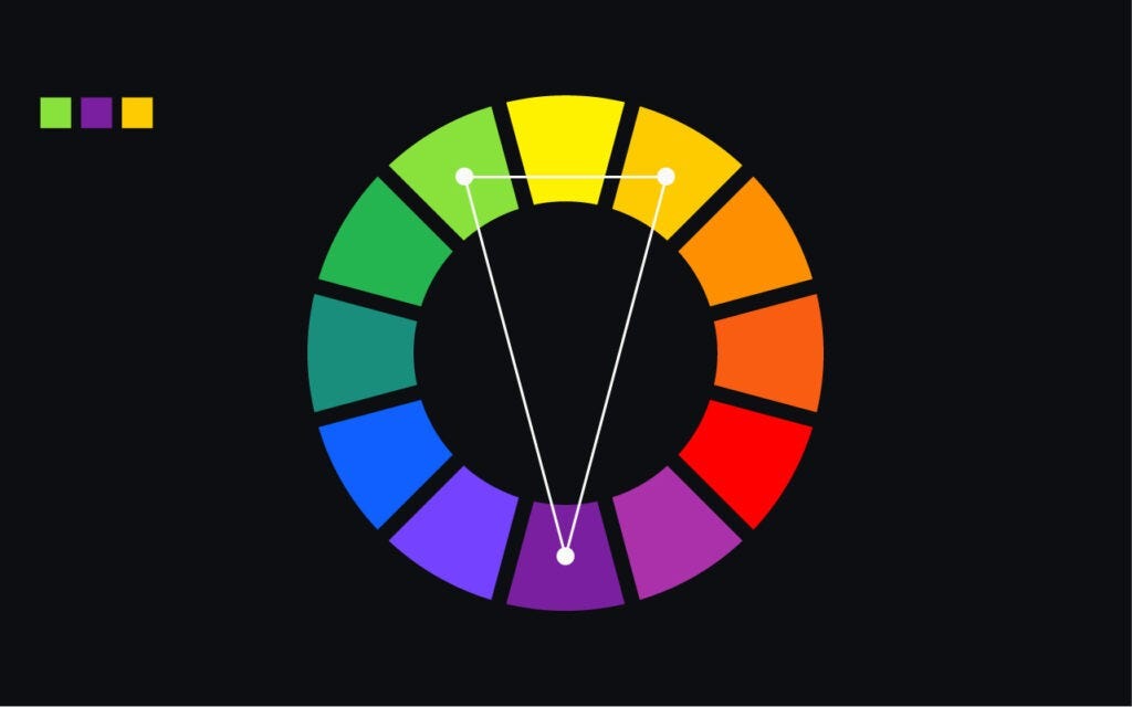
One way to make the most of color contrast is to choose colors that are on opposite ends of the color wheel. This will create a bold and eye-catching look that will grab people’s attention. Think about pairing vibrant colors like blue and red or green and orange for maximum impact.
Another trick is to use color contrast to emphasize certain elements of your logo. For example, you could make your company name or a key symbol stand out by using a bold, contrasting color. This will draw the eye to the most important parts of your design and help people remember your brand.
Don’t be afraid to get creative with your color choices. Experiment with different combinations and see what works best for your logo. Remember, the goal is to create a design that is not only visually appealing but also memorable. So play around with color contrast and find a combination that truly pops!
Inciting Action and Engagement Through Thoughtful Color Choices
Ready to take your designs to the next level? It all starts with choosing the right colors to incite action and engagement in your audience. Don’t just throw together a mishmash of hues – put some thought into it! Here are a few tips to get you started:
First things first, consider the psychology of color. Different colors evoke different emotions and reactions, so choose wisely. For example, red can create a sense of urgency or excitement, while blue often conveys trust and professionalism. Think about how you want your audience to feel and pick colors that will help you achieve that.
Next, don’t forget about contrast. If everything in your design is the same color, it’s going to be pretty boring. Use contrasting colors to make important elements stand out and draw the viewer’s eye exactly where you want it to go. A pop of yellow against a background of purple can make a world of difference!
Remember, less is more. You don’t need to use every color in the rainbow to make an impact. Stick to a few key colors that work well together and complement each other. A well-chosen palette can do wonders for your design and make it much more visually appealing. So next time you’re picking colors for a project, take a moment to think about how they can help you incite action and engagement – your audience will thank you!
FAQs
What role does color play in logo design?
Color in logo design is like seasoning in cooking – it adds flavor, vibrancy, and can even bring out the best in your brand’s personality. Choosing the right colors can evoke certain emotions, convey specific messages, and ultimately make your logo memorable.
How can I choose the perfect color scheme for my logo?
When it comes to choosing the perfect color scheme for your logo, think about the message you want to convey. Do you want to appear trustworthy and professional? Go for blues and blacks. Want to come across as energetic and fun? Think reds and yellows. Just make sure the colors represent your brand accurately.
Is it okay to use multiple colors in a logo?
Absolutely! Using multiple colors can add depth and complexity to your logo design. Just make sure the colors complement each other well and don’t overwhelm the overall design. A good rule of thumb is to stick to a maximum of three colors to keep things cohesive.
What are some common color associations in logo design?
Certain colors have universal associations that can help convey specific messages. For example, green is often associated with nature, health, and growth. Blue can evoke feelings of trust, security, and professionalism. It’s important to consider these associations when choosing colors for your logo.
Can I change the color of my logo later on?
Of course! While consistency is key in branding, there’s always room for evolution. If you feel like your logo’s color scheme no longer represents your brand accurately, don’t be afraid to make a change. Just be sure to update all your branding materials to maintain a cohesive look.
Color Your World with Logo Design
Congratulations, you are now armed with the power of color in logo design! Go forth and unleash your creativity onto the world. Remember, just like a great outfit, the right colors can make all the difference. So go ahead, paint the town red (or blue, or green, or yellow…you get the idea) with your logo designs. The world is your canvas, so color it boldly and beautifully!


