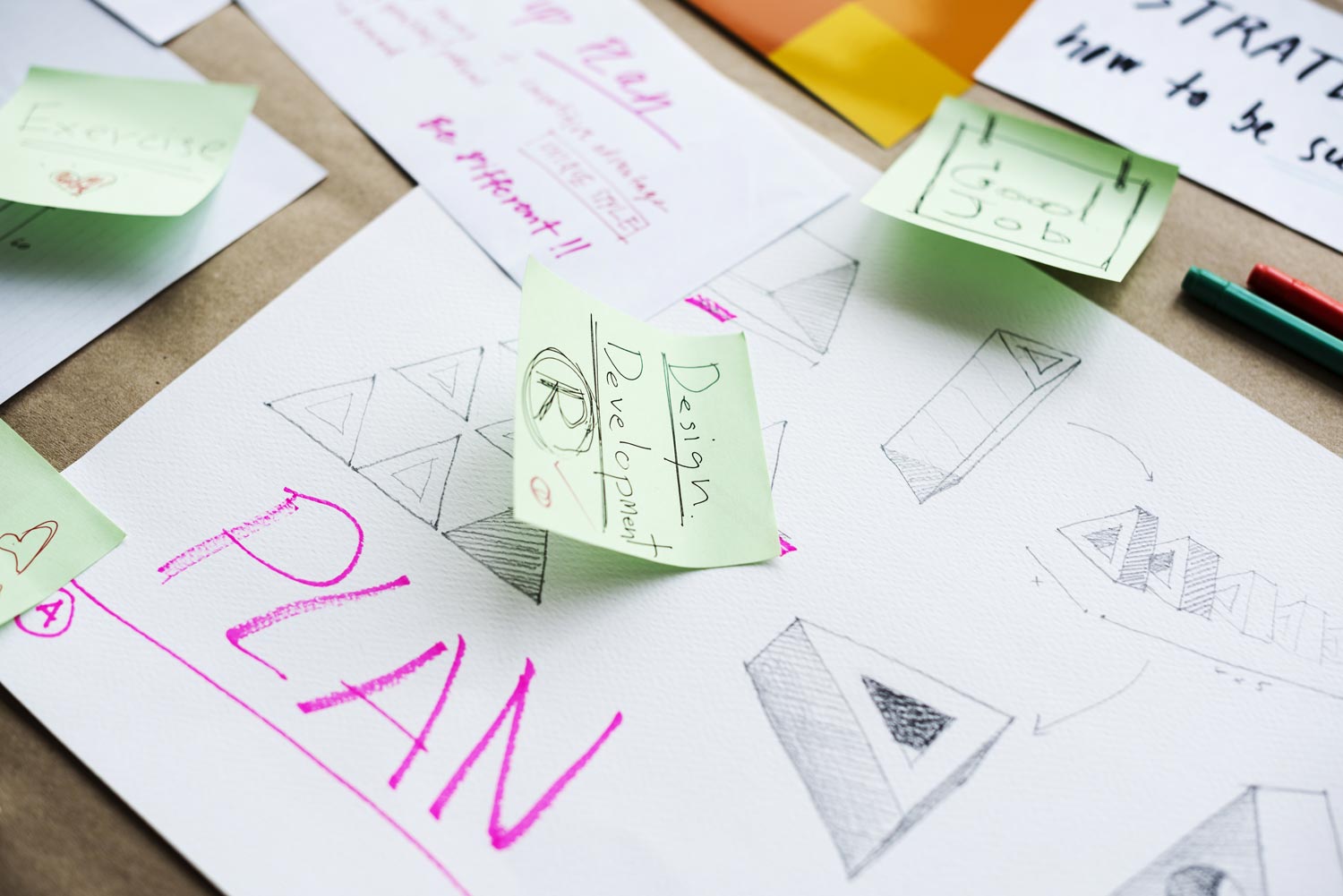
A logo is the core of every branding identity. It is extremely important to create a strong mark out of the gates and avoid logo design mistakes (that often prove to be costly down the road). Once a logo is connected to your business it is a fully formed representation of everything that you stand for. Let’s walk through 8 of the more popular errors and discuss how they can be avoided.
1) Poor typography
The typography of a logo is the style in which letters are written and arranged. Many businesses fall victim to poor typography as they select overly intricate, unusual styled elements. While it’s always great to be unique and showcase an appreciation for design, readability must always remain the priority. Your target audience will ultimately set the stage for what you can realistically deploy, but when in doubt go with a clean layout that is easy for your audience to comprehend.
2) Selecting the wrong font
Fonts give different personalities to logos. They can reflect an array of characteristics: playful, traditional, strong, bold, feminine, delicate, and many more. Choosing a font for your business name is just as important as choosing a representative image. You’ll want to make sure that the text style, icon, and general feel of your brand all unite harmoniously.
3) Using more than two fonts
This is another case where businesses sometimes go over the top with different graphic elements (trying to impress their audience). When more than two fonts are introduced into a logo, they start to compete with one another. This can visually overwhelming the buyer without adding any true value.
4) Choosing a complex design with too many elements
A complex logo will usually take more effort from your audience to be understood and remembered. Consider some of the bigger companies out there (Target, Wal-Mart, Apple, etc): their logos are extremely simple, and as a result easy to recognize. In addition to this, simple logos reproduce well under a variety of print conditions (small size, grayscale, etc). If you shrink down your logo to fit on your social media page will you still be able to read it? If the answer is no, your design might need to be reconsidered.
5) Relying too much on color
Color should enhance a design, not be the sole means of support. Line work is imperative when it comes to creating a lasting image, and this will ensure that you logo looks great even when in black and white. Sometimes people will print your logo on a standard printer and if your logo isn’t recognizable then that’s a missed opportunity.
6) Creating a compilation of ready-made art
The DIY approach may save you money early on, but creating your logo from pre-made art (like clipart) can really damage a brand in the long run. More often than not these cookie cutter designs will appear cheap, and just look sloppy overall. First impressions are everything, so why sacrifice possible conversions/sales due to a poor brand image?
7) Imitating the design of another company
This may seem like a time and money saving shortcut (for budget strapped startups), but it’s even more damaging than using pre-made art. Copying another company’s design will not only come off as sleazy, but it will likely land you in hot water and even a lawsuit. Every business deserves to be treated and presented as a unique concept. It’s also important to respect the time and effort others have put in their own.
Conclusion
Creating an incredible logo takes a lot of brainstorming, creative development, and testing… but it is always worth the investment. Your business will be presented with this logo for years to come and this is what your audience will first notice about you and your work ethic. Set a positive first impression and get your branding started on the right foot!


