What do McDonald’s golden arches, Coca-Cola’s vibrant red label, and Starbucks’ iconic green siren all have in common? Besides being household names, these logos harness the psychological power of color to make you crave a Big Mac, reach for a refreshing soda, or splurge on a fancy latte. Yes, the secret sauce to logo design lies in the rainbow of emotions that colors can evoke in our brains. So buckle up, as we take a colorful trip into the wild world of logo psychology!
The Role of Color Psychology in Logo Design
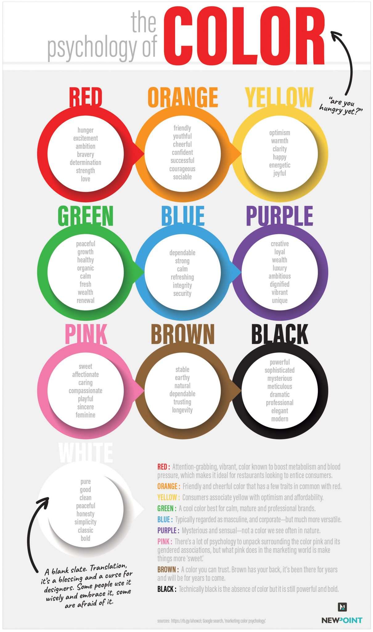
When it comes to logo design, color psychology plays a crucial role in conveying messages and evoking emotions. Here’s a list of some common colors used in logos and their associated meanings:
- Red: Known for representing passion, energy, and excitement. It’s the color of love and danger - talk about a rollercoaster of emotions!
- Blue: Often used to convey trust, security, and reliability. It’s like the cozy blanket you can always count on when you need a comforting hug.
- Yellow: Symbolizes happiness, optimism, and sunshine. It’s like a burst of joy that puts a smile on your face – just like finding money in your jacket pocket!
- Green: Represents growth, harmony, and nature. It’s like a peaceful walk in the park, surrounded by chirping birds and fluttering butterflies.
So, next time you’re designing a logo, make sure to choose colors wisely to elicit the right emotions and connect with your target audience in a meaningful way. After all, a logo is more than just a pretty picture - it’s a story waiting to be told with every color choice you make!

Impact of Different Colors on Consumer Perception
So, you’re in the business of selling products and you want to make sure your customers see your brand in the best light possible. Well, did you know that the color of your packaging can play a huge role in how consumers perceive your products? It’s true! Let’s break it down:
First up, blue. This color is often associated with trust, stability, and calmness. So, if you’re looking to build a relationship of trust with your customers, consider incorporating some blue into your packaging. Just don’t go overboard and make everything blue – no one wants to feel like they’re drowning in a sea of trustworthiness.
Next, we have red. Ah, red – the color of passion, excitement, and danger. If you want your customers to feel a rush of adrenaline when they see your products, red might be the way to go. Just make sure they don’t mistake your products for a fire alarm and start running for the exits.
And finally, we come to green. Green is often associated with nature, health, and wealth. So, if you want your customers to feel like they’re making a smart, environmentally-friendly choice, green might be the color for you. Just be careful not to overdo it and give off a “Soylent Green” vibe – no one wants to feel like they’re eating people, even if it is good for the environment.

Symbolism and Emotion: How Color Choices Affect Brand Identity
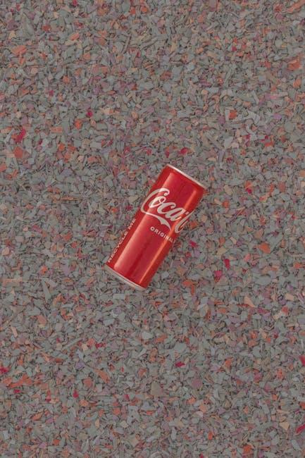
Color choices play a crucial role in shaping a brand’s identity. From the calming blues of Facebook to the fiery reds of Coca-Cola, each color evokes a specific emotion and feeling in consumers’ minds. Understanding this psychology can help businesses create a strong and memorable brand that resonates with their target audience.
When it comes to branding, every shade matters. Here are some fun examples of color symbolism in branding:
- Red: Often associated with passion and excitement, red is a popular choice for brands looking to convey energy and urgency. Think of brands like Coca-Cola, Netflix, and Target.
- Green: Green is the color of nature and growth, making it a great choice for eco-friendly and sustainable brands. Companies like Whole Foods, Starbucks, and Spotify use green to convey a sense of health and well-being.
- Yellow: Bright and cheerful, yellow is the color of optimism and creativity. Brands like McDonald’s, Best Buy, and IKEA use yellow to grab attention and create a sense of fun.
By choosing the right colors for your brand, you can create a lasting emotional connection with consumers. So, the next time you’re brainstorming your brand’s color palette, remember that every hue carries its own unique message and can shape how your brand is perceived in the marketplace.

Creating Brand Recognition Through Strategic Color Selection
Color selection is no joke when it comes to brand recognition. It’s like choosing the outfit for your brand – you wouldn’t show up to a fancy event wearing plaid with stripes, would you?
So how do you pick the right colors to represent your brand? Here are some tips:
- Know Your Audience: Think about who you’re trying to appeal to. Are they bold and edgy or sophisticated and classic? Choose colors that will resonate with your target demographic.
- Research Your Competition: You don’t want to be a copycat, but you also don’t want to blend in. Look at what colors your competitors are using and try to stand out in a unique way.
- Consider Color Psychology: Colors evoke different emotions and perceptions. For example, blue is often associated with trustworthiness and professionalism, while red can symbolize passion and energy. Choose colors that align with your brand’s message.
Remember, your brand colors are like your signature – they should be instantly recognizable and make a statement. So choose wisely and paint the town (or at least your brand) with the perfect hues!

Analyzing the Psychological Response to Logo Colors
The psychology of color is a fascinating topic, especially when it comes to analyzing the impact of colors used in logos. Let’s take a closer look at how different colors can evoke specific psychological responses:
1. Red: This color is known to grab attention and convey a sense of urgency. It can also stimulate appetite, which is why many fast-food chains use red in their logos.
2. Blue: Blue is often associated with trust and reliability. It can create a sense of calm and security, making it a popular choice for banks and financial institutions.
3. Yellow: Yellow is a cheerful and energetic color that can evoke feelings of happiness and positivity. It is often used by brands that want to convey a sense of optimism and warmth.
4. Green: Green is commonly associated with nature, growth, and health. It can evoke a sense of balance and harmony, making it a popular choice for eco-friendly and organic brands.
The Subtle Differences in Color Shades and Their Effects on Brand Image
When it comes to building a brand image, choosing the perfect color shade is crucial. Did you know that slight variations in color can evoke different emotions and perceptions in consumers? It’s like finding the perfect shade of lipstick – one wrong move, and you could end up looking like a clown.
Take the color blue, for example. Dark blue exudes trust and stability, making it perfect for tech companies wanting to appear reliable. But switch to a lighter shade, and suddenly you’re channeling creativity and innovation. It’s like a chameleon color, able to blend into any brand image.
And let’s not forget about the color green. A dark forest green represents wealth and luxury, while a lighter shade brings thoughts of nature and tranquility. So, whether you want to be seen as a high-end brand or a zen retreat, choosing the right green is essential to your overall image.
- Dark blue: trust and stability
- Light blue: creativity and innovation
- Dark green: wealth and luxury
- Light green: nature and tranquility
FAQs
Why do certain colors evoke specific emotions in people?
Well, you see, colors are like little mood influencers. Blue is all chill and calming like a summer breeze, while red is fiery and passionate like your grandma’s famous chili.
How can businesses use the psychology of color to their advantage in logo design?
Think of your logo as the charmer at a party - you want it to attract the right kind of attention. Using warm colors like yellow or orange can evoke feelings of energy and optimism, perfect for a vibrant brand image. Meanwhile, cool colors like green or blue can convey a sense of trust and reliability, ideal for more serious businesses.
Can the same color have different meanings in different cultures?
Absolutely! It’s like a cosmic game of telephone. In one culture, white might symbolize purity and innocence, while in another it could represent mourning and death. So, it’s always a good idea to do your homework before slapping any old color on your logo.
Are there any colors that are universally appealing in logo design?
Oh child, let me tell you about the wonders of the color blue. It’s like the Beyoncé of the color wheel - universally loved and adored. So, if in doubt, just go blue and watch the magic happen.
Color Your World
So there you have it – the colorful world of logo design. From the calming blues to the energetic reds, the psychological influence of color is a powerful tool in creating a memorable brand identity. So next time you’re designing a logo, remember to think about the message you want to convey and choose your colors wisely. As they say, the right shade can paint a thousand words!


