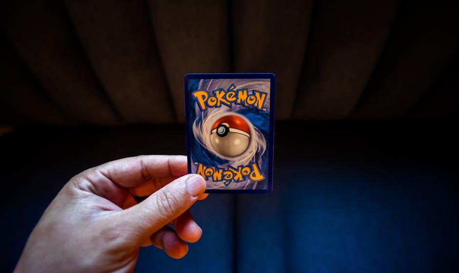
Are you feeling blue (or maybe red, or green)? Well, buckle up and get ready to dive into the vibrant world of logo design and the power of color! In this article, we’ll show you just how much strategic color choices can make or break a brand’s identity. So grab your rainbow palette and let’s get colorful!
Understanding color psychology in logo design
So you want to learn about color psychology in logo design, huh? Well buckle up, because we’re about to dive deep into the weird and wonderful world of colors and how they can mess with our brains.
First things first, **red**. It’s the color of passion, power, and sometimes anger (watch out, bullfighters). If you want your logo to scream “look at me!” then throw some red in there and watch heads turn like you’re walking down a fashion runway.
Next up, **blue**. Ah, the color of tranquility and trust. Want people to feel calm and collected when they see your logo? Just add a splash of blue and suddenly everyone will want to spill their deepest secrets to you.
- Yellow – the color of happiness and sunshine. Throw some yellow into your logo design and watch as people suddenly feel like they’re frolicking in a field of daisies.
- Green – the color of nature and money. Want your logo to feel fresh and environmentally friendly? Slap some green on there and suddenly everyone will want to recycle, compost, and maybe even start a community garden.
So there you have it, folks. Color psychology in logo design: it’s like a magical rainbow of emotions and subconscious triggers. Use it wisely, and who knows? You might just become the next big thing in the design world.

Choosing the right color for your brand identity
When it comes to choosing the perfect color for your brand identity, it’s not just about picking your favorite shade of the rainbow. You need to consider the psychology behind different colors and how they will resonate with your target audience. Here are some tips to help you make the right choice:
- Consider the emotions you want to evoke. Do you want customers to feel calm and serene (think blues and greens) or energetic and vibrant (think reds and yellows)?
- Look at your competitors. You don’t want to blend in with the crowd, so choose a color that sets you apart while still staying on brand.
- Think about the versatility of the color. Will it look good on everything from your logo to your website to your marketing materials?
Remember, color is just one piece of the branding puzzle. You also need to think about your messaging, tone, and overall visual identity. But getting the right color can definitely help you stand out in a sea of competitors. So go forth and paint the town (or your brand) red, blue, green, or whatever color speaks to you!

The impact of color on consumer perception
Have you ever wondered why you’re drawn to certain products over others? Well, it turns out that color plays a major role in consumer perception. In fact, studies have shown that 85% of consumers say color is their primary reason for buying a product. That’s right, folks – it’s all about the hue!
So, what exactly does each color convey to consumers? Let’s break it down:
- Red: This color is associated with energy, passion, and urgency. It’s no wonder why so many sales signs are painted red - they make us want to buy NOW!
- Blue: Trust, security, and peace are the key emotions evoked by the color blue. That’s why so many financial institutions use this color in their branding – because who doesn’t want to feel safe with their money?
Next time you’re shopping, pay attention to the colors around you. You might be surprised at how much they influence your buying decisions. Remember, it’s not just about the product itself – it’s about the color that’s selling it to you!

Creating emotional connections through strategic color choices
When it comes to selecting colors for your brand, it’s not just about picking your favorite shade of bubblegum pink or neon green. The colors you choose can actually evoke specific emotions in your audience.
By strategically selecting colors that resonate with your target demographic, you can create a deep emotional connection with your customers. Think about it – who wouldn’t feel warm and fuzzy inside seeing a website that uses a calming shade of seafoam green or a vibrant pop of sunshine yellow?
On the flip side, imagine stumbling upon a website that uses a muddy brown color scheme – it might leave you feeling less than enthusiastic about making a purchase. That’s the power of color psychology, folks!
So, don’t underestimate the impact of color choices on your brand. Take the time to think about the emotions you want to evoke in your customers, then get creative with your color selections. Your brand will thank you!
Optimizing brand recognition through color strategy
When it comes to optimizing brand recognition, color strategy is key! Choosing the right colors can help your brand stand out in a crowded market and make a lasting impression on your audience. Whether you’re a new startup looking to make a splash or an established company looking to revamp your image, using color strategically can help take your brand to the next level.
So, how can you use color to optimize your brand recognition? Well, for starters, consider the psychology of color. Different colors can evoke different emotions and associations, so it’s important to choose colors that align with your brand’s values and messaging. For example, blue is often associated with trust and reliability, while red can convey energy and passion.
Another way to optimize your brand recognition through color strategy is by creating a cohesive color palette. Consistency is key when it comes to building brand recognition, so make sure to choose a set of colors that work well together and use them across all of your marketing materials. This will help create a strong visual identity that people will associate with your brand.
Remember, color is a powerful tool when it comes to branding, so don’t be afraid to get creative and think outside the box. Whether you’re playing it safe with classic colors or pushing the boundaries with bold, eye-catching hues, finding the right color strategy for your brand can help set you apart from the competition and leave a lasting impression on your audience.
Implementing color theory in logo design
Color theory is like that friend who always knows the perfect outfit for every occasion – indispensable and oh-so stylish. In logo design, understanding color theory can take your brand from drab to fab in no time. So, buckle up, my fellow design enthusiasts, and let’s dive into the colorful world of logo design!
1. **The Basics**: Remember those good old days in kindergarten when you had to memorize your color wheel? Well, turns out that knowledge is actually useful in the real world. Colors can be broadly categorized into primary (red, blue, yellow), secondary (purple, green, orange), and tertiary (the fancy middle children), each bringing its own flavor to the design table.
2. **The Psychology of Color**: Did you know that the color red can evoke emotions of passion and excitement, while blue is all about trust and tranquility? It’s like having your own secret language to speak to your audience. Understanding the psychology behind colors can help you convey the right message without saying a word.
3. **Color Combinations**: Ah, the age-old question of which colors go together like peanut butter and jelly. Fear not, dear designers, for there are tried-and-tested color combinations that never fail to impress. From complementary (opposite on the color wheel) to analogous (neighbors on the wheel), the possibilities are endless.
So, throw on your color theory cap, unleash your inner artist, and let the rainbow guide you to logo design greatness. Remember, when in doubt, just add more color – you can never have too much of a good thing!
The role of color in building brand loyalty
When it comes to building brand loyalty, color plays a crucial role that often goes unnoticed. Think about it – when you see that iconic red and white logo, you immediately know you’re in for a sweet treat. But why does color have such power over our buying decisions? Let’s break it down.
First off, color has a way of triggering emotions and memories that can deeply impact our perception of a brand. For example, when you see the color green, you might associate it with nature, growth, and eco-friendliness. So, if a brand uses green in their logo or packaging, you’re more likely to trust them for their sustainability efforts.
Secondly, color can also help a brand stand out from the competition. Just think about how easy it is to spot a bright yellow Ferrari on the road – you can’t help but turn your head! By choosing a unique and eye-catching color scheme, a brand can ensure that they stay top of mind for consumers.
And let’s not forget about the power of consistency. By sticking to a specific color palette across all touchpoints, a brand can create a sense of familiarity and trust with their audience. So, the next time you see that familiar shade of blue, you’ll know exactly where to turn for your morning caffeine fix.
FAQs
How important is color in logo design?
Color is the Beyoncé of the design world—it’s powerful, commanding attention, and making everything look a million times better. In logo design, color sets the mood and tone of your brand, impacting how customers perceive your business.
Can certain colors evoke specific emotions in consumers?
Absolutely! Just like that one ex who always made you see red, colors can evoke certain emotions in consumers. For example, blue can symbolize trust and dependability, while red can evoke feelings of passion and excitement.
What factors should be considered when choosing colors for a logo?
When choosing colors for your logo, you need to think about your target audience, the message you want to convey, and the industry you’re in. For example, a funeral home probably shouldn’t use neon green in their logo.
Can using the right colors in a logo increase brand recognition?
Definitely! Think of it this way: you wouldn’t show up to a job interview wearing a neon pink suit, would you? Using the right colors in your logo can help customers remember and recognize your brand more easily.
Are there any color combinations that work particularly well in logo design?
Oh, absolutely! Some color combinations are like peanut butter and jelly—they just work together. Complementary colors, such as blue and orange or purple and yellow, can create a visually appealing contrast in your logo.
How can I ensure my logo stands out using color?
To make your logo stand out using color, don’t be afraid to get a little bold and adventurous. Look at what your competitors are doing and then do the opposite. Remember, in a world full of black and white logos, be the neon pink unicorn.
In Conclusion: Let Your Colors Fly!
Thank you for taking the colorful journey with us as we explored the strategic power of color in logo design. Remember, when it comes to choosing the right hues for your brand, don’t be afraid to think outside the crayon box! Whether you’re feeling blue, seeing red, or tickled pink, just remember that the right color can make all the difference. So go ahead, paint the town (and your logo) whatever shade speaks to you. Your brand will thank you for it!


