Have you ever wondered why certain logos make you feel a certain way? Or why you’re drawn to some brands over others? Well, buckle up, because we’re diving into the world of color psychology in logos. Get ready to unleash your inner design detective and decode the hidden messages behind your favorite brands’ color choices. Grab your magnifying glass and put on your thinking cap, because we’re about to unravel the mysterious world of logo design. Let’s color outside the lines and see what secrets we uncover!
Understanding the Psychology of Color
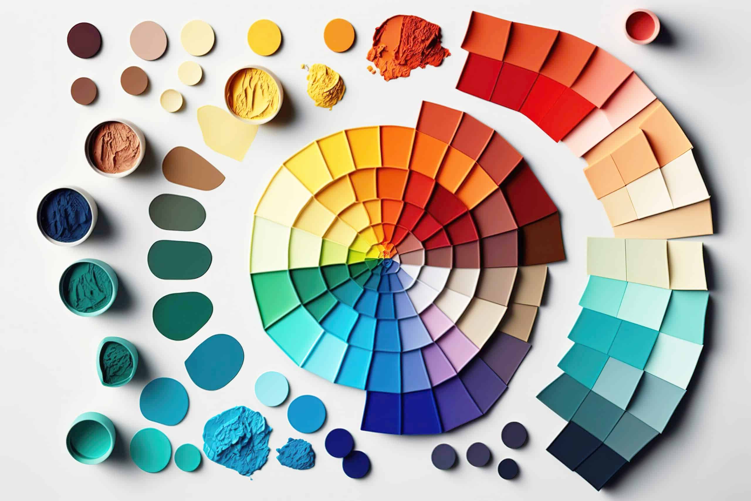
Color psychology is a fascinating field that explores the emotional and psychological impact that different colors can have on individuals. It’s like dressing up your brain in a rainbow jumpsuit and watching it do the electric slide!
Have you ever noticed how red makes you feel passionate and energized, while blue makes you feel calm and peaceful? It’s like each color has its own special superpower that can either lift you up or bring you down faster than a rollercoaster with a missing track.
Just like how you wouldn’t wear bright yellow to a funeral (unless you’re trying to make a bold fashion statement, in which case, go you!), can help you make informed choices in everything from interior design to branding. It’s like having a secret weapon in your back pocket that you can whip out whenever you need a mood boost.
So next time you’re feeling blue, why not surround yourself with some vibrant yellows and oranges to bring a little sunshine into your life? Or if you need a moment of peace and relaxation, wrap yourself in a cozy blanket of blues and greens. Remember, the world is your crayon box – so go ahead and color outside the lines!
Using Color to Evoke Emotions in Logo Design
When it comes to logo design, color plays a crucial role in evoking emotions from viewers. It’s not just about making things look pretty; it’s about tapping into people’s subconscious and making them feel things they didn’t even know they could feel. Sounds powerful, right? Here are some ways you can use color to turn your logo into an emotional rollercoaster:
First up, let’s talk about blue. This color is known for its calming and trustworthy vibes. Want your brand to exude professionalism and reliability? Blue is your go-to color. Just think of all those corporate logos out there rocking the blue hue – they’re not just doing it because it looks good, they’re doing it because they want you to trust them with your life savings.
Next, let’s dive into the fiery world of red. Red is the color of passion, power, and sometimes danger. Want your logo to scream “look at me!”? Slap on some red and watch heads turn. It’s like wearing a flashy red dress to a black tie affair – you might raise some eyebrows, but hey, at least you’re making a statement.
And don’t forget about green – the color of nature, growth, and wealth. Want people to associate your brand with environmental friendliness? Green is your best bet. It’s like hugging a tree while counting your money – a winning combination if you ask me. So go ahead, play around with colors and watch the emotions flow!

The Impact of Color on Brand Perception
Color plays a crucial role in shaping how we view and interact with brands. It can evoke certain emotions, convey specific messages, and ultimately influence our perception of a company. Let’s dive into the colorful world of branding and explore how different shades can make or break a brand’s image.
When it comes to branding, choosing the right colors is like picking out the perfect outfit for a first date – you want to make a good impression! Have you ever noticed how fast-food chains tend to use bold, bright colors like red and yellow? That’s not a coincidence – those colors are known to stimulate hunger and grab people’s attention. It’s like they’re saying, “Hey, come on in and feast on some greasy goodness!”
On the flip side, luxury brands often opt for more subdued, elegant colors like black, white, and gold. They’re all like, “We’re so fancy, you already know!” These colors convey sophistication and exclusivity, giving off an air of high-class elegance. It’s like they’re whispering in your ear, “Only the elite shop here, darling.”
So, next time you’re shopping or scrolling through your favorite websites, pay attention to the colors being used. Each hue has a story to tell and a message to convey. Whether it’s a bold statement or a subtle whisper, color has the power to shape how we perceive and connect with brands. So, the next time you see a brand’s logo or website, don’t just look – feel the colors and let them paint a picture in your mind!

Choosing the Right Colors for Your Logo
When it comes to choosing the perfect colors for your logo, it’s important to think carefully about what message you want to convey to your audience. Remember, color is not just about aesthetics, it’s also about psychology! Here are a few tips to help you pick the right hues for your logo:
Consider your target audience: Are you targeting kids? Maybe go for bright, playful colors like yellow and orange. Trying to attract a more sophisticated crowd? Stick to classy colors like navy blue and gold.
Stay on brand: Make sure the colors you choose align with your brand’s personality and values. If you’re a health and wellness company, opt for calming greens and blues. If you’re a tech startup, maybe go for sleek silvers and blacks.
Think about contrast: You want your logo to stand out, so make sure the colors you choose contrast well with each other. Avoid using colors that blend together or wash out when printed or displayed online. A bold color palette will make your logo pop!

Color Combinations for Effective Branding
When it comes to creating a successful brand, choosing the right color combinations is key. You want your brand to stand out, make an impact, and be memorable. So, why settle for boring old black and white when you can spice things up with some vibrant and eye-catching hues?
One winning color combination that never fails to make a statement is blue and yellow. This dynamic duo exudes confidence, creativity, and optimism. Just think of the iconic blue and yellow logo of a certain Swedish furniture store – it’s impossible to ignore! So, if you want your brand to radiate positivity and energy, look no further than blue and yellow.
Another foolproof color combination for effective branding is red and white. This classic pairing is bold, timeless, and commands attention. Think of all the successful brands that have embraced this color combo – Coca-Cola, Target, and Netflix, just to name a few. So, if you want your brand to evoke passion, purity, and power, red and white is the way to go.
And let’s not forget about the magical mashup of purple and green. This whimsical pairing is perfect for brands that want to stand out from the crowd and exude a sense of creativity and uniqueness. So, if you want your brand to be seen as innovative, imaginative, and a little bit quirky, purple and green is the winning combination for you.
Using Color Theory to Create Memorable Logos
Color theory is like the secret sauce of logo design. It’s the magic ingredient that can take a logo from forgettable to unforgettable. By understanding the psychology behind different colors, you can create logos that resonate with your audience on a whole new level. Here are some tips for using color theory to create logos that pack a punch:
- Choose colors that express the personality and values of the brand. Think about what feelings you want to evoke - is it trust, excitement, or sophistication?
- Consider the cultural associations of different colors. For example, in Western cultures, red is often associated with passion and energy, while in some Asian cultures, it represents luck and prosperity.
- Pay attention to color combinations. Using contrasting colors can create visual interest and make your logo stand out. Just make sure they don’t clash like cats and dogs.
Remember, color is just one piece of the puzzle when it comes to logo design. It’s important to consider other elements like typography and shape to create a cohesive and impactful logo. So next time you’re designing a logo, don’t be afraid to get a little colorful!
FAQs
Why is it important to consider color psychology when designing a logo?
Because colors have superpowers! Just like how wearing a bright yellow raincoat can make a gloomy day seem a little bit sunnier, using the right colors in your logo can evoke specific emotions and perceptions from your audience. Choosing the right colors can help you communicate your brand’s personality and values effectively.
How do different colors in logos impact consumer perception?
Oh, they impact it big time! Green can make people think of nature and growth, red can evoke feelings of passion and excitement, and blue can bring about a sense of trust and reliability. Just like how your ex’s favorite color can trigger certain emotions, the colors in your logo can influence how consumers view your brand.
Is there a specific color that works best for all logo designs?
If only there was a one-size-fits-all color for logos! Unfortunately, choosing the right color for your logo depends on your brand’s identity and target audience. So, get ready to do some soul-searching and market research to find the color that speaks to your brand’s true essence.
Can using multiple colors in a logo be effective?
Who said you can’t have multiple lovers… I mean colors in your logo? Using multiple colors can add depth and richness to your logo design, but be careful not to go overboard like a unicorn in a paint factory. Make sure the colors work well together and complement each other to create a harmonious visual experience.
How can I choose the right colors for my logo if I’m colorblind?
Don’t worry, colorblind amigos, you’re not alone in this colorful world! There are plenty of tools and resources available online that can help you choose color combinations that work well together, even if you’re not a color expert. Just remember, it’s all about finding the right balance and contrast to make your logo pop!
In conclusion, remember to not go color-crazy with your logo design!
After all, you don’t want potential customers to see red, feel blue, or be green with envy. Stick to the tried-and-true principles of color psychology, and you’ll be well on your way to creating a logo that not only looks good, but also evokes the right emotions in your audience. Happy designing, and may your colors always be on point!


