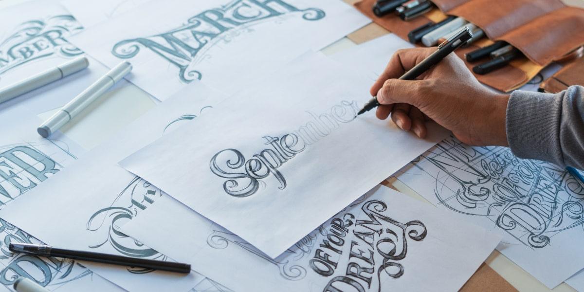
Welcome to the magical world of typography, where every curve, every line, and every flourish holds the power to make or break a brand. In this article, we will explore the art of crafting logos that leave a lasting impact through the use of cleverly chosen fonts and typographic elements. So grab your favorite typeface, loosen up those ligatures, and let’s embark on a typographic journey like no other!
Choosing the Right Font for Your Brand
So, you’re ready to choose the font for your brand. This decision is crucial! After all, the font you choose will say a lot about your brand – whether you want it to or not!
Here are a few tips to help you make the right choice:
- Personality: Your font should match the personality of your brand. Are you fun and quirky? Maybe go for a playful script font. Are you serious and professional? Opt for a sleek and simple sans-serif font.
- Readability: Your font should be easy to read. Nobody wants to strain their eyes trying to decipher your company name. Make sure your font is legible, no matter the size.
- Uniqueness: Stand out from the crowd! Choose a font that is unique to your brand and sets you apart from your competitors. Avoid using overused fonts like Comic Sans or Papyrus – nobody wants to be associated with those disasters!
Remember, your font is like the outfit your brand wears. It should be eye-catching, appropriate, and memorable. So choose wisely, and let your font do the talking for your brand!

Utilizing Typography to Communicate Your Brand’s Personality
Your brand is like that one friend who always wears the same t-shirt. Sure, it’s comfortable and familiar, but sometimes you need to shake things up a bit. And what better way to do that than through typography?
Typography is like the clothing for your brand’s personality. It can convey so much more than just words on a page – it can show your audience what your brand is all about. Are you fun and playful? Bold and edgy? Elegant and sophisticated? Let your typography do the talking.
But wait, there’s more! With the right typography, you can create a whole vibe for your brand. Imagine your brand as a party – what kind of music is playing? What are people wearing? What font would they be using? By choosing the right typography, you can set the mood and atmosphere for your brand, creating a memorable experience for your audience.
So next time you’re thinking about how to communicate your brand’s personality, don’t just stick with the same old t-shirt. Get creative with typography and let your brand shine in a whole new light.
Creating Timeless Logos with Classic Typography
In order to create timeless logos with classic typography, it’s important to remember the age-old saying: “Keep it simple, stupid.” No offense to anyone’s intelligence, of course! But seriously, classic typography is all about minimalism and elegance. Think sleek, sophisticated, and oh-so-chic.
When choosing fonts for your logo, opt for tried-and-true classics like Times New Roman, Garamond, or Helvetica. These fonts have stood the test of time for a reason – they’re like the Audrey Hepburns and Cary Grants of the typography world. Timeless, classy, and always in style.
Don’t be afraid to play around with different font pairings to create a harmonious balance in your logo. Pairing a bold, serif font with a delicate script font can create a look that’s traditional yet modern, elegant yet edgy. It’s all about finding that perfect balance, like mixing a classic martini – shaken, not stirred.
And finally, when it comes to color, less is definitely more. Stick to classic, neutral shades like black, white, and gray. These colors never go out of style and will ensure that your logo remains timeless for years to come. Remember, simplicity is the ultimate sophistication – just ask Leonardo da Vinci!

The Power of Custom Letterforms in Logo Design
When it comes to logo design, custom letterforms can pack a serious punch. They have the power to elevate a brand from mundane to magnificent in a single stroke. Imagine a logo that not only catches your eye but also tickles your fancy – that’s the magic of custom letterforms!
With custom letterforms, designers can let their creativity run wild. They can twist, turn, stretch, and squish letters until they take on a life of their own. These bespoke creations are like little works of art that dance off the page and into your heart. Who knew that the alphabet could be so darn cute?
One of the best things about custom letterforms is that they give a brand a unique identity. No one else in the world will have a logo quite like yours, and that’s a pretty special feeling. It’s like having your own secret handshake with the world – a little wink that says, “Hey, remember me? I’m the one with the cool letters!”
So next time you’re brainstorming logo ideas, don’t be afraid to think outside the box (or in this case, outside the font). Let your imagination run wild and see where it takes you. Who knows, you might just stumble upon the perfect custom letterforms that will make your logo stand out from the crowd. And remember, when it comes to logo design, the power of custom letterforms is not to be underestimated!

Balancing Readability and Creativity in Logo Typography
When it comes to designing a logo, there’s a delicate balance between readability and creativity that must be maintained. Your logo typography is a representation of your brand and should be eye-catching while still being easily recognizable. Here are some tips to help you strike that perfect balance:
- Use fonts that are clean and easy to read. While it may be tempting to choose a funky, elaborate font, remember that the goal is for people to easily remember and identify your brand.
- Experiment with different weights and styles within a font family. This can add visual interest to your typography while still maintaining readability. Plus, it shows off your creative side!
- Consider the size of your typography in relation to your logo. You want it to be large enough to be noticed, but not so big that it overwhelms the rest of the design.
Another way to add creativity to your logo typography without sacrificing readability is to incorporate unique elements or symbols. Think outside the box and come up with a clever way to incorporate your brand’s message into the design. Just make sure it still complements the overall look and feel of your logo!
Remember, the key to a successful logo is finding that sweet spot where readability and creativity intersect. By following these tips, you can create a logo typography that effectively captures the essence of your brand while still standing out from the crowd. So go ahead, get creative with your typography – just don’t forget to keep it readable!
Enhancing Brand Recognition through Consistent Typography in Logos
When it comes to creating a memorable logo for your brand, consistency is key! One of the most important elements of consistency in branding is typography. By using the same fonts across all of your marketing materials, you can help reinforce your brand identity and make a lasting impression on consumers.
**Here are some tips for using consistent typography in your logos to enhance brand recognition:**
- Choose fonts that reflect the personality of your brand. Whether you’re going for a sleek, modern look or a more playful feel, make sure your typography aligns with your brand values.
- Stick to a limited number of fonts – too many different fonts can make your logo look cluttered and confusing. Pick 2-3 fonts that complement each other and use them consistently across all of your branding materials.
- Pay attention to spacing and alignment. Consistent spacing between letters and lines will give your logo a polished look and make it easier to read at a glance.
By incorporating these tips into your logo design process, you can create a strong visual identity for your brand that will help you stand out in a crowded marketplace. Remember, when it comes to branding, consistency is queen!
FAQs
Why is typography important in crafting impactful logos?
Well, let me tell you, typography is like the cherry on top of the logo sundae. It’s what sets the tone, conveys the message, and leaves a lasting impression on your audience.
How can I choose the right font for my logo?
Choosing the right font is like picking the perfect outfit for a first date – it needs to be attractive, appropriate, and make a statement. Think about your brand personality and target audience before making your selection.
What are some common mistakes to avoid when using typography in logos?
Avoid using too many fonts – it’s like a font party gone wrong. Also, watch out for readability issues, kerning nightmares, and mismatched typefaces. Keep it clean, cohesive, and classy.
Can I customize existing fonts for my logo?
Absolutely! Customizing existing fonts is like adding your own twist to a classic recipe. Play around with spacing, size, weight, and maybe even add a little doodle or flourish to make it your own.
Any tips for making typography stand out in a logo design?
Make it bold, make it loud, make it memorable. Use contrast, hierarchy, and creative layouts to make your typography pop like a firework on the Fourth of July. Don’t be afraid to experiment and push the boundaries.
In conclusion, let your type be your guide!
Whether you’re kerning like a pro or leading with flair, typography is the key to crafting impactful logos that leave a lasting impression. So go forth, fellow typographers, and wield your fonts with finesse. Remember, with great type comes great responsibility…and even greater logo designs!


