Ready to make your brand stand out with clean lines and sleek designs? It’s time to master the art of minimalist logo design. Say goodbye to cluttered, confusing graphics and hello to simple, impactful branding that packs a punch. In this article, we’ll show you how to streamline your logo with a few key techniques that will have your customers saying “less is definitely more.” Get ready to make a big statement with just a few simple shapes – minimalist logo design, here we come!
Understanding Minimalist Design Principles
Minimalist design is all about simplicity, but there’s more to it than just putting up a white wall and calling it a day. Here are some key principles to keep in mind:
- Less is More: Don’t clutter up your space with unnecessary decorations or furniture. Keep it clean and streamlined for maximum impact.
- Use Negative Space: Embrace the empty spaces in your design to create a sense of balance and harmony. It’s like the design equivalent of taking a deep breath.
- Focus on Function: Minimalism is not just about looks, it’s also about practicality. Make sure your design serves a purpose and enhances the usability of the space.
Remember, minimalism is not about deprivation, it’s about intentionality. Every element in your design should have a reason for being there, whether it’s to create a focal point or to improve the flow of the space. So next time you’re tempted to add that extra throw pillow or kitschy knickknack, ask yourself: ”Does it spark joy?” If not, it’s time to declutter and embrace the minimalist aesthetic.
Choosing the Right Colors and Fonts
When it comes to for your project, it can feel like trying to pick the perfect outfit for a first date – you want to make a good impression, but also show off your personality. Luckily, with a few simple tips, you can nail the perfect combination that will make your design stand out like a peacock in a sea of pigeons.
First things first, let’s talk about colors. Think of your color palette as your design’s wardrobe. You want colors that complement each other, but also have a little bit of contrast to keep things interesting. Avoid pairing colors that clash like socks with sandals – unless that’s the look you’re going for, in which case, own it! **Bold** colors can make a statement, while softer hues can create a more calming vibe. Play around with different shades until you find the perfect match.
Next up, fonts are like the accessories of your design – they can make or break the whole look. Just like mixing metals in your jewelry, mixing fonts can be a tricky art to master. Stick to two or three fonts max to avoid looking like a walking billboard. **Bold** fonts can add emphasis, while cursive fonts can add a touch of elegance. Remember, consistency is key – don’t mix and match fonts like a thrift store outfit, unless you’re intentionally going for that eclectic vibe.
In the end, is all about expressing your unique style and making a statement. So go ahead, mix and match like a fashionista at Fashion Week. Just remember, at the end of the day, it’s all about confidence – if you own your choices, no one will question your design prowess. So strut your stuff, darling, and let your colors and fonts do the talking!
Simplifying Complex Ideas into Minimalist Icons
Have you ever tried to explain a complex idea or concept to someone only to have their eyes glaze over in confusion? Well, fear not! With the power of minimalist icons, you can simplify even the most convoluted of ideas into easily digestible visuals.
Think of it like translating Shakespeare into emojis – except way cooler. Instead of using words to convey meaning, you can condense it all down into a single, sleek image that says it all. It’s like magic, but for your brain!
Now, I know what you’re thinking - “But how do I even begin to create such minimalist masterpieces?” Don’t worry, my friend, I’ve got you covered. Below are a few tips to get you started on your icon-creating journey:
- Keep it simple: The whole point of minimalist icons is to strip away the unnecessary clutter and get straight to the point. So, ditch the frills and focus on the core idea.
- Use symbolism: Don’t be afraid to get creative with your icons. Think outside the box and use symbols that are easily recognizable to convey your message.
- Get feedback: Don’t be shy about sharing your icons with others and asking for feedback. Sometimes a fresh pair of eyes can help you see things from a different perspective.
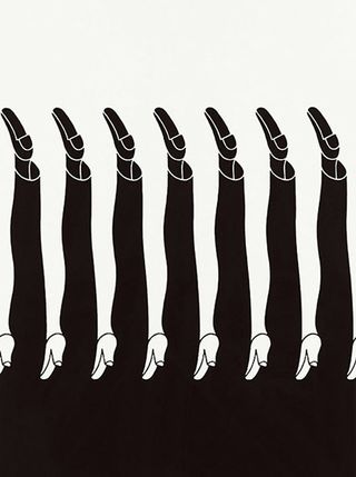
The Power of Negative Space in Logo Design
Negative space – it’s like the unsung hero of logo design. So often overlooked, yet so powerful in creating a memorable and impactful logo. Here’s how you can harness the power of negative space to take your logo game to the next level:
– **Less is More:** Negative space isn’t just empty space, it’s a design element in itself. By using less clutter and more negative space, you can create a logo that is clean, simple, and instantly recognizable. Remember, sometimes the spaces in between are just as important as the shapes themselves.
– **Optical Illusions:** Negative space can play tricks on the eye, creating optical illusions that make your logo stand out. By cleverly using negative space, you can make shapes appear to be overlapping, intertwining, or even floating. This not only adds visual interest but also makes your logo more dynamic and engaging.
– **Hidden Meanings:** Negative space is a sneaky little devil that can be used to hide secret messages and meanings within your logo. By strategically placing negative space, you can create hidden images or words that only reveal themselves upon closer inspection. This adds an element of intrigue and mystery to your logo, making it more memorable and giving people something to talk about.
So, don’t underestimate . Embrace the negative, unleash your creativity, and watch your logo come to life in ways you never imagined. Let the space between the lines be your playground, and who knows what kind of magic you might create.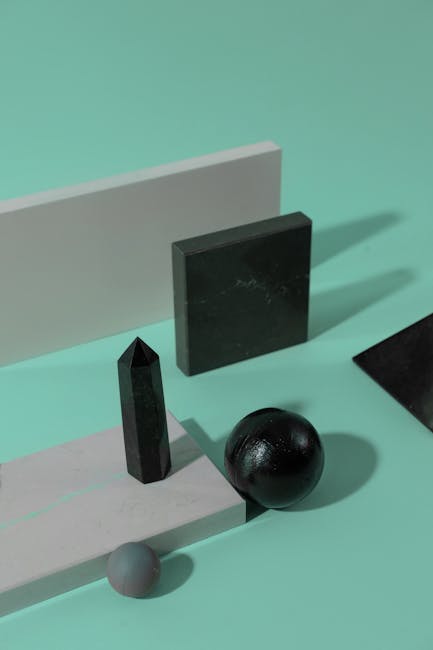
Achieving Balance and Symmetry in Minimalist Logos
When it comes to creating minimalist logos, achieving balance and symmetry is key. A well-balanced logo not only looks visually appealing but also conveys a sense of professionalism and attention to detail. Here are some tips to help you create logos that are perfectly balanced and symmetrical:
- Keep it simple: Minimalism is all about less is more. Don’t overcrowd your logo with unnecessary elements. Stick to a few key design elements that work well together.
- Use geometric shapes: Geometric shapes like circles, squares, and triangles can help you achieve symmetry in your logo design. Experiment with different shapes and placements to find what works best for your brand.
- Pay attention to negative space: Negative space, or the empty space around and between the elements in your logo, is just as important as the positive space. Use negative space creatively to create balance and symmetry in your design.
Remember, is a delicate art. It may take some trial and error to find the perfect harmony in your design, but don’t be afraid to experiment and push the boundaries of traditional logo design. By following these tips and trusting your creative instincts, you’ll be well on your way to creating logos that are both minimalistic and memorable.
Utilizing Monochrome to Create Timeless Logos
Monochrome logos are like the little black dress of the design world – they never go out of style. By sticking to a single color palette, you can create a logo that stands the test of time and remains effortlessly chic. Whether you opt for a classic black and white look or experiment with shades of gray, monochrome logos exude sophistication and elegance.
When utilizing monochrome in logo design, simplicity is key. Strip away the distractions and focus on the core elements of your brand. A monochrome logo allows your message to be communicated clearly and effectively without any unnecessary bells and whistles. Plus, it’s a great way to ensure that your logo looks just as striking in grayscale as it does in full color.
Monochrome logos are versatile and can be easily adapted for a variety of applications. Whether you’re using it on a website, business card, or billboard, a monochrome logo will always look sharp and professional. And let’s not forget the timeless appeal of black and white - these classic colors never go out of fashion and will ensure that your logo remains relevant for years to come.
So, next time you’re brainstorming logo ideas, consider the power of monochrome. Keep it simple, keep it stylish, and watch as your logo stands the test of time. Remember, black and white are more than just colors - they’re a statement of timeless elegance and sophistication.
FAQs
Can minimalist logos really make an impact?
Oh absolutely! Just like a tiny ninja, minimalist logos may be small in size, but they pack a powerful punch when it comes to brand recognition.
What are some key techniques for creating a minimalist logo?
Think of it like painting a masterpiece on a super tiny canvas – focus on clean lines, simple shapes, and a limited color palette. Less is definitely more in the world of minimalist logo design!
How can I ensure my minimalist logo stands out from the competition?
Well, Picasso once said, “Good artists copy, great artists steal.” So take a peek at what your competitors are doing, put your own unique spin on it, and voila! You’ve got yourself a standout minimalist logo.
Do I have to be a design expert to create a minimalist logo?
Not at all! With the right tools and a little bit of creativity, even the most artistically challenged among us can whip up a minimalist logo that would make Da Vinci jealous.
What are some common mistakes to avoid when designing a minimalist logo?
Steer clear of overcrowding your logo with unnecessary elements, using too many colors, or getting too fancy with the fonts. Remember, simplicity is key!
How can I ensure my minimalist logo effectively conveys my brand’s message?
Think of your logo as the Cliff Notes version of your brand – it should capture the essence of what your business is all about in a single, beautiful image. Keep it simple, keep it relevant, and watch the magic happen!
Don’t Max Out, Go Minimal!
Remember, when it comes to logo design, less is always more! So embrace the power of simplicity and let your brand speak for itself with a minimalist approach. With these simple techniques, you’ll be well on your way to creating a logo that leaves a lasting impression. Just remember: keep it clean, keep it sleek, and keep it simple. Happy designing!


