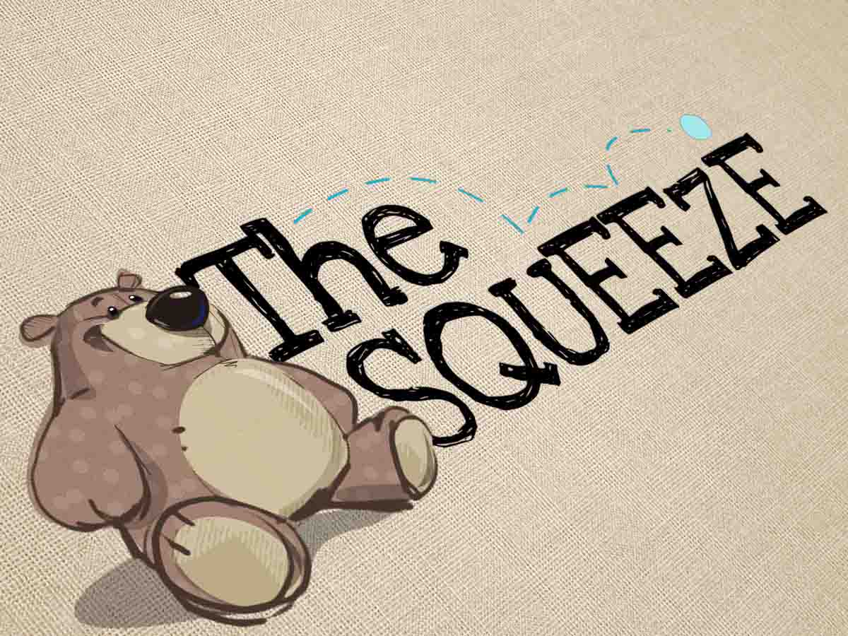
Corporations that create products (or services) for kids have a couple audiences to consider: The parents/grownups who purchase the product, and the kids who are requesting them. If you belong to a company that caters to children, you require a branding identity (fueled by a top notch logo design) that can effectively communicate with both target audiences. While that might sound like an impossible challenge, the elements of a design can be structured in a way that attracts children and reassures the caregiver(s).
Logo Design – The Fundamentals
A logo design is much more than simply a clever way of presenting your business name, especially when it comes to marketing for children. It is the cornerstone of your branding identity. A great kids logo design is based on science and psychology. It combines shape, color, space, and typography to leave a lasting impression on your audience.
Any time you are working with a team of designers to develop a concept, it’s important to explain your goals and vision for the business: The kind of shoppers you would like to entice, the attractive elements of your merchandise and services, as well as what sets you apart to make you unique from your competition. Your design team can then incorporate your ideas so that graphic truly conveys your brand’s value and communicates it to your current and potential clientele.
Color Psychology
Different colors trigger different emotional responses. Consider for example the uses of color within everyday life. Red, for example, is used for hospitals and emergency signs as it connotes passion, action, urgency, and power. Comparatively, yellow will often evoke a sense of stimulation, happiness, and warmth.
The truth is that even within a certain color, subtle differences of shade can inspire distinct emotions. Let’s take a look at blue as an example. A deep blue suggests reliability, security, and stability, whereas a sky blue might convey playfulness and friendliness. Selecting the correct shade of a color is definitely a critical choice in your logo design for youngsters.
When generating a logo design for kids, an experienced designer will decide on a color palette that triggers the emotional response your company requires to create loyalty and brand recognition. If the principal value of a company is all-natural components which are environment friendly, the logo should likely find a way to revolve around green. However if there is a company that wants to appeal to a child’s sense of urgency, the logo should likely incorporate red.
Working with Logo Coast
When starting a new business, it’s absolutely impossible to do everything yourself or in-house. One of the greatest self-discoveries can be learning to trust others and understanding the true value of a good connection. Choosing an expert design group to develop your kids logo design is right along those lines. Your logo is the basis of the identity of your small business (or corporation!). It will be seen on marketing and advertising materials, signs, business cards, as well as your website and (if not already… soon to be) active social media presence. An expert designer will be able to incorporate all of the the elements necessary to develop and achieve a timeless branding solution.


