In the wild world of marketing, it’s all too easy for your brand messaging to sound like a cacophony of conflicting voices. But fear not, dear reader, for we are here to guide you through the harmonious symphony that is harmonizing logos with brand messaging. So grab your conductor’s baton and get ready to create marketing magic that hits all the right notes.
Defining Your Brand Identity
So, you’ve decided to define your brand identity. Congratulations! It’s like giving your brand a personality makeover – think of it as getting a brand new wardrobe and a haircut all in one!
First things first, you need to figure out what makes your brand unique. What sets you apart from the competition? Maybe you have a quirky sense of humor, or your products are hand-crafted with love. Whatever it is, embrace it and let it shine!
Next, think about your brand’s values and what you stand for. Are you all about sustainability and eco-friendliness? Or maybe you’re all about pushing boundaries and thinking outside the box. Whatever it is, make sure your brand’s values are front and center in everything you do.
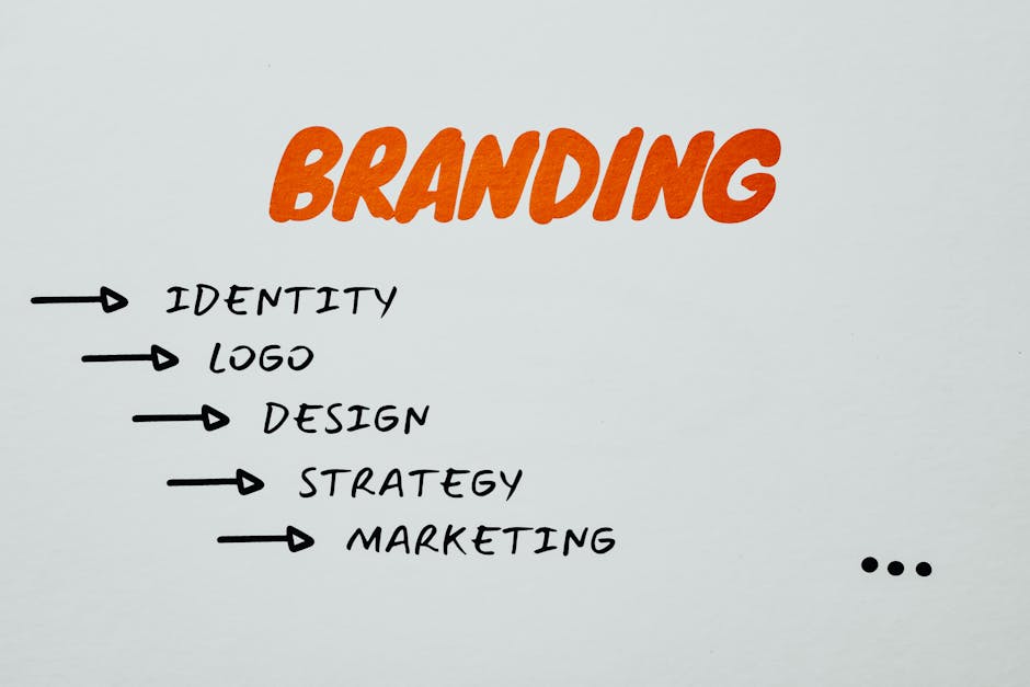
And finally, don’t forget about your brand’s visual identity. This includes your logo, color scheme, typography, and imagery. Make sure everything is cohesive and reflects your brand’s personality. Remember, you want your brand to be easily recognizable and stand out from the crowd!
Creating a Strong Logo Design
So, you’ve decided it’s time to give your brand a facelift with a shiny new logo. But where do you start? Fear not, my logo-loving friend, for I am here to guide you through the treacherous waters of design decisions and color choices. Strap in, it’s about to get wild!
First things first, when , remember that simplicity is key. You don’t want your logo to look like a hyperactive chicken crossed with a neon sign. Keep it clean, keep it classy, keep it memorable. Think of iconic logos like the Nike swoosh or the Golden Arches – simple, yet oh-so powerful.
Next up, consider the colors you want to use in your logo. Do you want to evoke a sense of trust with cool blues and grays, or maybe a burst of creativity with vibrant reds and yellows? Whatever you choose, make sure the colors complement each other and represent your brand’s personality. And remember, never underestimate the power of a good ol’ black and white logo – timeless and oh-so chic.
Lastly, don’t be afraid to think outside the box when it comes to logo design. Embrace your inner weirdo and let your creativity run wild. Maybe your logo is a dancing llama wearing sunglasses, or a smiling cupcake with a mustache. The world is your oyster, my friend, so go forth and create a logo that will make the design gods weep tears of joy.

Incorporating Brand Messaging into Logo Design
Who says you can’t kill two birds with one stone? Incorporating your brand messaging into your logo design can not only make your logo more visually appealing, but also convey a clear message about your brand. Here’s how you can do it:
First things first, brainstorm your brand messaging. What do you want people to know about your brand when they see your logo? Is it that you’re the best in the business? That you’re fun and quirky? That you’re reliable and trustworthy? Whatever it is, make sure it’s something that sets you apart from your competitors.
Once you have your brand messaging nailed down, it’s time to start thinking about how to incorporate it into your logo. Here are some creative ways to do it:
- Use colors that reflect your brand’s personality. If your brand is fun and youthful, use bright, playful colors. If your brand is sophisticated and elegant, stick to a more muted color palette.
- Include symbols or images that represent your brand message. If your brand is all about adventure and exploration, consider incorporating a compass or mountain into your logo design.
- Play with typography. The font you choose for your logo can say a lot about your brand. If you’re a modern and sleek brand, opt for a clean, minimalist font. If you’re a bold, edgy brand, go for a more unique and stylized font.

Ensuring Consistency Across Marketing Channels
When it comes to , it’s important to remember that you’re not just a marketer, you’re a magician. And like any good magician, you need to make sure your tricks are seamless and consistent across all platforms.
One way to keep your marketing efforts in harmony is by maintaining consistent branding. This means using the same fonts, colors, and logos across all channels. Think of it like wearing the same outfit to every magic show - it helps people recognize you and builds trust in your magic skills.
Another key to mastering consistency is to keep your messaging on point. Make sure the language and tone you use in your emails, social media posts, and website content all reflect the same magic spell…I mean brand voice. This way, your audience will feel like they’re experiencing the same magic show no matter where they encounter your marketing materials.
Lastly, don’t forget about the importance of using consistent imagery. Whether it’s photos, graphics, or videos, make sure the visuals you use are in line with your brand style. This will help create a cohesive experience for your audience and keep them coming back for more of your magical marketing tricks!

Utilizing Logo Variations for Different Platforms
When it comes to logos, it’s important to remember that one size does not fit all. Different platforms require different variations of your logo to ensure it looks its best. Here are some tips for :
1. **Social Media:** Social media platforms are a playground for your logo. You can get creative with how you display your logo, from changing the colors to adding fun elements. Just make sure it still remains recognizable as your brand. Remember, your logo is like your online dating profile picture – you want it to look good, but you don’t want to catfish anyone.
2. **Print Materials:** When it comes to print materials, simplicity is key. You want a clean, crisp version of your logo that will look good in both color and black and white. Remember, your logo on paper is like your resume – you want it to be professional and easy to read.
3. **Website:** Your website is like your brand’s home base, so your logo needs to be front and center. Make sure you have a high-resolution version of your logo that looks sharp and professional. Your logo on your website is like your brand’s first impression – you want it to be memorable and leave a good impression.
Seeking Feedback and Making Adjustments to Achieve Cohesiveness
So you’ve gathered your team of misfits and oddballs to work on a project together. You quickly realize that achieving cohesiveness among this eclectic group is going to be a challenge. Fear not, my friend! The key to success is seeking feedback and making adjustments along the way.
First things first, make sure everyone’s ideas are heard. Encourage open communication and listen to each team member’s thoughts and suggestions. Remember, there are no bad ideas, just some that are a little more questionable than others (looking at you, Jerry and your idea for a llama-themed marketing campaign).
Next, it’s time to put on your detective hat and identify any areas where the team may be lacking cohesiveness. Are there any conflicts or disagreements brewing under the surface? Is there a lack of alignment on the overall goals and objectives of the project? Get to the bottom of these issues and address them head-on.
Finally, don’t be afraid to make adjustments as needed. Whether it’s reassigning tasks, tweaking timelines, or ditching that questionable llama idea altogether, be willing to adapt and evolve as the project progresses. Remember, Rome wasn’t built in a day, and neither is a cohesive team of misfits.
FAQs
How can I ensure my logo matches my brand messaging?
Think of your logo as the face of your brand – it should reflect the same personality, values, and message that your brand conveys. Make sure it’s sending the right vibes!
What are some ways to harmonize my logo with my brand messaging?
Consider the colors, fonts, and imagery used in your logo and how they align with your brand’s identity. If your brand is all about fun and playfulness, a sleek and serious logo might not cut it! Keep it cohesive, folks!
Why is it important for my logo to match my brand messaging?
Consistency is key, my friend! When your logo and brand messaging are in sync, it creates a strong and memorable brand identity that sticks in people’s minds. Plus, it just looks darn good!
What can happen if my logo doesn’t harmonize with my brand messaging?
Oh boy, get ready for a brand identity crisis! Your audience might get confused about what your brand stands for, and you could lose that all-important connection with your customers. Keep it cohesive, or prepare for the consequences!
In Conclusion:
So there you have it! Harmonizing logos with brand messaging is the secret sauce to achieving cohesive marketing. Remember, a logo is like the cherry on top of a sundae – it ties everything together and leaves a lasting impression. So go forth and conquer the marketing world with your perfectly harmonized brand messaging and logo. Cheers to cohesive marketing success!


