In a world filled with logos that make you go ”meh,” it’s time to dive into the delightful world of typography and learn how to create logos that make a statement louder than a peacock in a library. Typography isn’t just about picking a fancy font and calling it a day – oh no, it’s about unleashing your inner design diva and creating a logo that screams “I’m fabulous and I know it.” So grab your fanciest pen and let’s dive into the fabulous art of designing distinctive logos through the magic of typography.
Understanding Typography in Logo Design
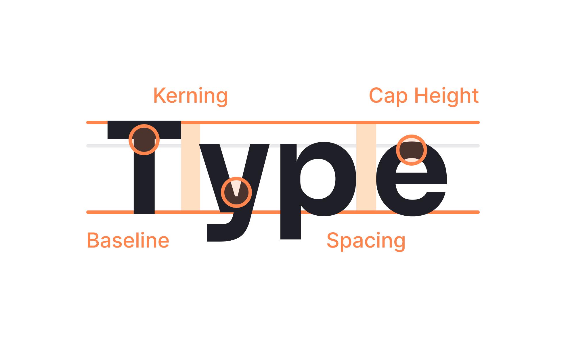
Typography in logo design is not just about picking a fancy font and calling it a day. It involves the careful selection of fonts and the manipulation of letterforms to create a unique and memorable brand identity. So, strap in and get ready to dive deep into the world of typography!
When choosing a font for your logo, consider the personality of your brand. Are you a quirky start-up or a serious law firm? Choose a font that reflects your brand’s values and mission. Experiment with different font styles - from modern sans-serifs to elegant serifs – to find the perfect match for your brand.
Don’t be afraid to play around with letter spacing, size, and weight to create a dynamic logo. Pro tip: use a mix of upper and lowercase letters to add visual interest. Remember, the goal of typography in logo design is to make your brand stand out from the competition, so don’t be afraid to break the rules and get creative!
In conclusion, is essential for creating a successful brand identity. By selecting the right fonts and manipulating letterforms creatively, you can make your logo memorable and impactful. So go forth, brave designer, and conquer the world of typography one logo at a time!
Choosing the Right Font for Your Brand
When it comes to , you can’t just pick any old Comic Sans or Papyrus and call it a day. No, no, no. Your font choice is a crucial decision that will reflect the personality and vibe of your brand, so choose wisely, my friend.
Here are some things to consider when selecting the perfect font:
- Legibility: Make sure your font is easy to read, unless you want people asking, “Wait, what does that say?”
- Consistency: Stick to one or two fonts to avoid looking like a ransom note.
- Personality: Is your brand fun and whimsical? Go for a playful font. Is it sleek and modern? Opt for a clean, sans-serif font.
Remember, your font choice is like the cherry on top of the branding sundae – it may seem small, but it can make a big difference. So, take your time, play around with different options, and find the font that speaks to your brand’s soul. Happy font hunting!
Utilizing Layout and Spacing for Impact
Picture this: you’re navigating through a website and suddenly you come across a page that looks like it was designed by a kindergartener on a sugar high. Text everywhere, images overlapping, it’s chaos! That my friends, is what happens when layout and spacing are not utilized effectively.
The key to creating impact through design is using layout and spacing in a strategic way. By properly organizing elements on a page, you can guide the viewer’s eye and draw attention to the most important information. Imagine a well-structured webpage as a soothing symphony, where every element plays its part harmoniously.
One way to create visual interest is through the use of white space. Don’t be afraid to give your content room to breathe! White space allows for a cleaner, more focused design that is easy on the eyes. Remember, less is often more when it comes to layout.
Another tip for is to consider the hierarchy of information. Use bold headings and subheadings to clearly outline different sections of your content. By breaking up text with headers and subheaders, you make it easier for the reader to scan the page and find what they’re looking for. And don’t forget to use lists to further organize information in a digestible way. A well-structured layout paired with appropriate spacing can make all the difference in creating a visually appealing and impactful design.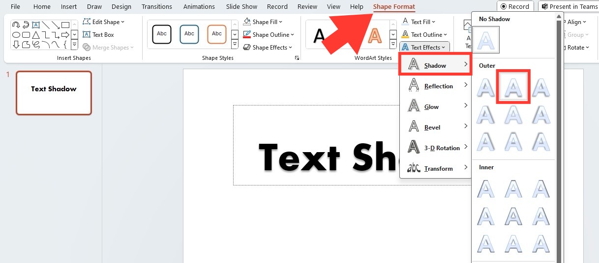
Incorporating Effects to Enhance Typography
Typography is more than just choosing a fancy font for your design. By incorporating effects, you can take your typography game to the next level and make your text pop! Here are a few fun ways to enhance your typography with some special effects:
Drop Shadows: Adding a subtle drop shadow behind your text can give it a sense of depth and make it stand out on the page. Be careful not to go overboard with the shadow though – you don’t want your text to look like it’s floating off the page!
Gradient Text: Instead of sticking with a solid color for your text, why not experiment with gradients? Mixing two or more colors can make your text look more dynamic and eye-catching. Plus, it’s a great way to add a little extra personality to your design.
Textures: Adding a texture overlay to your text can give it a unique and tactile feel. Whether it’s a subtle paper texture or a bold metallic finish, textures can help your text really pop off the page and grab your audience’s attention.
Don’t be afraid to experiment with different effects and see what works best for your design. With a little creativity and a touch of flair, you can turn your typography from bland to grand in no time!
Balancing Creativity with Readability in Logos
When designing a logo, it’s crucial to strike a balance between creativity and readability. After all, what good is a stunningly artistic logo if people can’t even make out the company’s name?
Here are a few tips to keep your logo both eye-catching and legible:
- Keep it simple: Resist the temptation to go overboard with intricate designs. A simple, clean logo is not only easier to read but also more timeless.
- Play with fonts: Choose fonts that are unique and visually appealing while still being easy to read at a glance. Experiment with different styles and sizes to find the perfect balance.
- Use contrasting colors: A bold color palette can make your logo stand out, but be sure to pair it with colors that offer enough contrast for easy readability.
Remember, a good logo is like a piece of art - it should be visually striking while still serving its practical purpose. So go ahead, unleash your creativity, but always keep readability in mind!
FAQs
Why is typographic design important for creating a distinctive logo?
Typography is like the seasoning of a logo design, adding flavor and personality to the brand. A well-designed typographic logo can communicate the brand’s message and aesthetic in a way that sets it apart from the competition.
What are some tips for choosing the right font for a logo?
When selecting a font for your logo, consider things like the brand’s personality, target audience, and industry. Play around with different fonts to find one that complements the overall design and reflects the brand’s identity.
How can designers use custom typography to create a unique logo?
Custom typography is like a bespoke suit for your logo – tailored specifically to fit and express the brand’s individuality. By creating a custom typeface or tweaking existing fonts, designers can ensure their logo stands out in a sea of generic designs.
What role does color play in typographic logo design?
Color is like the icing on the typographic cake - it can enhance the mood and message of the logo. When choosing colors for a typographic logo, designers should consider the brand’s identity, target audience, and industry trends to create a visually appealing and memorable design.
Time to Put Your Thinking Caps On!
Now that you’ve learned all about the art of typography in designing distinctive logos, it’s time to flex those creative muscles and get to work! Remember, the key to a successful logo is to think outside the box and come up with something truly unique and eye-catching. So grab your favorite font, fire up that design software, and let your imagination run wild. Who knows, you might just come up with the next iconic logo that everyone will be talking about!


