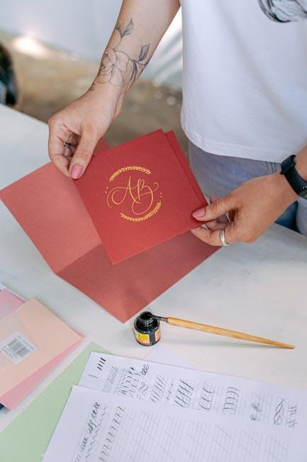
In a world where logos are the ultimate wingmen of brands, taking them on a global escapade requires a blend of creativity, strategy, and a sprinkle of stardust. Crafting logos for global reach is like developing a universal language that speaks to hearts and wallets across continents. So grab your pens, dust off your design skills, and get ready to embark on a logo-making journey that’s more epic than a backpacking trip around the world (but with fewer hostel bunk beds and more coffee breaks).
Understanding International Branding
Branding is like giving your product a personality, but on a global scale. It’s kind of like teaching your dog to do a trick in multiple languages.
When you’re trying to build an international brand, you have to consider cultural differences. For example, did you know that in some countries, the color red symbolizes good luck, while in others it represents danger? It’s like playing a game of cultural roulette, but with your brand at stake.
One key element in international branding is consistency. You have to make sure your brand message is the same no matter where in the world you are. It’s like trying to keep all your plants alive by watering them with the same brand of water, no matter where they are.
And let’s not forget about localization. You have to adapt your brand to fit the local culture and language. It’s like trying to fit a square peg into a round hole, but with a team of translators and cultural experts on hand to help smooth out the edges.

Adapting to Cultural Differences
When encountering cultural differences, it’s important to approach them with an open mind and a sense of humor. Instead of feeling overwhelmed or confused, embrace the opportunity to learn and grow from these unique experiences.
One way to adapt to cultural differences is to observe and mimic the locals. Whether it’s the way they greet each other, the foods they eat, or the gestures they use, being a good observer can help you blend in seamlessly.
Another tip is to ask questions and show genuine interest in the culture. People love sharing their traditions and customs, so don’t be afraid to engage in conversation and learn something new. Plus, you might even make some new friends along the way!
Lastly, don’t forget to laugh at yourself. We all make cultural faux pas from time to time, but instead of getting embarrassed, embrace your mistakes and use them as learning opportunities. Remember, it’s all part of the adventure!

Choosing Colors and Symbols Wisely
When it comes to choosing colors and symbols, it’s important to keep in mind that what you choose will say a lot about your brand. You don’t want to end up inadvertently sending the wrong message to your audience. Here are a few things to consider:
Don’t be too literal: While it might be tempting to choose a symbol that directly represents your brand, sometimes subtlety is key. Think outside the box and consider using symbols that have a deeper, more symbolic meaning.
Consider the psychology of color: Colors have a way of evoking different emotions and responses in people. Make sure to choose colors that align with the message you want to convey. For example, red might convey passion and energy, while blue might convey trust and stability.
Avoid clichés: While it might be tempting to go with a tried-and-true color palette or symbol, try to be unique. Don’t just follow the trends – set them! Stand out from the crowd and make a statement with your choices.

Creating Versatile Logos for Different Platforms
When creating logos for different platforms, it’s important to consider the versatility of the design. Your logo should be able to adapt to various sizes and formats without losing its impact. To achieve this, here are a few tips to keep in mind:
1. Keep it simple: A cluttered logo will only cause confusion when scaled down to fit on smaller screens or social media profiles. Opt for clean lines and minimalistic designs that can easily be recognized at any size.
2. Test it out: Before finalizing your logo, make sure to test it out on different platforms and devices. This will help identify any issues with legibility or visibility that may need to be addressed.
3. Choose versatile colors: Colors can look different depending on the platform they are viewed on. Make sure your logo looks great in both color and black and white to ensure it is adaptable to any situation.

Utilizing Typography for Global Appeal
In a world where memes reign supreme and emojis are our go-to form of communication, one thing remains constant: typography. Whether you realize it or not, the fonts you choose for your global audience can make or break your design. So, how can you utilize typography to ensure your message reaches every corner of the globe? Here are a few tips:
When it comes to choosing a font, think outside the box. Sure, everyone loves a good Arial or Times New Roman, but why not mix things up a bit? Experiment with fonts like:
- Comic Sans (for a touch of whimsy)
- Papyrus (because who doesn’t love a good ancient Egyptian vibe)
- Curlz MT (for when you want to add a little pizzazz)
Remember, not every font translates well across cultures. While Comic Sans may be a hit in the Western world, it may not have the same appeal in Asia or the Middle East. Opt for universal fonts that are easy to read and understand, like:
- Helvetica (the Swiss army knife of fonts)
- Arial (when in doubt, go with the basics)
- Verdana (perfect for online reading)
Lastly, don’t be afraid to play around with font size and spacing. A little extra kerning here and there can make a big difference in how your message is perceived. Bold important words or phrases to ensure they stand out. And remember, when in doubt, just add a few exclamation points!!! Because nothing says ”global appeal” like excessive punctuation!!!
FAQs
What are some key considerations when designing a logo for a global audience?
When crafting a logo for global reach, it’s essential to consider cultural differences, color psychology, and the potential for misinterpretation. You don’t want your logo to accidentally offend someone on the other side of the world!
How can I make sure my logo translates well across different languages?
Keep your logo design simple and avoid text-based elements that may not make sense or translate properly in other languages. Stick to universal symbols or imagery that can be easily understood by anyone, anywhere.
What role does color play in creating a logo with global appeal?
Color can have different meanings and connotations in different cultures, so it’s important to choose colors wisely. For example, in some cultures, white symbolizes purity and innocence, while in others, it represents mourning and death. So, maybe avoid using white if you want to avoid mixed messages.
How can I ensure my logo is culturally sensitive and doesn’t offend anyone?
Research, research, research! Make sure you understand the cultural norms and symbols of the countries or regions you’re targeting with your logo. The last thing you want is to accidentally offend potential customers with a logo that has unintended negative connotations.
Is it necessary to create multiple versions of my logo for different regions?
It might be a good idea to create different versions of your logo for different regions if you are targeting a truly diverse global audience. This way, you can tailor your logo to better resonate with each specific market without risking cultural insensitivity.
Go forth and conquer the world with your globally appealing logo!
Whether you’re targeting customers in Tokyo or Timbuktu, your logo is now equipped to make a lasting impression on a global scale. So go ahead, show off your new logo to the world and watch as your brand reaches new heights across borders and continents. Remember, a well-crafted logo knows no boundaries – except maybe for the ones on a world map. Happy logo crafting!


