In the wild world of nonprofits, where everyone is vying for attention and donations like a pack of hungry wolves at a potluck dinner, having a standout logo is like having the juiciest piece of meat on your plate. It’s the key to attracting donors, volunteers, and the elusive creature known as brand recognition. So strap on your creative apron and get ready to whip up some iconic logos that will make your nonprofit stand out in the crowded wilderness of charitable organizations.
Creating a Strong Concept for Meaningful Branding
When it comes to branding, having a strong concept is like having the perfect outfit for a first date. You want to make a lasting impression that screams confidence and uniqueness. Here are some tips for creating a concept that will make your brand stand out:
Unleash your inner creativity: Think outside the box (way outside the box, like in a galaxy far, far away). Let your imagination run wild and come up with ideas that are as bold as a flamingo in a crowd of pigeons.
Know your audience: It’s important to understand who you’re trying to reach with your brand. Are they adventurous risk-takers or cautious rule-followers? Do they prefer cats over dogs? Knowing these details will help you tailor your concept to appeal to your target audience.
Inject some personality: Your brand concept should be like a superhero, with a distinct personality that sets it apart from the rest of the caped crusaders. Whether it’s quirky, sophisticated, or downright wacky, make sure your brand concept has a personality that people can’t help but fall in love with.
Selecting Colors that Resonate with Your Mission
Choosing the perfect colors for your brand is no easy feat, especially when you’re trying to find the ones that truly resonate with your mission. Here are some tips to help you pick the right shades to represent your brand and values:
- Think about the emotions you want to evoke – are you a fun and funky brand, or a serious and professional one? Choose colors that match the vibe you’re going for.
- Consider your target audience – are they more likely to respond to bright and bold colors, or muted and calming ones?
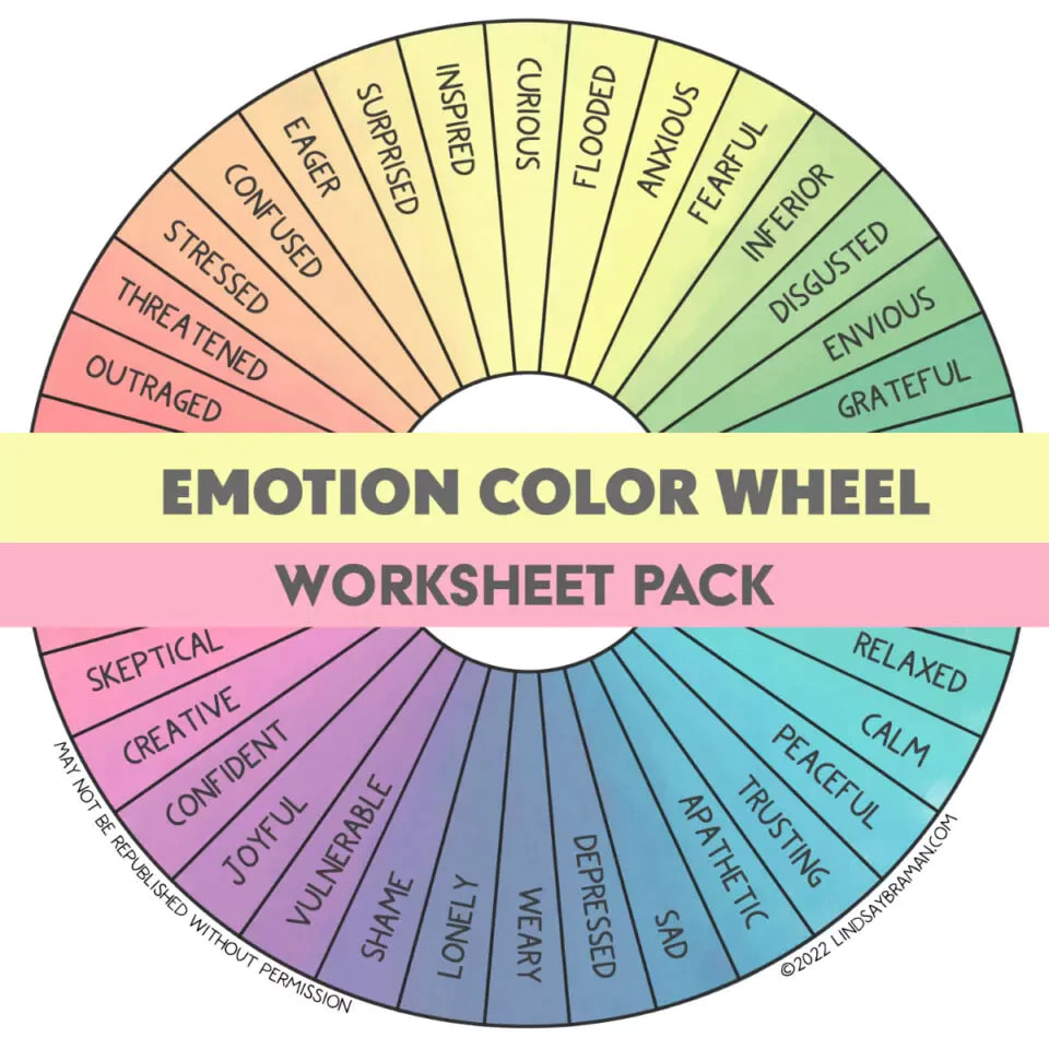
Remember, colors have meaning and can convey different messages. Here are a few examples:
- Red: Passion, energy, and excitement.
- Blue: Trust, loyalty, and stability.
- Green: Growth, health, and nature.
So, when you’re selecting colors for your brand, make sure they align with your mission and values. After all, you want your brand to stand out and resonate with your audience in a meaningful way!

Choosing Fonts that Convey Your Nonprofit’s Personality
When it comes to choosing fonts that convey your nonprofit’s personality, you don’t want to just pick any random font and call it a day. Your font choice says a lot about who you are as an organization, so why not have a little fun with it? Here are some tips to help you pick the perfect fonts that truly represent your nonprofit’s vibe:
- Think about your mission statement: Is your nonprofit serious and professional, or quirky and laid-back? Choose a font that reflects the tone of your mission statement. If your goal is to save the planet, maybe a bold, eco-friendly font is the way to go.
- Consider your target audience: Who are you trying to reach with your message? If you’re trying to attract a younger crowd, maybe a trendy, modern font is the way to go. If your audience is more traditional, a classic serif font might be the better choice.
- Don’t be afraid to mix and match: Who says you have to stick to just one font? Mix things up by combining a bold headline font with a more understated body text font. Just make sure they complement each other, like peanut butter and jelly!
Overall, the key to choosing fonts that convey your nonprofit’s personality is to have fun with it. Don’t be afraid to experiment and think outside the box (or text box, in this case). Remember, your font choice is the first impression your audience will have of your organization, so make it count!

Incorporating Symbolism for Reader Recognition
When it comes to incorporating symbolism in your writing, it’s important to remember that subtlety is key. You don’t want to hit your readers over the head with heavy-handed metaphors like a sledgehammer. Instead, think of symbolism as a delicate dance between author and reader, where the meaning is just beneath the surface, waiting to be discovered.
One fun way to incorporate symbolism is through the use of recurring motifs that appear throughout your work. Maybe your main character always wears a certain color, or a particular animal shows up at key moments in the story. By weaving these symbols throughout the narrative, you create a sense of unity and depth that will keep your readers engaged and coming back for more.
Another trick is to use visual symbols, like a specific object or image that carries meaning beyond its literal interpretation. Think of the green light in The Great Gatsby or the white whale in Moby Dick. These symbols serve as touchpoints for readers, helping them navigate the complex themes and emotions of the story.
So next time you sit down to write, think about what symbols you can incorporate to add layers of meaning and depth to your work. Whether it’s a subtle nod to a recurring motif or a bold visual symbol that leaps off the page, incorporating symbolism is sure to elevate your writing and leave a lasting impression on your readers.
Maintaining Consistency Across All Marketing Materials
When it comes to , think of yourself as the ultimate brand enforcer. You are the superhero of branding, the one who swoops in to make sure every piece of content stays on point.
One way to keep things consistent is by creating a style guide. This handy document is like the bible for your brand – it lays out everything from colors and fonts to tone of voice and imagery. Think of it as your brand’s own version of a horoscope – except it actually makes sense and can help you create killer content.
Another trick is to stay organized. Keep all your marketing materials in one place, whether it’s a shared drive, a folder on your desktop, or a secret underground lair (hey, whatever works for you!). This way, you can easily reference past content and make sure your new stuff doesn’t stray off course.
And finally, don’t be afraid to experiment! Just because you’re maintaining consistency doesn’t mean you have to be boring. Try out new ideas, play around with different formats, and see what sticks. After all, being consistent doesn’t mean being stagnant – it just means staying true to who you are. So go forth, brand warriors, and conquer the world of marketing with style and swagger!
Receiving Feedback and Making Iterative Improvements
So you’ve received feedback on your latest project and it wasn’t exactly glowing praise. Don’t worry, everyone has been there before! It’s all about taking that feedback and using it to make iterative improvements. Here are some tips to help you navigate the treacherous waters of feedback:
- Stay calm: Before you start throwing your computer out the window in frustration, take a deep breath. Remember, feedback is not a personal attack – it’s an opportunity for growth.
- Identify patterns: Look for common themes in the feedback you’ve received. Is everyone saying the same thing about a particular aspect of your project? That’s a good indicator that something might need to be changed.
- Break it down: Instead of feeling overwhelmed by all the feedback you’ve received, break it down into manageable chunks. Focus on one piece of feedback at a time and make incremental improvements.
Remember, Rome wasn’t built in a day - and neither was the perfect project. Embrace the feedback, make those iterative improvements, and watch your project soar to new heights!
FAQs
Why are logos important for nonprofit branding?
Because without a logo, how will anyone know who you are? It’s like trying to attend a costume party without a costume – you’ll just blend into the background and be forgotten.
What makes a logo iconic?
An iconic logo is like a celebrity in the branding world – instantly recognizable, memorable, and always stealing the show. Think of it as the Beyoncé of your nonprofit’s visual identity.
How can a nonprofit craft a logo that stands out?
Well, first you need to think about what makes your nonprofit special. What sets you apart from the rest of the do-gooders out there? Once you have that figured out, channel your inner Picasso and start sketching your way to logo greatness.
Do logos really impact the success of a nonprofit?
Absolutely! A logo is like the superhero cape of your nonprofit – it gives you power, makes you stand out in a crowded room, and helps you save the world, one donor at a time.
What are common mistakes to avoid when designing a nonprofit logo?
Avoid clichés like the plague, steer clear of overly intricate designs that get lost in translation, and for the love of all things good, please don’t use Comic Sans. No one takes a nonprofit seriously when their logo is in Comic Sans.
Time to Make Your Mark!
Thanks for tuning in to our crash course on crafting iconic logos for successful nonprofit branding! Remember, a strong logo can support your mission, engage your audience, and ultimately make a bigger impact in the world. So grab your sketchbooks, fire up your design software, and get ready to create a logo that will make your nonprofit stand out from the crowd. Happy branding!


