In a world filled with logos as confusing as IKEA instructions, it’s time to bring order to the chaos and craft purposeful logos that actually reflect brand values. Because let’s face it, a logo that looks like it was designed by your uncle’s pet goldfish isn’t going to cut it in today’s fast-paced, logo-loving society. So buckle up, buttercup, because we’re about to dive into the wild and wonderful world of logo design and show you how to create a logo that not only speaks volumes about your brand, but also makes your customers go, “Wow, they really get me.” Let’s get cracking, shall we
– Understanding Brand Values and Identity
So you’ve heard the term “brand values and identity” thrown around a lot, but what does it all really mean? Let’s break it down in a way that even your grandma could understand.
First things first, brand values are basically the guiding principles that a company stands for. It’s like the moral compass of the business world, except instead of always pointing north, it points towards things like honesty, integrity, and maybe even a little bit of humor (if the company has good taste, that is).
On the other hand, brand identity is all about how a company presents itself to the world. It’s like that friend who always knows how to dress to impress, but in this case, it’s all about logos, colors, and even the typefaces a company uses. Essentially, it’s the company’s way of saying, “Hey, I’m here to party, but I’m also here to get down to business.”
So, when a company’s brand values and identity align perfectly, it’s like a match made in branding heaven. It’s like peanut butter and jelly, mac and cheese, or even Batman and Robin (minus the tights, of course). And when that happens, you know you’ve got a brand that’s going to stick around for the long haul.

– Researching Target Audience and Market Trends
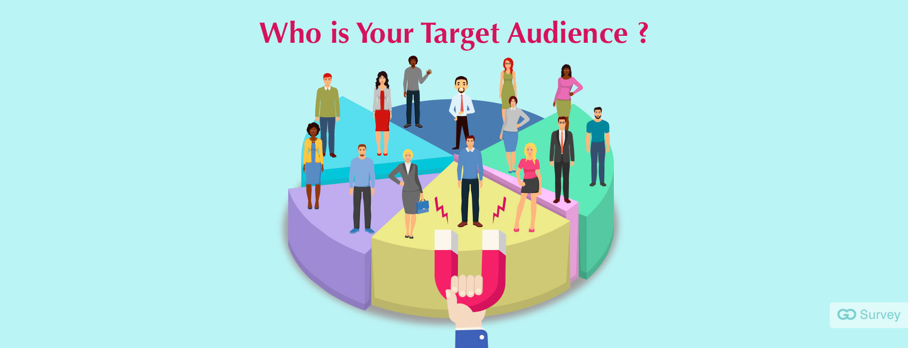
When it comes to researching your target audience and market trends, it’s crucial to dive deep into the world of your potential customers. Use every tool at your disposal to gather insights and understand their preferences, behaviors, and desires.
One way to get to know your audience better is by conducting surveys. Get to know their likes and dislikes, their shopping habits, and even their favorite memes. Remember, your goal is to understand them on a personal level, so don’t be afraid to get a little nosy!
Keep an eye out for market trends by stalking your competitors (in a non-creepy way, of course). See what they’re up to, what products they’re launching, and how they’re engaging with their audience. Take notes and brainstorm ways to one-up them in the most delightful and unexpected ways.
Remember, researching your target audience and market trends is not just about gathering data – it’s about getting inside the minds of your customers and staying ahead of the game. So grab your magnifying glass, put on your detective hat, and get ready to uncover the juicy secrets of your audience!

– Communicating a Clear Message
Ever found yourself in a situation where you’re trying to get your point across but everyone just seems to stare back at you with blank expressions? Well, fear not! Here are some tips on how to communicate a clear message and avoid those awkward moments where no one knows what you’re talking about.
First and foremost, it’s important to keep your message simple and to the point. Rambling on and on will only confuse your audience and leave them scratching their heads. So, remember to be concise and get to the point!
Secondly, make sure to use visual aids to help illustrate your message. Whether it’s a chart, a graph, or even a funny meme, visuals can often convey information more effectively than words alone. Plus, who doesn’t love a good meme?
Lastly, listen to your audience’s feedback and adjust your message accordingly. Communication is a two-way street, so be open to suggestions and be willing to adapt your message if needed. Remember, it’s all about getting your point across in a way that resonates with your audience!

– Choosing the Right Colors and Typography
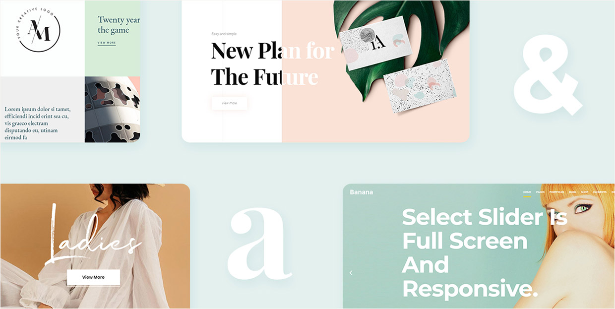
When it comes to choosing the right colors and typography for your project, it’s important to remember that you’re not just picking out shades and fonts – you’re setting the tone for your entire design. So, before you start randomly selecting colors and typing out words in Comic Sans, take a moment to consider the following:
Colors:
- Choose colors that evoke the right emotions. Need to convey trustworthiness? Go for blues. Want to show creativity? Opt for purples and oranges.
- Avoid using too many colors – you’re designing a project, not a rainbow.
- Consider color contrast for readability. No one wants to strain their eyes trying to read neon green text on a bright pink background.
Typography:
- Make sure your fonts are legible. If your audience needs a decoder ring to read your text, you might want to reconsider your font choice.
- Stick to a font hierarchy. Using 10 different fonts in one design is a surefire way to make your project look like a ransom note.
- Pair fonts like a fine wine and cheese – they should complement each other, not compete for attention.
Remember, a well-chosen color scheme and typography can make or break your design. So, take your time, experiment a little, and don’t be afraid to get creative – just not ‘Curlz MT’ kind of creative.
![]()
– Incorporating Symbolism and Icons
When it comes to incorporating symbolism and icons into your work, it’s important to think outside the box…literally! Don’t be afraid to get creative and use symbols and icons to convey deeper meanings or messages in your work. Remember, a picture is worth a thousand words, so why not let your symbols do the talking for you?
One tip for incorporating symbolism and icons is to think about the emotions or ideas you want to express and then find symbols that represent those feelings. For example, if you want to convey a sense of freedom, you could use a soaring bird icon. If you want to represent strength, a lion symbol might be the perfect choice. The possibilities are endless, so don’t be afraid to experiment!
Another fun way to incorporate symbolism and icons into your work is to create your own custom symbols or icons. This can add a personal touch to your work and make it truly unique. Whether you’re a doodler or a graphic design whiz, creating custom symbols can be a fun and rewarding way to enhance your work.
So go ahead, unleash your inner artist and start incorporating symbolism and icons into your work today. Your audience will thank you for it, and who knows, you might just discover a new favorite tool for expressing yourself creatively!
– Ensuring Versatility Across Platforms and Applications
Are you tired of trying to make your content fit across multiple platforms and applications? It’s like trying to fit a square peg into a round hole! But fear not, we have the solution to ensure versatility no matter where you go.
With our innovative technology, you can seamlessly switch between platforms without losing the essence of your message. Whether you’re on social media, email, or a presentation, your content will always shine bright like a diamond (or at least a cubic zirconia).
Our system is so versatile, it’s like having a wardrobe full of mix-and-match outfits. You can easily customize your content to fit the style and tone of any platform or application, making you the chameleon of the digital world.
So say goodbye to the days of awkwardly forcing your content into places it doesn’t belong. Embrace the freedom of versatility and watch your message soar across platforms like a majestic eagle with a jetpack. You’ll never look back (unless you’re checking out your awesome content on different platforms, of course).
FAQs
How can I ensure my logo accurately reflects my brand values?
Always start by channeling your inner Zen master and meditate on your brand’s core values. Reflect on what really makes your brand tick and then translate that into visual form. Remember, your logo is basically your brand’s sidekick, so make sure they’re on the same page!
What are some common design elements that can help convey brand values in a logo?
Think about using colors, fonts, shapes, and images that speak to your brand’s personality. If your brand is all about adventure, maybe throw in a rugged font or a daring color palette. When it doubt, just imagine your logo as a person – what would they wear, how would they speak, and what would they represent?
How can I ensure my logo stands out from the competition while still reflecting my brand values?
Take a good hard look at your competitors and then do the exact opposite – just kidding! Find a unique angle that sets your brand apart while still staying true to your values. Maybe throw in a quirky shape or a unexpected color choice to catch people’s attention.
What are some tips for ensuring my logo is timeless and won’t need constant updating?
Avoid trendy design elements like the plague! Stick to classic fonts, simple shapes, and timeless colors that won’t go out of style faster than you can say “retro is back, baby!” Remember, your logo is your brand’s trusty steed – don’t leave them in the dust with outdated design choices.
Why is it important for a logo to reflect brand values?
Think of your logo as the superhero cape of your brand – it’s what gives you that extra oomph and sets you apart from the rest of the world. When your logo reflects your brand values, it helps build trust with your audience and creates a strong emotional connection. Plus, it just makes your brand look way cooler!
Time to Show the World Your Brand’s True Colors!
Congratulations on taking the first step towards crafting a purposeful logo that reflects your brand’s values. Remember, a logo is not just a pretty design - it’s a visual representation of who you are as a brand. So be true to yourself, stay authentic, and let your logo speak volumes about what you stand for.
Now go forth and conquer the world with your emblematic logo, because as they say, a logo is worth a thousand words…and hopefully a million customers!


