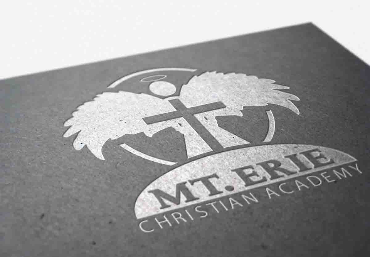
Church Logo Design – Powerful Symbolism
While it might seem unusual to market a religious establishment, churches can reap huge rewards by going the extra mile to establish a brand name. As any marketing specialist or branding agency will tell you, developing a powerful brand starts with a sound logo design.
When developing a church logo design, you want symbolism that represents your beliefs and evokes passion within your followers. However, various factors need to be considered, such as color psychology, imagery, message, as well as typography. Below is a brief list of standard design practices that a religious establishment should consider in order to address these concerns.
Colors – The Message They Send
Comparable to how imagery can express a religious institute’s messages, faith, and principles… so too can color. Psychologically speaking, every color carries an individual connotation that can be implemented to elicit emotions, set the tone, and communicate specific information.
As you can imagine, churches are prime candidates for color palettes that convey a sense of peace. With this in mind, white is the clear selection. However, blue (with a popular expression of tranquility), and yellow (a color of hope and idealism), have both become more accepted.
Typeface – Set the Tone
Typography in your logo can directly express the mood behind your most popular scriptures and sayings. Times New Roman is a very popular (arguably overused) serif font that is believed to reflect the rich traditions of a church. The more conservative nature of the font is often particularly appealing to the older generation.
Alternatively, you can select clean, sans serif fonts, such as Myriad or Gothic. These types of fonts will come off as a bit more fresh and modern. Thus, religious institutions may consider these fonts if they wish to attract and target a more youthful audience.
Church logo design tends to achieve optimal appearance when utilizing serif or sans-serif fonts. Script can be a wonderful addition to your logo, but they do consist of a more elegant, ornate appearance which could make them illegible, especially if they are shrunk down to a smaller size.
Let Us Help – Spread the Word
Logo Coast will assign up to 3 professional designers to develop concepts for your logo. We welcome you to work closely with us throughout the process to finalize your ideal color scheme and visual arrangements. Once complete, you will receive a zip with all of the source files as well as standard jpg, pdf, and png for convenience. These different formats will allow you to implement your logo on an array of media across all sizes, ranging from stationery to billboards.
The perfect logo design will be sure to captivate your audience, and help showcase the beliefs and character traits you cherish most. By working with Logo Coast, your church will have access to the most cost effective and efficient approach to fulfilling your branding needs.


