Have you ever looked at a brand’s logo and thought, “Wow, that logo needs a serious makeover”? Well, you’re not alone! In the world of marketing, brand reinvention is like giving your logo a fresh new wardrobe and a chic haircut. Join us as we take a walk down memory lane and explore the wild and wacky evolution of logos, where old designs go to die and new designs rise from the ashes like a fashionable phoenix. So grab your magnifying glass and prepare to witness the incredible transformations that have left logos looking sleeker, sexier, and more stylish than ever before!
The Importance of Brand Identity
When it comes to brand identity, you can think of it as the superhero costume your business wears. It’s not just any old outfit – it’s a statement, a symbol of who you are and what you stand for. Just like Batman’s cowl or Wonder Woman’s tiara, your brand identity is what sets you apart from the rest of the pack.
Think of it this way: would you be able to pick Superman out of a lineup if he wasn’t wearing his iconic ‘S’ emblem? Probably not. And the same goes for your business – without a strong brand identity, you risk blending in with the crowd and losing your customers’ attention faster than you can say ”Kryptonite.”
So, what exactly makes up a brand identity? It’s more than just a logo or a color scheme – it’s the whole package, baby. From your company’s tone of voice to your choice of fonts, every little detail adds up to create a one-of-a-kind identity that speaks to your audience. And let’s face it, no one wants to be just another face in the superhero lineup. Stand out, be bold, and let your brand identity shine!
![]()
Evolution of Logos Through the Years
Who doesn’t love a good logo evolution story? Let’s take a trip down memory lane and dig into some of the most iconic logo transformations over the years.
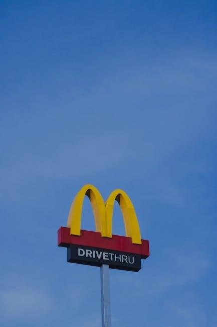
First up, we have the McDonald’s golden arches. Did you know that the famous “M” wasn’t always the sleek, modern design we know today? Back in the day, the logo looked more like a doodle from a bored high school student. Thank goodness for that redesign!
Next on the list is everyone’s favorite search engine, Google. Remember when their logo was a jumbled mess of primary colors and unpronounceable font? Now, they’ve cleaned up their act with a crisp, minimalist design that screams “we’re here to dominate the internet.”
And finally, let’s not forget the tech giant Apple. From its humble beginnings with a rainbow-colored apple, to the sleek, metallic apple we see today, this company knows a thing or two about rebranding. Talk about starting from the bottom and now we’re here!

Factors Influencing Logo Design Changes
There are several factors that can influence changes in logo design, some more bizarre than others. Here are some of the most unusual ones:
- Celebrity Influence: When a famous celebrity decides to change their name or personal brand, some companies may feel the need to update their logo to stay relevant. After all, who wants to be caught sporting a logo that’s so last season?
- Alien Abduction: Believe it or not, there have been cases where logo designers claim their inspiration came from being abducted by aliens. Perhaps a close encounter of the third kind is just what your brand needs to shake things up!
- Zombie Apocalypse: In the event of a zombie apocalypse, it’s essential to have a logo that reflects your brand’s ability to survive. Think blood, guts, and brains – because nothing says “resilience” quite like decaying flesh.
So, whether it’s a sudden urge to impress a celebrity crush, an alien encounter, or preparing for the undead uprising, there are plenty of unexpected factors that can lead to changes in logo design. The world of branding is a strange and unpredictable place, but one thing’s for sure – your logo should always stand out, even if it means taking a few creative liberties along the way!

Successful Examples of Logo Reinvention
Forget about the old logos of your favorite brands because they’ve all gotten a major facelift! Check out these that will leave you feeling like you just stepped into a time machine:
- McDonald’s: The golden arches have never looked so sleek and modern! With a more minimalist design, McDonald’s new logo is the epitome of sophistication.
- Apple: Say goodbye to the rainbow-colored apple logo of the past. Apple’s new logo is all about simplicity and elegance, with a sleek silver finish that screams luxury.
- Nike: Just do it, but do it in style with Nike’s new logo. The iconic swoosh has been given a futuristic update, making it look like it’s ready to take you to the moon and back.
These brands have shown that a little reinvention can go a long way. So next time you’re feeling a little outdated, just remember that even the biggest brands in the world have had to shake things up to stay relevant!

Challenges of Rebranding a Logo
Rebranding a logo may seem like a fun project at first, but trust me, it comes with its own set of challenges that can make even the bravest of designers break out in a cold sweat. Let me break it down for you:
First off, you’ve got to deal with the fear of change. Your clients, stakeholders, and even your own team members may be attached to the old logo like it’s a security blanket. Convincing them that a new logo is necessary can feel like trying to get a toddler to eat their vegetables - it’s a tough sell.
Then there’s the issue of creative block. Coming up with a fresh new design that not only captures the essence of the brand but also resonates with the target audience is no easy feat. It’s like trying to solve a Rubik’s cube blindfolded - you’re just hoping for a miracle at this point.
And let’s not forget the technical challenges. Once you’ve finally nailed down the perfect new logo, you’ve got to make sure it scales well across all platforms, from business cards to billboards. It’s a bit like playing a game of Tetris, but instead of colorful blocks, you’re dealing with pixels and vectors.
Tips for Implementing a Logo Evolution Strategy
So, you’re thinking about evolving your logo, huh? Well, you’ve come to the right place! Here are some tips to help you navigate this exciting journey:
- Remember to stay true to your brand’s identity. Evolution is great, but you don’t want to completely lose sight of who you are. It’s like getting a new haircut – you want to still look like yourself, just a little more updated.
- Don’t rush the process. Evolution takes time, just like a fine wine needs time to mature. Take the time to brainstorm, test out different ideas, and gather feedback before making any final decisions.
- Consider the feelings of your loyal fans. Changing your logo is like changing your outfit – some people might love it, while others might need some time to adjust. Be open to feedback, but also trust your instincts.
And remember, a logo evolution is like a caterpillar turning into a butterfly – it’s a transformation that can lead to beautiful things. Embrace the change and watch your brand soar to new heights!
FAQs
Why do brands reinvent their logos?
Well, you know how sometimes you just get tired of looking at yourself in the mirror every day? Same goes for brands! They need a little makeover every now and then to stay fresh and relevant in the ever-changing world of design.
How does a new logo help a brand stand out?
Imagine being at a party and everyone is wearing the same boring outfit. Then, in walks someone wearing a flashy, sparkly, attention-grabbing ensemble. That’s what a new logo does for a brand – it helps them shine brighter than the rest!
What are some examples of successful logo reinventions?
Well, let me tell you about the ultimate glow-up - Starbucks! They went from a boring brown logo to a vibrant green siren, which really helped them make a splash in the coffee world. Another great example is Apple – they ditched the rainbow-colored apple for a sleek, modern look that matched their innovative products.
Are there any risks involved in changing a logo?
Oh, absolutely! It’s like getting a new haircut – you never know if it’s going to turn out amazing or make you regret every decision you’ve ever made in your life. Brands risk losing their loyal customers if they completely change their iconic logo, but at the same time, they might attract new fans who love the fresh new look.
How often should a brand reinvent its logo?
Think of it like changing your sheets – you don’t want to wait until they’re completely worn out and smelly before giving them a wash. Brands should update their logos every few years to keep up with design trends and stay ahead of the competition.
Time to Evolve Your Brand!
Well folks, it’s time to bid farewell to the old, outdated logos of the past and embrace the new, shiny reinvented versions. Remember, just like Madonna and Cher, brands need to reinvent themselves too. So go ahead, give your logo a makeover and watch your brand soar to new heights! Let your brand evolution begin!


