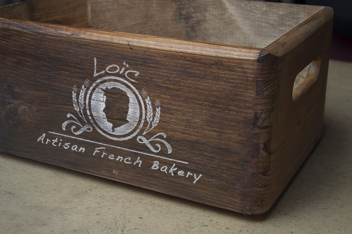
There are few things more inviting than the wonderful aroma of fresh baked pies, cakes, and bread. Even though it is not possible to include the actual scent within your visual branding (well, not always!), it is possible to design a bakery logo that entices customers’ sense of taste and smell. A well-designed logo with the right imagery and text has the capacity to express the taste, texture, and quality of your products.
Bakery logo designs are unique as they are required to directly appeal to two highly motivational senses involved in the purchasing process: taste and smell. By applying the appropriate symbolism, color palette, and typography, it is possible to create positive visual associations with your bakery. There are a variety of tactics to set you apart from your competition, and here’s how you can do it:
Logo Design – Effective Tools
Developing a bakery logo design can be just as exciting as baking itself! However, in place of sugar, yeast, and flour your key ingredients are words, color, and graphics. Similar to the texture and taste of your baked goods, your customers will have common expectations associated with your bakery logo. Here are some ideas to consider when designing your logo:
1. Relevant Imagery
Just as it wouldn’t be recommended to use a pie pan when baking a wedding cake, you need to be wary when selecting images, and avoid any icons or color schemes that could imply “stale”, “bland”, or anything opposite of fresh and delicious. Common images used in bakery logo design include utensils such as whisks and mixing spoons, aprons, chef hats, or boxes of edibles. Popular colors are brown, pink, white, and light blue, as well as a variety of effervescent pastel hues that are combined in multicolored striped patterns. Be aware that colors play an important role within the design and can easily determine the fate of your final concept. Make sure to avoid using them too liberally, and ensure that they are well coordinated and eye-catching.
2. Specificity
There are endless varieties of scrumptious baked goods available in bakeries. It is therefore important to create a unique logo that expresses your area of expertise. Whether your area of expertise is in donuts, cupcakes, pies, artisan breads, French pastries, or organic products, your visual branding should clearly indicate your unique offerings. These minor differences greatly influence the style of imagery and text that you should use for your logo. As a rule of thumb, the more unique your product line, the more you should attempt to tap into your particular niche. This will help ensure your message is clear, and that you attract your target demographic.
3. Color Balance
Your bakery logo design ought to look just as strong in b&w as it does in full color. This will allow you to feature it in a variety of scenarios, from online banners to print media (such as letterheads or catalog advertisements). Therefore, it is important to balance each design element so that there are no distracting shadows or overlaps.
In order to develop your perfect logo, ensure you work with experienced designers (just like the team at Logo Coast)! We understand what it truly takes to build effective visual branding for your business, and can develop a series of logo designs tailored just for you.


