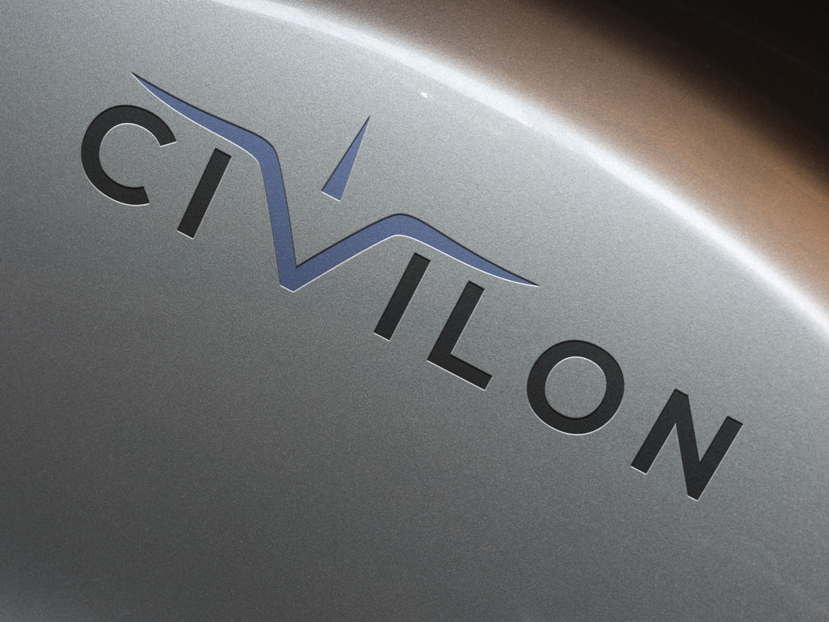
Aviation Logo Design – Elevate Your Brand
Carried out appropriately, aviation logo design can truly take flight. With countless specializations within the field, the logo design needs to be branded in a way that represents your greatest strengths. It’s always useful to evaluate competitors’ logos and analyze where their logos flourish, and where they may falter.
Imagery
When it comes to designing aviation logos, the first image that comes to mind is undoubtedly an airplane. While a sleek jet can certainly make for an amazing logo element, it is important to consider whether this image is an ideal representation of your organization.
What initial impressions do you wish for consumers to make of your logo? Whether you service remote destinations, offer fast flights, or dabble in luxury air travel, you must portray your company creatively and with visual flair.
Typography
There is much more to typography than merely being legible. The style and font you select can send subtle messages that stick in the minds of consumers even long after being viewed. When it comes to aviation logo design, you should focus on a typeface that conveys security, stability, and strength.
Serif type fonts exude respectability. To elicit a company that is dedicated to trust and reliability, a serif type font may be just the ticket.
Colors
Just as typography conveys a subtle message, so too does your logo’s color palette, and a majority of consumers will associate particular hues to intrinsic, but distinct, emotions.
Red is associated with strength and courage, and blue is deemed a soothing and steady accompaniment to this fascinating hue. Further, consumers often deem blue a color of calmness, trustworthiness, efficiency, and intelligence… all of which are invaluable qualities that individuals seek from airline professionals.
While red and blue are tried and tested classic tones within the industry, there are other shades you may want to consider. Green offers an aura of peace, restoration, and balance. Purple represents regality and denotes luxury. And consumers immediately associate orange with safety and comfort.
Black, on the other hand, lends an air of sophistication and stability. White is pure, clean, and cultured. Brown is perceived as steady and warm. However, brown may also contain undertones of being rustic and unsophisticated, which is not the most beneficial or desired branding within the aviation industry.
Considerations
Designing logos is a careful balancing act. While you want consumers to retain a sense of protection and security, you may also want to incorporate a sense of innovation. Attracting passengers to board a sleek aircraft (a mere metal tube hurtling through the air at frightening speeds), may be complicated. But the abundance of profitable logos currently flooding the aviation landscape proves that it is indeed possible.
The industry’s most distinct logos are eye-catching and effortlessly recognizable. To ensure you achieve prominence, Logo Coast will assign a team of dedicated design experts to assist you with creating the best design possible. We strive to operate at your disposal, and will coordinate efforts to develop branding that appeals to both you and the target audience.


