In the wild world of corporate branding, one thing is for sure: logos are like Pokémon – they gotta evolve. From awkward beginnings to sleek, sophisticated transformations, a logo can say a lot about a brand’s journey. So grab your Pokeball and get ready to learn how to align your logo design with brand evolution in this guide to becoming the very best, like no brand ever was.
Building a Strong Foundation: Understanding Your Brand’s Evolution
So, you’ve decided to take the plunge and dive into the world of branding. Congratulations are in order! But before you start plastering your logo everywhere, it’s important to understand the evolution of your brand. Think of it like raising a child, except with fewer tantrums (hopefully).
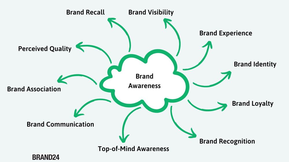
First things first, you need to establish your brand identity. This includes defining your values, mission, and personality. Are you a fun-loving, quirky brand or a serious, no-nonsense one? Once you know who you are, it’s easier to convey that to your audience. Remember, consistency is key here.
Next up, it’s time to do a deep dive into your target audience. Who are they? What do they like? What makes them tick? Conduct surveys, interviews, and maybe even some good old-fashioned stalking (just kidding, please don’t do that). Understanding your audience will help you tailor your brand messaging to resonate with them on a personal level.
Finally, don’t forget to keep an eye on the competition. What are they doing right? Where are they dropping the ball? Take notes, learn from their successes and failures, and use that information to carve out your own unique place in the market. Remember, Rome wasn’t built in a day, and neither is a strong brand foundation.

Exploring the Evolution of Logo Design Trends
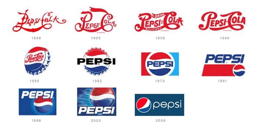
Logo design trends have come a long way since the days of hand-drawn calligraphy. Today, logos are more than just a simple representation of a brand - they are a visual language that speaks volumes about a company’s identity and values.
One of the biggest trends in logo design right now is the use of bold, eye-catching colors. Gone are the days of muted tones and subtle gradients – today’s logos are all about making a statement. Think hot pink, neon green, and electric blue – the bolder, the better!
Another trend that has been gaining popularity in recent years is the use of negative space. By cleverly incorporating hidden symbols or messages within a logo, designers are able to create a sense of intrigue and mystery that keeps viewers coming back for more. It’s like a secret code that only the most observant can crack!
And let’s not forget about the rise of minimalist logos. In a world cluttered with information, sometimes less really is more. A simple, clean design can speak volumes about a brand’s sophistication and elegance. Plus, it’s a lot easier to stencil onto a t-shirt!

Assessing Your Current Logo: Does it Reflect Your Brand Evolution?
When was the last time you really took a good look at your logo? I mean, really looked at it. Does it still represent everything your brand stands for, or does it look like it’s stuck in the ’90s, like a pair of acid-washed jeans?
Take a moment to assess whether your current logo reflects your brand evolution. Does it scream cutting-edge innovation, or does it whisper “I was designed on Microsoft Paint”? Your logo should be a window into your brand’s soul, not a mirror reflecting your awkward teenage years.
Here are a few things to consider when evaluating your logo’s relevance:
- Is it still appealing to your target audience, or does it make them cringe like that time you tried to do the Macarena at the office party?
- Does it convey the right message about your brand, or does it leave people scratching their heads like they just watched the series finale of Lost?
Remember, your logo is the face of your brand. If it’s not reflecting your brand evolution, it might be time for a makeover. After all, no one wants to be stuck in the past, especially when the future looks so damn good.

Strategies for Updating Your Logo to Align with Brand Evolution
So, you’ve decided it’s time to give your logo a facelift to keep up with your brand’s evolution. Here are some strategies to help you through the process:
- Start with research: Take a deep dive into your brand’s history, values, and target audience to ensure your new logo will resonate with your customers.
- Get feedback: Don’t be afraid to ask for input from employees, customers, and even your grandma’s neighbor’s dog. You never know where the next big logo idea might come from!
- Keep it simple: Remember, your logo should be able to stand the test of time. Avoid trendy design elements that might look outdated in a few years.
- Work with a professional: Unless you’re secretly a design wizard, it’s probably best to leave the logo redesign to the experts. Trust us, your customers will thank you.
By following these strategies, you’ll be well on your way to creating a logo that not only aligns with your brand evolution but also captivates your audience and leaves a lasting impression. Good luck!

Leveraging Logo Design to Reinforce Your Brand’s Values
So you’ve got a killer logo that perfectly represents your brand – great job! But did you know that your logo can do so much more than just look pretty? That’s right, your logo has the power to reinforce your brand’s values and make a lasting impact on your audience.
Here are a few ways you can leverage your logo design to reinforce your brand’s values:
- Use color psychology: Choose colors for your logo that evoke the emotions you want associated with your brand. For example, blue can represent trust and reliability, while red can symbolize passion and excitement.
- Incorporate symbolism: Include elements in your logo that reflect your brand’s values. Whether it’s a hidden message or a subtle symbol, adding meaning to your logo can create a deeper connection with your audience.
- Stay consistent: Make sure your logo is used consistently across all platforms and touchpoints. This will help reinforce your brand’s values and create a sense of trust and familiarity with your audience.
So don’t underestimate the power of your logo – it’s more than just a pretty picture. By using your logo to reinforce your brand’s values, you can create a strong and memorable brand that resonates with your audience.
Case Studies: Successful Examples of Aligning Logo Design with Brand Evolution
Let’s take a look at some real-life examples of how brands have successfully aligned their logo design with their evolving brand identity.
In the first case study, we have Paws & Claws Pet Store. As they shifted their focus from just selling pet supplies to offering pet grooming and daycare services, they knew their logo needed a makeover. They retained their cute paw print icon but added a playful font to reflect the fun and friendly atmosphere of their newly expanded offerings.
Next up is ByteMe Tech Solutions, a company that started off providing computer repair services but gradually transitioned into a full-fledged IT consulting firm. They kept their signature blue and green color scheme but updated their logo to include a stylized circuit board design, showcasing their tech expertise in a modern and eye-catching way.
And finally, we have Sweat & Sparkle Fitness Studio. Originally known for their high-intensity workouts, they later introduced yoga and dance classes to appeal to a wider audience. Their revamped logo features a dynamic combination of a dumbbell and a glittery star, perfectly capturing the balance of strength and glamour that defines their brand.
FAQs
What are the key factors to consider when updating a logo to align with brand evolution?
– Well, first and foremost, you’ll want to make sure that your new logo aligns with your brand values and messaging. It’s all about sending the right vibes to your audience, you know?
How can a business ensure that their new logo design reflects their brand identity?
– One word: research. Dive deep into your brand’s identity, values, and audience. You want your logo to scream “This is who we are!” from the rooftops.
Why is it important for a logo to evolve along with a brand?
– Let’s put it this way: would you wear the same outfit you did in the 90s today? Probably not. Your brand’s logo is like its wardrobe – it needs to stay current and stylish.
What are some common mistakes businesses make when updating their logo design?
– Oh, where do I start? One big mistake is straying too far from the original design. Evolution is key, but you don’t want to lose sight of where you came from.
How can a business ensure that their new logo design resonates with their target audience?
– It’s all about knowing your audience like the back of your hand. Get inside their heads, understand what makes them tick, and design a logo that speaks directly to their hearts (metaphorically, of course).
In conclusion, remember to evolve your logo like a Pokémon trainer evolving their Pokémon!
So, whether you’re a startup just starting out or an established brand looking to shake things up, aligning your logo design with your brand evolution is crucial for staying relevant and connected with your audience. So, grab your design tools and get ready to level up your brand!


