Ah, the treacherous waters of logo redesign – a task that can feel like trying to navigate a minefield blindfolded. But fear not, brave design warriors! With a little creativity, a touch of humor, and a few essential tips up your sleeve, you’ll be charting a course to logo redesign success in no time. So grab your compass and buckle up, because we’re about to embark on a perilous yet exhilarating journey into the wild world of logo makeovers. Let’s set sail, shall we
Key considerations before starting the redesign process
So you’ve decided to take the plunge and give your website a much-needed facelift. But before you dive headfirst into the redesign process, there are a few key considerations you need to keep in mind.
First and foremost, take a good look at your current website and identify what’s working and what’s not. Are there certain features that users love? Keep those. Do you have any outdated design elements that are cringe-worthy? Get rid of those ASAP.
Next, think about your target audience. Who are they? What do they want? What are their pain points? Make sure your redesign caters to their needs and preferences. After all, they’re the ones who will be using your website, not your grandma!
And last but not least, consider your budget and timeline. Redesigning a website can be a time-consuming and expensive process, so make sure you have a clear idea of how much you’re willing to spend and how long you’re willing to wait. Remember, Rome wasn’t built in a day – and neither is a killer website!
 brand identity and market positioning“>
Analyzing current brand identity and market positioning
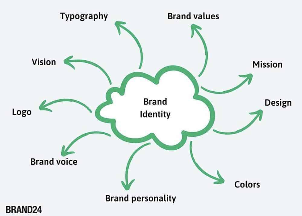
Now that we’ve peeled back the layers of our brand like an onion, it’s time to take a closer look at what we’ve found. Our brand identity is like a fingerprint – unique, sometimes smudged, but always leaving an impression. We’ve examined our colors, logo, fonts, and messaging to see what makes us stand out in a sea of fish.
Next up, we’re diving into the deep end of market positioning. It’s like a game of chess, where we need to anticipate our competitors’ moves and strategize our own. Are we the queen of the board, making power moves left and right? Or are we more like a pawn, slowly inching our way to the other side?
As we analyze our current brand identity and market positioning, it’s important to remember that perception is everything. Are we seen as the cool kid on the block, or are we the slightly awkward neighbor who always waves too enthusiastically? Let’s take a moment to reflect on how we want to be perceived and how we can make that a reality.

Setting clear goals and objectives for the new logo
When it comes to designing a new logo, it’s important to set clear goals and objectives to ensure that the end result is a perfect representation of your brand. So, grab a cup of coffee, put on your thinking cap, and let’s get started!
First and foremost, let’s **define** what we want the new logo to achieve. Is it to attract a younger audience, improve brand recognition, or simply give your company a fresh new look? Once we have a clear understanding of our goals, we can move on to the next step.
Next, let’s **brainstorm** some ideas for the overall look and feel of the logo. Do we want something sleek and modern, or maybe something more traditional and classic? Let your creativity flow and don’t be afraid to think outside the box – after all, we want a logo that stands out from the crowd!
Finally, let’s **outline** the specific elements that our new logo should include. Whether it’s a certain color scheme, a particular font style, or even a hidden message or symbol, make sure that every aspect of the design aligns with our goals and objectives. And remember, Rome wasn’t built in a day – take your time and don’t settle for anything less than perfection!

Working with a professional graphic designer or agency
So you’ve decided to take the plunge and work with a professional graphic designer or agency – congratulations! You’re about to enter a world of endless creativity, impeccable design skills, and possibly a few too many cups of coffee. Here are a few things to keep in mind as you embark on this exciting journey:
**Communication is key:** Make sure you clearly communicate your vision, goals, and expectations to your designer or agency. They may be creative geniuses, but they’re not mind readers (except for that one guy who claims he can read minds – watch out for him).
**Feedback is your friend:** Don’t be afraid to provide feedback on the designs you receive. Constructive criticism is a crucial part of the design process, and your designer will appreciate your honesty (even if they pretend not to).
**Trust the process:** Remember that your designer or agency has years of experience and expertise under their belt. Trust their judgement and let them work their magic – you may be surprised at the incredible results they come up with!

Gathering feedback from stakeholders and target audience
So you’ve reached the point in your project where you need to gather feedback from your stakeholders and target audience. What a fun time to be alive! Here are a few tips to make sure you get the feedback you need without pulling out your hair in frustration.
First things first, make sure you’re asking the right questions. Nobody wants to waste their time answering pointless questions like “Do you like blue?” or “Are you breathing right now?” Be specific and ask questions that will actually help you improve your project.
Next, consider the medium through which you’ll gather feedback. Will you send out surveys via carrier pigeons or host focus groups in a secret underground lair? Whatever you choose, make sure it’s convenient for your stakeholders and target audience to participate. Remember, nobody likes a complicated feedback process!
Lastly, don’t forget to show your appreciation to those who take the time to provide feedback. A simple thank you can go a long way in making people feel valued and more likely to participate in the future. Plus, who doesn’t love a good ol’ pat on the back for a job well done? Now go forth and gather that feedback like the feedback-gathering champion you were born to be!
Testing and refining the new logo design
After much anticipation, we finally have a new logo design to test out and refine! Our design team has been hard at work crafting the perfect image to represent our brand, and now it’s time to put it to the test.
First and foremost on our testing agenda is seeing how the logo looks in various sizes. Will it hold up as a tiny favicon as well as it does blown-up on a billboard? Only time will tell! We’ll also be experimenting with different color schemes to see which one really makes our logo pop.
Of course, we can’t forget about user feedback. We’ll be sending out surveys, hosting focus groups, and maybe even bribing a few friends with free swag to get their honest opinions on our new design. After all, who knows our brand better than our loyal supporters?
As we go through the process of testing and refining our new logo, we’ll be documenting every step of the way. Stay tuned for behind-the-scenes peeks, sneak peeks at potential variations, and maybe even a blooper reel of all the failed attempts along the way. It’s going to be a wild ride, but we’re confident that we’ll come out on the other side with a logo that truly embodies everything our brand stands for. Bold, eye-catching, and completely unforgettable.
Integrating the new logo across all branding materials and platforms
With our spiffy new logo in tow, it’s time to give all our branding materials and platforms a sleek makeover. No more outdated designs holding us back – it’s time to shine!
First up, let’s tackle our website. Our homepage, landing pages, and even our blog posts need a fresh coat of paint with the new logo front and center. Let’s make sure our website visitors know we mean business.
Next on the list, social media. From Facebook to Twitter to Instagram, our profiles need a facelift. It’s time to show off that new logo with pride and let our followers know we’re on top of our game.
Lastly, let’s not forget about our marketing materials. From business cards to brochures to email signatures, everything needs to be updated with the new logo. Let’s make sure our brand is consistent across the board for maximum impact!
FAQs
Q: How can I convince my boss that a logo redesign is necessary?
A: First, you could subtly start leaving Post-it notes around the office with the current logo crossed out and a frowning face drawn next to it. If that doesn’t work, you could always stage a dramatic protest in the break room with picket signs that say “Down with the old logo, up with the new!”
Q: What are some common pitfalls to avoid during a logo redesign?
A: One major pitfall to steer clear of is asking your nephew who took an art class in high school to design the logo for free. Unless, of course, you’re going for the “homemade chic” aesthetic.
Q: How can I ensure that my new logo resonates with my target audience?
A: You could hire a team of mind readers to determine exactly what your target audience wants in a logo. Or you could just, you know, ask them. But where’s the fun in that?
Q: What are some creative ways to unveil a new logo to the public?
A: You could hire a skywriter to spell out your new logo in clouds above a major city. Or you could just post it on social media and hope for the best. The choice is yours!
May Your Logo Redesign Journey be as Smooth as Buttered Popcorn!
Thank you for sticking with us as we navigated the treacherous waters of logo redesign. Remember, a great logo is like a fine wine – it gets better with age (and a few touch-ups here and there). So go forth, armed with these essential tips, and let your brand shine brighter than a disco ball at midnight. And remember, when in doubt, just add more glitter!


