Attention all architects, builders, and construction aficionados - are you tired of seeing the same old boring logos plastered on construction sites across the city? Fear not, because we’re here to shake things up and reveal the latest logo trends in construction that will have you saying “I beams-a make that my logo!” So grab your hard hats and get ready to crack the code on logo design in the construction industry. Let’s build some brand recognition like never before!
Understanding the Importance of Logos in the Construction Industry
Logos in the construction industry are like the cherry on top of a perfectly built cake – they add that extra touch of professionalism and credibility to a company’s brand. But why exactly are logos so important in this rugged world of hard hats and steel-toed boots? Let’s break it down like a dilapidated building ready for demolition.
First off, logos are like the blueprint of a construction company’s identity. They convey a sense of reliability and trustworthiness to clients who are looking for someone to build their dream projects. A well-designed logo can show potential customers that a company is serious about their work and is committed to delivering quality results. It’s like saying, “we may wear tool belts, but we mean business.”
Another reason logos are crucial in the construction industry is for brand recognition. Think of it this way – when you see a bold yellow M on a red background, you immediately think of fast food. And when you spot the iconic swoosh, you know it’s time to “Just Do It.” A strong logo can help a construction company stand out in a sea of competitors, making it easier for clients to remember and recommend them. It’s basically like leaving a trail of breadcrumbs for clients to follow straight to your construction site.
In addition to building brand awareness, logos also help establish a company’s reputation for quality workmanship. A logo that is clean, sophisticated, and well-executed can imply that a construction company pays attention to details and takes pride in their craft. It’s like wearing a perfectly tailored suit to a job interview – it shows that you mean business and are ready to hammer out any challenges that come your way. In the construction industry, a logo isn’t just a symbol – it’s a statement. So, don’t neglect this important aspect of your brand identity. Build a logo that will help you lay the foundation for success, one brick at a time.
Evolution of Logo Design in the Construction Sector
When it comes to logo design in the construction sector, one thing is for certain – they’ve come a long way from just a hammer and nail! Gone are the days of basic, uninspired logos that simply showcased a generic tool or building. Today, construction companies are getting creative with their branding, incorporating clever design elements that truly stand out.
From bold, modern fonts to sleek, architectural symbols, the has been quite impressive. Companies are now focusing on creating logos that not only reflect their expertise and professionalism but also showcase their unique personalities.
One trend that has been gaining popularity in recent years is the use of vibrant colors in construction logos. No longer limited to just grays and blues, companies are embracing bold hues like orange, green, and even purple to make their logos pop.
Overall, the is a clear reflection of the industry’s growth and creativity. So next time you see a construction company logo, take a closer look – you might just be surprised at how far they’ve come!

Key Elements to Consider When Designing a Logo for a Construction Company
When it comes to designing a logo for a construction company, there are a few key elements you need to keep in mind. Trust me, it’s not just about slapping a hammer and a wrench together and calling it a day. Here are some hilarious but wise tips to make sure your construction company logo stands out:
- Simplicity is Key: Keep it simple, silly! A cluttered logo is like a construction site in the rain – messy and unappealing. Stick to clean lines and minimalistic designs that will instantly catch the eye.
- Play with Tools: Let your inner handyman shine through in your logo design. Incorporate tools like hammers, saws, or even a trusty hard hat to convey the essence of construction work.
- Color Scheme: Don’t be afraid to get bold with your color choices. Construction is all about strength and power, so why not go for vibrant yellows, fiery oranges, or cool blues to make your logo pop?
Remember, a logo is the face of your construction company, so make sure it reflects your brand’s personality and values. With a little creativity and a lot of laughs along the way, you’ll have a logo that will build a solid foundation for your business!

Emerging Trends in Construction Logo Design
Are you tired of seeing the same old boring construction logos everywhere? It’s time to shake things up and embrace the ! Say goodbye to those outdated hard hat and hammer designs, and hello to a new era of creativity and innovation.
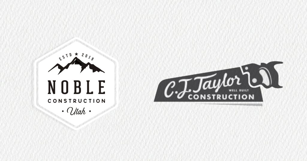
One of the hottest trends in construction logo design right now is incorporating geometric shapes and patterns. Think outside the box (or should I say, outside the rectangle?) and experiment with triangles, hexagons, and other shapes to give your logo a modern and unique look.
Another trend that’s taking the construction world by storm is using bold and vibrant colors in logo design. Don’t be afraid to add a pop of color to your logo – it will make your brand stand out from the competition and show off your fun and playful side. Plus, who said construction logos have to be boring and dull?
Finally, don’t forget about typography! Mix and match different fonts and styles to create a one-of-a-kind logo that reflects your company’s personality and values. Whether you go for a sleek and modern sans-serif font or a classic and elegant serif font, the possibilities are endless when it comes to typography in logo design.

Incorporating Symbolism and Iconography in Construction Logos
When designing construction logos, incorporating symbolism and iconography can really elevate your brand’s image. You know, because nothing says “we build stuff” like a little bit of symbolism, am I right?
Consider using tools such as hammers, nails, and saws to represent the tools of the trade. Or how about a crane symbolizing strength and structure? And let’s not forget about everyone’s favorite symbol of construction - the ever classic hard hat. Safety first, people!
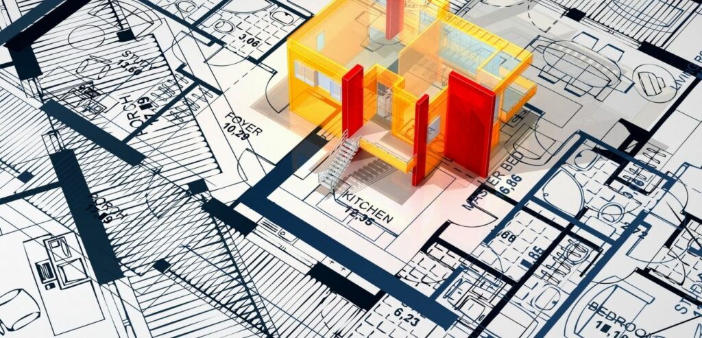
Don’t be afraid to get creative with your iconography. Play around with building blocks to represent growth and stability, or maybe even incorporate a blueprint design to show off your attention to detail. The possibilities are endless!
Remember, your logo is the face of your company, so make sure it reflects the values and qualities that are important to you. And hey, if all else fails, just slap a picture of a crane on there and call it a day. Works like a charm!
Utilizing Color Theory for Effective Construction Logo Design
When it comes to construction logo design, color theory can be your best friend. By understanding how different colors can evoke emotions and convey messages, you can create a logo that not only looks visually appealing but also effectively communicates your brand identity.
Here are a few tips for utilizing color theory in your construction logo design:
- Yellow: Yellow is often associated with optimism and energy, making it a great choice for a construction logo that wants to convey a sense of reliability and efficiency.
- Blue: Blue is a calming color that conveys trust and professionalism, making it a popular choice for construction companies that want to build a strong reputation.
- Orange: Orange is a vibrant and energetic color that symbolizes creativity and innovation, making it a great choice for construction companies that want to stand out from the competition.
By carefully selecting the right colors for your construction logo, you can create a design that not only looks good but also effectively communicates your brand values. So next time you’re brainstorming ideas for your logo, don’t forget to consider the power of color theory!
Case Studies: Successful Construction Companies and Their Logo Designs
Let’s take a closer look at some successful construction companies and their logo designs that have stood the test of time.
First up, we have the mighty Hammer & Nails Construction Co. Their logo features a bold hammer striking a nail, symbolizing strength and precision. The clever use of contrasting colors makes the logo pop and instantly recognizable.
Next, we have Brick by Brick Builders whose logo incorporates, you guessed it, bricks! The clean and simple design exudes professionalism and stability, perfect for a construction company.
And how can we forget about Underground Diggers, Inc.? Their logo cleverly combines a shovel and a hardhat, representing the core of their business. The sleek design and clever use of negative space make this logo a standout in the industry.
FAQs
Q: Why are logos important for construction companies?
A: Well, let’s face it – construction sites are usually not the most attractive places. A killer logo can help spruce up the image of a company and make them appear more professional and trustworthy.
Q: What are some popular logo trends in the construction industry?
A: Oh, we’ve got a few classic favorites like using strong, bold fonts to convey strength and reliability. Also, incorporating tools like hammers or hard hats into the design is always a hit. And let’s not forget about the ever-popular blueprint-inspired look – nothing says “construction” quite like it!
Q: How can a construction company stand out from the competition with their logo?
A: Easy peasy! Just think outside the toolbox, my friend. Get creative with your design – maybe add a pop of color or throw in a quirky element that sets you apart. Remember, you want your logo to be memorable, not forgettable!
Q: Is it important for a construction company to have a logo that reflects their brand identity?
A: Absolutely! Your logo is like the face of your company – it should reflect who you are and what you stand for. So, if you’re a no-nonsense, get-the-job-done-right kind of company, make sure your logo reflects that. And if you’re a fun-loving, sky’s-the-limit type of crew, well, let that shine through in your logo!
Q: How can a construction company ensure their logo is timeless and won’t go out of style?
A: Ah, the age-old question! The key is to keep it simple, my friend. Avoid trendy design elements that might look outdated in a few years. Stick to classic, timeless elements that will continue to look fresh for years to come. Trust me, your logo will thank you!
Wrapping Up
Thanks for joining us on this deep dive into the world of construction logo trends. We hope you’ve gained some inspiration for your own logo design, whether you’re a seasoned pro or just starting out in the industry. Remember, when it comes to cracking the code of logo design, the sky’s the limit (or maybe just the top of your building)! Happy designing!


