Are you tired of your brand’s logo looking like it was designed by a toddler playing with crayons? It’s time to step up your game and create a logo that screams “I mean business” without breaking the bank. In this article, we’ll show you how to create impressive logos using the power of vector illustration. So grab your drawing tablet and put on your thinking cap, because it’s time to take your logo game to the next level!
Choosing the Right Design Software
can be overwhelming, but fear not! I’m here to guide you through the maze of options with some helpful tips.
First things first, consider your needs. Are you a beginner looking for something user-friendly, or a pro searching for advanced features? Make sure the software you choose aligns with your skill level.
Next, explore the different software available. From Adobe Photoshop to Sketch to Canva, the options are endless. Don’t be afraid to experiment with different programs to see which one suits your style best.
Lastly, don’t forget to take advantage of trial versions. Many design software offer free trials, so you can test out the features before committing. Remember, the perfect software is out there waiting for you!
Understanding the Basics of Vector Illustration
So, you want to dip your toes into the world of vector illustration, eh? Well, buckle up, because you’re in for a wild ride!
First things first, let’s talk about what exactly a vector illustration is. Basically, it’s like a fancy-schmancy version of a stick figure drawing, where everything is made up of points, lines, and curves. Think of it as connecting the dots on steroids.
Now, I know what you’re thinking. “But how do I actually create these magical works of art?” Fear not, my friend, for all you need is a trusty software like Adobe Illustrator or CorelDRAW, and a whole lotta patience. With these tools in hand, the world is your oyster!
But before you go off creating the next Mona Lisa of vector illustrations, remember these key principles:
- Scalability is key: Unlike your favorite pair of skinny jeans, vector illustrations can be resized to infinity and beyond without losing any quality.
- Color me impressed: Don’t be afraid to play around with different colors and gradients to make your illustrations pop!
- Practice makes perfect: Rome wasn’t built in a day, and neither will your vector illustration skills. Keep practicing and experimenting, and soon enough, you’ll be the talk of the town!

Utilizing Shapes and Paths for Logo Creation
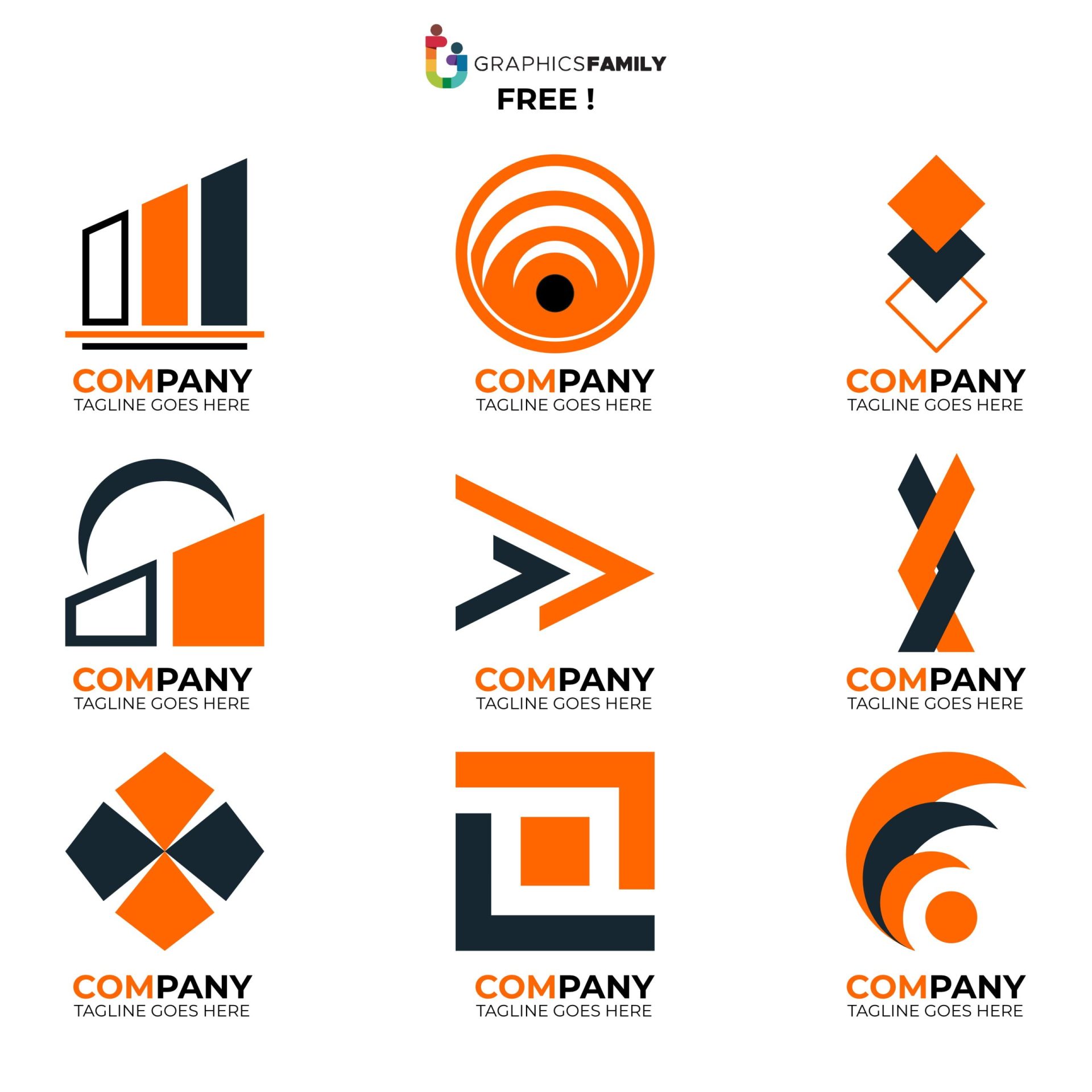
When creating a logo, it’s important to think outside the box—literally. Don’t be a square, be a shape-shifting ninja! Use circles, triangles, and other polygons to add a touch of flair to your design. After all, who said logos have to be boring rectangles?
Paths are your friends in logo creation. They’re like the GPS for your design journey. With a well-planned path, you can navigate through the wild world of logo creation with ease. So grab your trusty pen tool and start drawing those funky shapes and crazy curves.
Mix and match shapes and paths like a mad scientist in a design lab. Combine a circle with a zig-zag path for a logo that screams “I’m quirky and cool.” Add a dash of creativity by experimenting with different line weights and colors. Before you know it, you’ll have a logo that’s as unique as a unicorn wearing a top hat and monocle. So go forth, brave designer, and conquer the world of logo creation with shapes and paths as your trusty sidekicks.
Incorporating Typography into Your Logo Design
Typography can make or break a logo design. To avoid any typographic disasters, here are some tips for incorporating typography into your logo:
1. Choose the Right Font: The font you choose can make a huge difference in how your logo is perceived. Opt for a font that matches the personality of your brand. If you’re a fun and quirky company, go for a playful font like Comic Sans. Just kidding, please don’t use Comic Sans. But seriously, think about how you want your brand to be perceived and choose a font that reflects that.
2. Experiment with Typography: Don’t be afraid to play around with different fonts, sizes, and styles. Mix and match until you find a combination that works. Remember, this is like a typography playground – have fun with it!
3. Keep it Simple: While it’s important to be creative with your typography, don’t go overboard. A cluttered logo can be overwhelming and hard to read. Keep it clean and simple to make a lasting impression.
4. Test, Test, Test: Once you’ve settled on a typography style, test it out on different backgrounds and at different sizes. Make sure it’s legible and looks good in various contexts. Your logo will be everywhere, so make sure it looks great wherever it goes!
Exploring Color Palettes for Impactful Logos
Color palettes can make or break a logo design. That’s why it’s crucial to explore different options to find the perfect combination that will leave a lasting impact. Here are some tips and tricks to help you on your colorful journey:
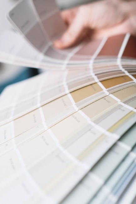
Consider the psychology of colors: Each color evokes different emotions and responses. For example, red can symbolize passion and energy, while blue can represent trust and calmness. Make sure to choose colors that align with the message and personality of the brand.
Don’t be afraid to experiment: Mix and match different hues to see what works best together. You might be surprised by the unique color combinations that emerge when you step out of your comfort zone.
Look to nature for inspiration: Mother Nature is the ultimate artist when it comes to color palettes. Take a stroll outside and observe the colors around you. You’ll find endless inspiration in the vibrant hues of flowers, sunsets, and even your morning cup of coffee.
Keep it simple: While it’s tempting to use every color of the rainbow in your logo, sometimes less is more. Stick to a few key colors that complement each other and make a bold statement. Remember, a visually cluttered logo can be overwhelming and detract from the brand message.
FAQs
Why is vector illustration essential for creating impressive logos?
Vector illustration is like the superhero of the design world. It allows for infinite scalability without losing quality, making your logo look sharp and professional on any platform. Who doesn’t want their logo to shine like a diamond in the rough of mediocrity?
What are some important elements to consider when designing a logo with vector illustration?
Think of vector illustration as your trusty sidekick, helping you navigate the treacherous waters of logo design. Elements like simplicity, versatility, and uniqueness are key. Your logo needs to be memorable and able to adapt to a variety of sizes without losing its impact. It’s like finding that perfect little black dress that looks good no matter the occasion.
How can I ensure my logo stands out from the competition with vector illustration?
Imagine your logo as the peacock strutting its stuff among a sea of pigeons. To stand out, your logo needs to embody your brand’s essence while also being visually striking. Use bold colors, unique shapes, and clever design elements to make your logo pop like a bubblegum flavored soda at a boring party.
What are some tips for beginners looking to create logos using vector illustration?
Embarking on the journey of logo design can be a wild ride, like trying to tame a wild mustang with a stick of bubblegum. Start by sketching out your ideas on paper, then bring them to life using vector illustration software like Adobe Illustrator. Remember, practice makes perfect, so don’t get discouraged if your first attempts look like a misshapen unicorn.
How can I incorporate storytelling into my logo using vector illustration?
Your logo should be like a mini novel, telling the story of your brand in a single image. Use symbols, colors, and fonts that reflect your brand’s personality and values. Think of your logo as the opening chapter to a great adventure, enticing customers to learn more about what you have to offer.
In Conclusion: Unleash Your Creativity and Vectorize Your Logo Game!
Look, we get it. Creating logos with vector illustration might seem daunting at first. But trust us, once you start playing around with those anchor points and curves, you’ll be hooked! So go forth, dear reader, and unleash your inner artist. With a little bit of practice and a whole lot of creativity, you’ll be crafting impressive logos that will make your competitors green with envy. Happy vectorizing, folks!


