Have you ever stopped to think about why certain logos make you feel calm and reassured, while others make you want to run for the hills? It’s all thanks to the magical world of color psychology! That’s right, folks - there’s a whole science behind why we’re drawn to certain hues and repelled by others. So buckle up and prepare to take a colorful journey through the wild world of logo design, where every shade tells a story and every hue has a purpose. Let’s dive in and discover why choosing the right colors for your logo is more important than remembering to wear pants on a Zoom call.
Understanding the Basics of Color Psychology
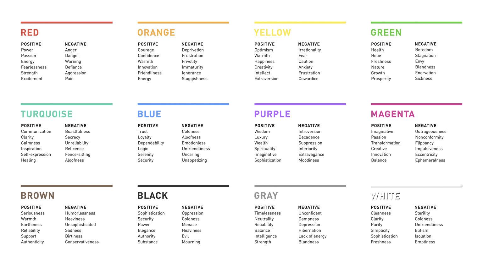
Color psychology is a fascinating field that explores how colors can impact human emotions, behavior, and perceptions. If you’ve ever wondered why you feel so calm in a room filled with blue hues or why you suddenly crave a burger when you see that unmistakable red and yellow branding, then you’ve already experienced the power of color psychology without even knowing it!
Here are a few basics to help you understand how colors can affect your mood and decision-making:
- Red: This fiery color is often associated with passion, energy, and excitement. It can also stimulate appetite, which is why so many fast food chains use it in their branding.
- Blue: Cool, calm, and collected, blue hues are often used to convey a sense of trust, peace, and professionalism. It’s no wonder that many corporate logos feature shades of blue.
- Yellow: Bright and cheery, yellow is known to evoke feelings of happiness, optimism, and warmth. It’s also closely associated with creativity and innovation.
Remember, the way you perceive and react to colors is also influenced by cultural and personal associations, so what may make one person feel energized could leave another feeling completely different. It’s all about finding the right palette that speaks to you and evokes the emotions you want to cultivate in your surroundings!

The Impact of Different Colors on Human Emotions
Let’s dive into the world of colors, where hues have the power to make us feel all sorts of emotions. It’s like a weird science experiment, except instead of test tubes and bubbling potions, we’ve got rainbows and paint swatches.
First up, we have **red**. This fiery color is known to stir up feelings of passion and excitement. It’s like the awkward teenager of the color wheel – so intense and in-your-face, you can’t help but pay attention. Red is the friend who always wants to go out and party, and you can’t say no because, well, who can resist a good time?
Next, we have **blue**. This cool and calming color is like the yoga instructor of the bunch. It’s all about tranquility and peace, bringing a sense of serenity to any room or outfit. Blue is the friend who’s always there to listen to your problems and offer sage advice – a true shoulder to cry on in a sea of chaos.
And then there’s **yellow**. Ah, yellow, the happy-go-lucky color that screams sunshine and smiles. It’s like that friend who’s always cheerful and never fails to lift your spirits. Yellow is the eternal optimist, the eternal ray of sunshine in a world full of clouds. So next time you’re feeling down, just remember: a little splash of yellow might be all you need to brighten your day.
Utilizing Color Theory in Logo Design
When it comes to logo design, color theory is like the secret sauce that makes your design pop! Here are some fun ways to utilize color theory in your logo:
- Contrast is Key: Make sure to use colors that contrast well with each other, like black and white, to make your logo stand out.
- Know Your Audience: Different colors evoke different emotions, so make sure to choose colors that resonate with your target audience. For example, red can convey passion and energy, while blue can evoke trust and professionalism.
- Go Bold or Go Home: Don’t be afraid to use bold, vibrant colors in your logo design. They can help your logo grab the viewer’s attention and create a lasting impression.
Remember, color theory is not just about picking pretty colors - it’s about creating a visual identity that reflects your brand’s personality and values. So, have fun experimenting with colors and see how they can elevate your logo design to the next level!

Creating a Strong Brand Identity through Color Choice
When it comes to creating a strong brand identity, the colors you choose can make all the difference. Think about it – would Starbucks be the same without its iconic green and white color scheme? Or would McDonald’s golden arches pack the same punch if they were purple?
So, how do you go about choosing the right colors for your brand? Well, it all comes down to psychology. Different colors evoke different emotions and associations in people’s minds. For example, red is often associated with passion and energy, while blue tends to convey trust and dependability.
When deciding on your brand’s color scheme, consider the following:
- Research: Look into the psychology of color to see which hues align best with your brand’s values.
- Consistency: Stick to a few key colors to avoid confusing your audience.
- Competition: Research what colors your competitors are using and consider how you can stand out.
Remember, color choice is a crucial aspect of branding, so don’t be afraid to get creative and think outside the box. After all, who knows - maybe your brand’s signature color will be the next big thing!

The Role of Color Contrast and Saturation in Logo Design
When it comes to creating a killer logo, color contrast and saturation are like the undercover agents that make or break the case. You might not give them much thought, but trust me, they’re the secret sauce that takes your design from “meh” to “wow.”
Picture this: a logo with colors that blend together like a bad oil painting. It’s a total snooze-fest. But add some contrast - like a bright yellow against a deep navy blue – and suddenly you’ve got a logo that pops like a bag of microwave popcorn.
And let’s not forget about saturation. Too much and your logo screams ”I didn’t know when to stop,” while too little makes it look as dull as a Monday morning staff meeting. Strike a balance and you’ve got a logo that’s as vibrant as a Las Vegas showgirl.
So next time you’re designing a logo, don’t forget about the unsung heroes of color contrast and saturation. They may not wear capes, but they sure know how to make your brand stand out in a sea of mediocrity.
Examining Successful Logo Designs and Their Use of Color
When it comes to successful logo designs, one of the key elements to consider is the use of color. Colors have the power to evoke emotions, convey messages, and create memorable branding. Let’s take a closer look at some iconic logos and how they have cleverly utilized color schemes to make a lasting impression:
In the world of fast-food restaurants, McDonald’s stands out with its bold use of red and yellow. Red is known to stimulate hunger and yellow is associated with happiness, making it the perfect combination to entice customers to grab a quick bite.
On the other end of the spectrum, Apple has mastered the art of simplicity with its sleek logo in grayscale. The black and white colors exude sophistication and elegance, reflecting the brand’s minimalist design philosophy.
When it comes to social media platforms, Facebook has nailed it with its blue and white color scheme. Blue is often associated with trust and reliability, qualities that are essential for a platform that connects billions of users worldwide.
Tips for Incorporating Color Psychology into Your Logo Design Strategy
Color psychology can play a big role in the effectiveness of your logo design. Here are some tips that will help you incorporate it into your strategy:
- Consider the emotions you want to evoke with your logo. Select colors that align with those emotions. For example, red can represent passion and energy, while blue can evoke trust and reliability.
- Don’t be afraid to think outside the box when it comes to color combinations. Sometimes unexpected pairings can create a memorable and impactful logo. Who says hot pink and neon green can’t work together?
- Take into account cultural differences when choosing colors for your logo. What may symbolize luck in one country could signify danger in another. You don’t want your logo unintentionally sending the wrong message!
Remember that color can also affect readability and accessibility. Make sure your logo is visually appealing to as many people as possible by choosing colors that contrast well and are easy to distinguish. You want your logo to catch the eye, not strain it!
FAQs
What role does color psychology play in logo design?
Color psychology is like the fairy godmother of logo design, sprinkling magic dust on a brand’s identity. It influences emotions, perception, and behavior, guiding consumers to feel a certain way about a company without them even realizing it. It’s like hypnotizing your audience, but in a totally legal and ethical way.
How can different colors evoke different emotions in consumers?
Picture this: you see a logo with fiery red and your heart starts racing, or a logo with soothing blue and you feel calm and collected. Colors have the power to tap into our subconscious and awaken all sorts of emotions – from passion and energy to trust and stability. So, choose wisely!
Why is it important to consider your target audience when selecting colors for a logo?
Think of your target audience as your VIP guests at a fancy party. You wouldn’t serve sushi to a group of steak lovers, right? The same goes for colors in logo design. Different colors resonate with different demographics, so pick hues that speak their language and make them swoon.
How can a well-chosen color palette help a brand stand out from its competitors?
In the vast sea of logos, a well-chosen color palette is like a beacon of light guiding lost souls to your brand. It helps you differentiate yourself from competitors, create a strong brand identity, and carve your own little corner of the market. It’s like having a neon sign that says, “Look at me, I’m fabulous!”
Can color psychology be used to rebrand a struggling company?
Absolutely! Color psychology is like a superhero cape for struggling companies. By choosing the right colors for a rebrand, you can breathe new life into a fading brand, inject fresh energy, and reconnect with consumers on a deeper level. It’s like hitting the reset button, but with a splash of color.
Time to Add Some Color to Your Logo!
So there you have it – the importance of color psychology in logo design! Now that you’re armed with this knowledge, go forth and create eye-catching, memorable logos that will leave a lasting impression on your audience. Remember, a vibrant logo is like a splash of color in an otherwise black and white world – so go ahead and paint the town (and your logo) red, blue, or any color you choose! Happy designing!


