
In a world where attention spans are shorter than a TikTok video, having a logo that can grab a viewer’s eye quicker than you can swipe left on a bad date is crucial. Crafting attention-grabbing logos in the digital era is no easy feat, but fear not – we’ve got the tips and tricks you need to make your brand stand out in a sea of scrolling thumbs. So grab your designer’s toolkit and get ready to make some pixel-perfect magic!
Understanding the Importance of Logos in the Digital Age
In today’s digital age, logos play a crucial role in establishing a brand’s identity and standing out in a sea of competition. Here are a few reasons why logos are more important now than ever:
- First impressions matter, and your logo is often the first thing potential customers see.
- A well-designed logo can convey your brand’s personality and values in a single glance.
- Logos help create brand recognition and loyalty, making it easier for customers to remember and choose your business over others.
Think of logos as the superhero capes of the business world – they may seem small, but they pack a powerful punch. Without a strong logo, your brand might as well be wearing a disguise and hiding its true identity.
So next time you’re tempted to skimp on your logo design, remember that it’s not just a pretty picture – it’s the digital face of your brand, the silent ambassador of your business, and the unsung hero of your marketing efforts.

Trends in Logo Design for Maximum Impact
Logos are like tattoos for businesses – they’re permanent, they better be good, and they’re usually found on a forearm. So how can businesses ensure their logos have maximum impact in this ever-evolving world of design trends?
Firstly, simplicity is the name of the game. Forget about intricate designs and wordy slogans; think minimalistic and to the point. Logos should be easily recognizable at a glance, like spotting your ex across a crowded room. Keep it clean, keep it simple.
Secondly, geometric shapes are all the rage. Squares, circles, triangles – oh my! Embrace your inner math geek and let those shapes shine in your logo design. Think of it as playing Tetris, but with your brand identity.
Lastly, don’t forget about color. Bold and bright hues can make your logo pop like a bag of microwave popcorn. Think of your logo as a peacock showing off its feathers – be bold, be colorful, and make the competition green with envy.

Key Elements to Consider in Crafting a Standout Logo
When it comes to crafting a standout logo, there are a few key elements that you need to consider. First and foremost, your logo needs to be memorable. You don’t want potential customers to see your logo and immediately forget about it. You want it to stick in their minds like that annoying jingle from a commercial you can’t get out of your head.
Another important element to consider is simplicity. Your logo should be clean and easy to understand. You don’t want it to be so cluttered with graphics and text that it looks like a hot mess. Remember, less is more when it comes to logo design.
Color choice is also crucial when crafting a standout logo. You want to choose colors that not only look good together, but also convey the right message about your brand. For example, if you’re a funeral home, you probably don’t want to use bright, neon colors in your logo. That might send the wrong message…
And finally, don’t forget about scalability. Your logo should look good whether it’s being displayed on a billboard or on a business card. You want it to be easily recognizable no matter what size it is. So, take these key elements into consideration when crafting your logo and you’ll be well on your way to creating a standout design that represents your brand perfectly.
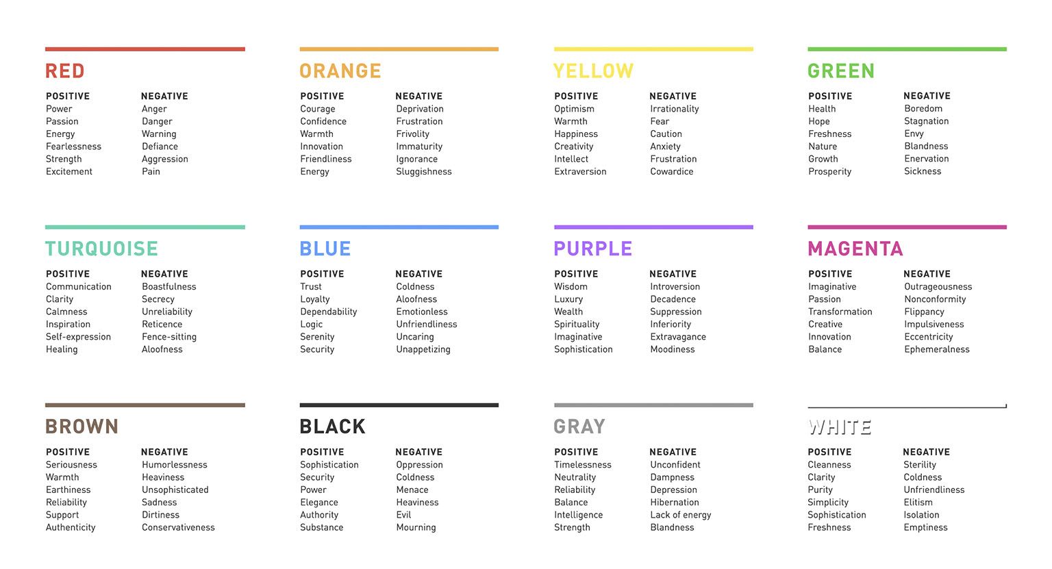
Utilizing Color Psychology and Typography to Enhance Logo Appeal
If you want to take your logo from drab to fab, look no further than the wonderful world of color psychology and typography! By understanding how different colors and fonts can evoke certain emotions and perceptions, you can create a logo that truly speaks to your target audience. Here are some tips on how to utilize these design elements to enhance your logo’s appeal:
- Colors: When choosing colors for your logo, consider the emotions and associations they may convey. For example, red can evoke feelings of passion and energy, while blue suggests trust and professionalism. Play around with different color combinations to see what resonates with your brand’s message.
- Typography: The font you choose can make a world of difference in how your logo is perceived. Bold, serif fonts often indicate tradition and reliability, while sleek, modern sans-serif fonts can convey a sense of innovation and creativity. Experiment with different fonts to find the one that best represents your brand’s personality.
By incorporating elements of color psychology and typography into your logo design, you can create a visual identity that not only looks great but also resonates with your audience on a deeper level. Don’t be afraid to think outside the box and get creative with your choices – after all, a little splash of color and a funky font can go a long way in making your logo stand out from the crowd!

Tips for Ensuring Logo Scalability and Versatility
When designing a logo, it’s important to keep scalability and versatility in mind. You want your logo to look good whether it’s blown up on a billboard or shrunk down on a business card. Here are some tips to help ensure your logo can adapt to any size or application:
Keep it Simple: Your logo should be easily recognizable even when it’s small. Avoid intricate details or tiny text that will become unreadable when scaled down.
Choose a Flexible Color Palette: Stick to a few key colors that work well together and can be easily adapted to different backgrounds. Avoid using too many colors that could clash or get lost when reproduced in black and white.
Experiment with Different Layouts: Try your logo in different orientations and arrangements to see how it looks in different contexts. A logo that works well horizontally may not look as good stacked vertically, so play around with the layout to find what works best.
The Role of Simplicity and Memorability in Logo Design
When it comes to logo design, simplicity and memorability go together like peanut butter and jelly. A simple logo is like a well-tailored suit – it gets the job done without any unnecessary frills. Think of iconic logos like the Nike swoosh or the golden arches of McDonald’s – they’re simple, to the point, and easily recognizable. No one wants a logo that looks like it came from a bad acid trip.
But let’s not forget about memorability – the key to making sure your logo sticks in people’s brains like a catchy song that you just can’t shake. A memorable logo is like a good joke – it lingers in your mind long after you first hear it. Just think about the Apple logo - once you see that little bitten apple, you can’t unsee it. It’s like a tattoo on your brain.
So, when you’re designing a logo, remember the golden rule: keep it simple, stupid! Your logo should be like a good pickup line – short, sweet, and impossible to forget. And if all else fails, just throw a cat in there. People love cats, right?
In the world of logo design, simplicity and memorability are the dynamic duo that will take your brand to the next level. So, don’t overcomplicate things – keep it simple, make it memorable, and watch your logo work its magic like a well-oiled machine.
Branding Strategies to Implement with Your Logo in the Digital Era
In today’s digital age, having a strong branding strategy is more important than ever. Your logo is the face of your brand, so it’s crucial to implement the right strategies to make sure it stands out in the crowded online world.
One way to do this is by ensuring your logo is **mobile-friendly**. With more people accessing the internet on their phones than ever before, you want to make sure your logo looks just as good on a small screen as it does on a desktop. This means keeping it simple and easy to read, with bold colors and clean lines that won’t get lost on a smartphone.
Another key strategy is to **optimize your logo for social media**. Your logo is likely to be shared across various platforms, so you want to make sure it looks great on each one. This could mean creating different versions of your logo for different social media channels, or simply ensuring that it scales well and is easy to recognize at a glance.
And finally, don’t be afraid to get **creative** with your logo. In the digital era, standing out is key, so don’t be afraid to experiment with different colors, fonts, and styles to make your logo truly unique. Just remember to keep it consistent across all platforms to maintain brand recognition.
FAQs
Why is it important to have an attention-grabbing logo in the digital era?
Having an attention-grabbing logo in the digital era is crucial because, let’s face it, people have the attention span of a goldfish nowadays. If your logo isn’t catching their eye, they’ll just keep on scrolling.
What are some key elements to consider when crafting a logo for the digital age?
When crafting a logo for the digital age, you need to consider things like simplicity, versatility, and scalability. Basically, your logo should be able to look just as good on a tiny phone screen as it does on a giant billboard.
How can colors impact the effectiveness of a logo in the digital world?
Colors can make or break a logo in the digital world. Bright, eye-catching colors can help your logo stand out in a sea of blandness, while clashing colors can make people want to cover their eyes in horror.
What role does typography play in creating a memorable logo?
Typography is like the spice in a logo design recipe. It can add flavor and personality to your logo, making it more memorable and unique. Just make sure not to go overboard with the Comic Sans.
How can a business ensure their logo resonates with their target audience in the digital age?
To ensure your logo resonates with your target audience, you need to do your homework. Research your audience’s preferences, trends, and memes to create a logo that speaks their language. Trust me, they’ll appreciate it.
Time to Make Your Mark!
Congratulations! You’ve mastered the art of crafting attention-grabbing logos in the digital era. Now go forth and create some eye-catching designs that will make your brand stand out in a sea of mediocrity. Remember, a great logo is like a superhero cape for your company – it gives you the power to soar above the competition. So get out there and start designing!


