Are you tired of seeing the same old boring logos everywhere you turn? Well, get ready to have your mind blown with revolutionary typography that is changing the game! Say goodbye to dull, uninspired designs and hello to cutting-edge logos that will make you do a double take. Prepare to be wowed as we dive into the world of typography like you’ve never seen before. Get ready to have your eyeballs dazzled and your designer heart aflutter – because we’re about to revolutionize logos in the most epic way possible!
Evolution of Logos in Typography
Logos have been through quite the evolution when it comes to typography. From basic fonts to elaborate hand-lettering, typography has played a key role in shaping the identity of a brand. Let’s take a look at how logos have transformed over the years:
**1. Basic Fonts:** In the early days, logos were all about simplicity. Companies would use basic fonts like Times New Roman or Arial to convey their message. While these logos may have lacked flair, they got the job done.
**2. Custom Typography:** As companies started to realize the importance of standing out from the competition, custom typography became all the rage. Logos began to feature unique, eye-catching fonts that were designed specifically for the brand.
**3. Hand-Lettering:** In recent years, hand-lettering has made a comeback in the world of logo design. This artisanal approach adds a touch of personality and charm to a brand’s identity. Whether it’s a whimsical script or a bold serif, hand-lettered logos are all the rage.
Innovative Techniques in Typography
Typography has come a long way from just selecting a font and adjusting its size. Designers are pushing the boundaries of creativity by incorporating innovative techniques that make text truly stand out. From kinetic typography to holographic fonts, the possibilities are endless!
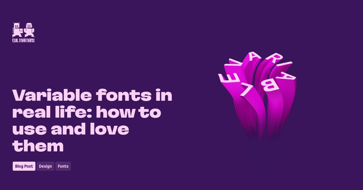
One technique that is gaining popularity is 3D typography. Instead of flat letters on a page, designers are creating text that pops out at you, literally! Imagine reading a website where the words literally jump off the screen at you. It’s like a virtual reality experience, but with letters instead of zombies.
Another cool technique is using animation to bring typography to life. Text that dances, spins, and morphs before your eyes – who needs a laser light show when you have animated typography? It’s like having a dance party in every sentence.
And let’s not forget about responsive typography. Just like responsive web design, text that adjusts and reflows based on the screen size. No more squinting at tiny fonts on your phone – with responsive typography, the words are always perfectly legible, no matter what device you’re using.
The Impact of Typography on Branding
When it comes to branding, typography can make or break a company’s image. The fonts used in a logo, website, or marketing materials can convey a lot about a brand’s personality and values.
Here are a few ways that typography can impact branding:
- First Impressions: The font choice is often the first thing that people notice about a brand. A sleek, modern font can give off a cutting-edge vibe, while a more traditional font can convey a sense of stability and reliability.
- Emotional Connection: The right typography can evoke emotions and create a connection with consumers. A playful, whimsical font might appeal to a younger audience, while a sophisticated, elegant font might attract a more upscale clientele.
- Consistency: Consistency in typography across all brand touchpoints is key to building brand recognition and trust. Using the same fonts in all communications helps create a cohesive brand identity.
So next time you’re designing a logo or crafting a marketing campaign, remember that typography matters. Choose your fonts wisely, and watch your brand soar!
Embracing Minimalism in Logo Design
Are you tired of logo designs that make your eyes hurt with too many bells and whistles? Well, it’s time to embrace minimalism in logo design and keep it simple, sleek, and oh-so-chic!
Here are a few reasons why minimalism is the way to go:
- Less is more, baby! Who needs all that clutter when you can make a bold statement with just a few strategically placed elements?
- Minimalist logos are like the little black dresses of the design world - timeless, elegant, and always in style.
- Clean lines and negative space are your new best friends. Trust us, they make a logo shine brighter than a diamond in the rough.
So, next time you’re brainstorming logo ideas, remember: simplicity is key. Embrace the power of less and let your design speak volumes with just a whisper of style. Minimalist logos are not just a trend – they’re a way of life!
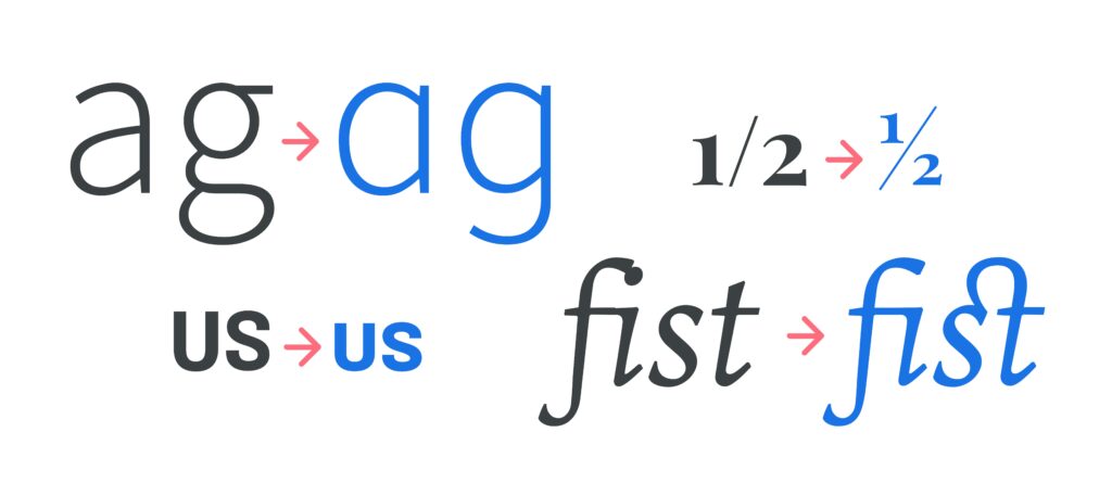
Creating a Memorable Logo through Typography
When it comes to , you’ve got to think outside the box. Bold, unique fonts are your best friend in this quest for design greatness. Remember, you want your logo to stand out like a neon pink flamingo in a sea of pigeons.
One key tip for typography success is to experiment with different font pairings. Mix and match bold, funky fonts with more traditional ones to create a logo that pops. It’s like putting together a quirky outfit – sometimes the most unexpected combinations are the ones that turn heads.
Don’t be afraid to play around with sizing and spacing to give your typography that extra oomph. A little extra kerning here, a touch of leading there – your logo will be screaming “look at me!” in no time.
And remember, simplicity is key. Sometimes less is more when it comes to typography. A clean, straightforward font can speak volumes without saying a word. Think of it like a silent but stylish ninja lurking in the shadows, ready to pounce on the competition.
Typography Trends in Modern Logo Design
Forget about boring old Times New Roman, in modern logo design, it’s all about pushing the boundaries of typography!
One of the hottest trends right now is mixing fonts to create a visually engaging logo that stands out from the crowd. From sleek sans-serif to playful script, designers are getting creative with their font choices to make a statement.
Another trend that’s making waves is the use of custom hand-lettered fonts. It’s like having a personalized touch that adds a unique flair to your logo design. Who needs pre-made fonts when you can have something tailor-made just for you?
And let’s not forget about the power of negative space! Cleverly using negative space within typography can create optical illusions and hidden messages that make your logo all the more intriguing. It’s like a secret code that only the most observant will crack!
FAQs
What makes typography in logos so important?
Oh, darling, let me tell you! Typography in logos is like the cherry on top of a perfectly frosted cupcake. It sets the mood, conveys the brand’s personality, and grabs attention faster than a puppy wearing a bowtie.
How can cutting-edge typography revolutionize a logo?
Picture this: your logo is a sleek sports car cruising down the typography highway. Cutting-edge typography is like giving that sports car a turbo boost, making it stand out from the rest of the traffic jams out there. It’s fresh, bold, and impossible to ignore.
Are there any risks involved in using cutting-edge typography for a logo?
Well, my friend, with great power comes great responsibility. Using cutting-edge typography can be like playing with fire – exhilarating and a little dangerous. Make sure it aligns with your brand’s identity and resonates with your target audience. A logo that’s too avant-garde may end up confusing more than impressing.
How can a business maintain a balance between traditional and cutting-edge typography in their logo?
Ah, the age-old question of yin and yang, of old versus new. Think of traditional typography as your reliable grandma’s homemade cookies – warm, comforting, and oh-so familiar. Cutting-edge typography, on the other hand, is like a trendy food truck serving up artisanal cronuts. Combine elements of both to create a logo that’s a delicious blend of the best of both worlds.
What are some examples of brands that have successfully revolutionized their logos with cutting-edge typography?
Oh, honey, there are plenty of shining stars in the typography galaxy. Think Airbnb’s playful and modern logo, or the bold and iconic wordmark of Supreme. These brands have shown the world that when it comes to logos, thinking outside the typographic box can truly make a world of difference.
In Conclusion, Let Your Words Shine!
So there you have it, folks! The future of logos is here, and it’s all about embracing cutting-edge typography. Say goodbye to boring old fonts and hello to eye-catching, innovative designs that will make your brand stand out from the crowd. With a little creativity and a lot of pizzazz, you too can revolutionize your logo and leave a lasting impression on your audience. So what are you waiting for? Get out there and let your words shine!


