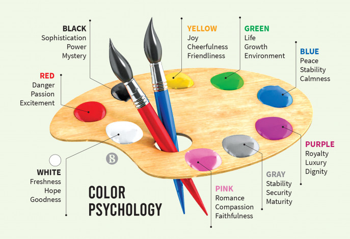
Welcome to the colorful world of logo design, where hues and shades reign supreme in the battle for brand recognition. In this article, we will delve into the mysterious realm of color psychology to uncover the secrets behind creating eye-catching logos that leave a lasting impression on the minds of consumers. So grab your paintbrushes and buckle up, dear readers, because we’re about to embark on a chromatic journey like no other. Let’s paint the town red… or blue, or yellow, or whichever color suits your brand best!
Understanding Color Theory
Ever wonder why certain colors clash or why some colors just seem to go together like peanut butter and jelly? That’s where color theory comes into play! It’s like the magic wand that makes your eyes do a happy dance when they see a well-designed color palette. Let’s break it down, shall we?
First up, let’s talk about the color wheel. It’s like the Beyoncé of color theory. You’ve got your primary colors (red, blue, yellow), your secondary colors (orange, green, purple), and your tertiary colors (lime green, turquoise, coral). It’s like a big happy family where everyone gets along and looks fabulous together.
Complementary colors are like that odd couple you never thought would work out but somehow make it work. They sit opposite each other on the color wheel and create a dynamic, eye-catching contrast. Think of red and green during the holidays or purple and yellow like a funky disco party.
Analogous colors, on the other hand, are like the BFFs of color theory. They sit next to each other on the color wheel and share similar undertones. It’s like they finish each other’s sentences and always know what the other is thinking. Blue, blue-green, and green are like the Three Musketeers of the color world.
The Impact of Color in Logo Design
When it comes to logo design, color plays a crucial role in making a lasting impact on consumers. The colors you choose can evoke specific emotions, communicate your brand’s personality, and even influence purchasing decisions. Let’s take a closer look at how different colors can affect the overall design of a logo.
Red: This bold and vibrant color is often associated with passion, energy, and excitement. It can grab attention and create a sense of urgency, making it a popular choice for logos in industries like food, retail, and entertainment.
Blue: Known for its calming and trustworthy qualities, blue is a favorite among tech companies, banks, and healthcare providers. It can convey professionalism and reliability, making customers feel confident in choosing your brand.
Yellow: Bright and cheerful, yellow is often used to convey optimism, creativity, and warmth. It can be a great choice for brands looking to stand out and leave a memorable impression on their audience.

Using Color to Evoke Emotions
Color has a magical way of stirring up emotions within us. Think about how you feel when you see a vibrant red sunset or a calming blue ocean. It’s like our eyeballs are having a dance party with our feelings! Let’s dive into how different colors can make us feel all the feels.
First up, we’ve got orange. This zesty color is like a burst of sunshine on a rainy day. It’s energetic, happy, and ready to party! So, next time you need a pick-me-up, surround yourself with some orange and let the good vibes flow.
On the flip side, blue is the cool cucumber of colors. It’s calm, serene, and ready to help you chill out after a long day. So, if you’re feeling a little frazzled, grab a cup of blue tea, snuggle up in a blue blanket, and watch your worries melt away.
Now, let’s talk about pink. This girly hue is like a big hug in color form. It’s sweet, soothing, and sure to make you feel all warm and fuzzy inside. So, grab your favorite pink sweater, put on some pink lipstick, and let the world see your rosy outlook on life!

Choosing the Right Color Palette for Your Brand
When it comes to , it’s important to remember that colors have personalities of their own. Make sure to pick colors that represent the essence of your brand and appeal to your target audience.
Here are some tips to help you make the perfect color choices:
- Research your competition: Take a look at what colors your competitors are using. You don’t want to blend in with the crowd, but you also don’t want to choose colors that are too similar to others in your industry.
- Consider color psychology: Different colors evoke different emotions. For example, blue represents trust and dependability, while red can convey passion and excitement. Think about what feelings you want to evoke in your audience and choose your colors accordingly.
- Test it out: Don’t just pick colors you like – make sure they work well together. You can use tools like Adobe Color to create color palettes and see how they look together before making a final decision.
Remember, your brand’s color palette will be a big part of your visual identity, so take your time and choose wisely. And most importantly, have fun with it! After all, who said branding can’t be colorful and exciting?

Analyzing the Psychology Behind Popular Brand Logos
When we see a logo for a popular brand, we often don’t realize the psychological impact it has on us. Let’s take a closer look at some famous logos:
Apple: The iconic apple with a bite taken out of it is not just a symbol of knowledge (like the forbidden fruit), but also a representation of Apple’s goal to disrupt the status quo. It makes us feel like rebels for choosing Apple products over the competition.
McDonald’s: The golden arches aren’t just a symbol of cheap, delicious fast food. They actually trigger feelings of happiness and nostalgia in our brains, thanks to the familiar colors and shape.
Nike: The swoosh symbolizes movement and speed, which subconsciously makes us feel like we’re athletes just by wearing their shoes. It’s like a magic spell that tricks us into thinking we’re more athletic than we really are!
FAQs
What role does color play in logo design?
Color in logo design is like seasoning in your food – it can make or break the dish! Different colors evoke different emotions and associations, so choosing the right color can help convey your brand message effectively.
How can I choose the perfect color for my logo?
Well, there’s no magic formula for this, but understanding color psychology can definitely help. Think about what emotions you want to evoke in your audience and choose colors that align with those feelings. For example, blue is often associated with trust and reliability, while red can convey excitement and passion.
Is it okay to use multiple colors in a logo?
Of course! Just make sure that the colors you choose complement each other and work well together. Too many colors can make your logo look cluttered and confusing, so it’s best to stick to a cohesive color palette.
Can I use black and white in my logo design?
Absolutely! Black and white can be powerful and timeless choices for a logo. They can convey simplicity, sophistication, and elegance. Just make sure to consider how these colors will work alongside any other colors you may want to incorporate.
Are there any colors I should avoid in logo design?
While there are no hard and fast rules, it’s generally best to avoid colors that clash or are overly bright and distracting. Neon pink and chartreuse might not be the best choices for a law firm logo, for example. Trust your gut and go for colors that feel right for your brand.
Ready to make your mark?
Congratulations, you’ve now unlocked the secrets of color psychology in logo design! Go forth and create eye-catching visuals that not only look good but also communicate the right message to your audience. Remember, the power of color is in your hands (or rather, in your design software). So go ahead, experiment, play around, and see which colors truly speak to your brand’s identity.
Good luck, aspiring color wizards! And may your logos be forever memorable and impactful.


