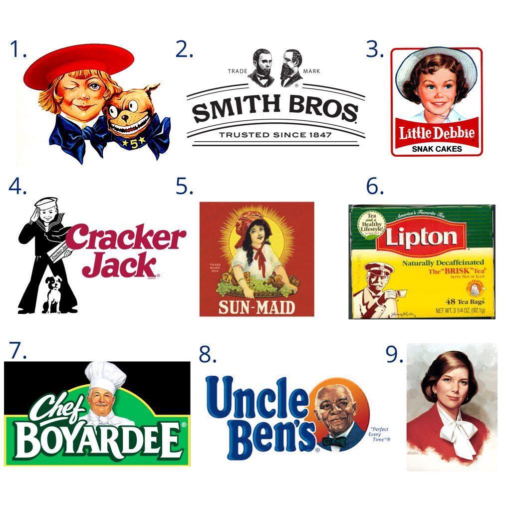
Welcome to the wild world of ever-changing logos, where a company’s identity is as fluid as a politician’s promises. These shape-shifting symbols are like chameleons on steroids, constantly morphing to stay ahead of the design curve. Join us as we unravel the mysteries of dynamic logo design and uncover the secrets behind these elusive creatures. Strap in, folks, because this rollercoaster of logos is bound to give you whiplash - in the best way possible!
The Evolution of Branding: A History of Dynamic Logos
From the ancient times of cave drawings to the modern age of digital design, the art of branding has gone through quite the evolution. Let’s take a trip down memory lane and explore the history of dynamic logos:
- Primitive Brands: Back in the day, our ancestors didn’t have Adobe Illustrator to create sleek logos. They relied on primitive symbols and markings to distinguish their clans. Think of it as the first form of branding, caveman style!
- Medieval Marks: Fast forward to the Middle Ages, where knights and nobles adorned their shields and banners with intricate family crests. Talk about a logo that commands respect – nothing says loyalty like a fierce dragon or majestic lion!
- Retro Revival: In the swinging sixties, brands embraced bold colors and funky fonts to capture the attention of a new generation. Who can forget the psychedelic swirls and groovy designs that defined the era? Peace, love, and a killer logo!
Today, branding has become a high-stakes game of visual identity. Companies invest millions in logo design, aiming to create a symbol that will stand the test of time. Whether it’s a sleek tech giant or a quirky indie brand, every logo tells a story and reflects the values of the company. So next time you see a logo, take a moment to appreciate the evolution of branding – it’s a journey that’s as dynamic as the logos themselves!

Capturing Attention with Animated Logos
If you want to grab people’s attention faster than a squirrel spotting a nut, animated logos are the way to go! These little snippets of visual delight can draw in viewers quicker than you can say “Bob’s your uncle”.
Imagine your logo coming to life on the screen, doing a little dance, and winking at your audience. It’s like having your own personal branding hype man, working overtime to get you noticed.
With animated logos, you can add a touch of whimsy to your branding that will make your competitors green with envy. Plus, they’re a great way to show off your company’s personality and stand out from the crowd.
So why settle for a boring old static logo when you can have one that’s alive and kicking? Dive into the world of animated logos and watch as your brand gets the attention it deserves!

The Psychology Behind Ever-Changing Logos
Have you ever noticed how some brands seem to change their logos more often than you change your socks? Well, there might just be some psychology behind it all. Let’s dive deep into the minds of these logo changers and uncover the mysteries behind their ever-changing designs.
First off, there’s the fear of commitment. These brands just can’t seem to settle on one logo design for too long. It’s like they have logo commitment issues or something. Maybe they’re just waiting for that one perfect logo to come along and sweep them off their feet. Who knows?
Then, there’s the need for attention. Changing logos is a surefire way to grab people’s attention and make headlines. It’s like these brands are saying, “Look at me! I’m new and improved! Pay attention to me!” And sure enough, we all fall for it hook, line, and sinker.
Lastly, there’s the desire to stay relevant. In a world that’s constantly changing and evolving, brands want to keep up with the times. They think that by changing their logos, they’ll stay fresh and trendy. Little do they know, we’re onto their sneaky little game.

Implementing Dynamic Design Strategies for Success
Are you tired of boring, static design strategies that don’t seem to get you anywhere? It’s time to shake things up with some dynamic design strategies that will propel you towards success! Implementing these strategies is easier than you think, and the results will speak for themselves.
First off, embrace the power of bold colors and eye-catching graphics. Don’t be afraid to think outside the box and experiment with unconventional color combinations. A pop of neon pink here and a dash of electric blue there can really make your design stand out from the crowd.
Next, consider incorporating interactive elements into your design. Whether it’s a fun quiz, a clickable infographic, or a scrolling animation, adding interactive features will engage your audience and keep them coming back for more.
Finally, don’t forget the importance of mobile optimization. In this day and age, most people are browsing the internet on their smartphones, so make sure your design is responsive and looks great on all devices. A user-friendly mobile experience is key to keeping your audience engaged and coming back for more.
Embracing Modern Technology: The Future of Dynamic Logos
In a world where attention spans are as short as a goldfish’s memory, it’s time for logos to step up their game. Enter dynamic logos – the superheroes of branding that can shape-shift, dance, and even tell jokes.
Imagine a logo that adapts to the user’s mood or the weather outside. One day, it’s smiling and sunny. The next, it’s frowning because it’s raining cats and dogs. Dynamic logos are the chameleons of the branding world, constantly evolving to keep up with the ever-changing digital landscape.
With the rise of virtual and augmented reality, the possibilities for dynamic logos are limitless. Picture a logo that pops out of your screen and does a little dance before turning into the brand’s signature color palette. It’s like having a mini-mascot living in your phone, ready to entertain and engage at a moment’s notice.
Dynamic logos are not just eye candy – they’re smart little creatures that can gather data, interact with users, and adapt to trends in real-time. They’re the future of branding, bringing a touch of magic and whimsy to the digital world. So go ahead, embrace the chaos and let your logo dance to the beat of modern technology!
The Impact of Dynamic Logos on Brand Identity and Recognition
Dynamic logos have the power to revolutionize a brand’s identity and recognition in ways we never thought possible. They add movement and excitement to a brand’s visual representation, making them stand out in a sea of dull and static logos.
With a dynamic logo, a brand can convey a sense of energy and forward-thinking innovation. It shows that they are not afraid to break boundaries and take risks in order to capture the attention of their target audience. Plus, who doesn’t love a logo that dances and twirls like a ballerina on a mission?
Imagine the possibilities of a logo that can transform and adapt to different mediums and platforms. Whether it’s spinning around on a website banner or jumping off a billboard, a dynamic logo can truly leave a lasting impression on consumers. It’s like having a chameleon for a mascot, blending in seamlessly wherever it goes.
Overall, dynamic logos bring a whole new level of fun and excitement to brand identity and recognition. So, next time you’re brainstorming ideas for your logo, don’t be afraid to think outside the box and add a little pizzazz with some dynamic elements. Trust us, your brand will thank you later!
FAQs
Why should companies consider using dynamic logos?
Companies should consider using dynamic logos because in the fast-paced world of marketing and branding, a flexible logo allows for a more adaptable and engaging brand identity. Plus, who doesn’t love a logo that can change with the times?
How can a dynamic logo benefit a company’s brand image?
A dynamic logo can benefit a company’s brand image by showcasing their ability to evolve and stay relevant in a constantly changing market. It also adds a fun and interactive element to their brand, setting them apart from the competition.
What are some creative ways to implement dynamic design elements into a logo?
One creative way to implement dynamic design elements into a logo is to use animation or motion graphics to bring the logo to life. Another idea is to incorporate color-changing elements or interactive features that respond to user input. The possibilities are endless!
What are some potential pitfalls to avoid when designing a dynamic logo?
One potential pitfall to avoid when designing a dynamic logo is making it too complex or busy, which can detract from the overall brand message. It’s important to strike a balance between creativity and simplicity to ensure that the logo remains memorable and effective.
How can a company ensure that their dynamic logo stays relevant over time?
To ensure that a dynamic logo stays relevant over time, a company should regularly reassess their brand identity and target audience to make sure that the logo continues to resonate with consumers. It’s also important to stay up-to-date on design trends and technological advancements to keep the logo feeling fresh and modern.
Stay Tuned for More Logo Magic!
Thanks for joining us on this journey into the world of dynamic logo design! Remember, just like logos, life is constantly changing, so embrace the magic of adapting and evolving. Keep an eye out for more insights and inspiration as we continue to explore the ever-changing landscape of design. Until next time, may your creativity sparkle and your logos dazzle!


