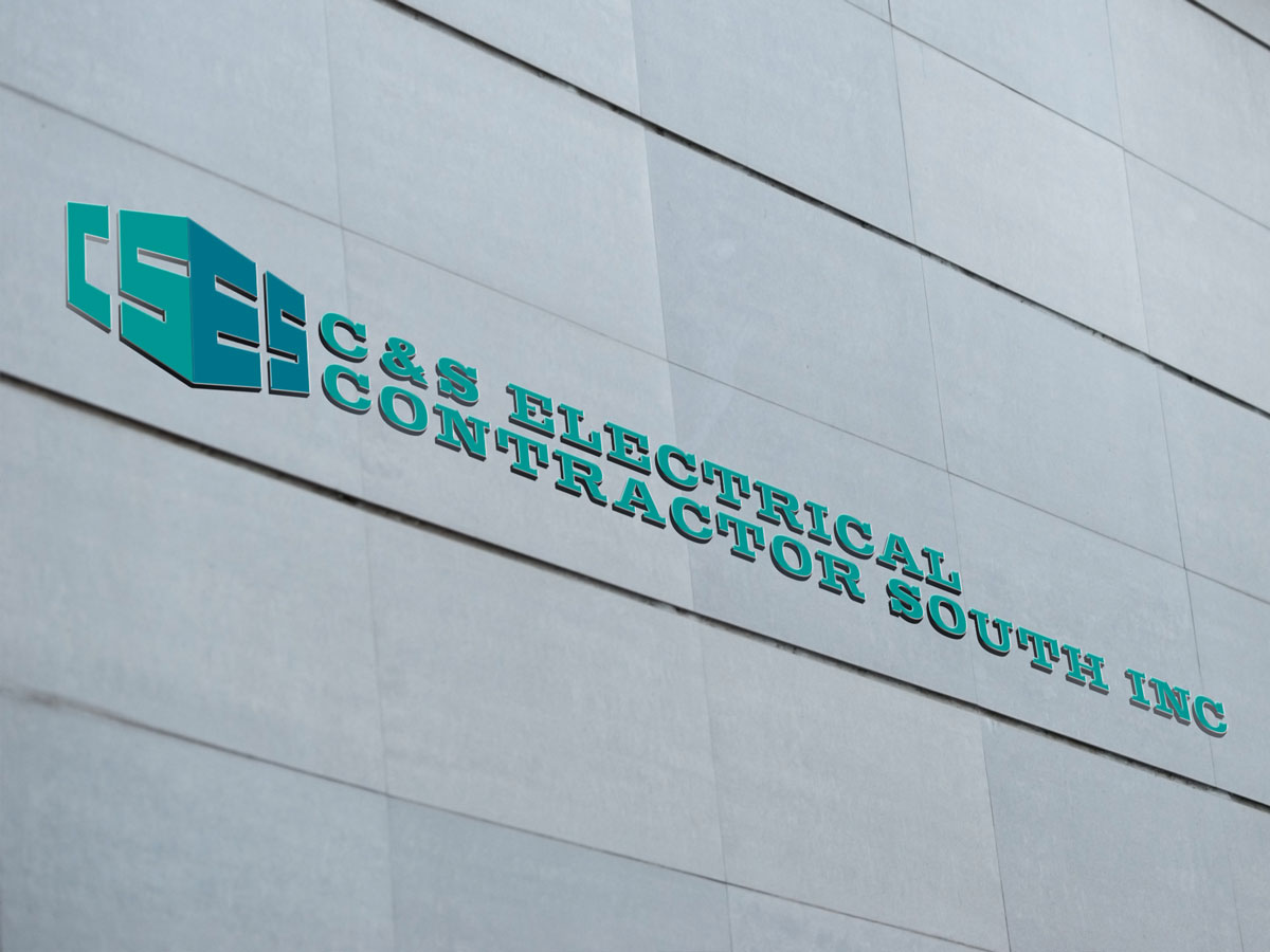
C&S Electrical (based out of Jacksonville, FL) specializes in industrial, commercial, & multi-family properties. They presented with a sketch for the main icon and also noted that the color teal was being used on their trucks (so it was important to preserve that palette for any previous brand recognition).
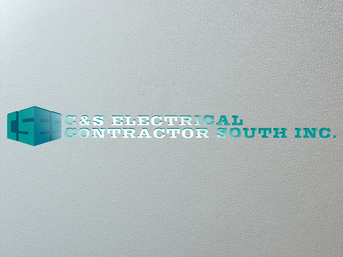
In addition to the above input, they also expressed interest in an icon that would appear as if the letters formed the structure of a building (with the spaces serving as windows). The first mockup on the left is modified a bit just for demonstration purposes, but in the 2nd image you can get a better idea for how this effect was achieved.


