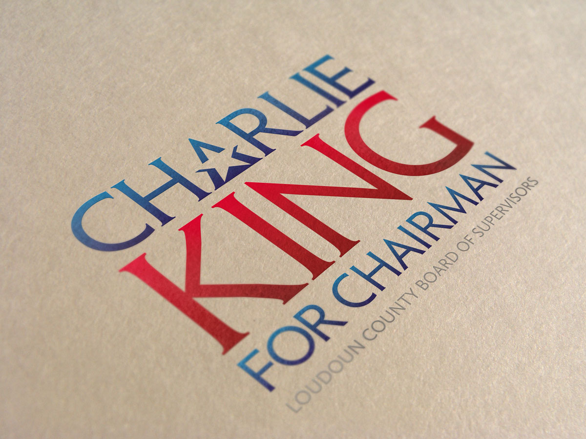
Charlie King for Chairman! This was a pretty interesting project considering we had an extremely long title + tagline to incorporate. As you can imagine the sheer volume of text limits layout options, but that certainly doesn’t prevent the ability to create hierarchy within the design.
Since this was a state race (not federal) the client confirmed that a flag was not mandatory, and noted how important it is that the logo reproduce well on t-shirts, postcards, letterhead, websites, and yard signs. As far as color palette goes, red, white and blue is tried and tested so there wasn’t much of a need to break the mold here. While creativity is always welcome when it comes to design, there’s also a reason that so many marks stay true to themselves and incorporate aesthetics that are guaranteed to relate well with the target audience.


