Fort Worth Logo Design

A premium logo design is the cornerstone of every successful branding identity

Are you looking for high-quality Fort Worth logo design services? Your image is typically the very first thing clients and customers see when they engage with your brand. What do they see now when they look at your branding identity? Hopefully, a professional logo design that represents who you are. If not, are you really putting your best foot forward with potential business opportunities? 

Below are a few of the most popular Fort Worth logo designs found throughout the city. These designs work to highlight their respective brands and present a professional image to the public. When you look at these designs, take a minute to think about what you like or do not like about them. Taking a look at other professional logo designs can help you narrow down what options are available for your own logo design. 

City of Fort Worth Logo Design

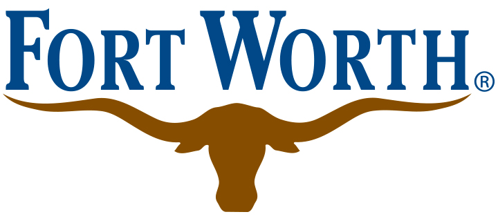
The “City of Fort Worth” logo design includes the name of the city and a pictorial mark of a Texas Longhorn. The image is simple and is commonly presented with a blue/brown earthy color palette. This logo works because it conveys an image and understanding about the city. People instantly know what to expect. It also is a strong nod to the culture commonly associated with Texas, and that is always something that people will subconsciously pick up on and remember. 

Fort Worth / Arlington AT&T Stadium Logo Design

AT&T bought the naming rights to the stadium in 2013, but there are plenty of people who will forever acknowledge the stadium as home of the Dallas Cowboys. The stadium is used for plenty of other entertainment events, yet the football team is the heart and soul of the venue.

One of the reasons this is a great example of branding is because AT&T shares similar colors to the Cowboys: blue and white. The logo doesn’t look out of place when the Dallas Cowboy logo is placed next to it. Yes, it’s convenient that this happened to work out this way, but also goes to show how important it is to have brand guidelines available for future marketing usage. It’s easy to want a logo with a variety of colors you enjoy, but will those color clash on different backgrounds?  How about when placed on different materials?

The new logo for the stadium includes the original (and existing) AT&T icon. This lets people instantly make the leap from the company to the stadium. It is a great way to unite the two industries. For most companies, this type of crossover isn’t something that they will experience. However, it provides some insight into the importance of having a minimal/simple logo design.  If AT&T was previously using an overly complex design, there’s no guarantee it would have the same harmony/impact when incorporated into other media. 

Fort Worth Zoo Logo Design

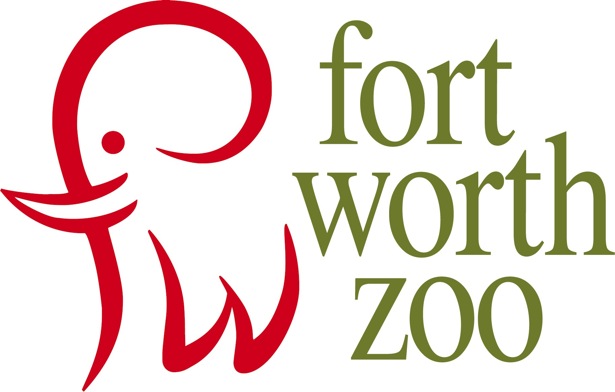
The Fort Worth Zoo logo is a prime example of clever logo design. It showcases an elephant, which is a very kind/likable animal in the minds of most people. This also lets people know immediately that this is a facility with elephants, which suggests that it could potentially be a zoo or conservation facility. The title utilizes a classic serif font, which adds a level of professionalism and trust. The “clever” part of this logo design is found within the execution of the elephant graphic. The elephant is created out of an “f” and a “w,” which are the two letters for Fort Worth, Texas. It’s a fun way to include the city’s initials and share the spotlight between the city/animals. 

Another reason why this logo is so successful is the fact that the elephant stands up extremely well on its own. It can act as a small emblem logo while being attached to various marketing materials. Functionality is on full display as this allows the logo text for “Fort Worth Zoo” to change as needed or be removed completely. Normally, you would not want to change any aspect of a logo on your marketing materials (because you want it to be recognizable and consistent). However, on a billboard, for example, the design might be better suited for a centered logo layout vs horizontal.  Another option is for the elephant to be placed anywhere on the billboard all by itself.  Due to the fact that it’s so memorable and well-branded, it’s able to still capture the essence of the company. This potential ensures that the logo remains timeless and usable in many different ways for years to come. 

Fort Worth Logo Design


Fort Worth Logo Design services typically include logo design, traditional marketing materials, social media materials, and brand identity items (including style guides).

Are you ready for your own Fort Worth logo design? Choosing to use a professional logo design can elevate your company and help potential customers gain trust in your business. We would love to work with you today and help you develop a logo design that makes sense for your company. Your logo design should create a professional blueprint that customers can follow and appreciate. It should draw people in and generate interest for people who want to learn more about who you are. 

Logo Coast can help you with all of your Fort Worth Logo Design service needs! Contact us today and we’d be happy to build your brand together. 

Call (877) 877-0651 with any questions, or

Schedule a Free Consultation